Project Description
… ..””From Frustration to Function: A Kitchen Redesign Journey”.”…
… ..””From Frustration to Function: A Kitchen Redesign Journey”.”…
At our company, making the most of small kitchen spaces is one of our specialties. In most homes, there’s never enough space for the kitchen you want, so something else has to give—like a closet, dining room, or bathroom. In some cases, we even expand into the yard to make more room, but that comes with its own challenges. This particular kitchen was no different.
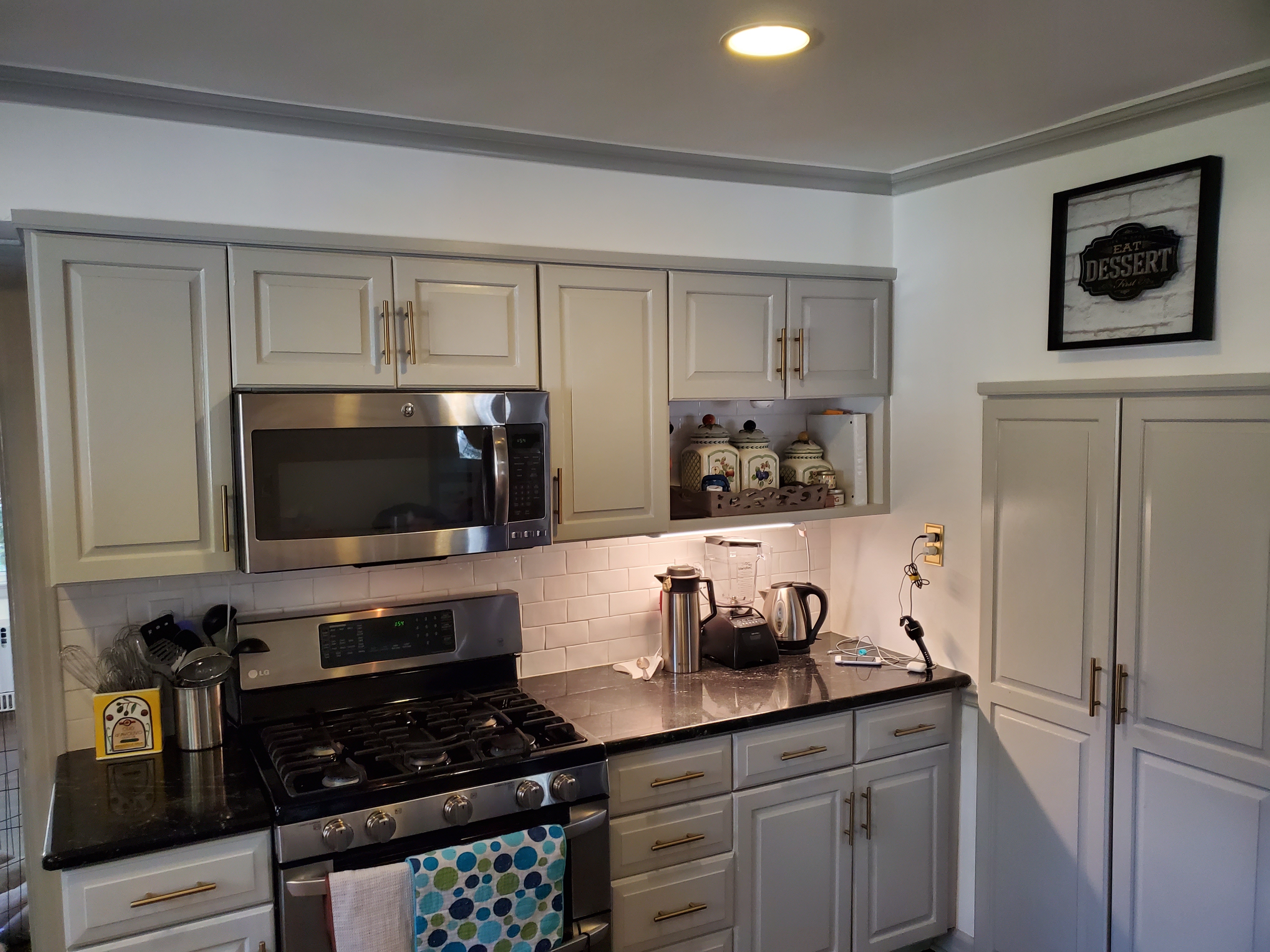
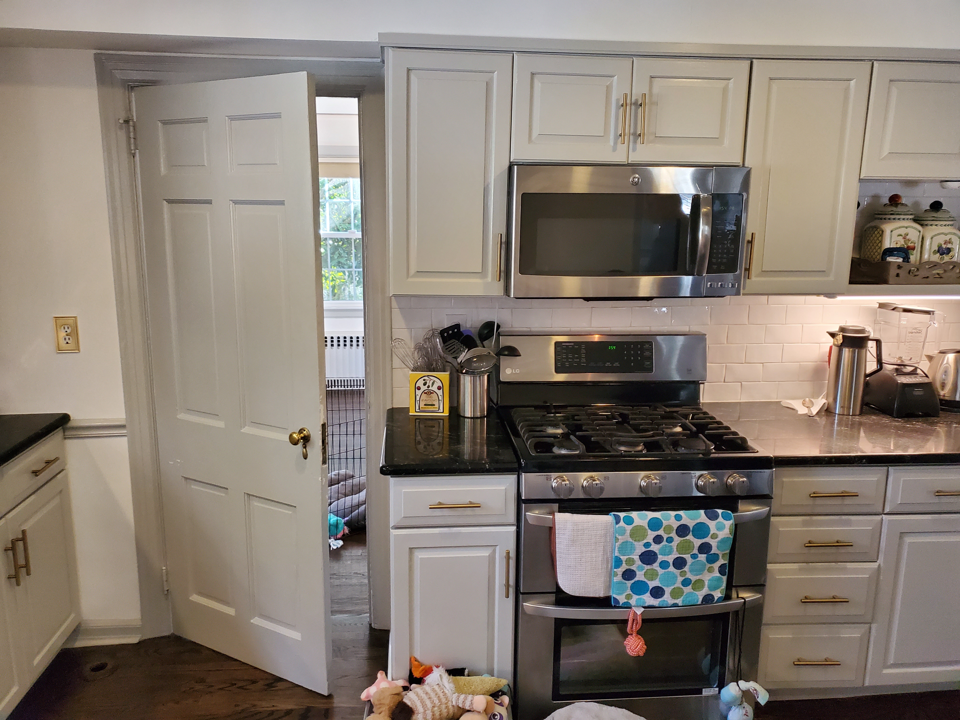
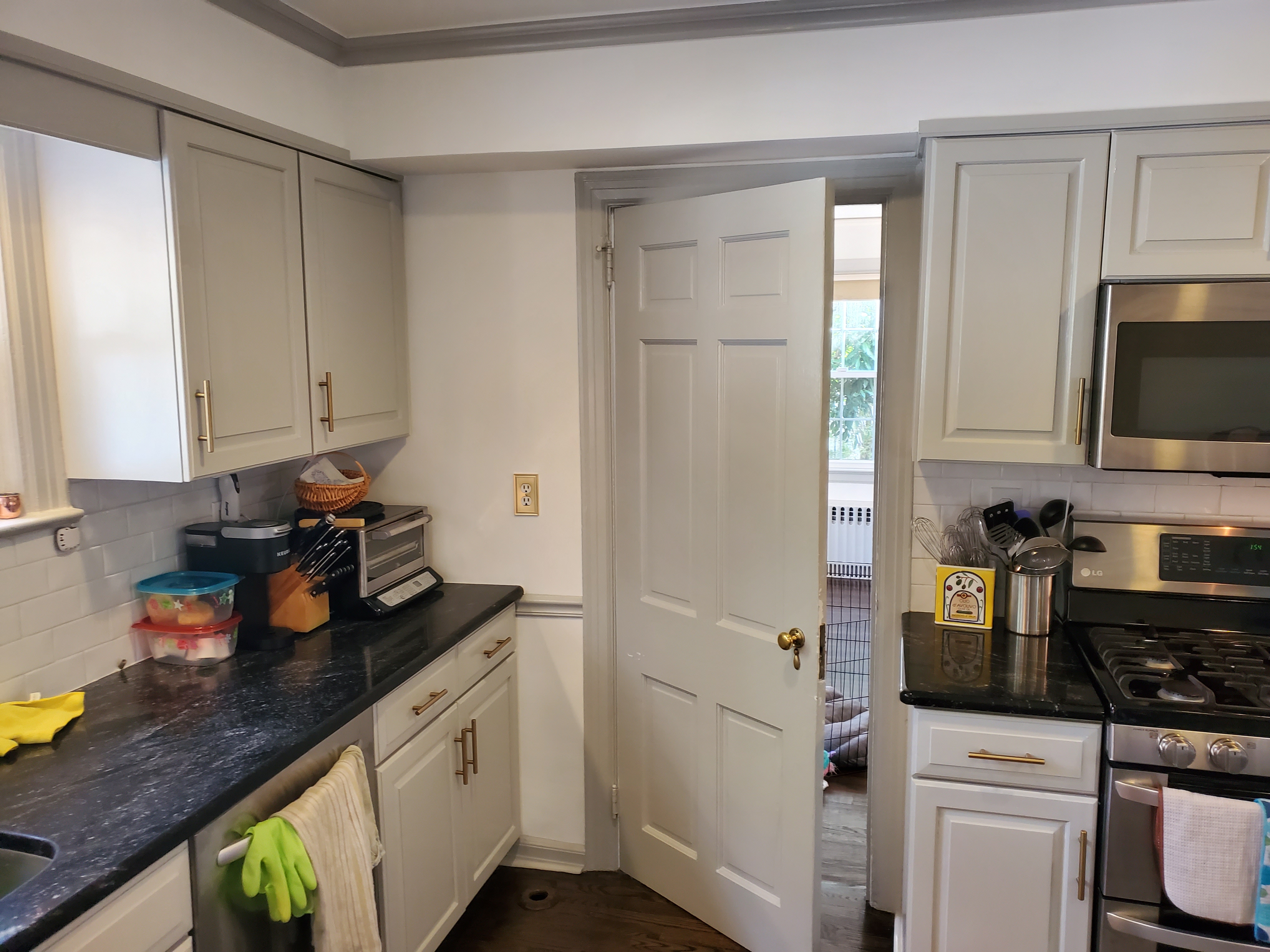
The homeowners had been frustrated with their kitchen for years. When we walked into the space, we immediately saw why. The kitchen was in a great location—it had access to the backyard, garage, dining room, living room, and even an office. The original architect couldn’t have picked a better spot. The kitchen was well-sized, but it was poorly designed. Despite having a walk-in pantry, a powder room, and some storage, it was hard to work in.
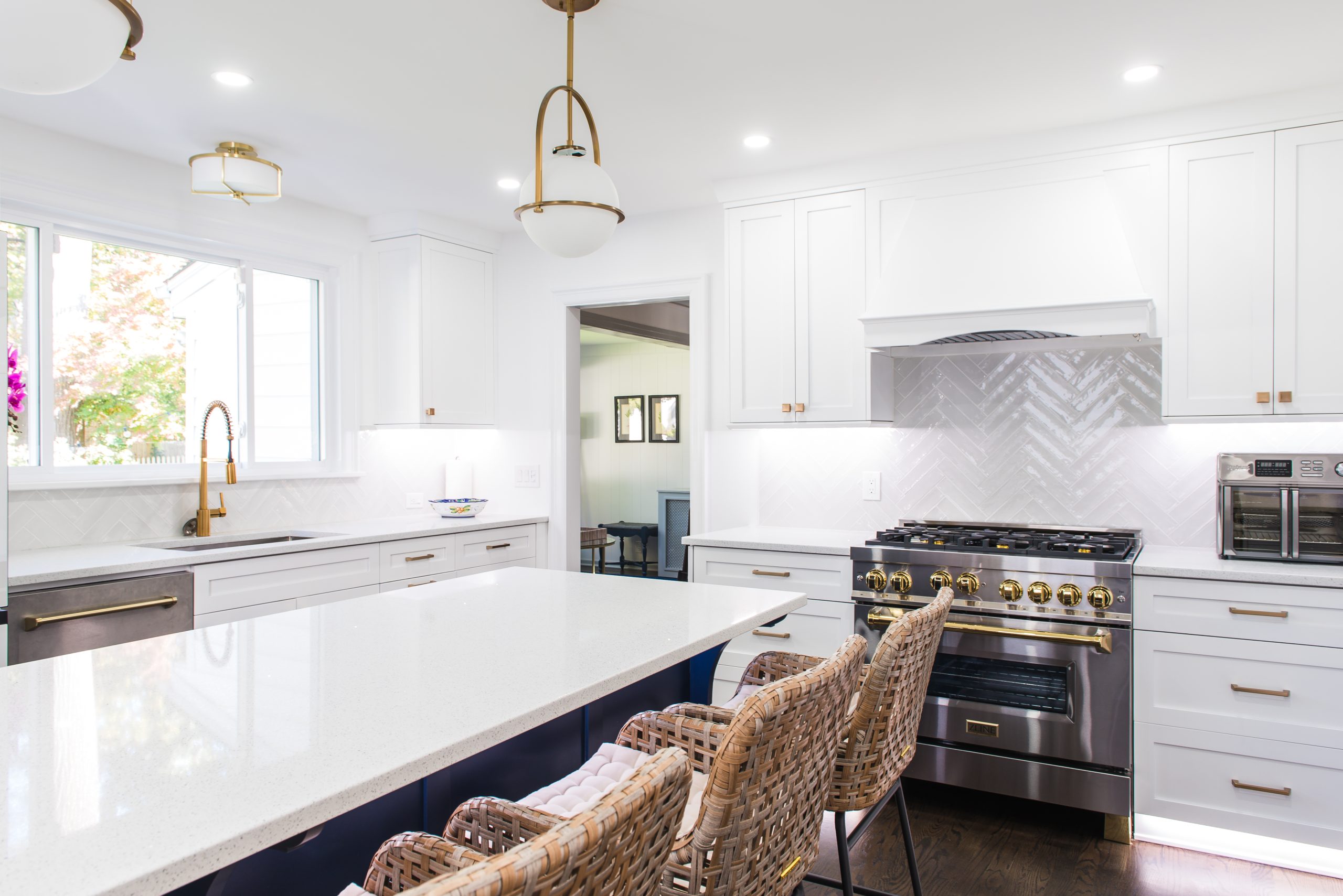
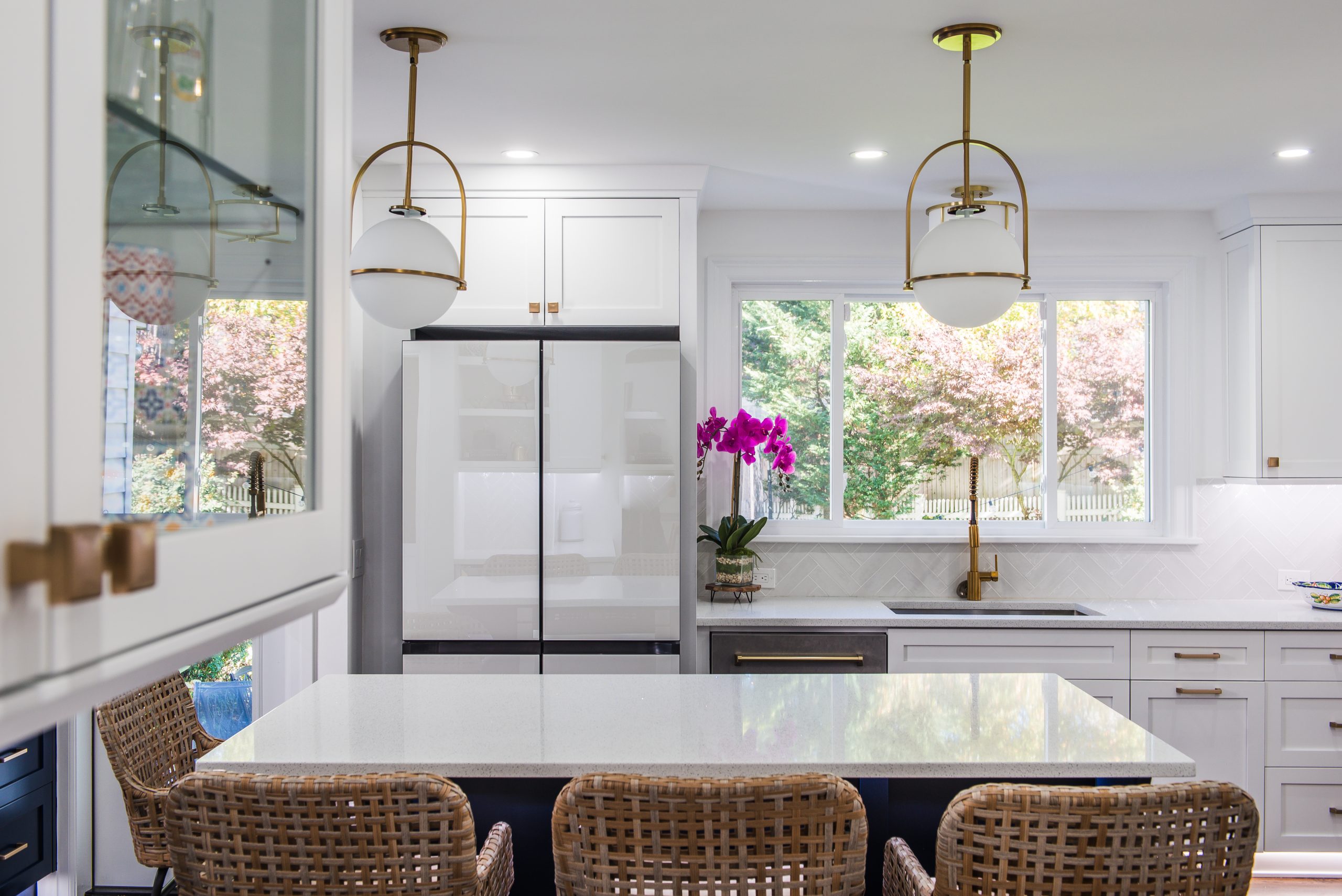
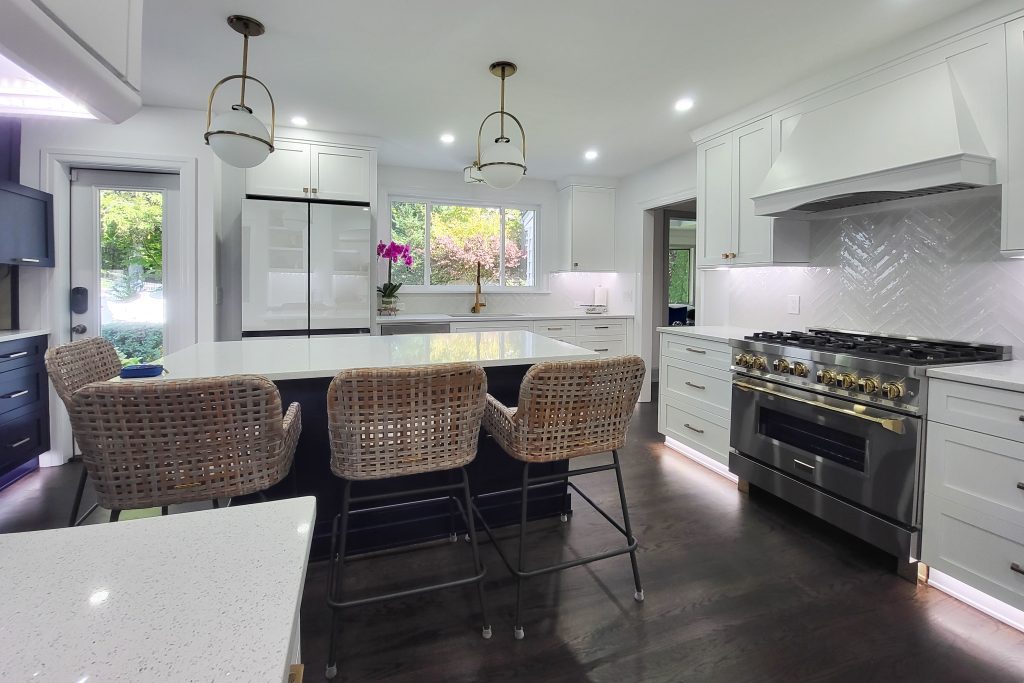
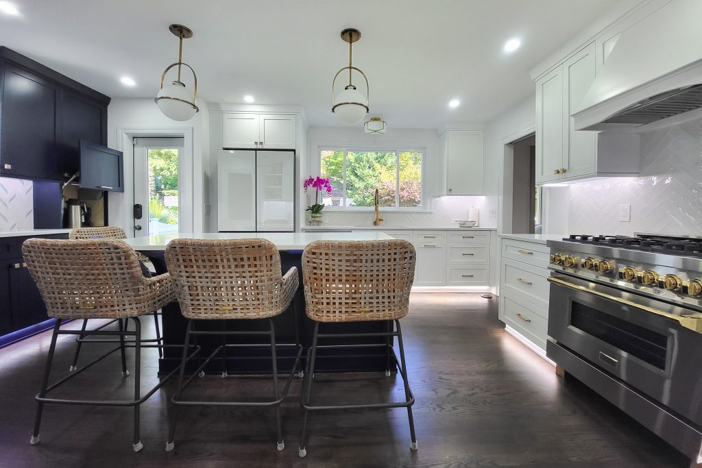
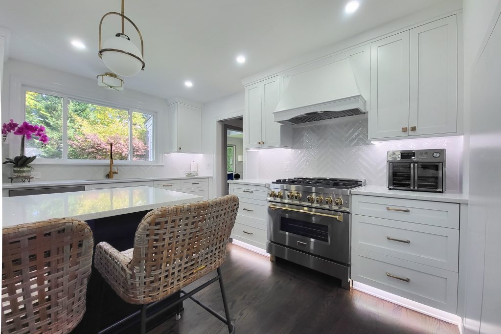
Our first step was to keep the range where it was, since it was in a good spot. We centered it on the wall and upgraded to a 36” range with a better venting hood. We also kept the sink in its original location, but we redesigned the space to include a triple-slider door. This opened up the view of the backyard and brightened the space.
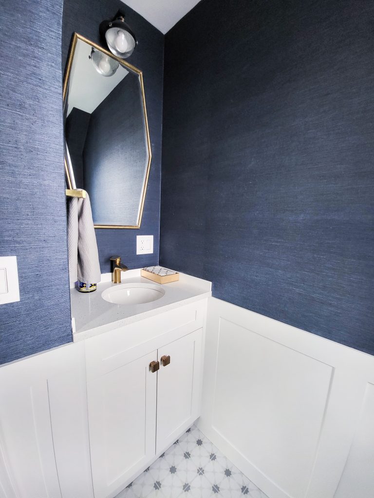
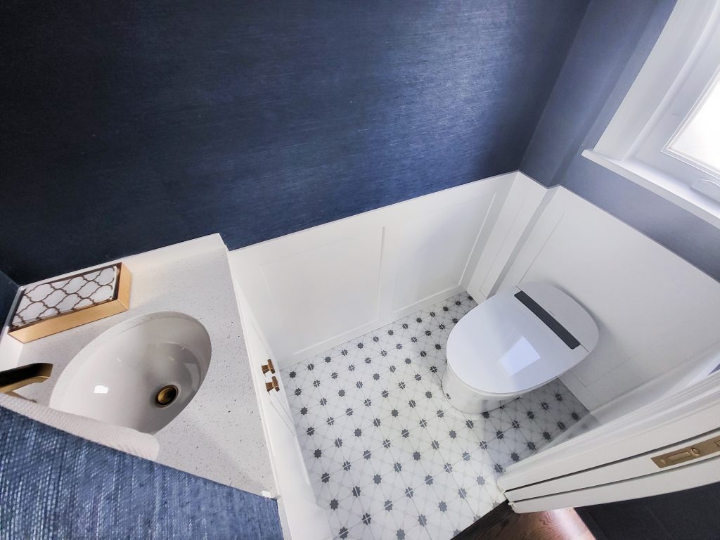
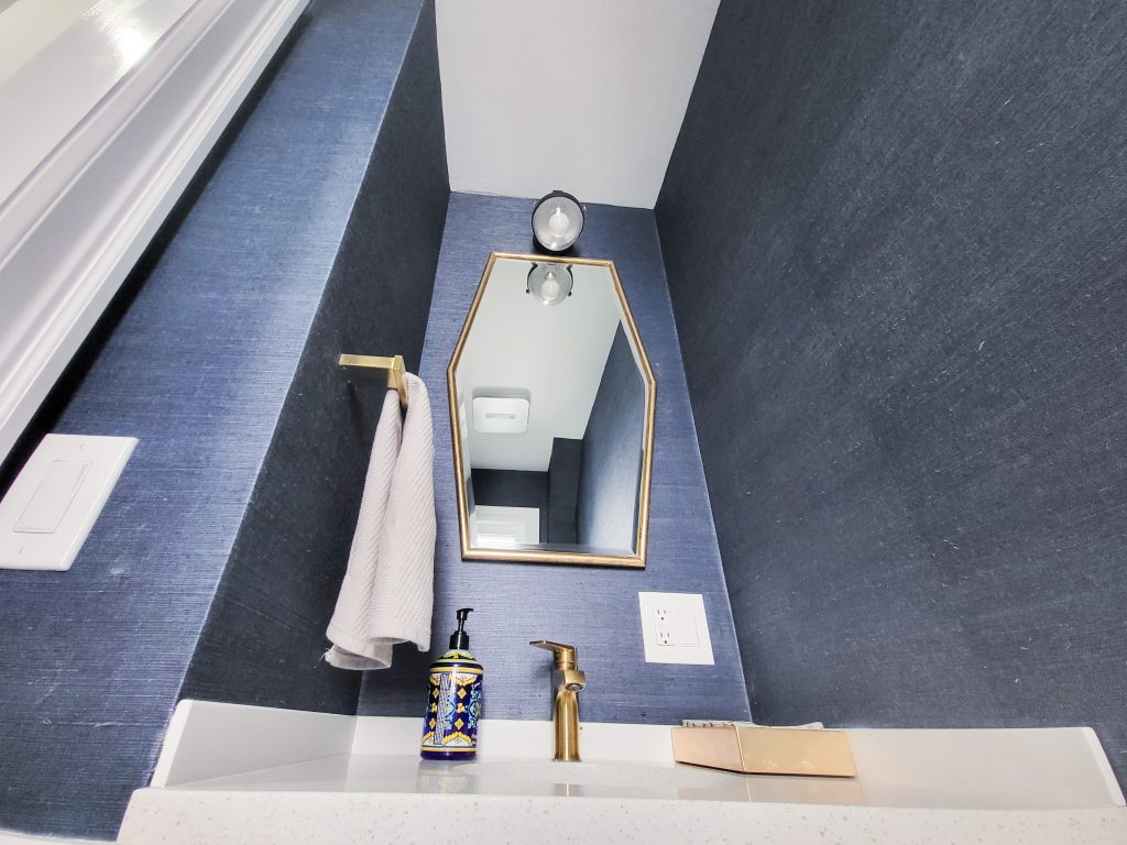
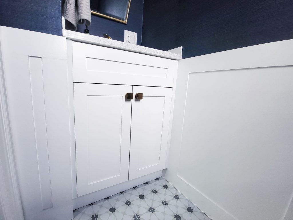
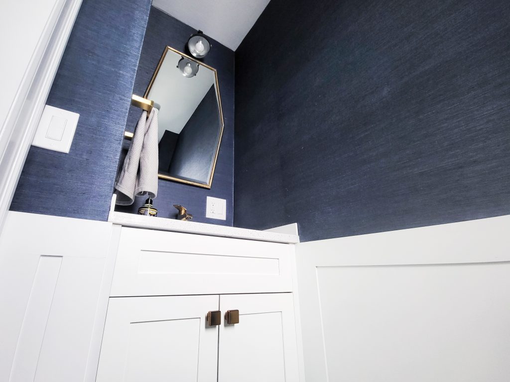
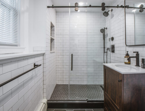
Next, we tackled the powder room, which was a major eyesore. It was in the way, blocking light and sightlines from the kitchen. We moved it, made it smaller, and allowed natural light to flow into the kitchen. (Here’s a look at the transformation:
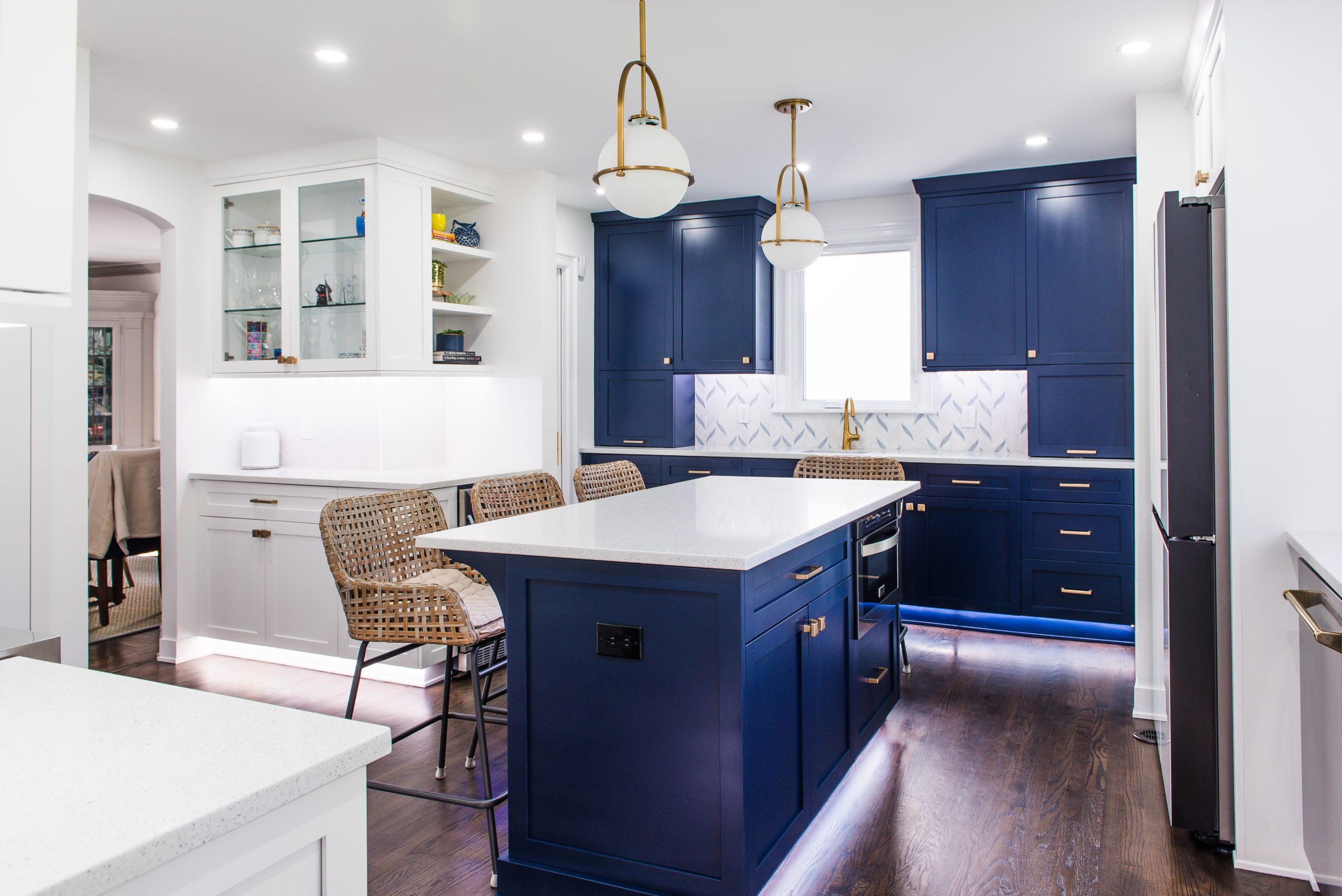
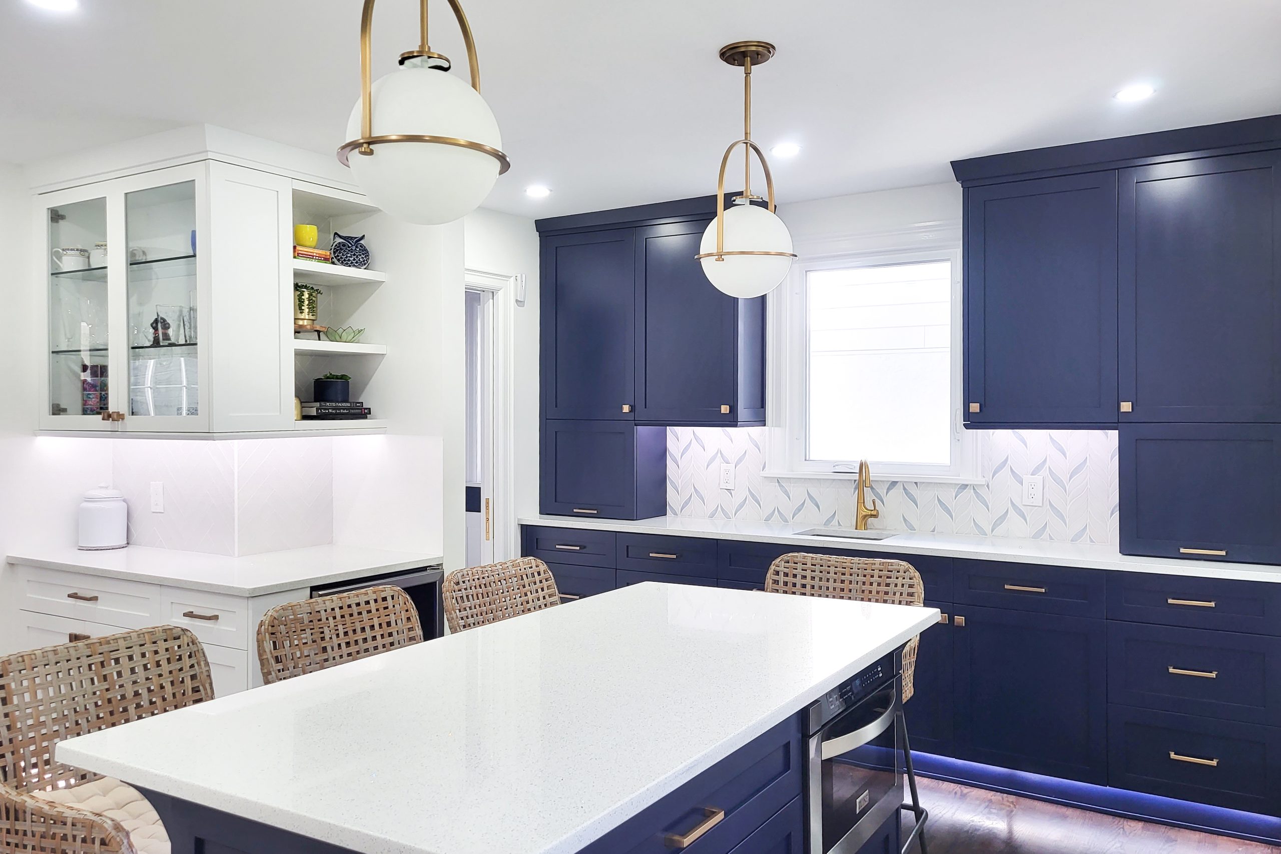
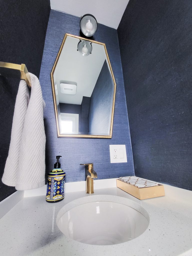
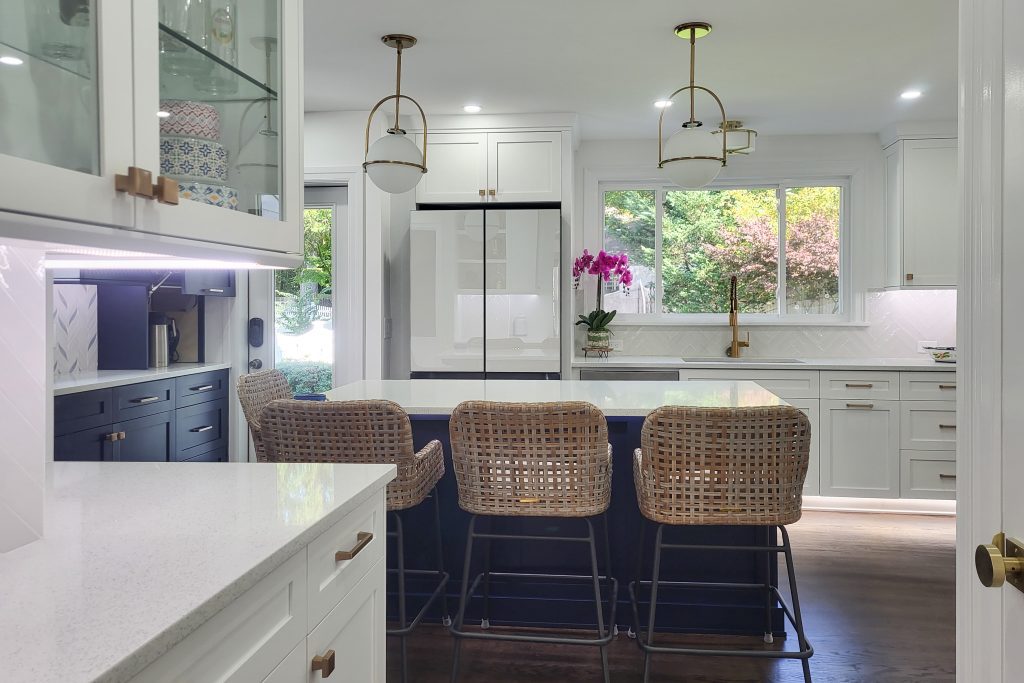
)We also added a beautiful blue feature wall and a second sink in place of the old powder room. The window, instead of lighting up the powder room, now brightens the kitchen.
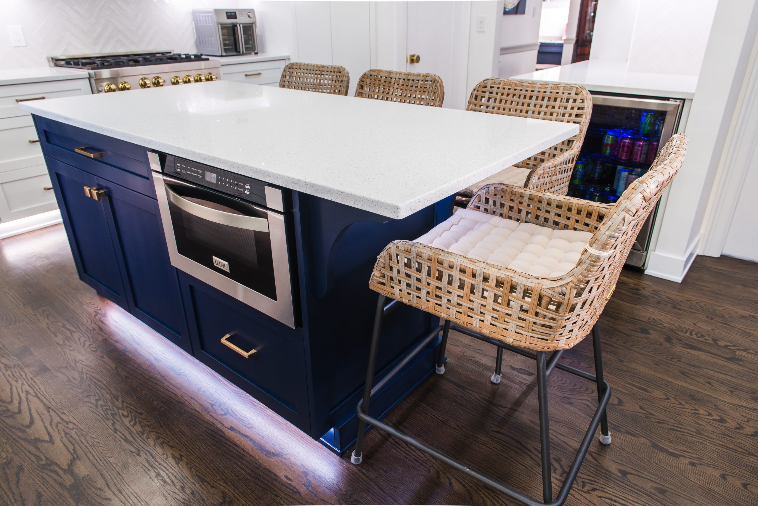
The family wanted an island and more countertop space. Not only did we fit an island, but we also added extra storage for a “beer” refrigerator (they made sure I didn’t call it a “wine” refrigerator). We added a glass cabinet and extended the wraparound cabinets to the dining room. Finally, the space could shine and serve the family’s needs.
The project had its challenges. We had to redo the floors twice—once due to an issue with the installation and then again when the family pet (now famous) walked on them just as we thought we were done. We also had to make a few quick design changes and rebuild a cabinet on-site, but that’s all part of the job.
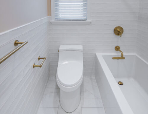
The new powder room is equipped with three ways to flush: with a foot pedal, a wave of the hand, or a button—showing off some impressive technology!
In the end, it was a fantastic experience working with this family to transform their home. We’re proud of the result and ready for the next project.
Another happy client—on to the next!
