Project Description
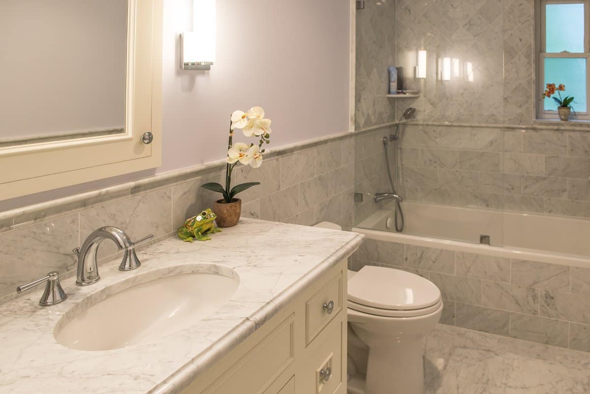
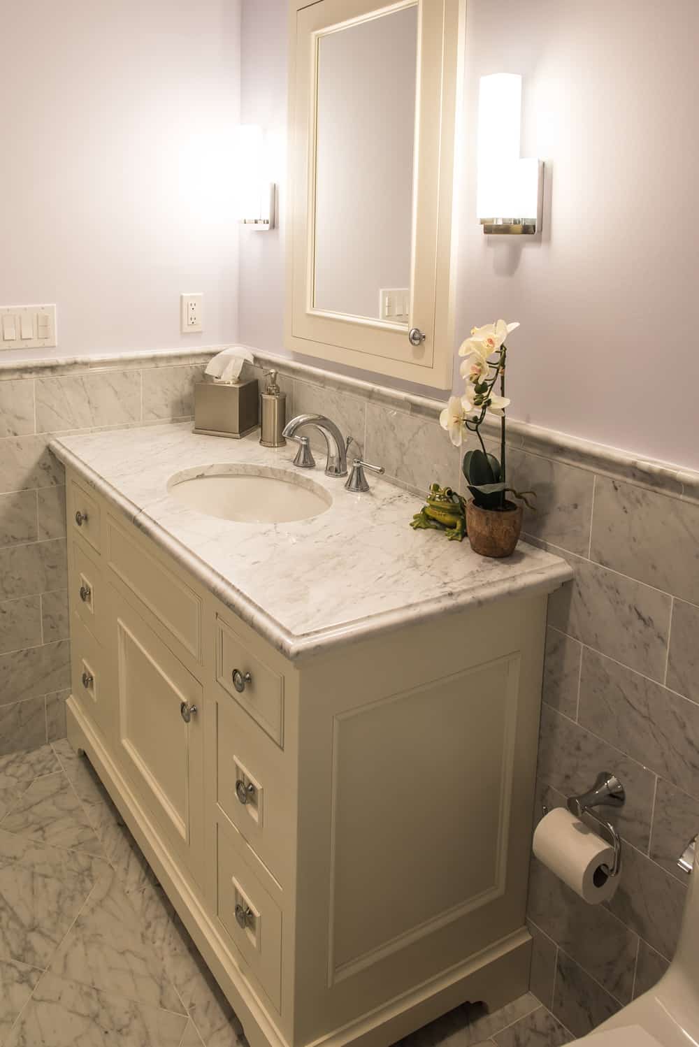
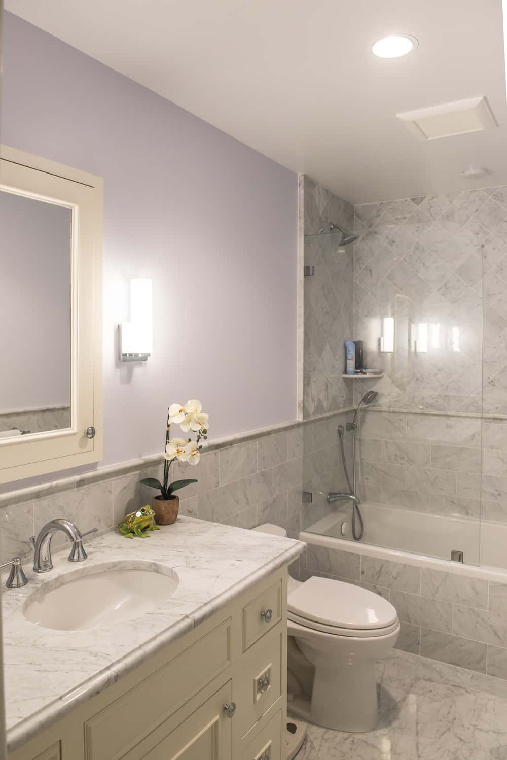
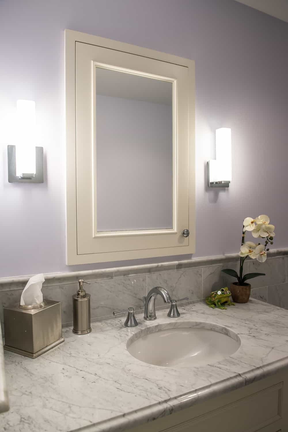
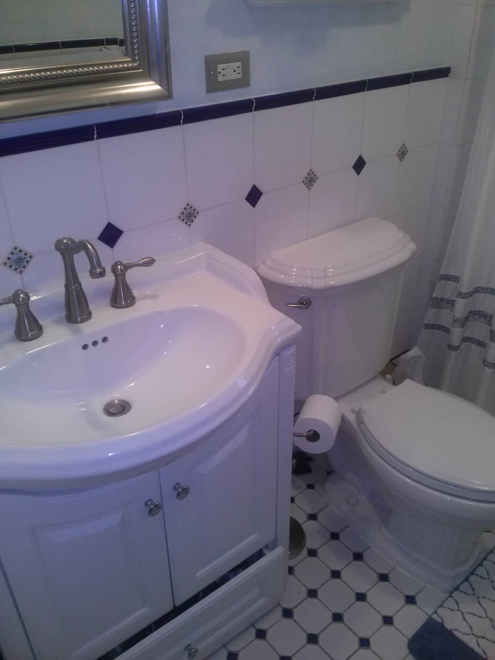
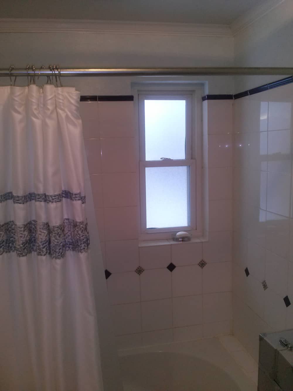
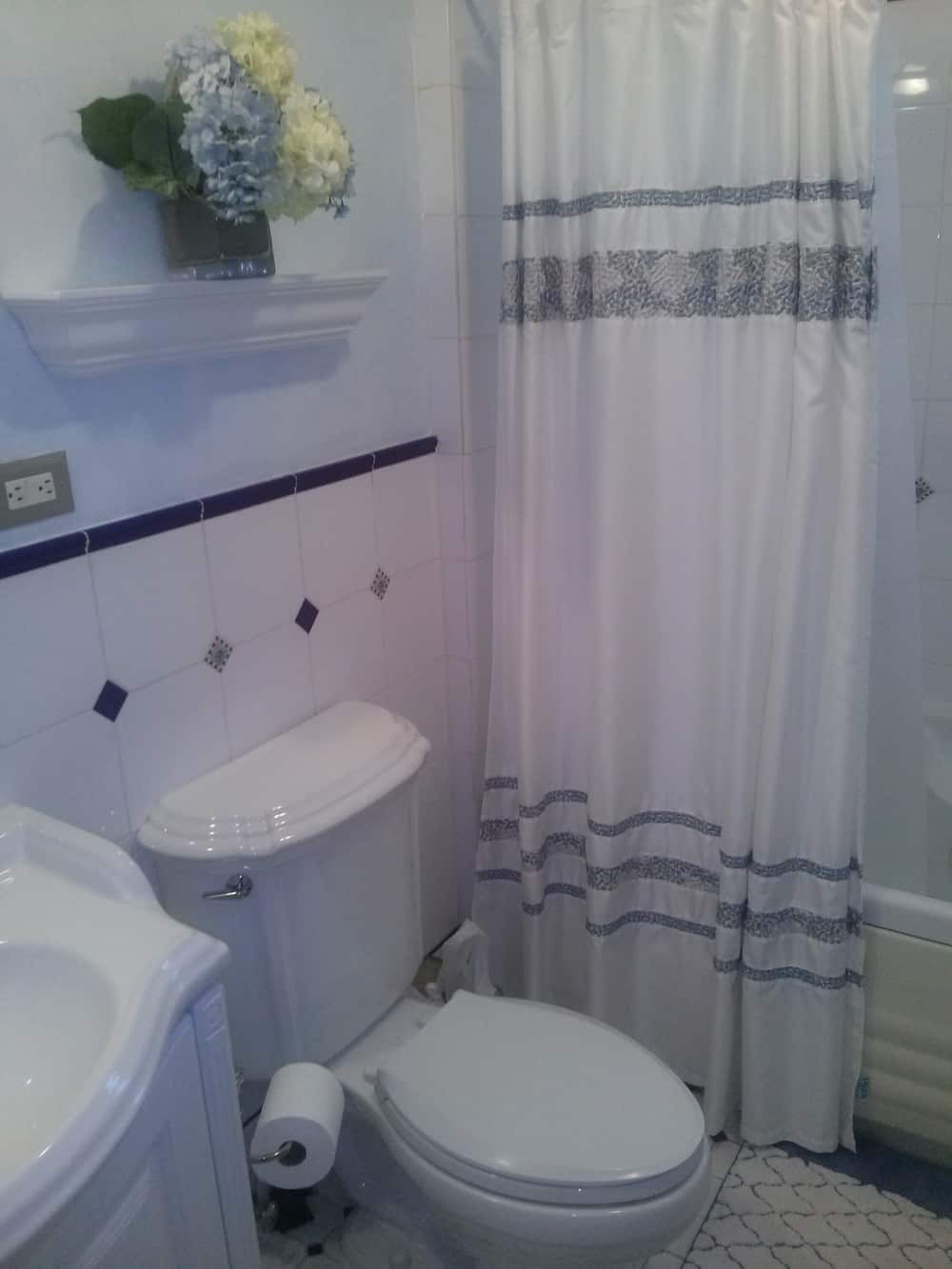
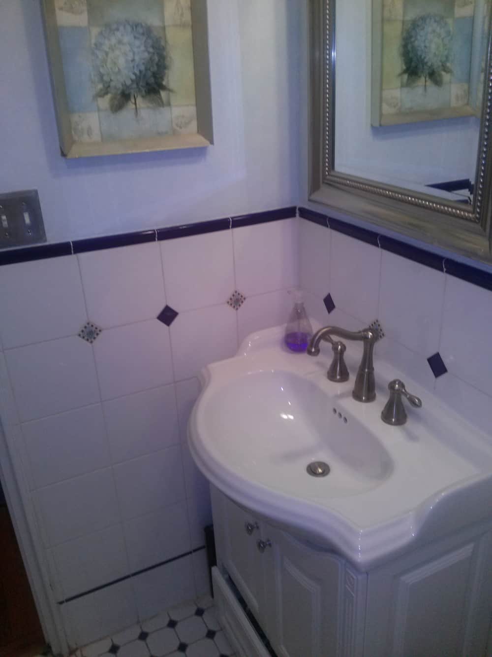
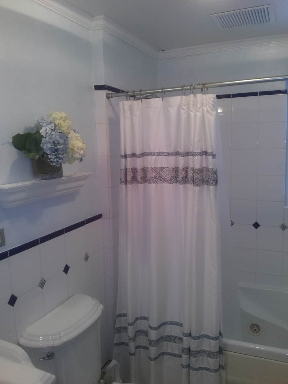
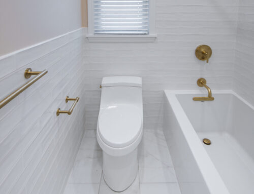
BATHROOM TRANSFORMED IN PELHAM MANOR
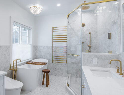
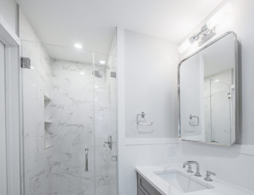
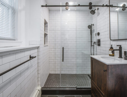
ADDITIONAL VIEWS & DETAILS:
SEE THE “BEFORE” PHOTOS:
“Design around a Chandelier.”
By the time the client and I sat down to discuss the kitchen, they already had some ideas what they wanted to do but wasn’t quite sure if the direction that they wanted to go would achieve what they had in mind. We sat and talked for about an hour and by that time I was in their heads and we all set out to design and create one of the most stunning kitchens you will ever see.
Everything was focus around one piece of item. A Chandelier! Believe it or not. This you will see in the middle of the room commanding the air, taking its place like a King to his castle. This was then followed by the colors of the cabinets, the iron chairs, Rolling ladder, hood and appliances.
To say this project was not challenging will be an understatement. We had a lot of obstacles to overcome. One such obstacle was figuring out how to use the corner sink without compromising on space, so we designed it to make them into pull out drawers. The other one, was to hide all of the AV and electronics in the space so not to see any Wires or IR cables exposed. They are huge sports fan so integrating the TV into that location to give a bar feel to the space was non- negotiable.
The other was the lack of usable storage. The solution was to have the drawers pull out on the side of the Island where we maximize both width and depth. We pulled the cabinets down to the counter to flank the range, which hides a lot of Countertop items and of course we compensated tons of deep bottom storage option, including the pull out pantry left of the Refrigerator. When you look closely at the sink photos you will also notice how we put drawers under the sink as well to pick up additional storage, which turns out to be a very good effective use of space.
Overall, we had a wonderful time with this project. We are happy and so honored to have been a part of such a unique Kitchen and our clients are even more elated that and are extremely satisfied with the outcome.
As a side note, if you look at one of the photos in the project portfolio, you’ll see a photo on the Island of the original kitchen that was demoed from this space. It was featured on the cover of the “Kitchen and Bath” Magazine as one of the best kitchen in 1969!
Faith would have it that this fresh take on the space that is now completed 47 years later, has just won the award for “the Best Kitchen in Westchester Magazine 2016”.
Here’s to one happy client! Now onto the next


