Project Description
“CONDO GETS A SMART MAKEOVER”
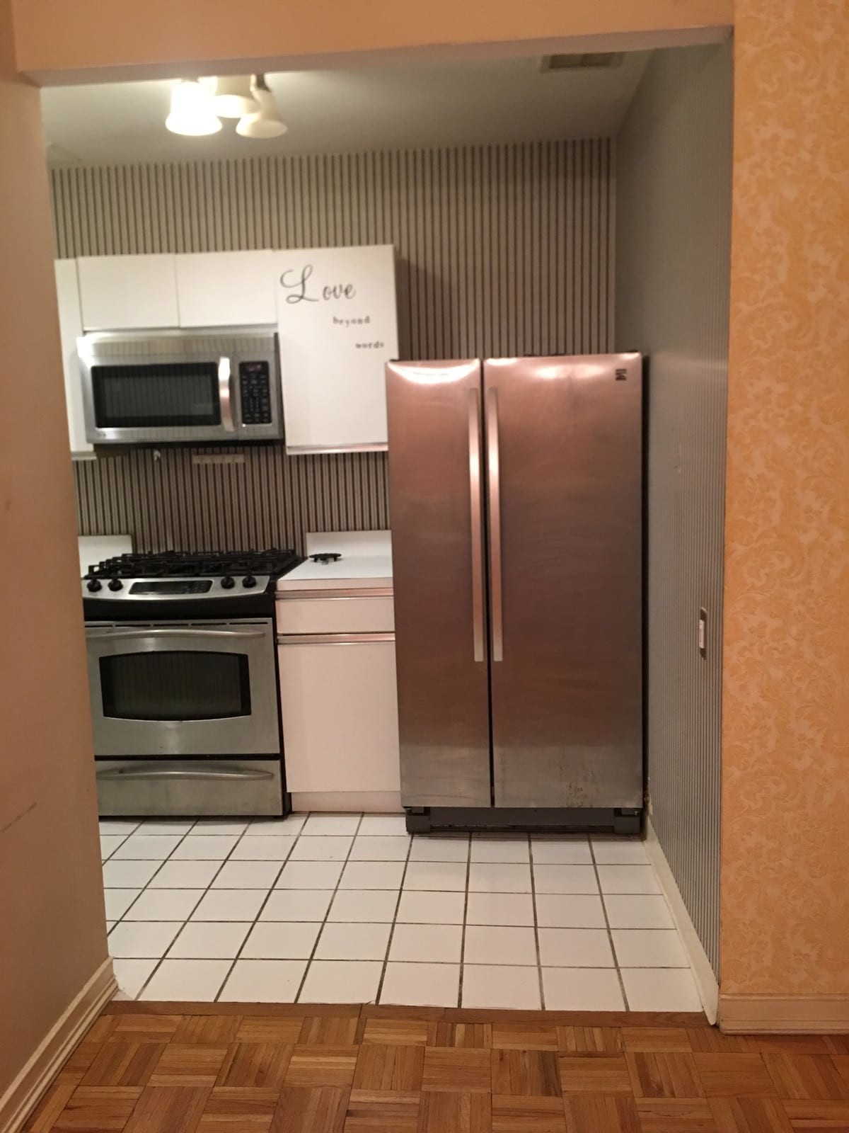
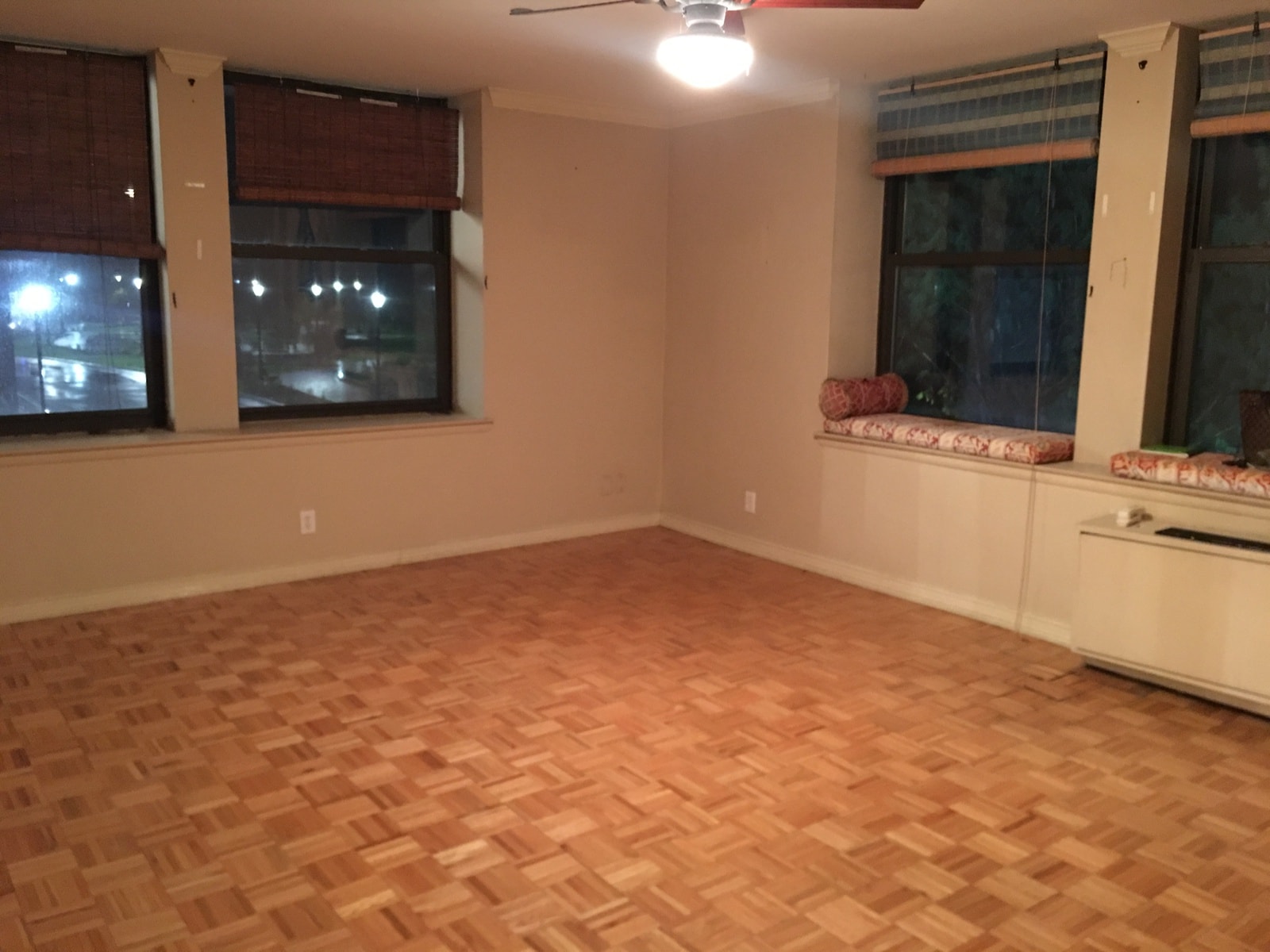
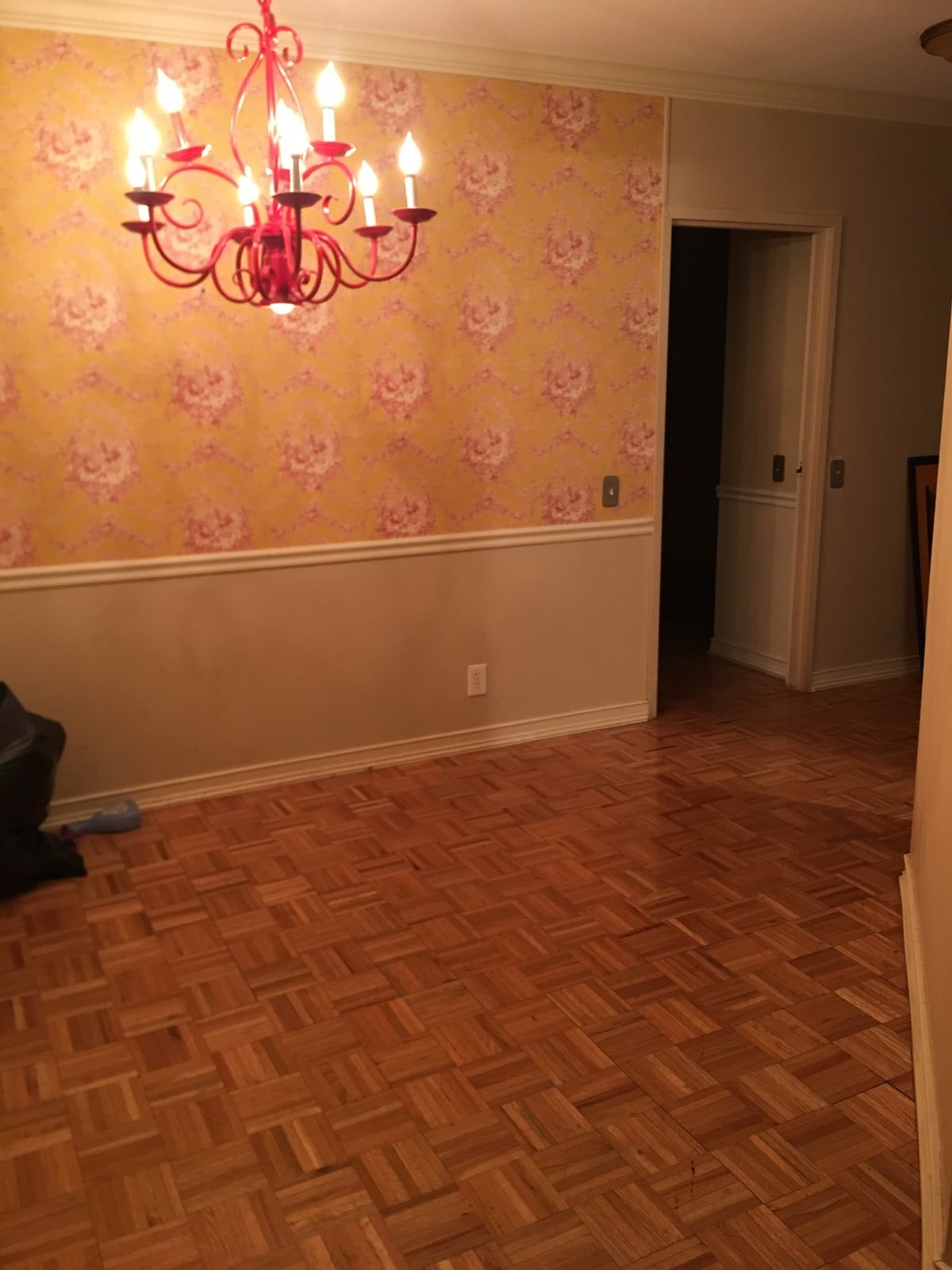
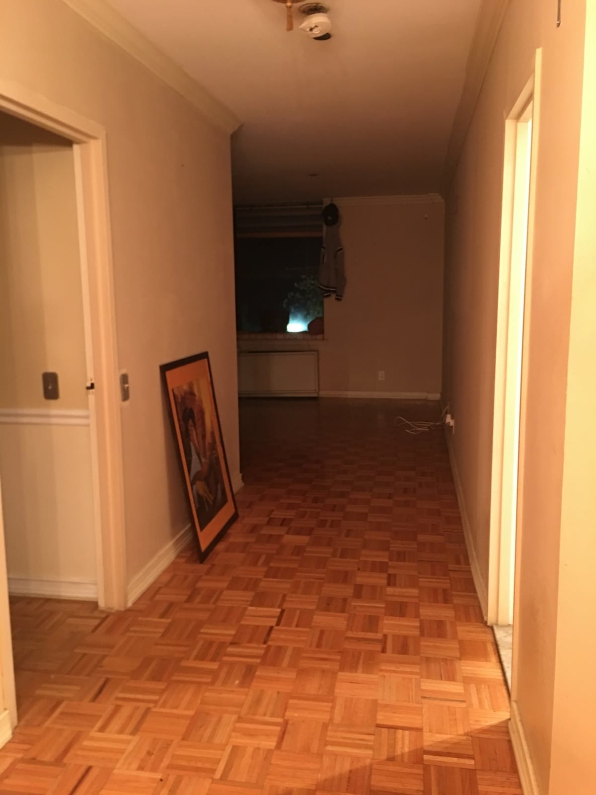
“BEFORE” PHOTOS:
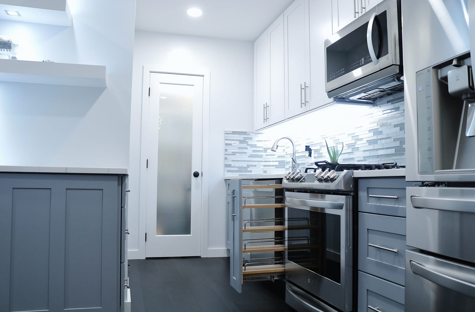
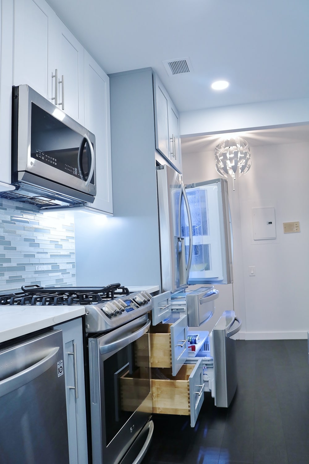
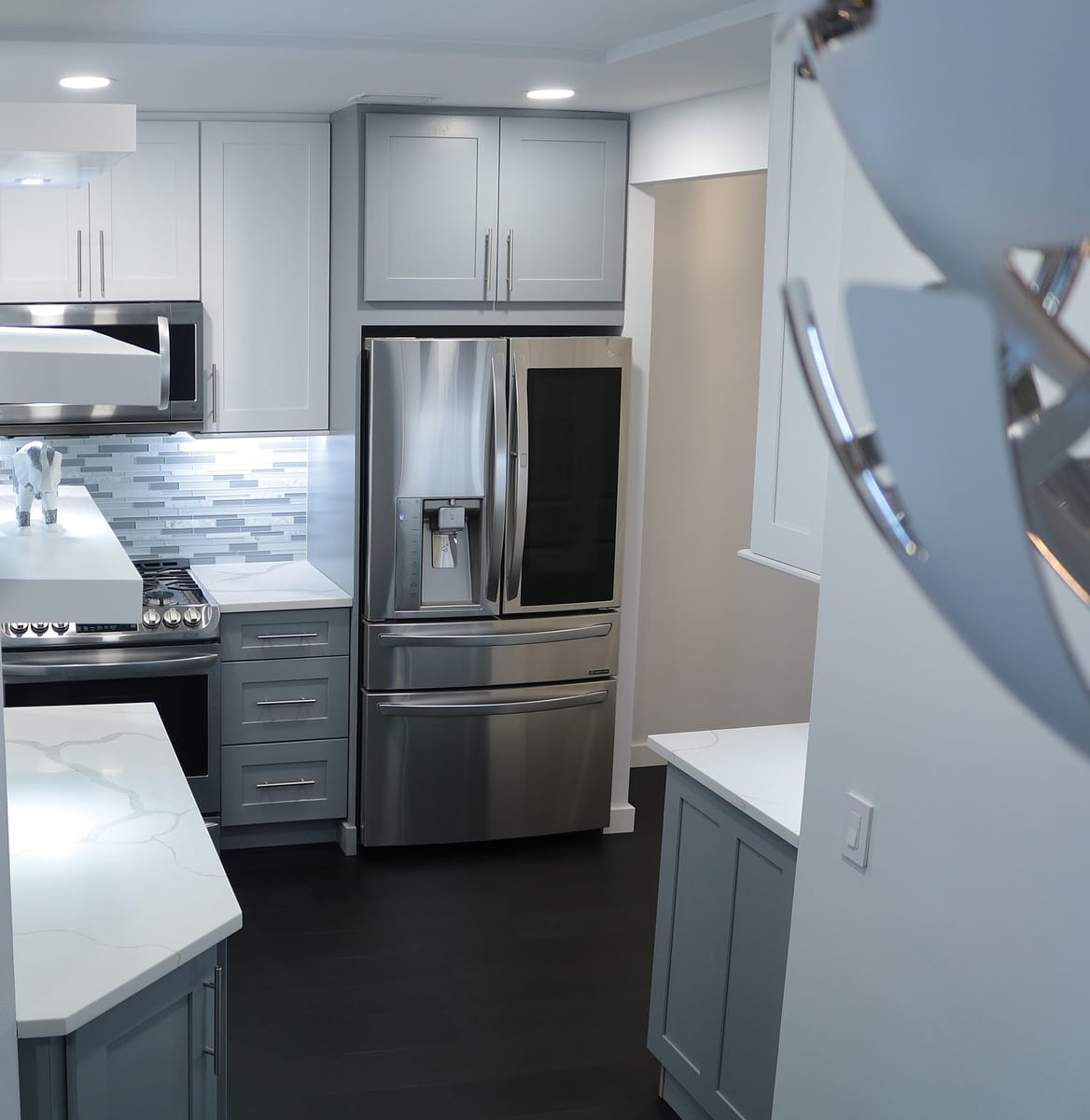
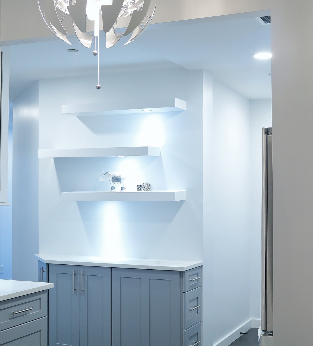
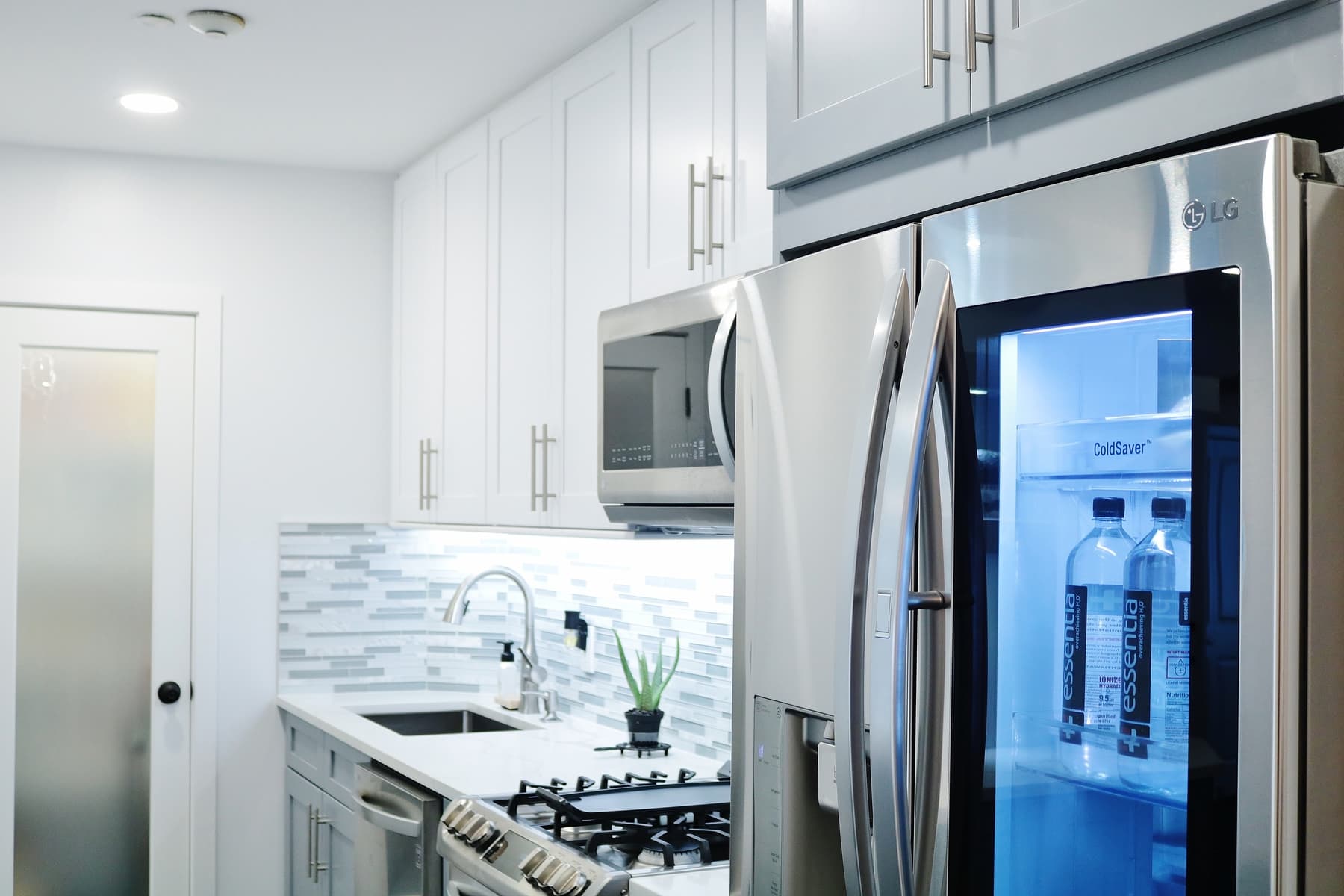
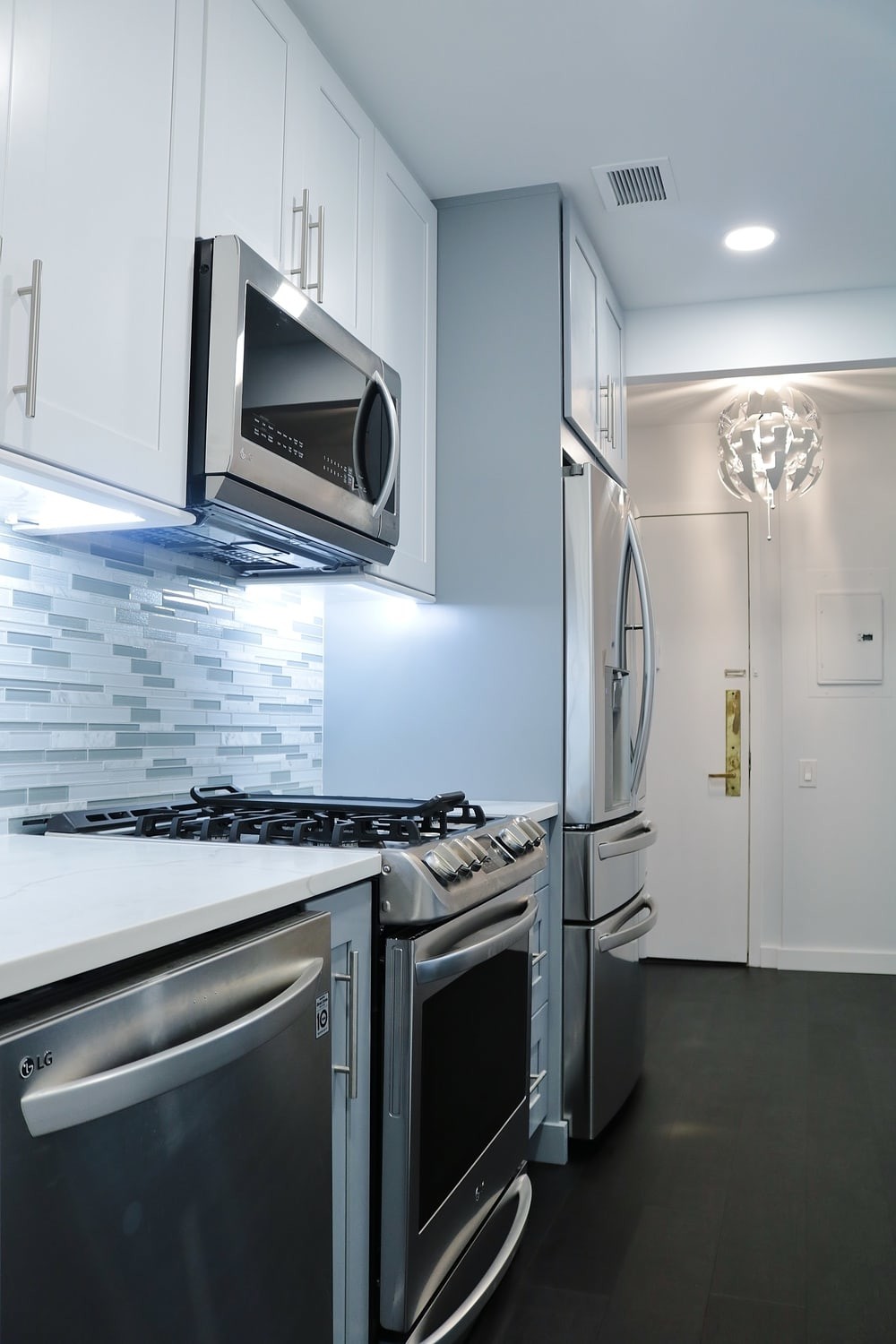
“AFTER” PHOTOS:
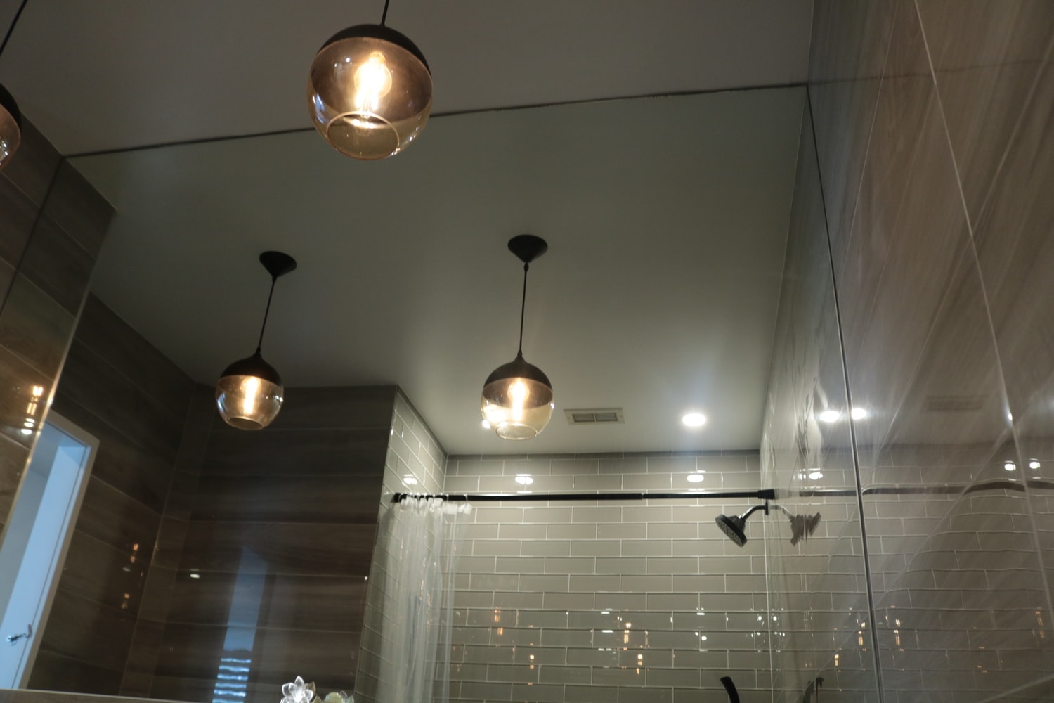
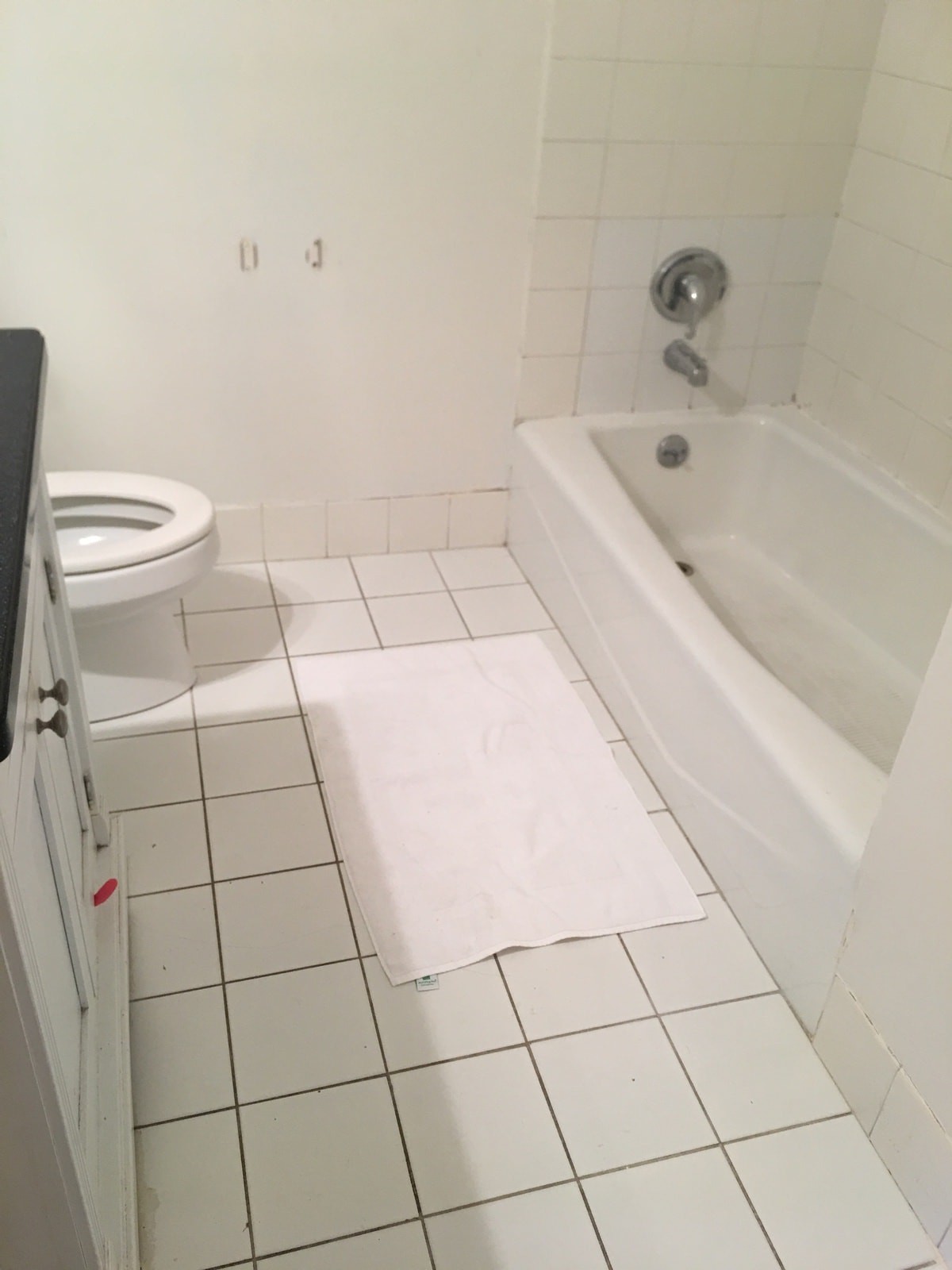
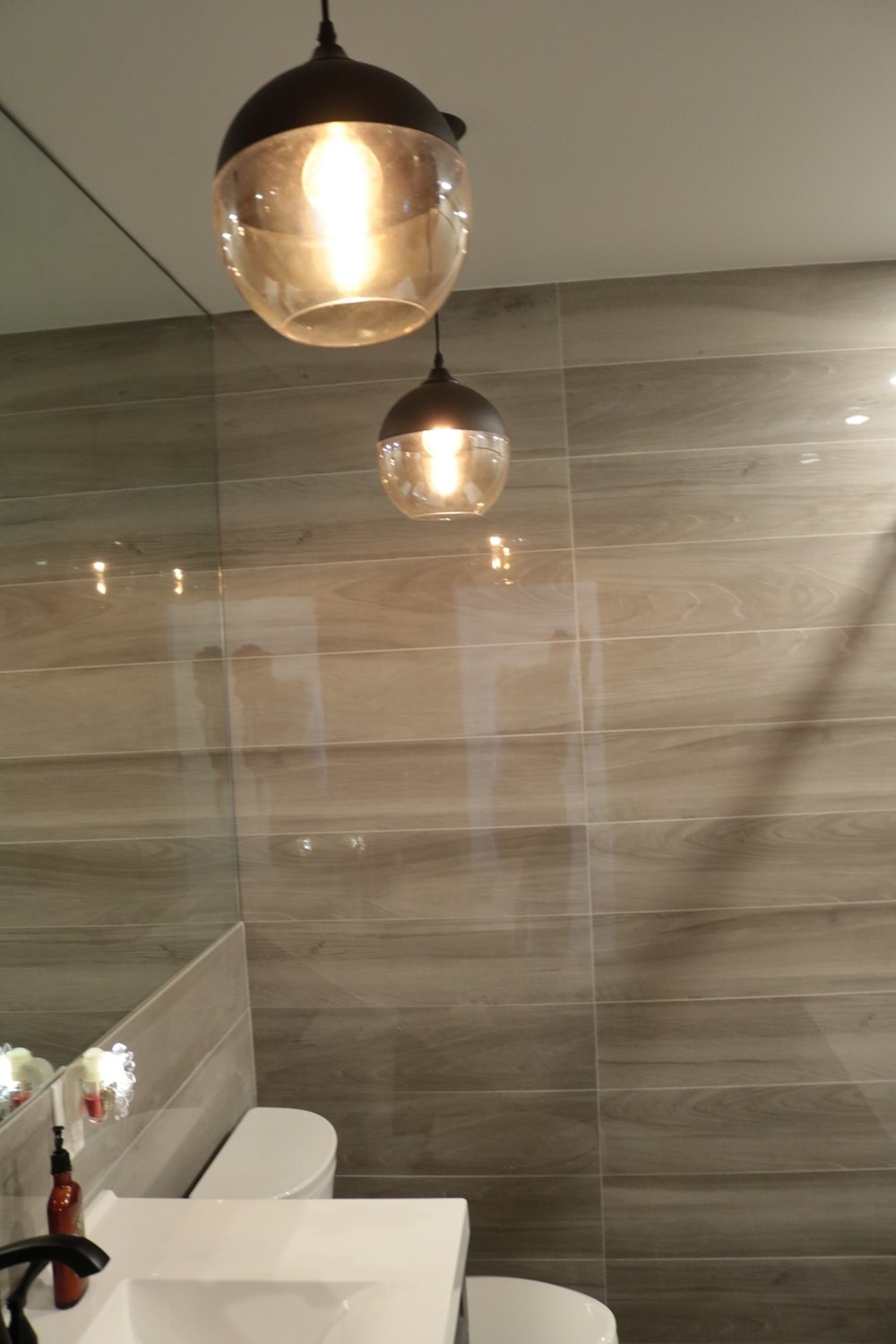
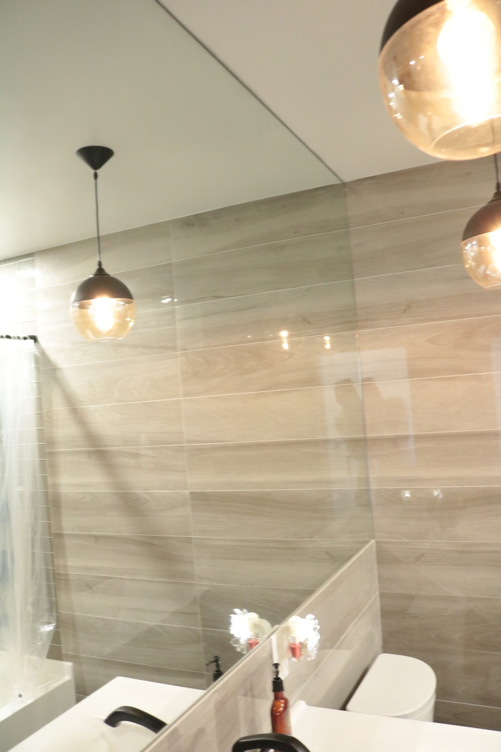
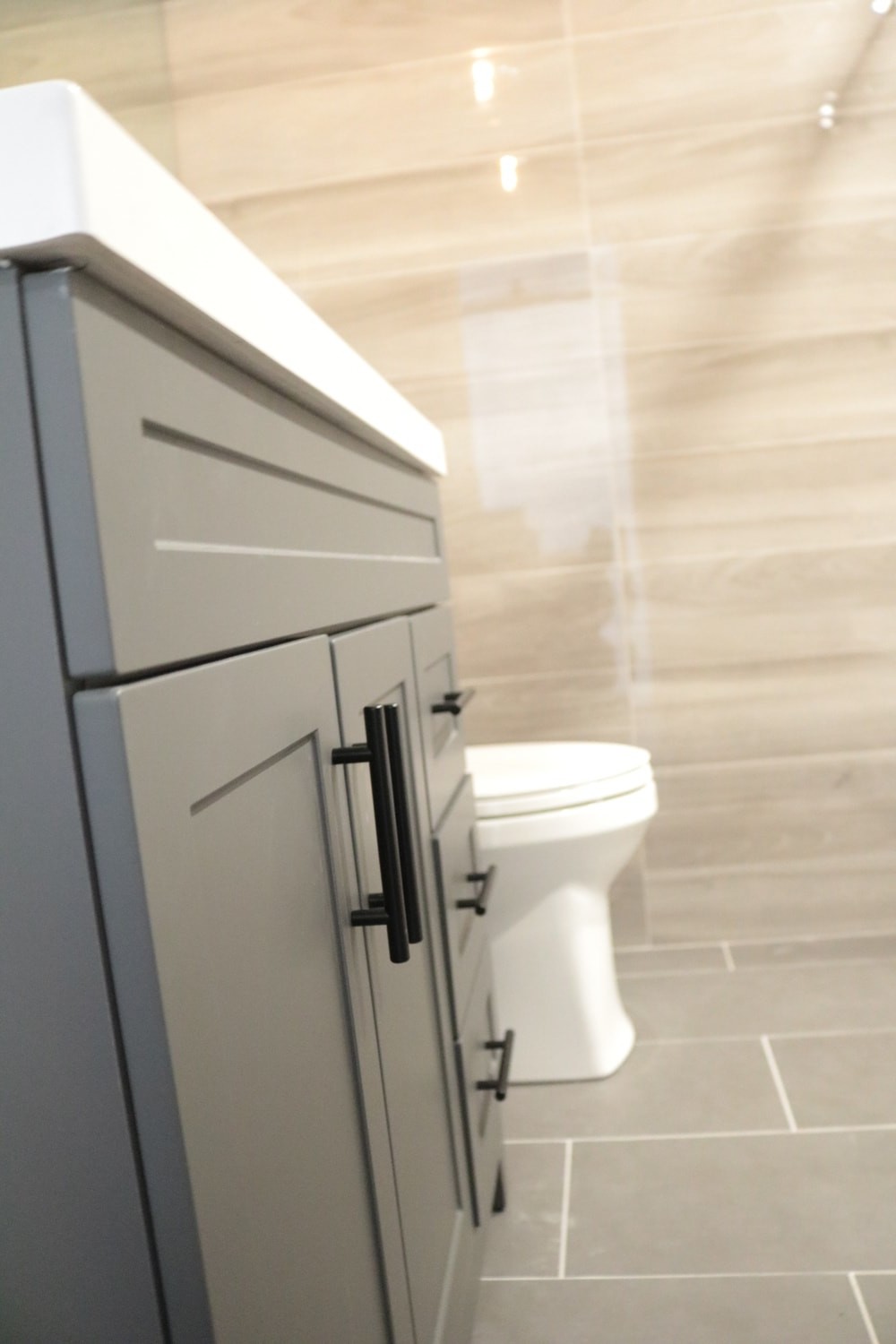
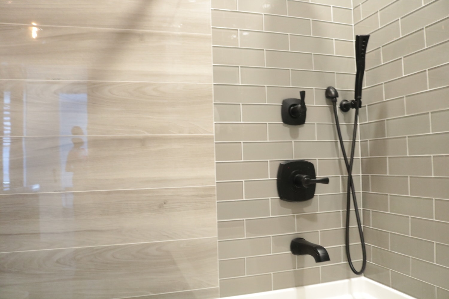
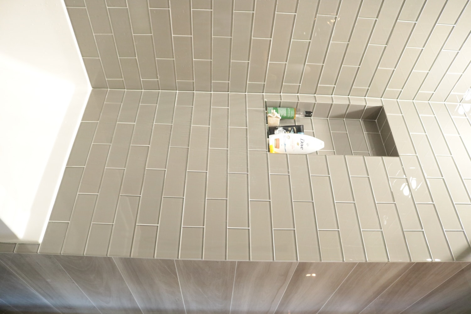
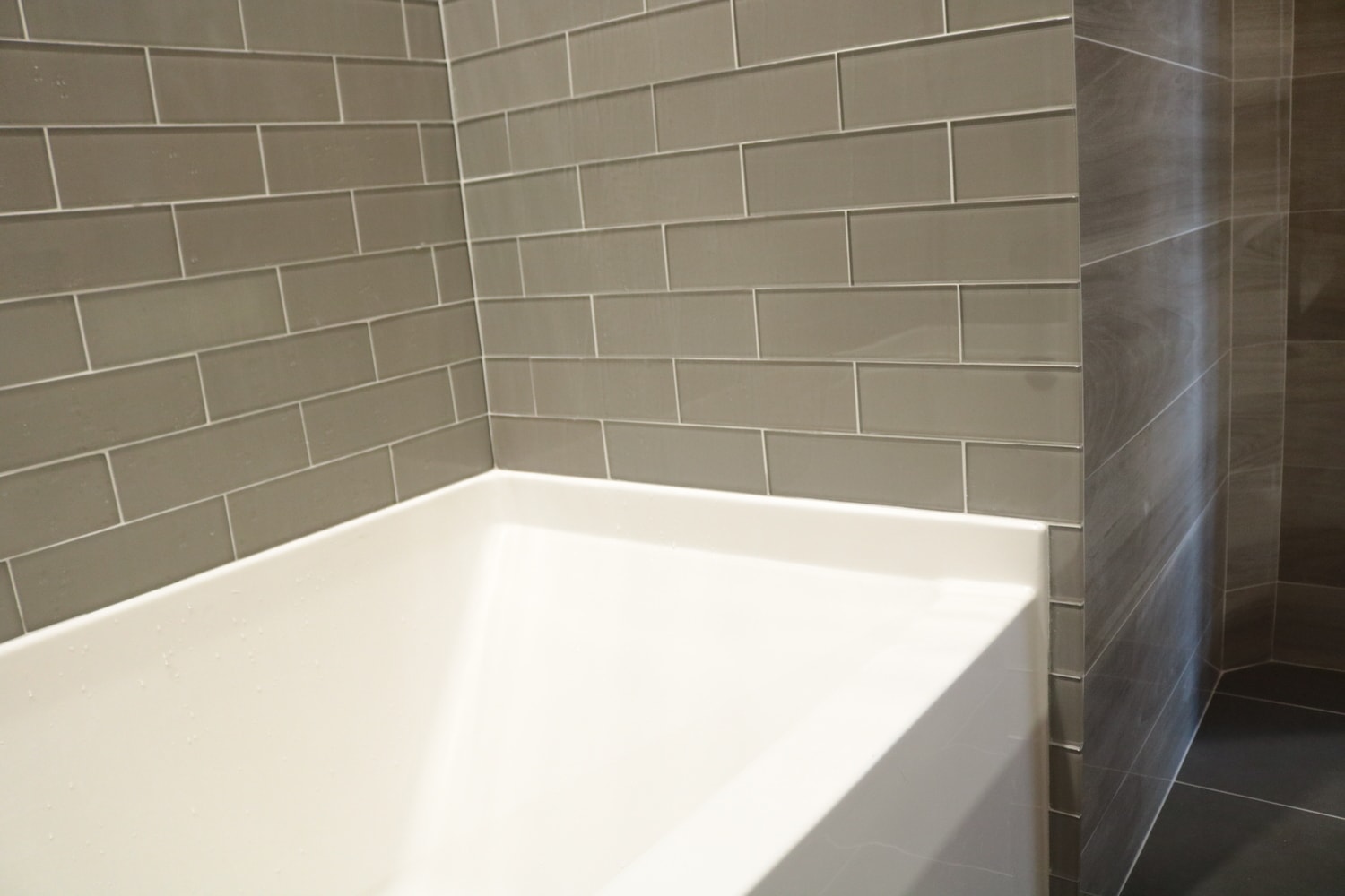
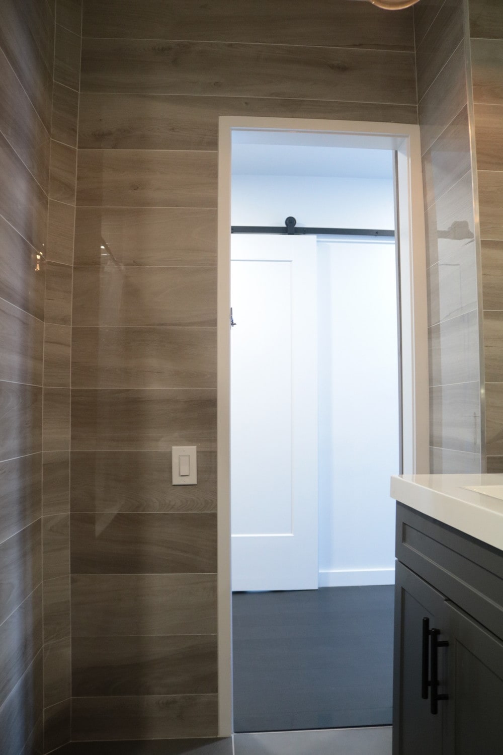
“BATHROOM” PHOTOS:
This young aspiring pilot in the air force bought this condo in a beautiful neighborhood, it was just the size that she was looking for but it was extremely dated. Not only was it dated but the layout didn’t quite make good use of the space around it.
The bedroom, bathroom kitchen and living room area all needed to be sorted out to make the space more aligned with today’s style and her personal taste.
The challenge was that when you open up the door, you would almost walk into a wall directly In front of
you that the previous owners converted into a closet, it was in a horrible spot and it closed in the room
thus making it difficult to feel the size of this 700sqft unit.
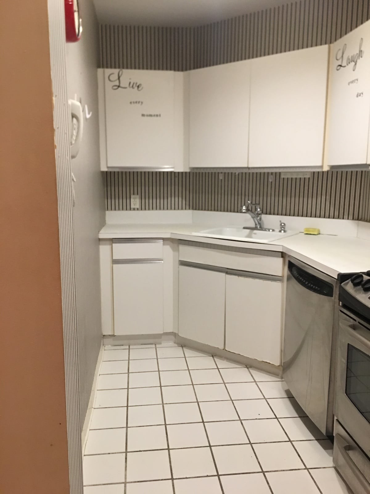
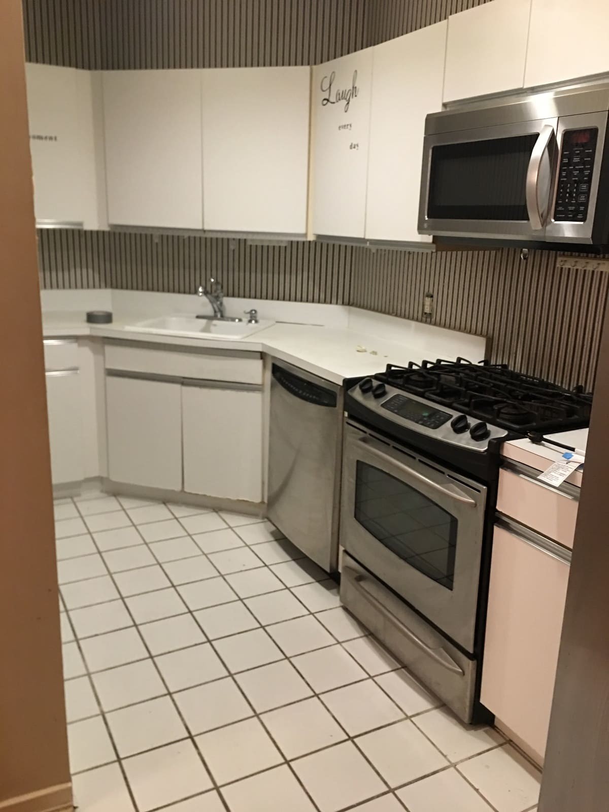
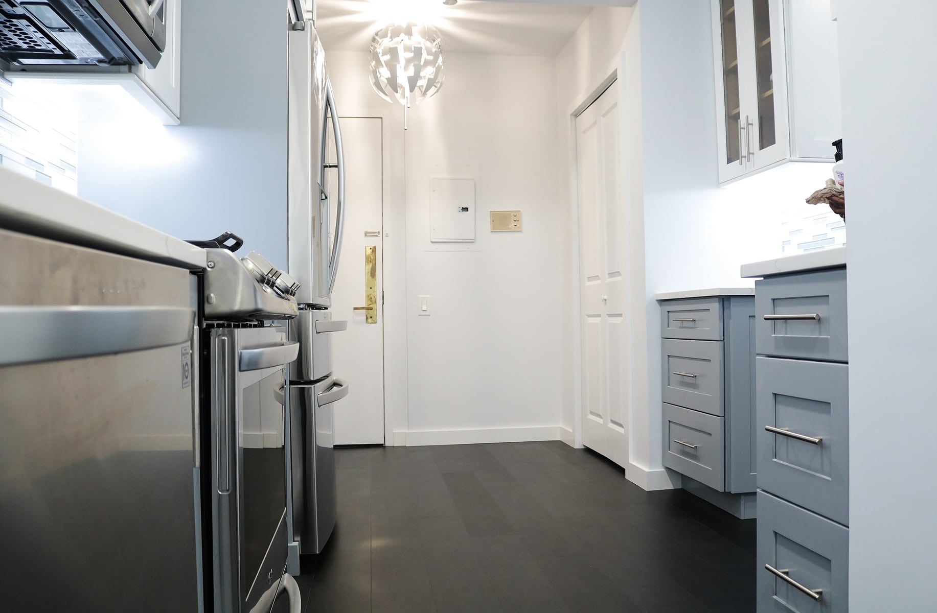
Behind of that wall was the kitchen. It has an angled wall in it that pushed you down a long narrow alley just to get to the sink, shows you how narrow
the space was.We were call in to remedy the footprint and come up with some very creative solutions to make this
condo feel like it belongs to this century.
The construction crew get right to work once the papers were approve for the remodel by the condo
board, the first thing we did was to take down that closet wall, but we didn’t get rid of it altogether, it
was in the right location but wrong spot. So, we relocated it to the right location where it belongs and
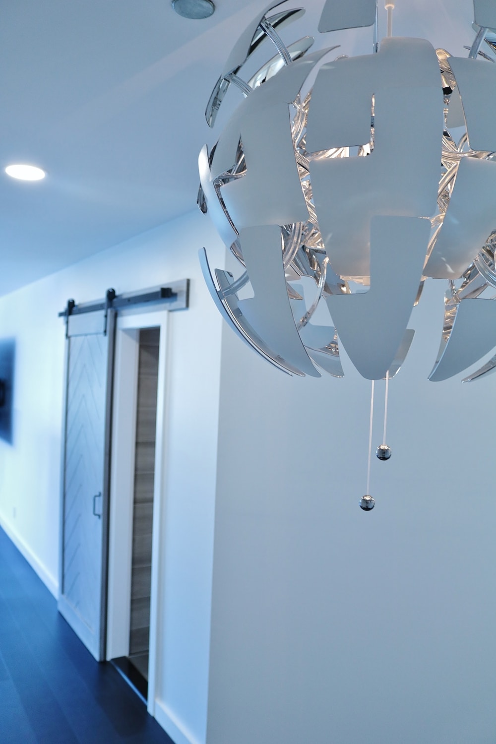
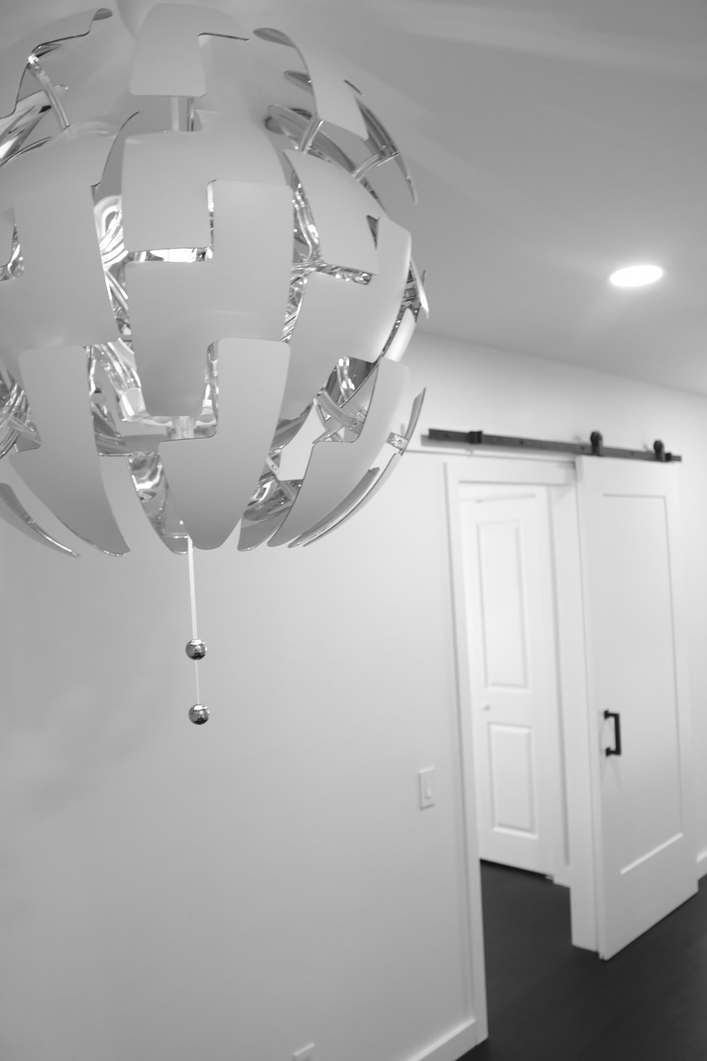
use the closet to create a new foyer entry into the condo. Where a bench and chandelier now define the
space.
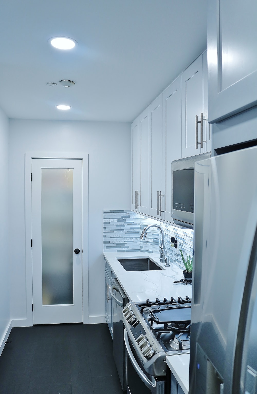
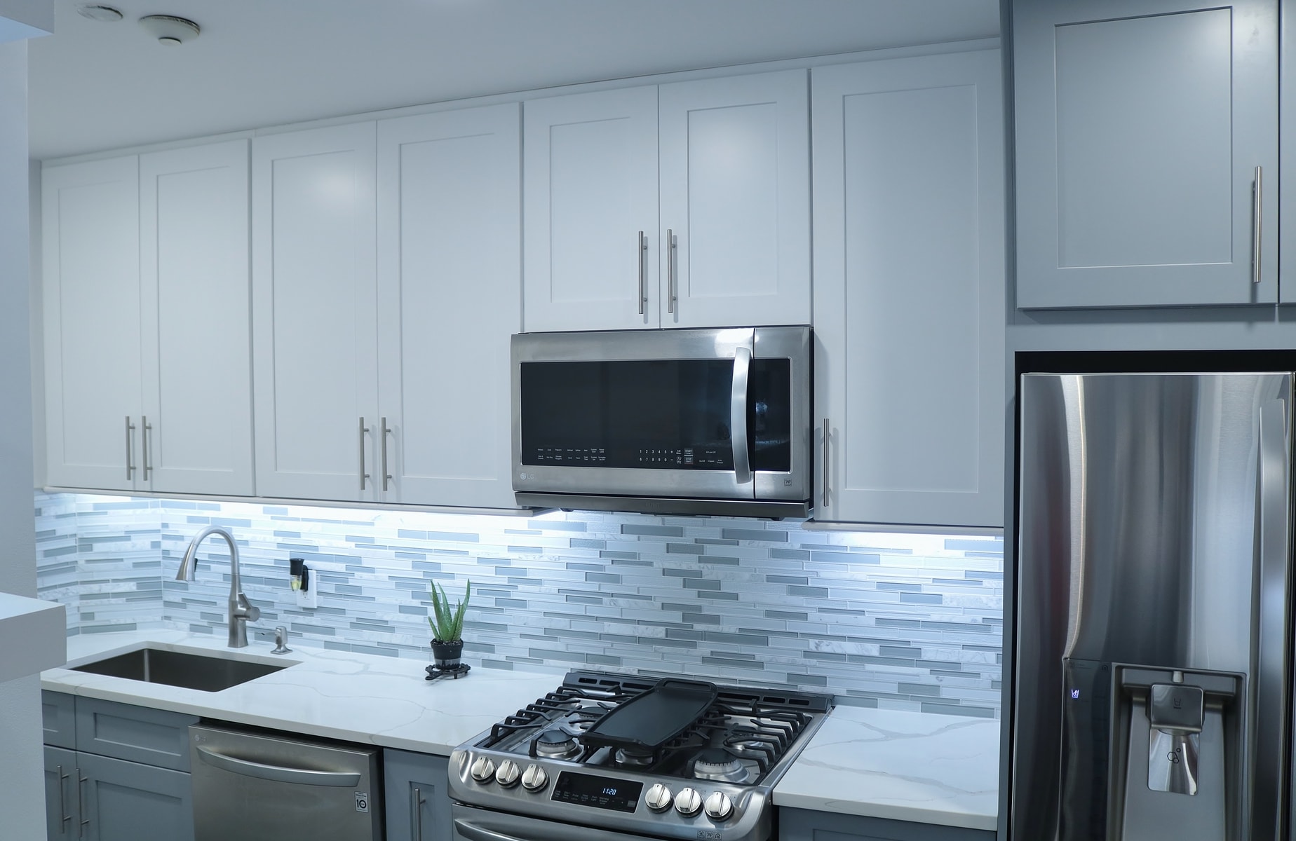
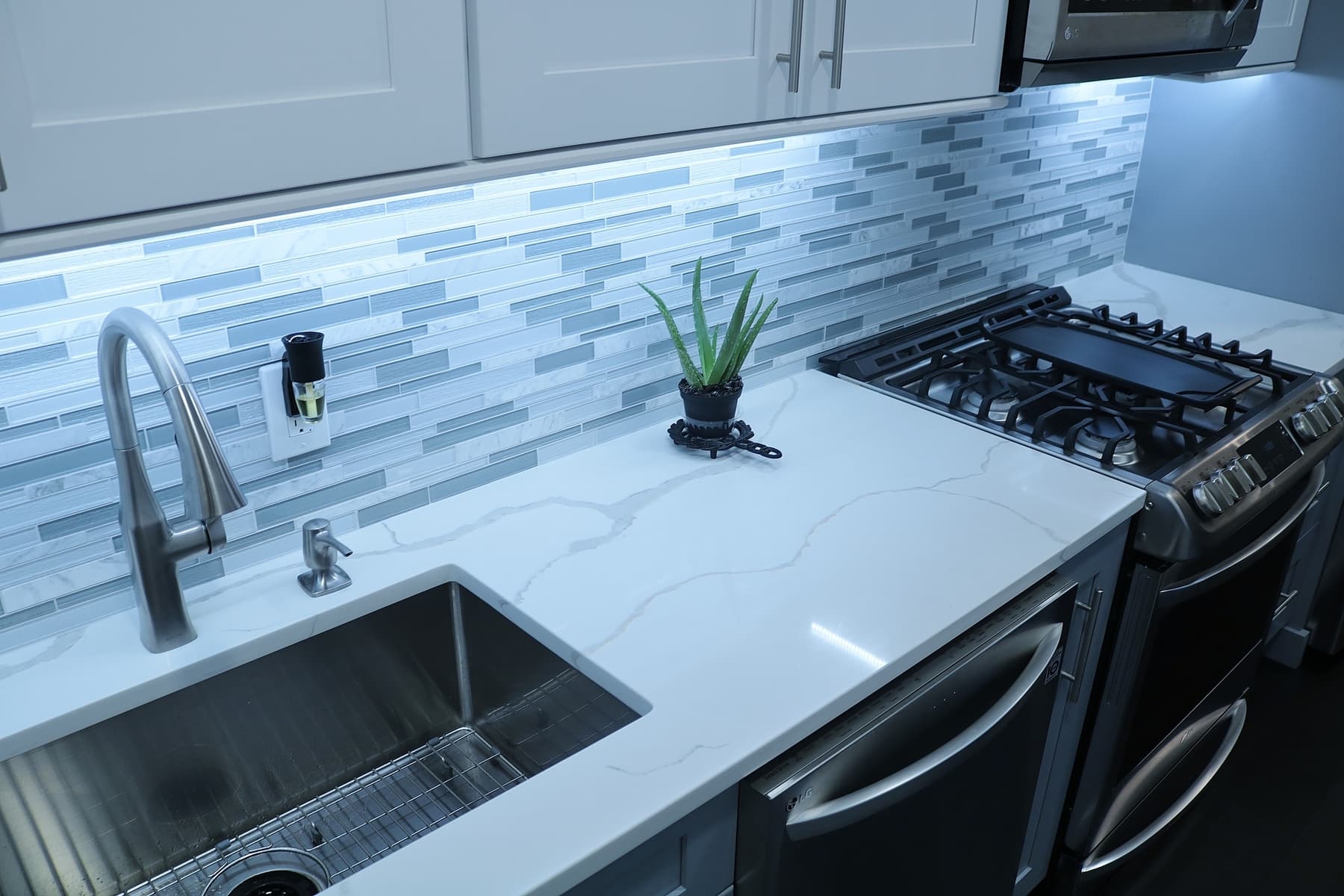
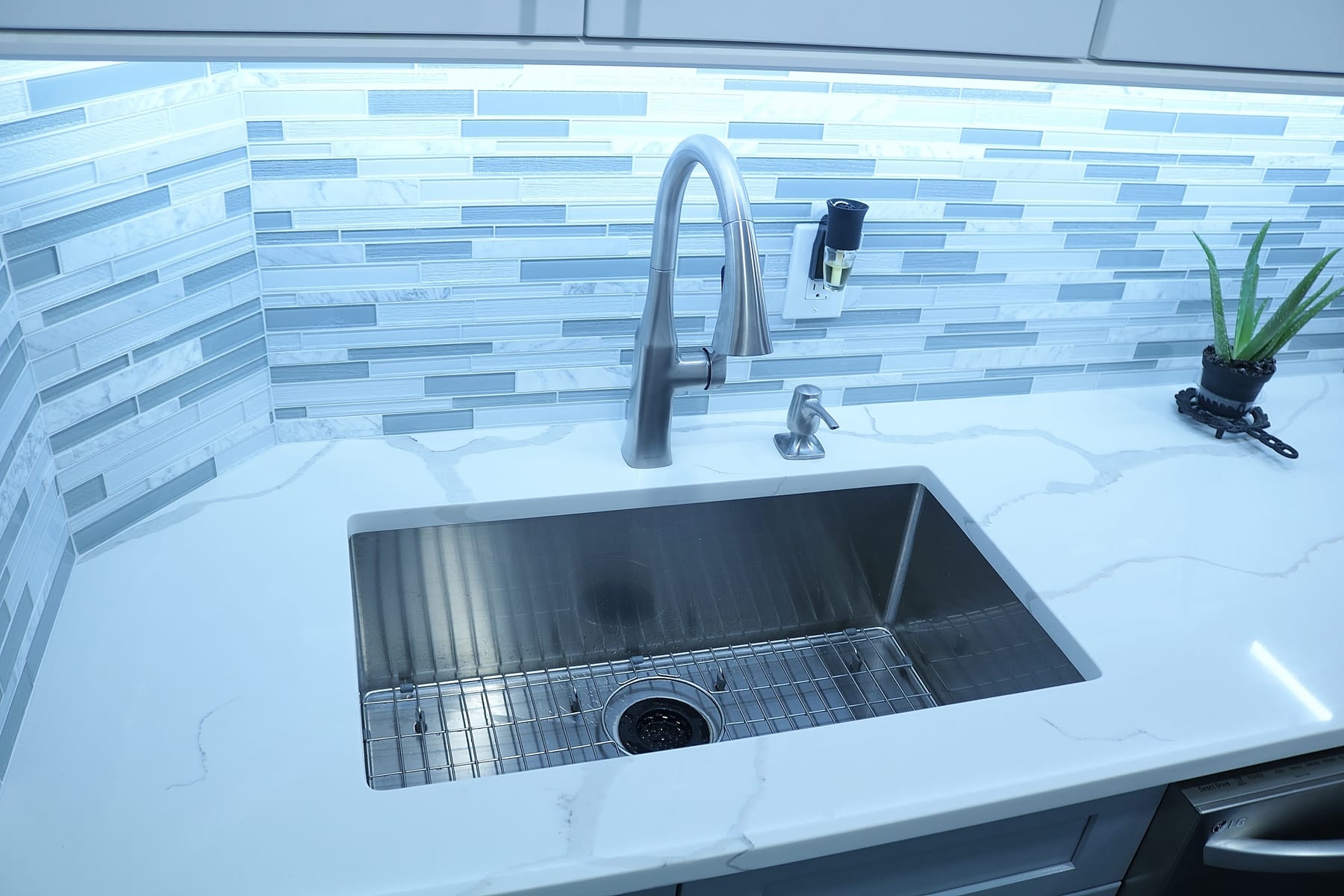
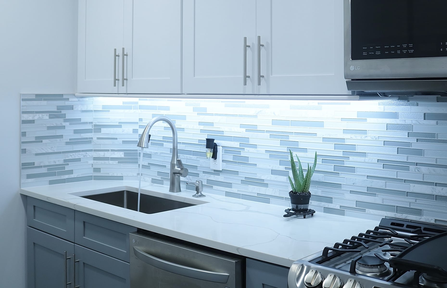
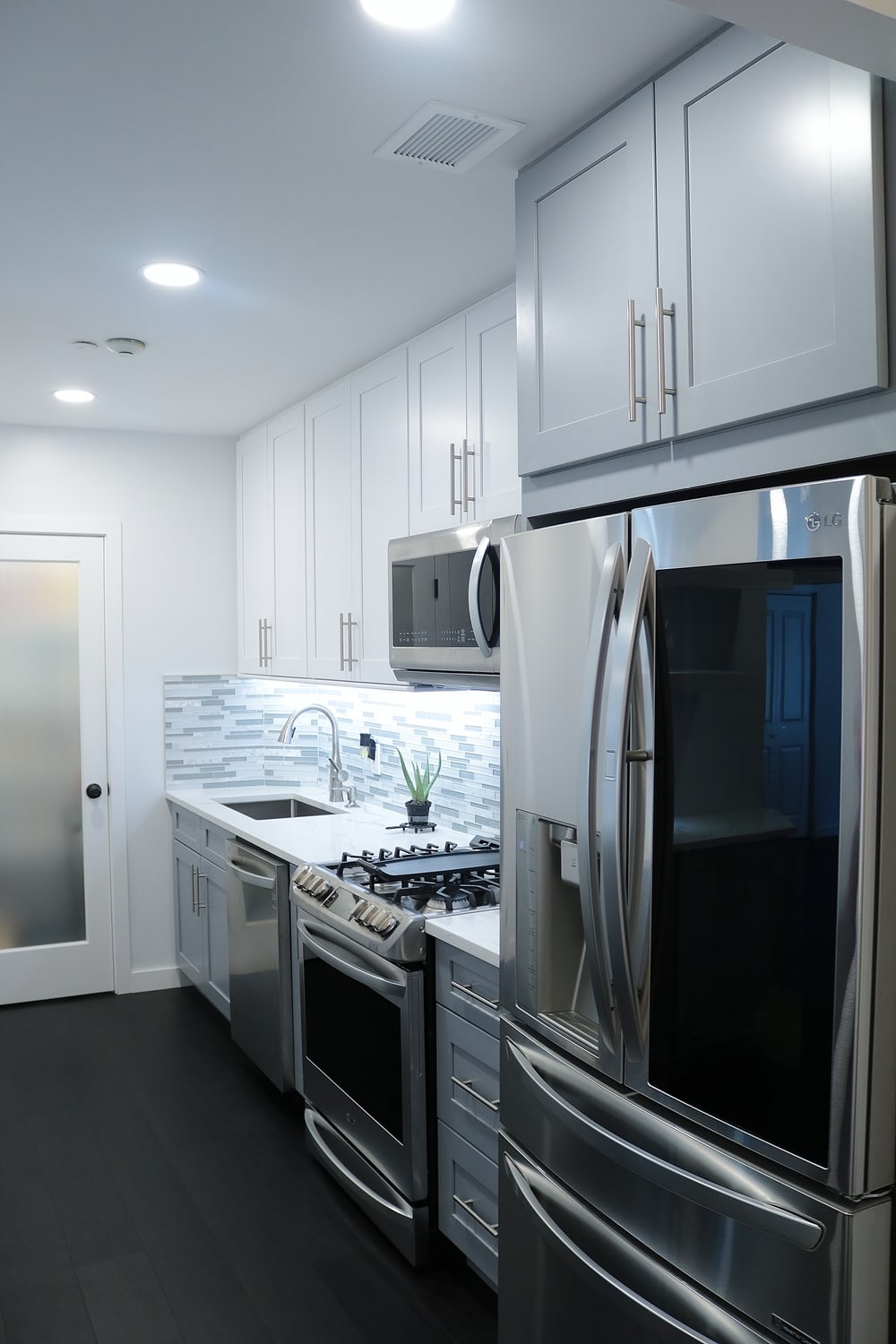
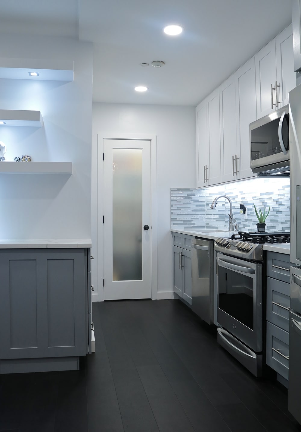
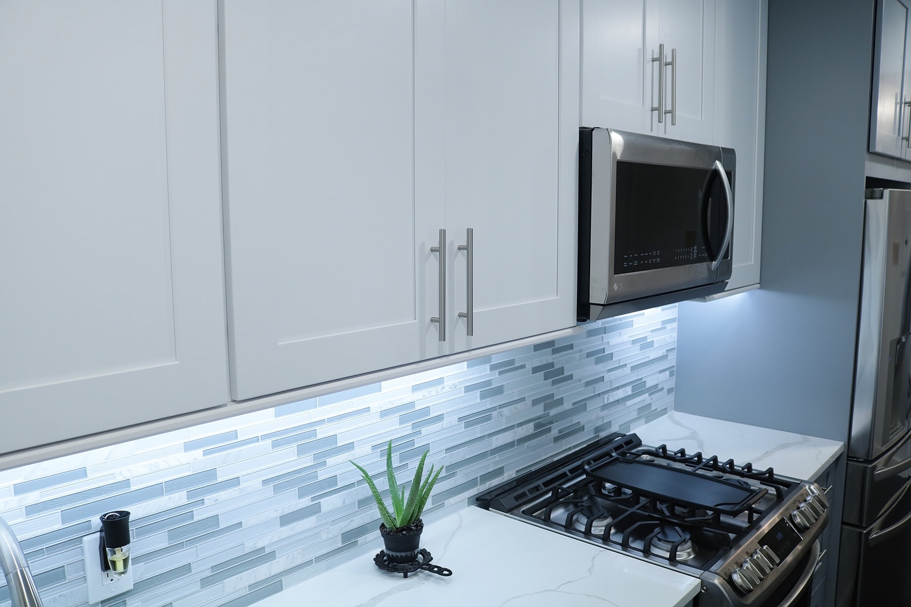
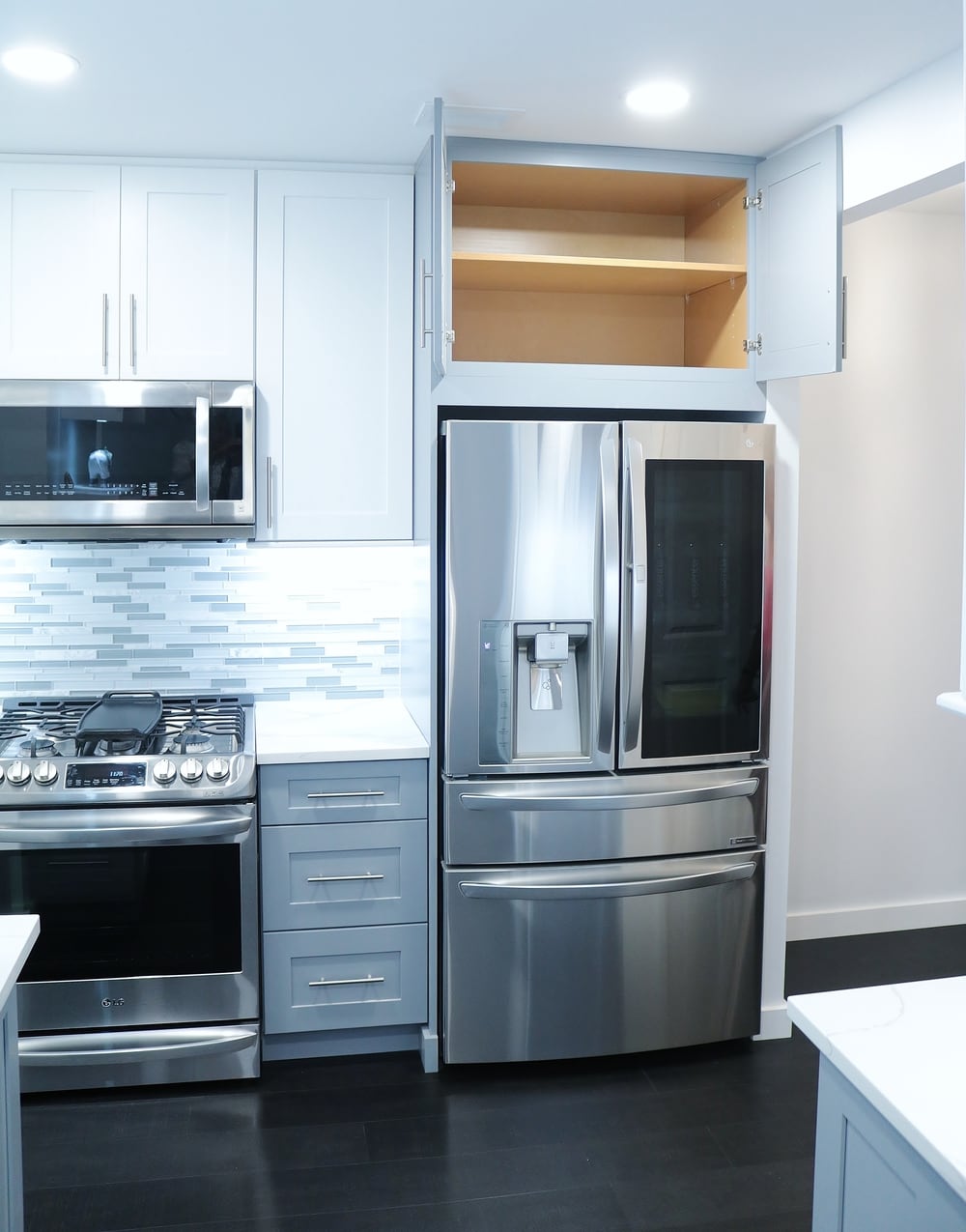
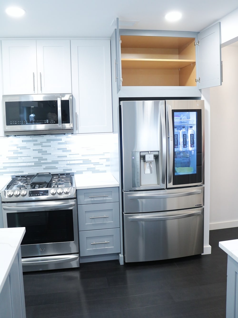
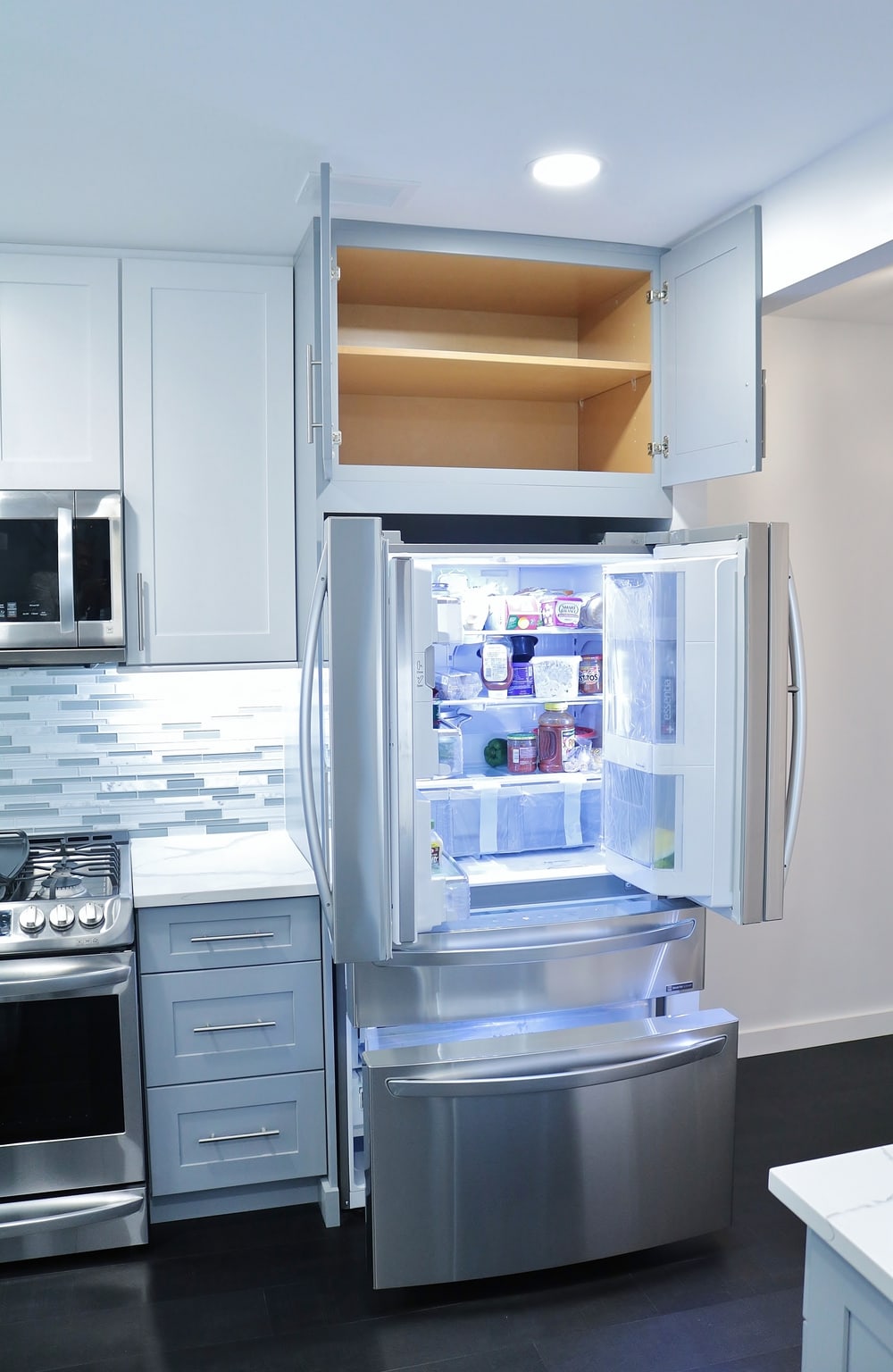
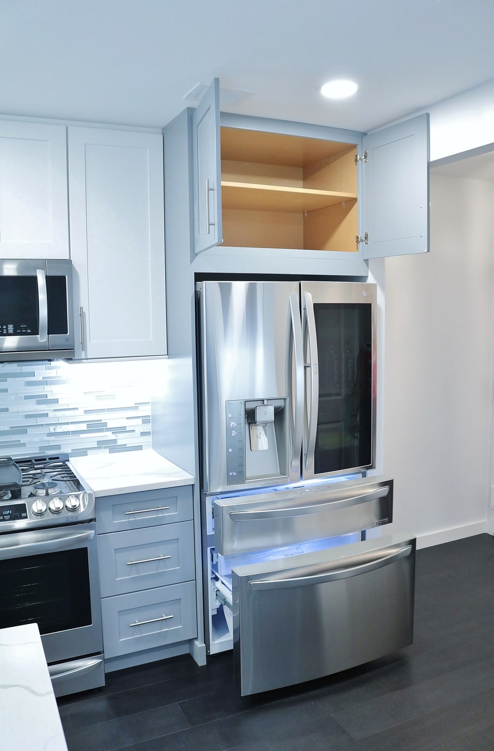
Once that was done, we use part of the original wall to hide the new Refrigerator side where the new
kitchen would now begin. By shifting the kitchen starting position we were able to straightened out the
weird angle corner by constructing a walk-in pantry in that position. A frosted glass door, lighting and
shelves finishes out that area well.
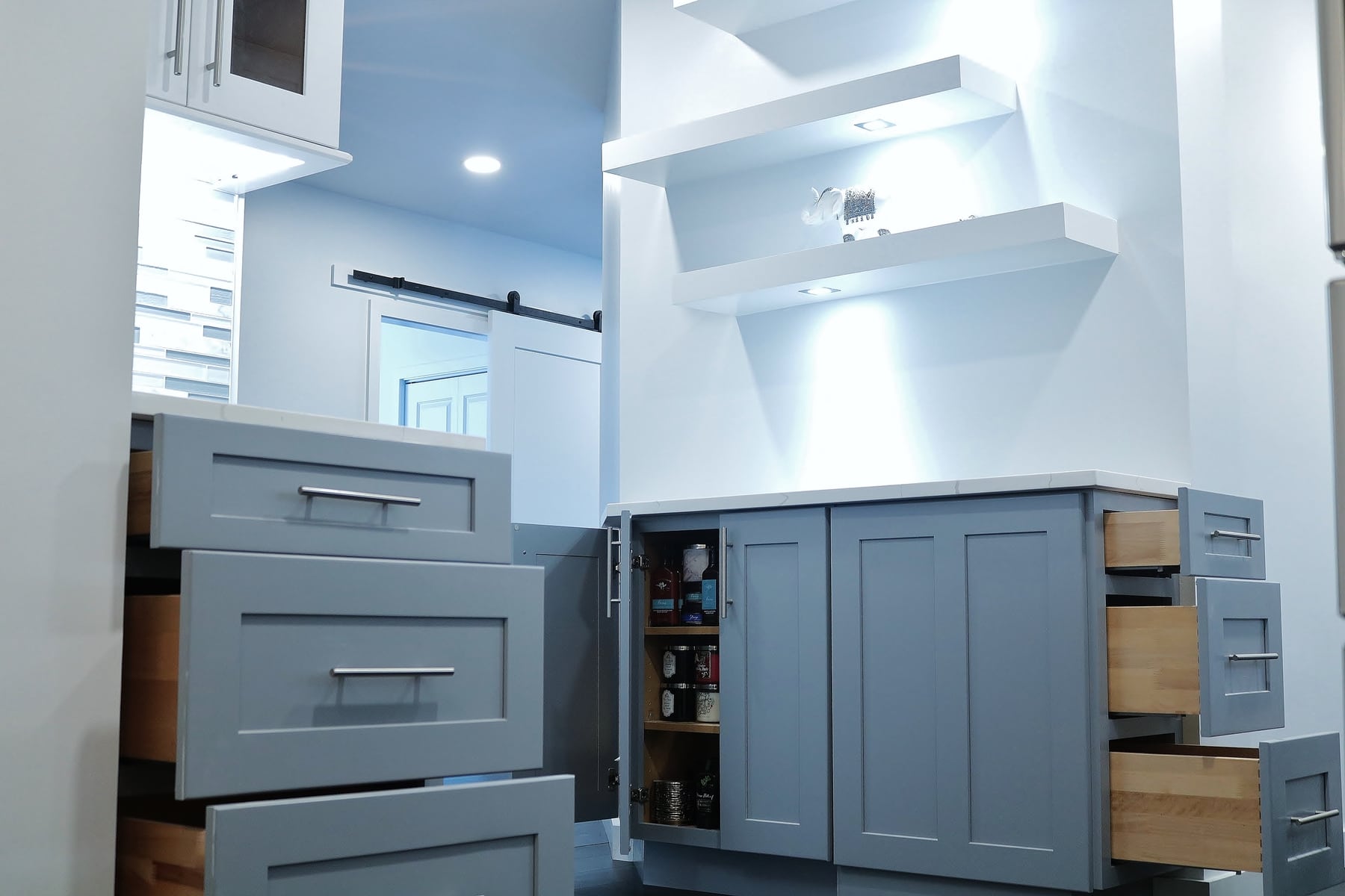
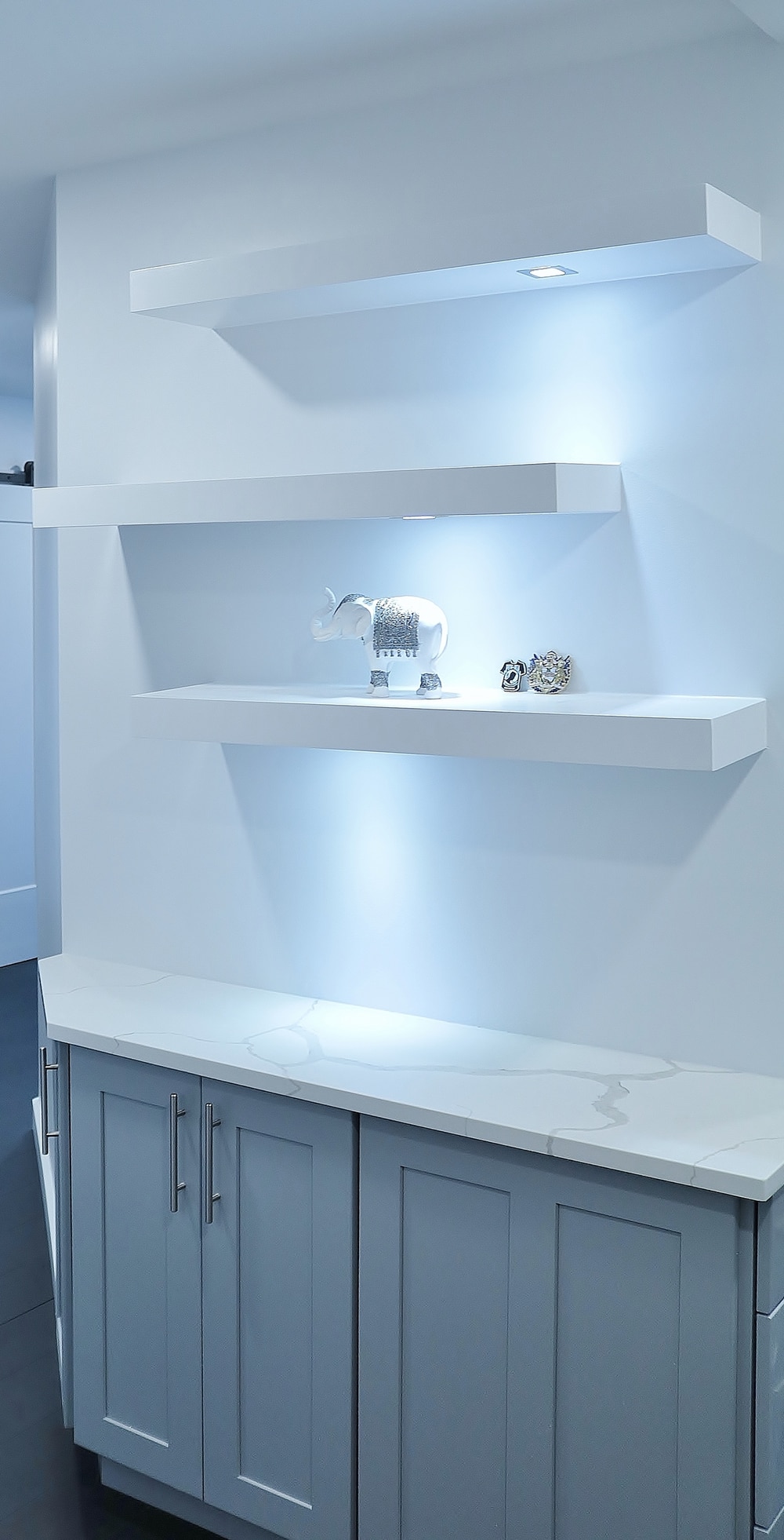
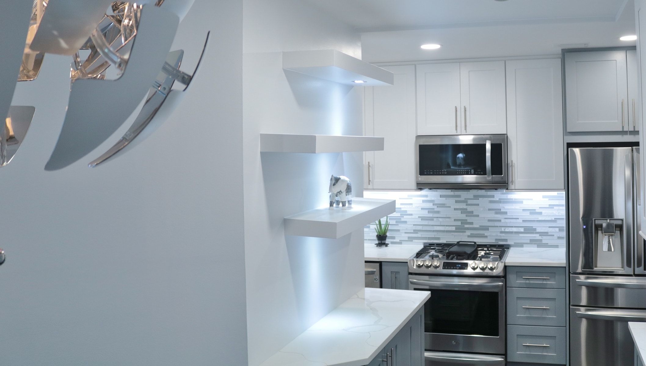
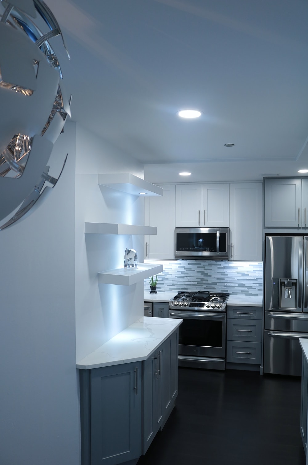
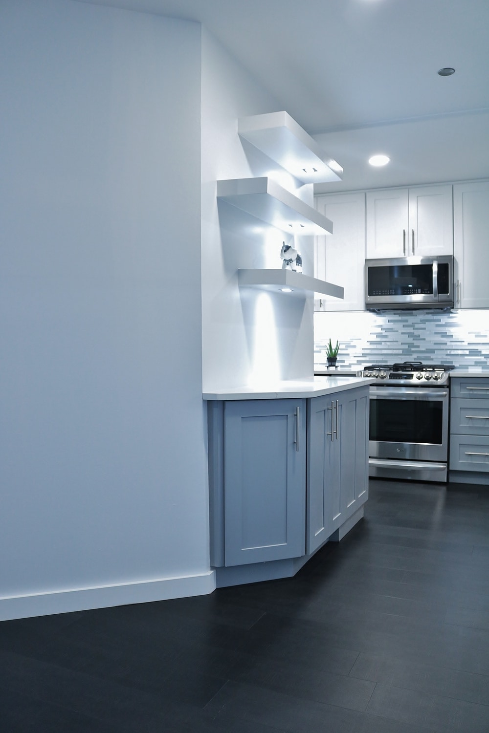
Now onto the path way towards the dining and kitchen, because we open up the entry way so nicely, we
use that open wall that was there doing nothing for space and install a buffet area with lighted open
shelving which you would notice one the front door is open.
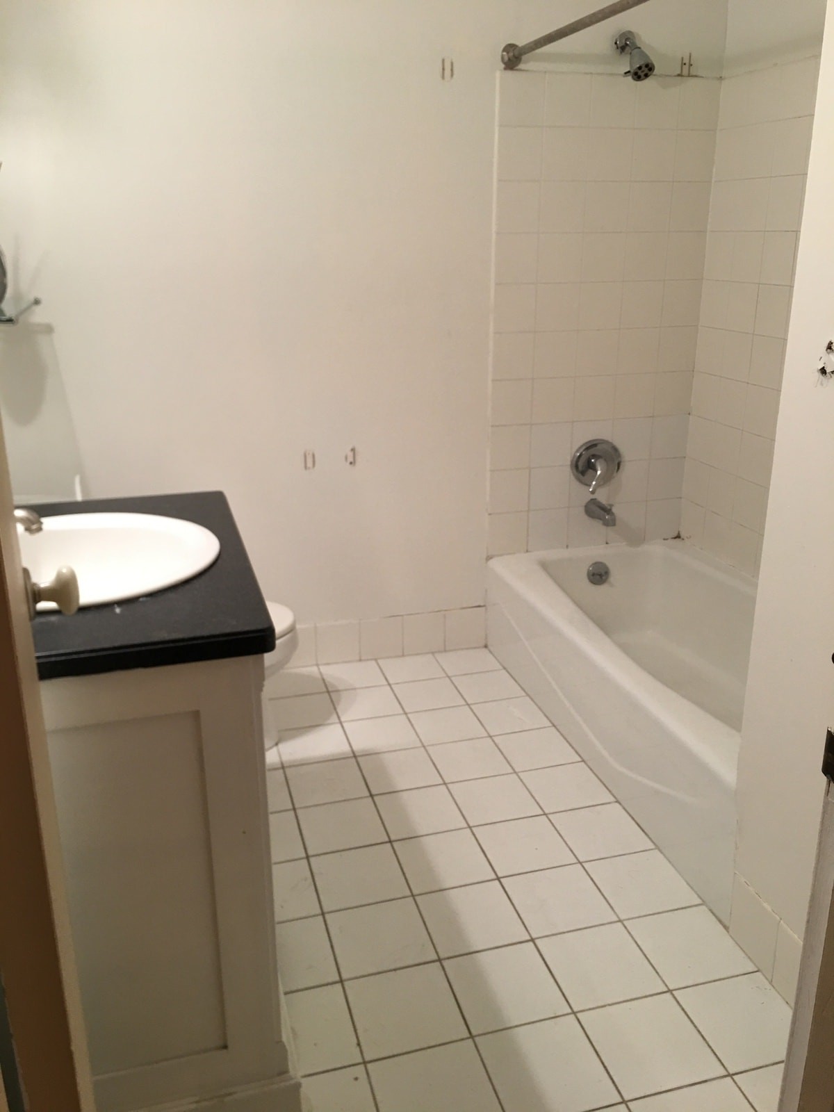
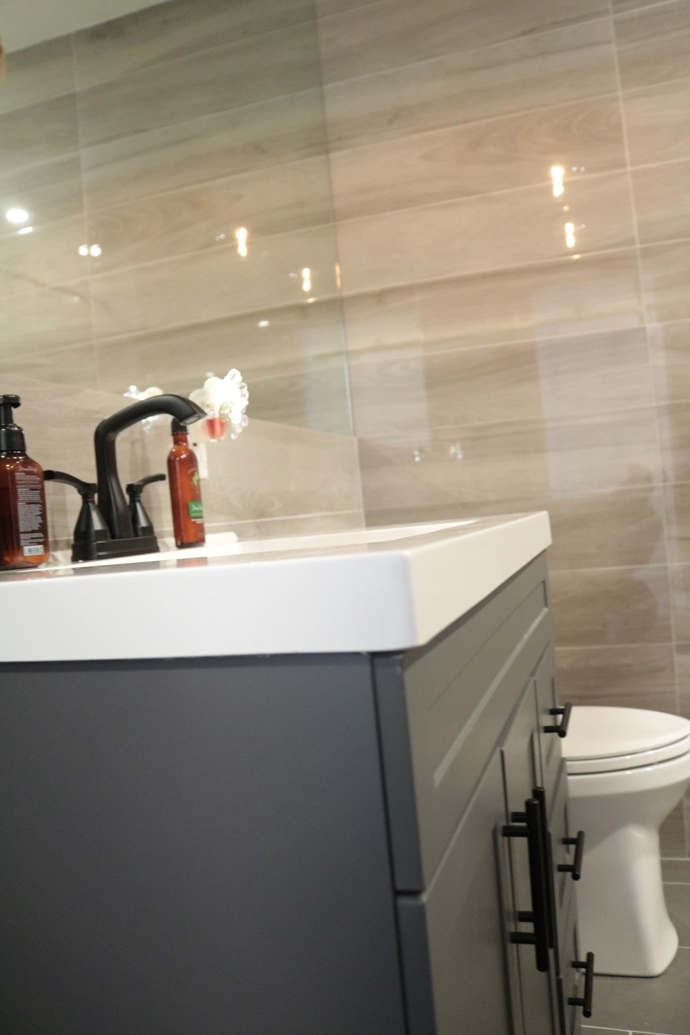
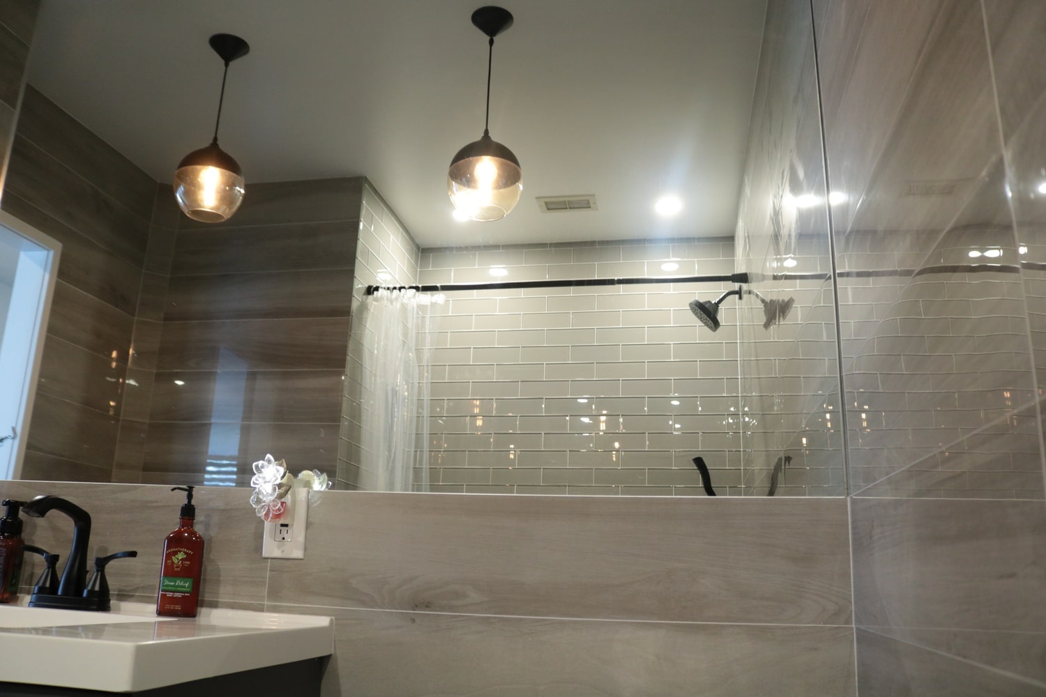
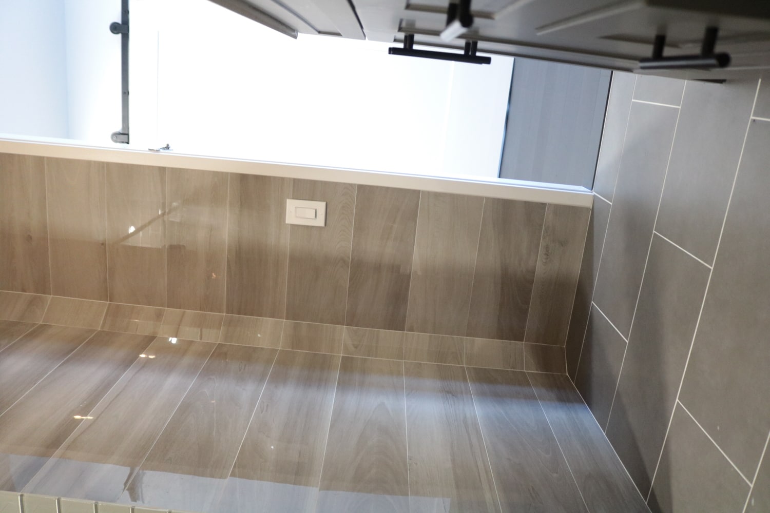
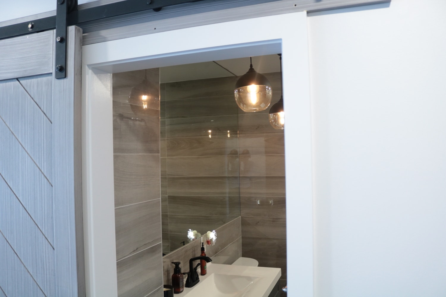
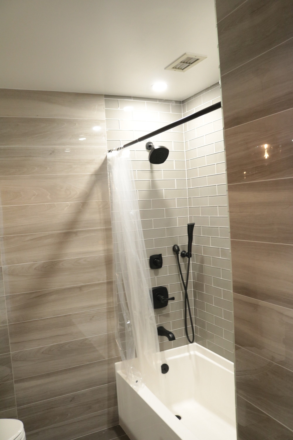
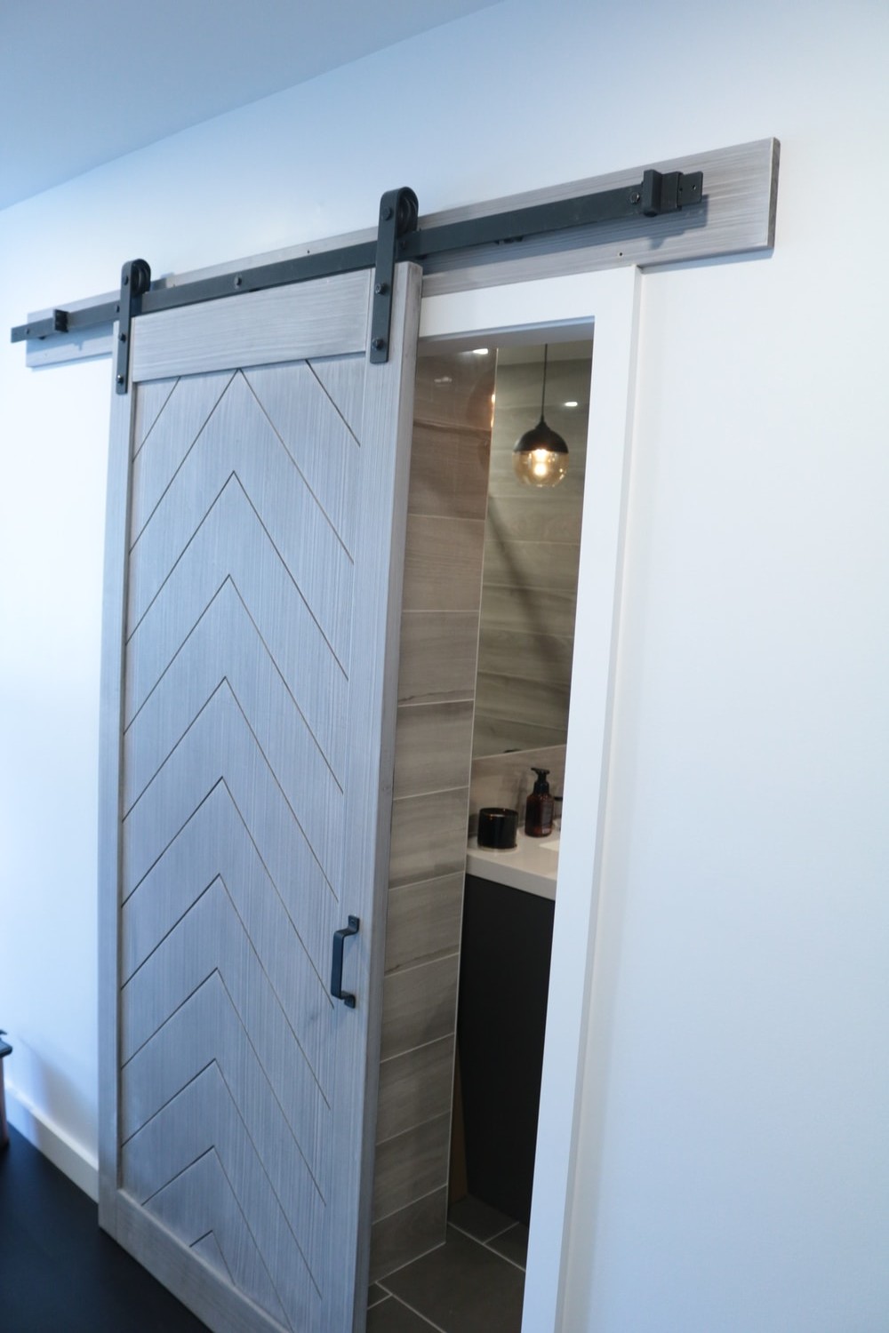
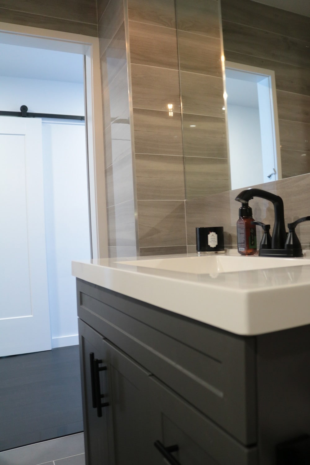
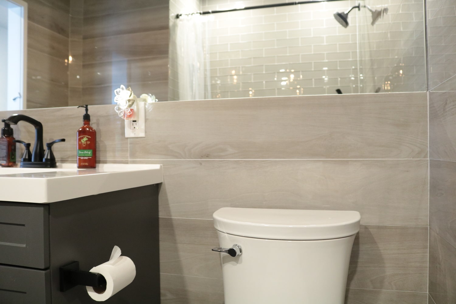
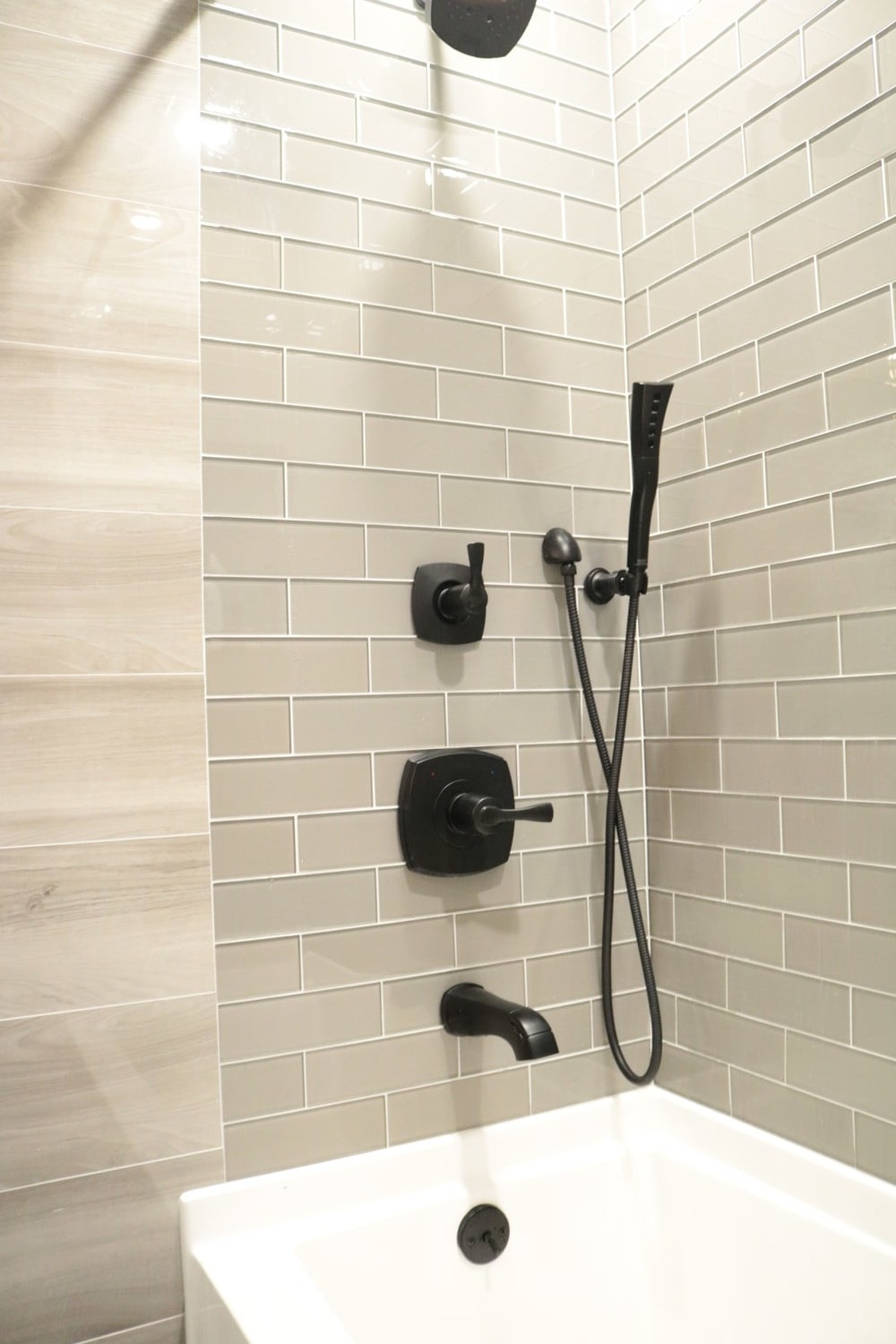
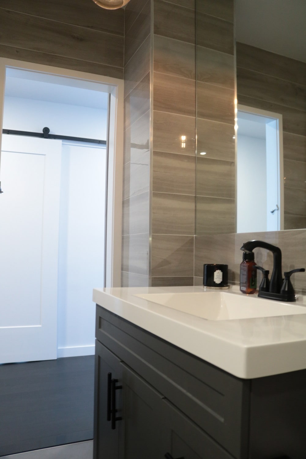
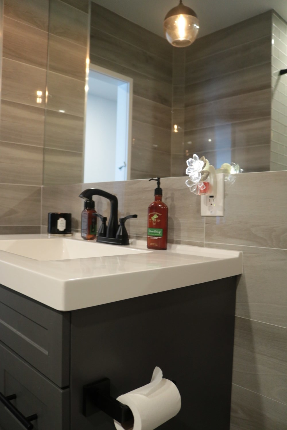
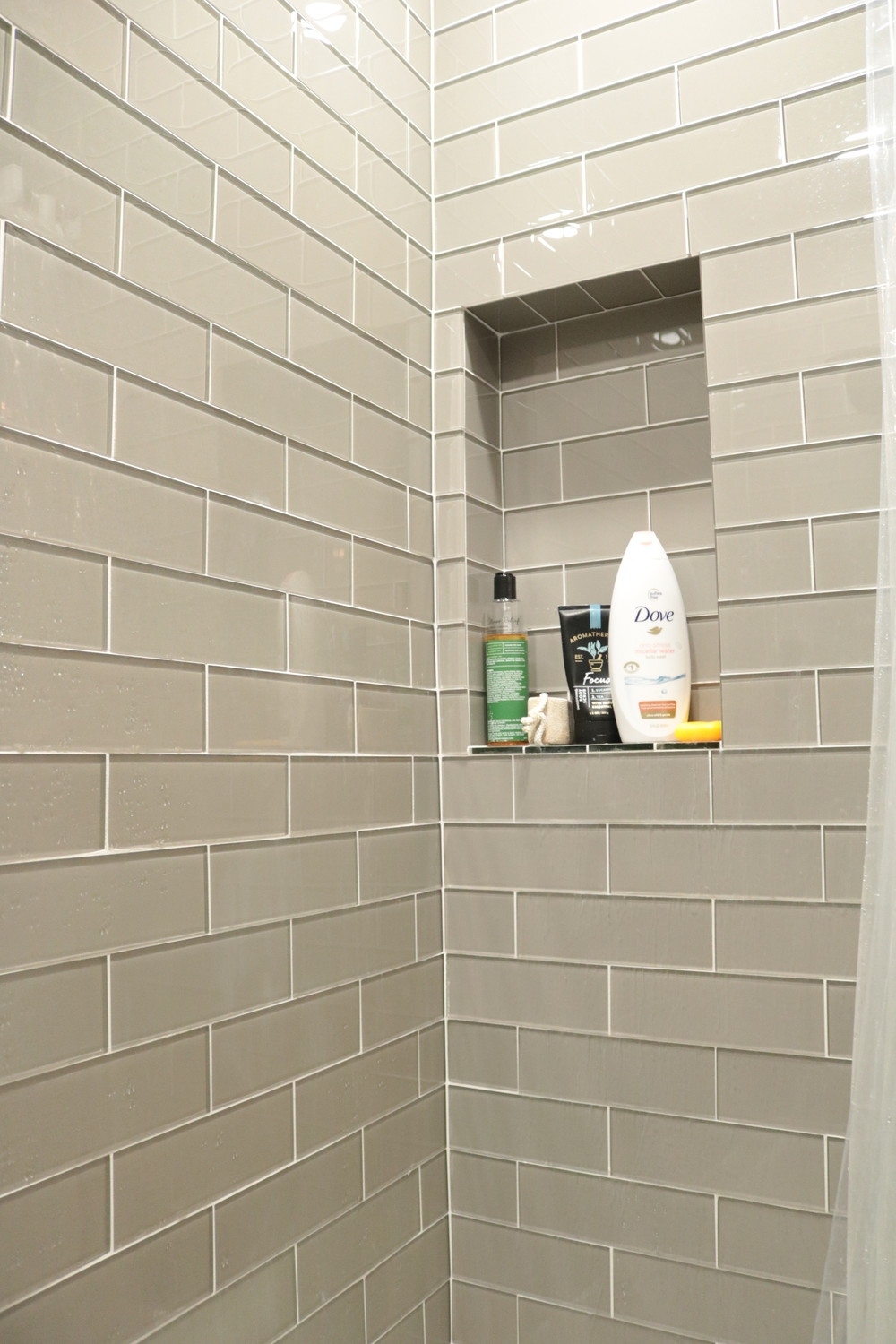
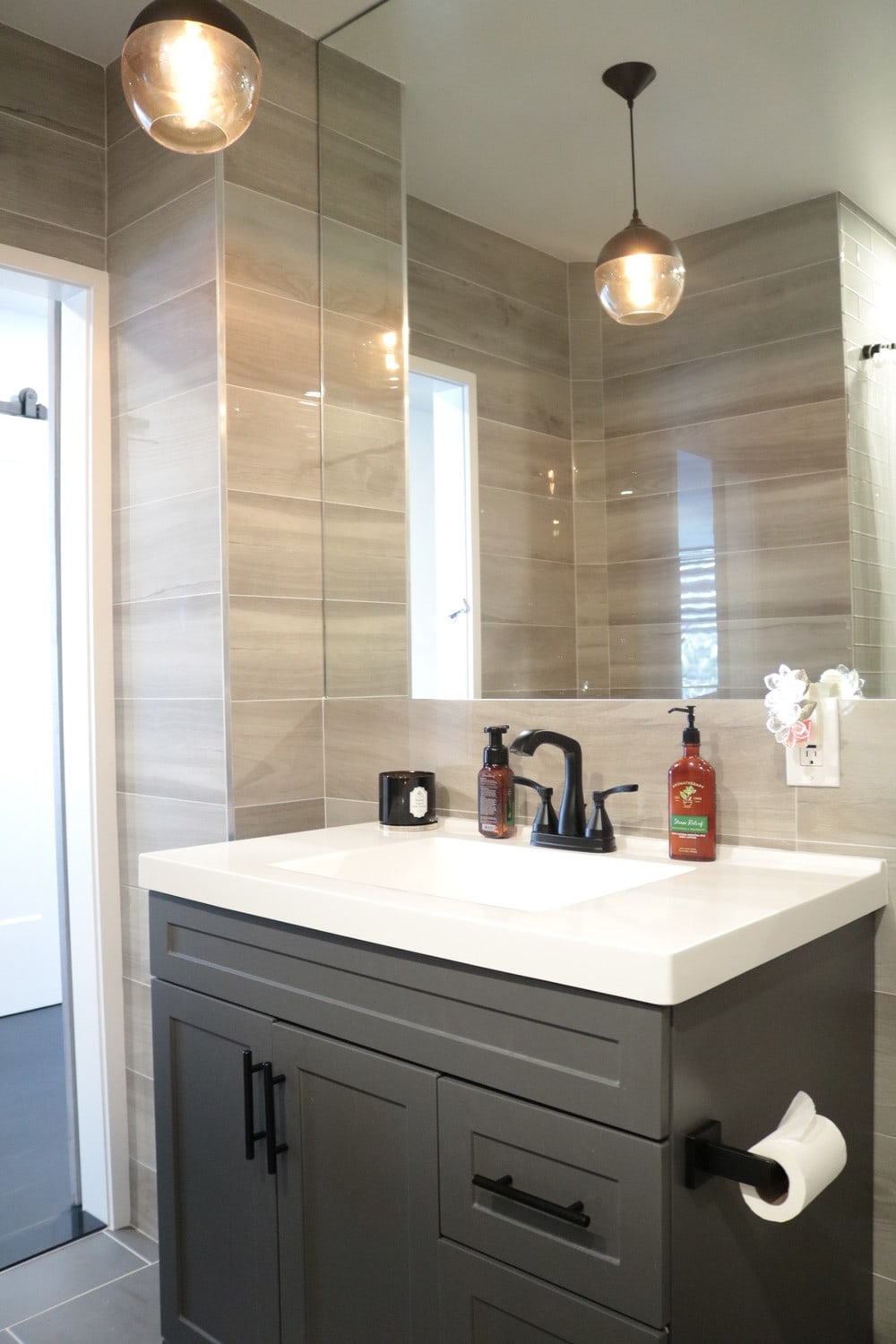
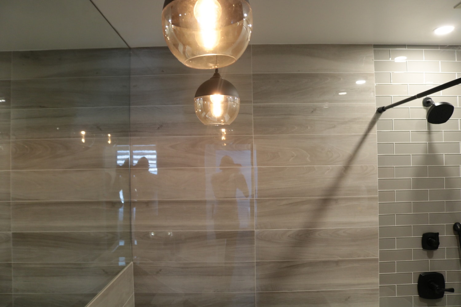
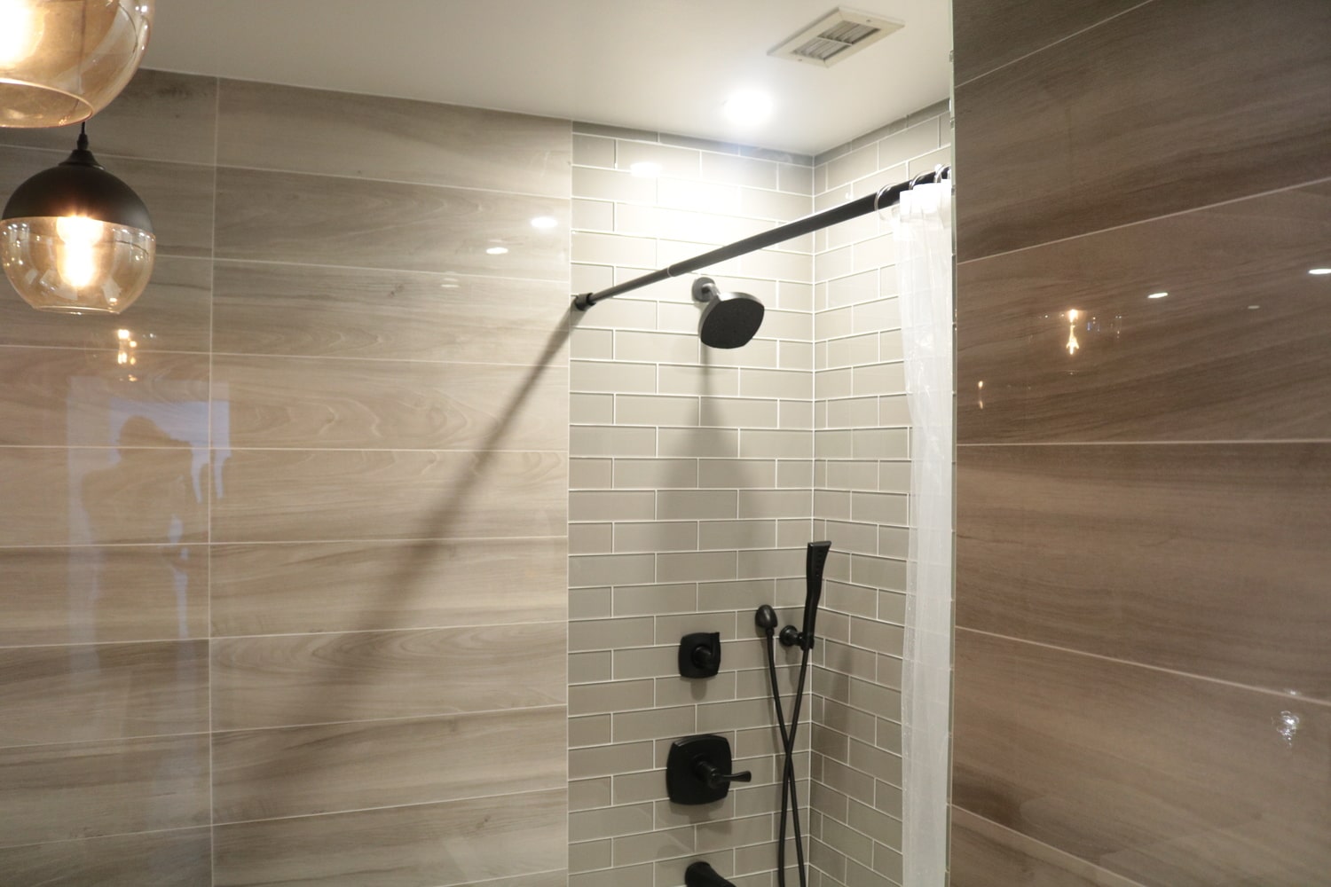
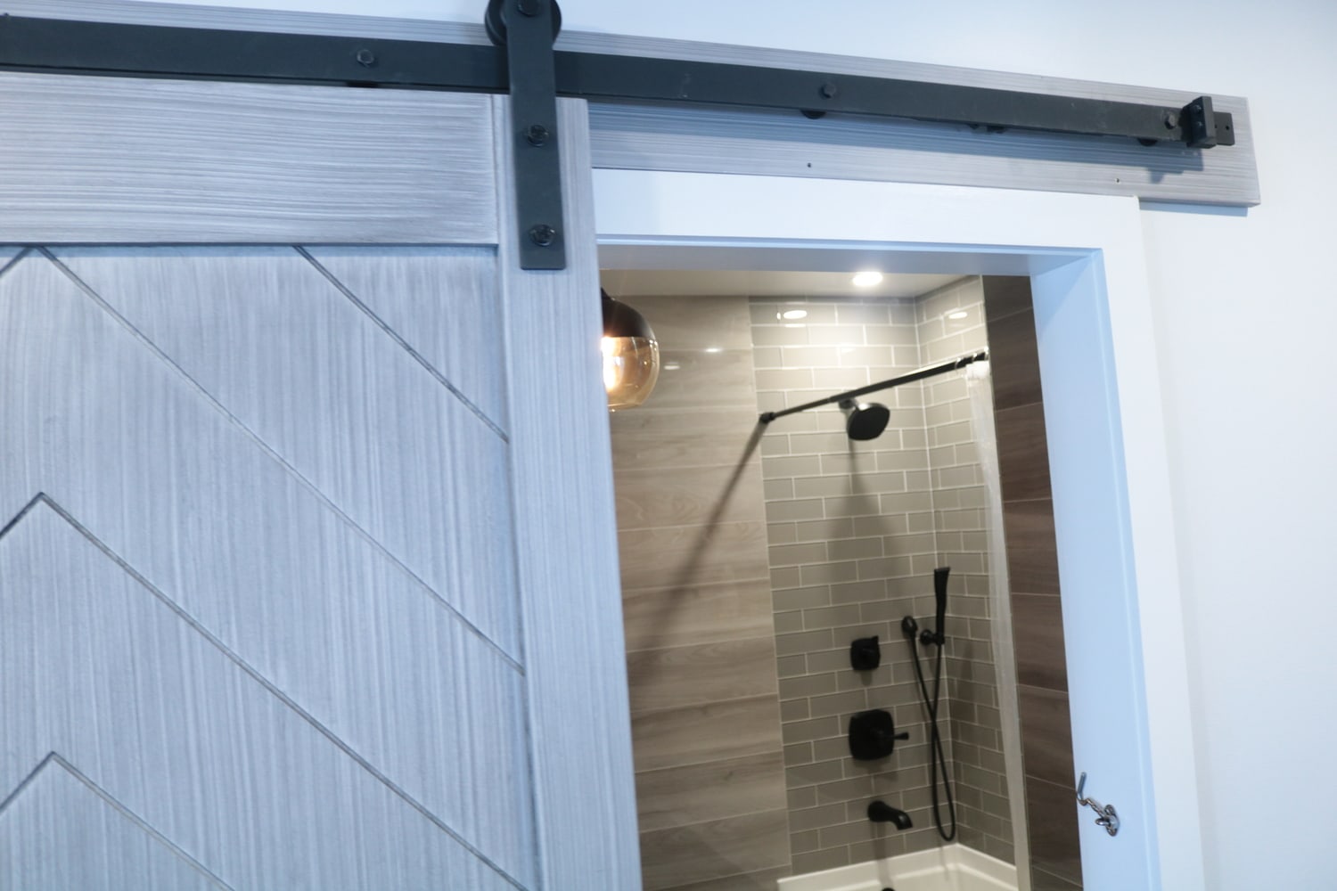
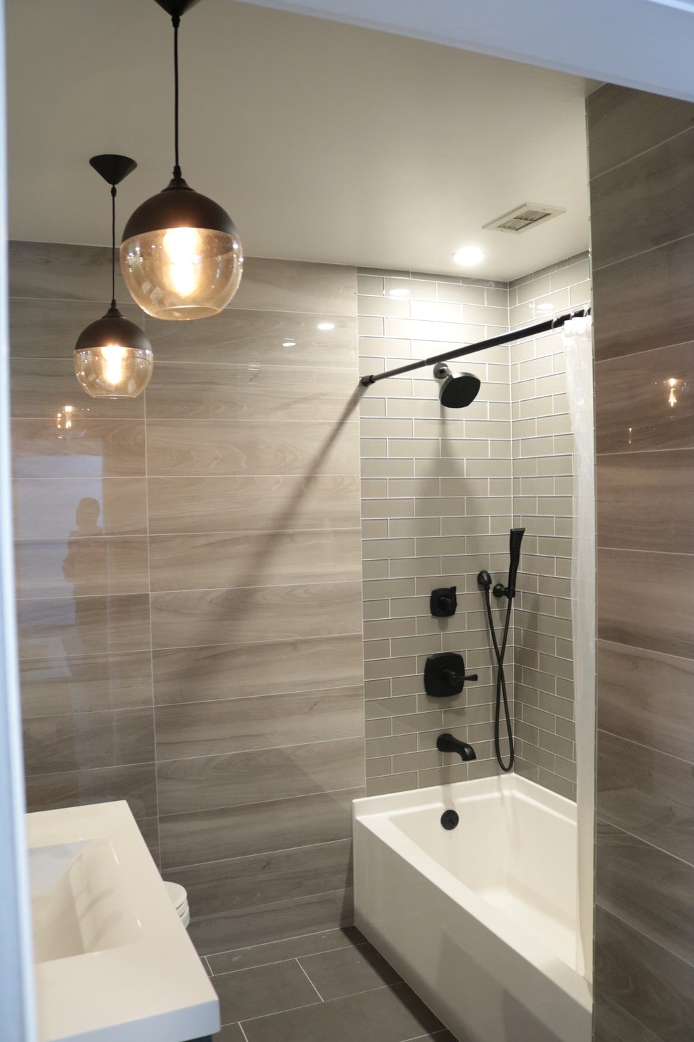
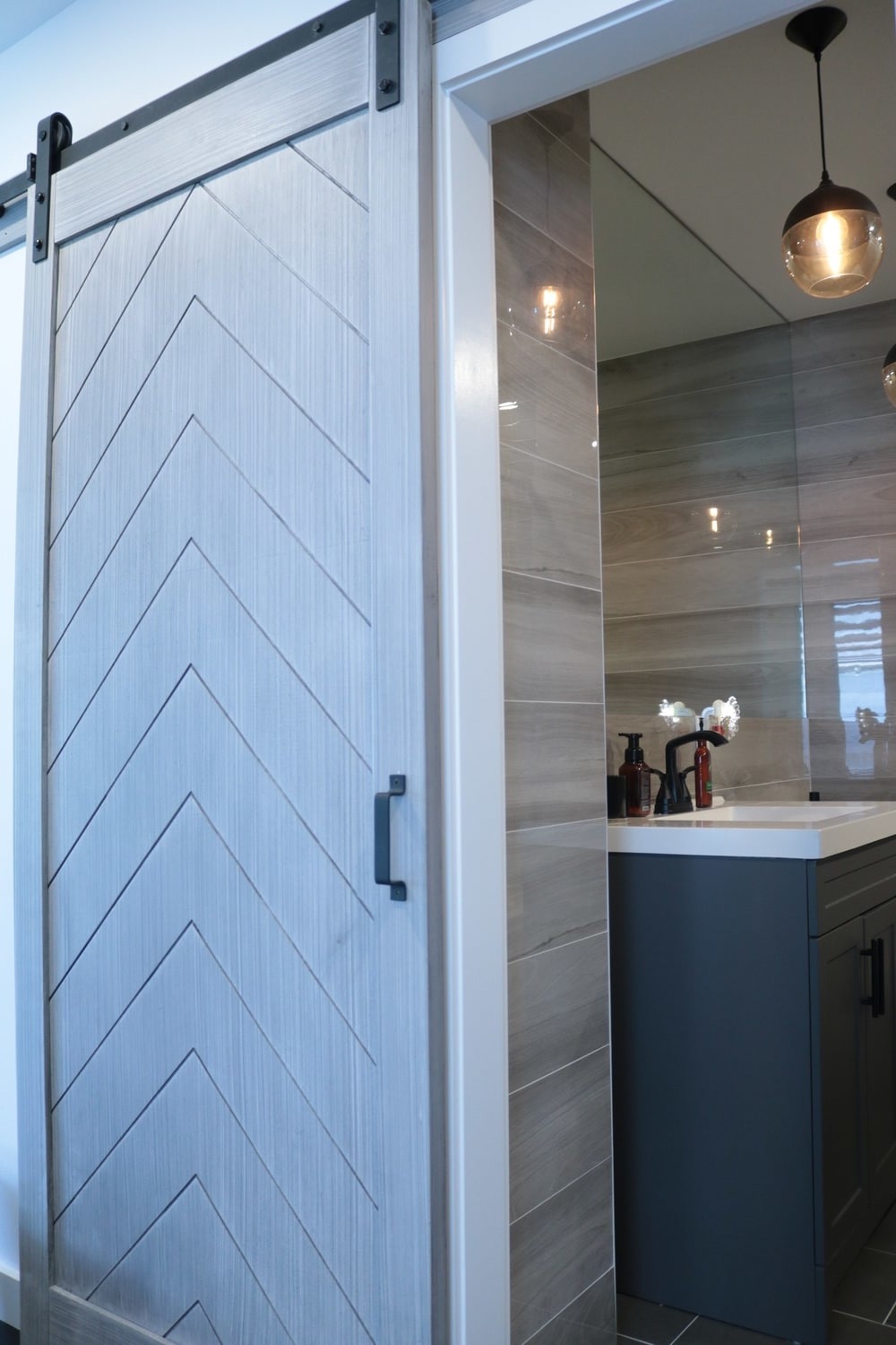
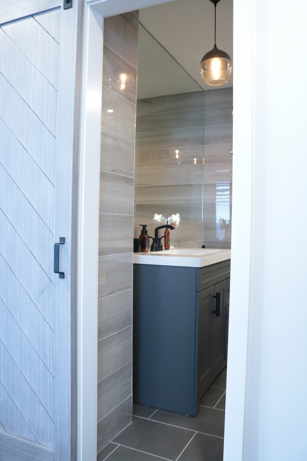
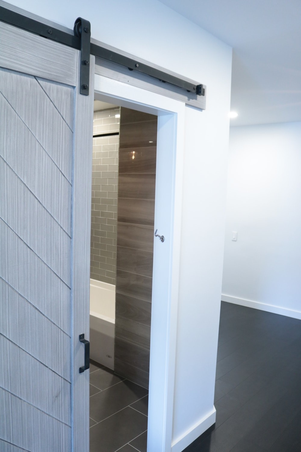
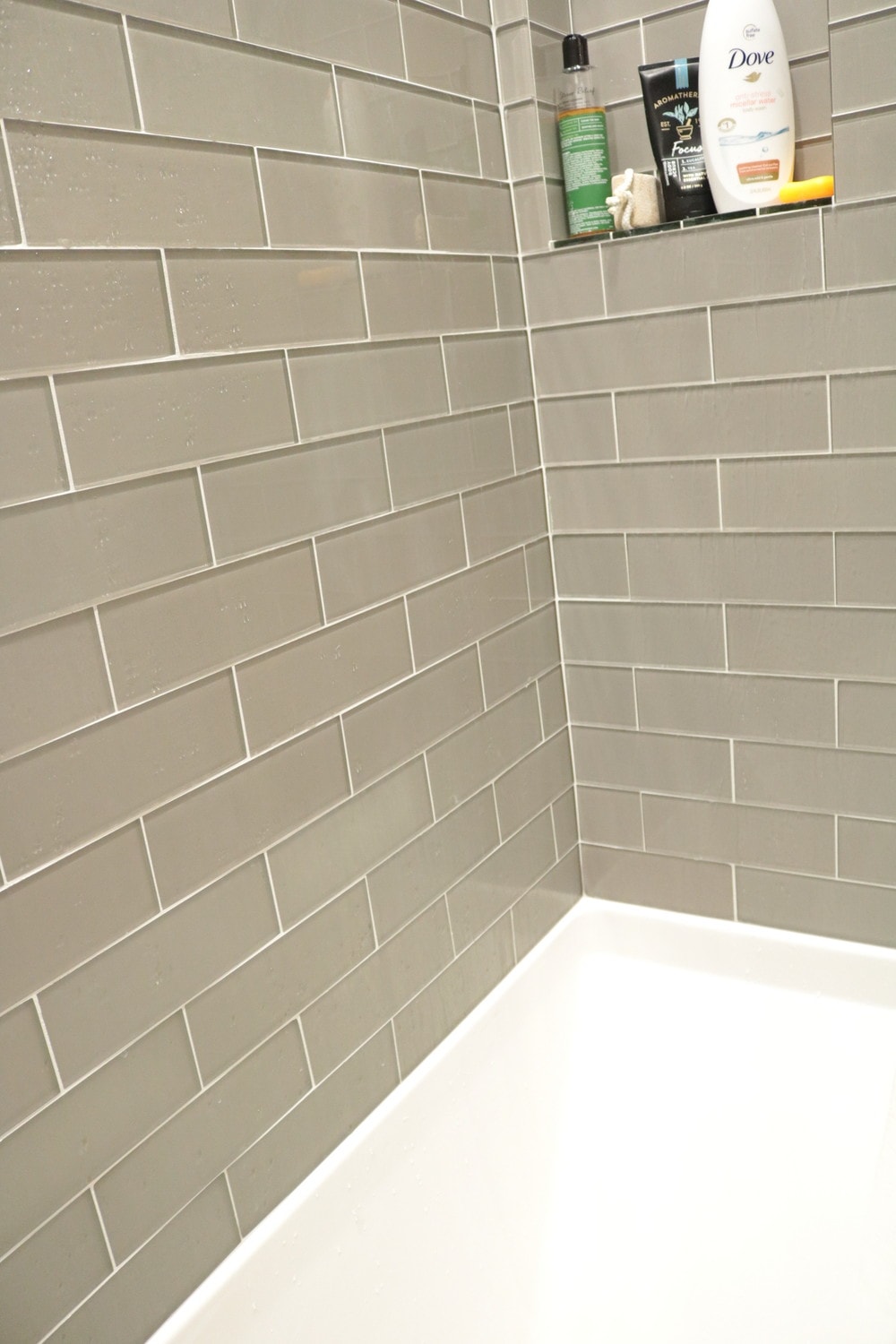
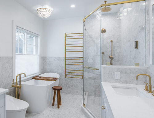
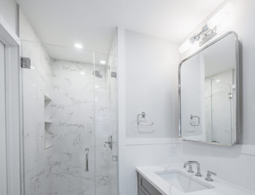
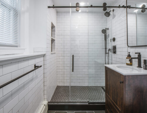
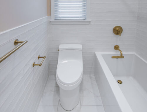
We gutted the bathroom down to the studs; it was a total rebuild. New tub, tiles, toilet, vanity, pendant
fixtures and a full glass wall mirror to make the room appears more bigger than it really was. We tried to
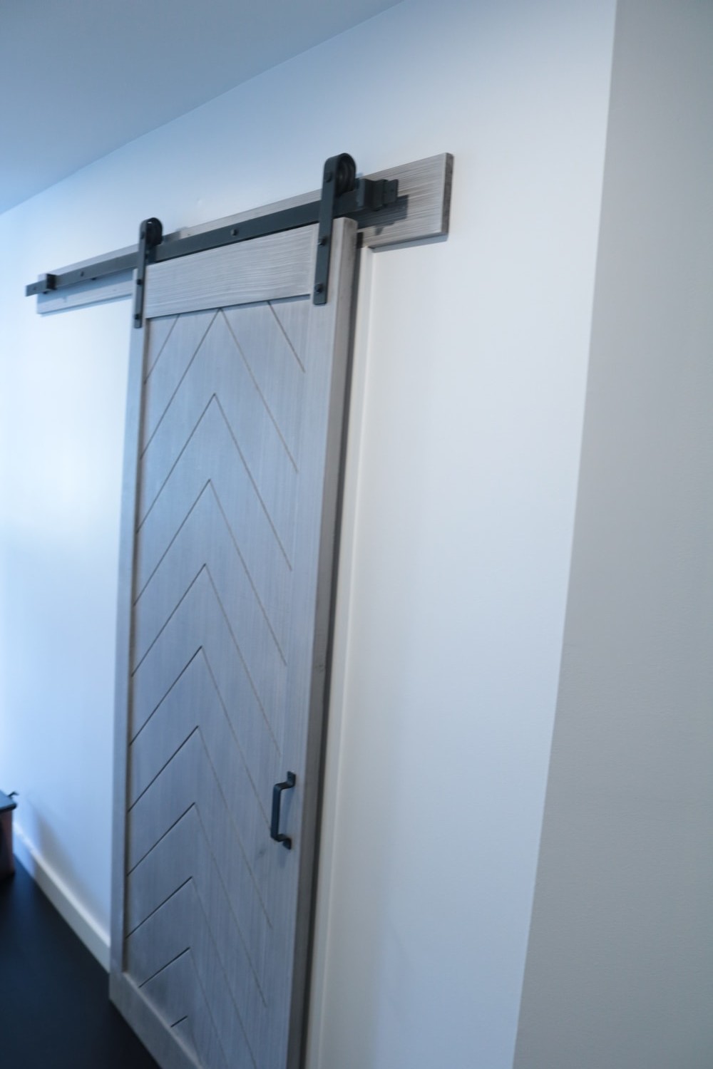
put in pocket door in the room but got stuck because of structural limitations so the barn door worked
just as beautiful and added some much-needed character and accent to the hallway.
The bedroom also had to be reconfigured because the two closets were located on the left and the right
side of the entry door making in a bit awkward to enter the room. We took down the closets and
transform them into one huge walk in closet instead at the back of the room which allowed us to keep
the bedroom free from those clumsy bulky closet walls. We use a piece of the closet wall to recess a
television into it thus making the room even more spacious.
Finally, the entire condo was painted, recesses lighting was added throughout the rest of the apartment,
new flooring, doors, trims and some finishing touches was what this condo needed to make it into now
this warm welcoming home. This was a Mid-Level Range Remodel. It shows how a little creativity can go
a long way with a small budget!
Thanks to all of our amazing vendors, and fabricators who worked with us around the clock to deliver this project on time and on Budget. The super amazing work of Anderson, Renaldo and their team from Samuka Construction who execute and deliver this project with such high level of detail and craftsmanship. Good teamwork on this project again! like so many other times.
Here’s to a happy client.. Now onto the next!


