Project Description
“DANCING BY THE WINDOW”
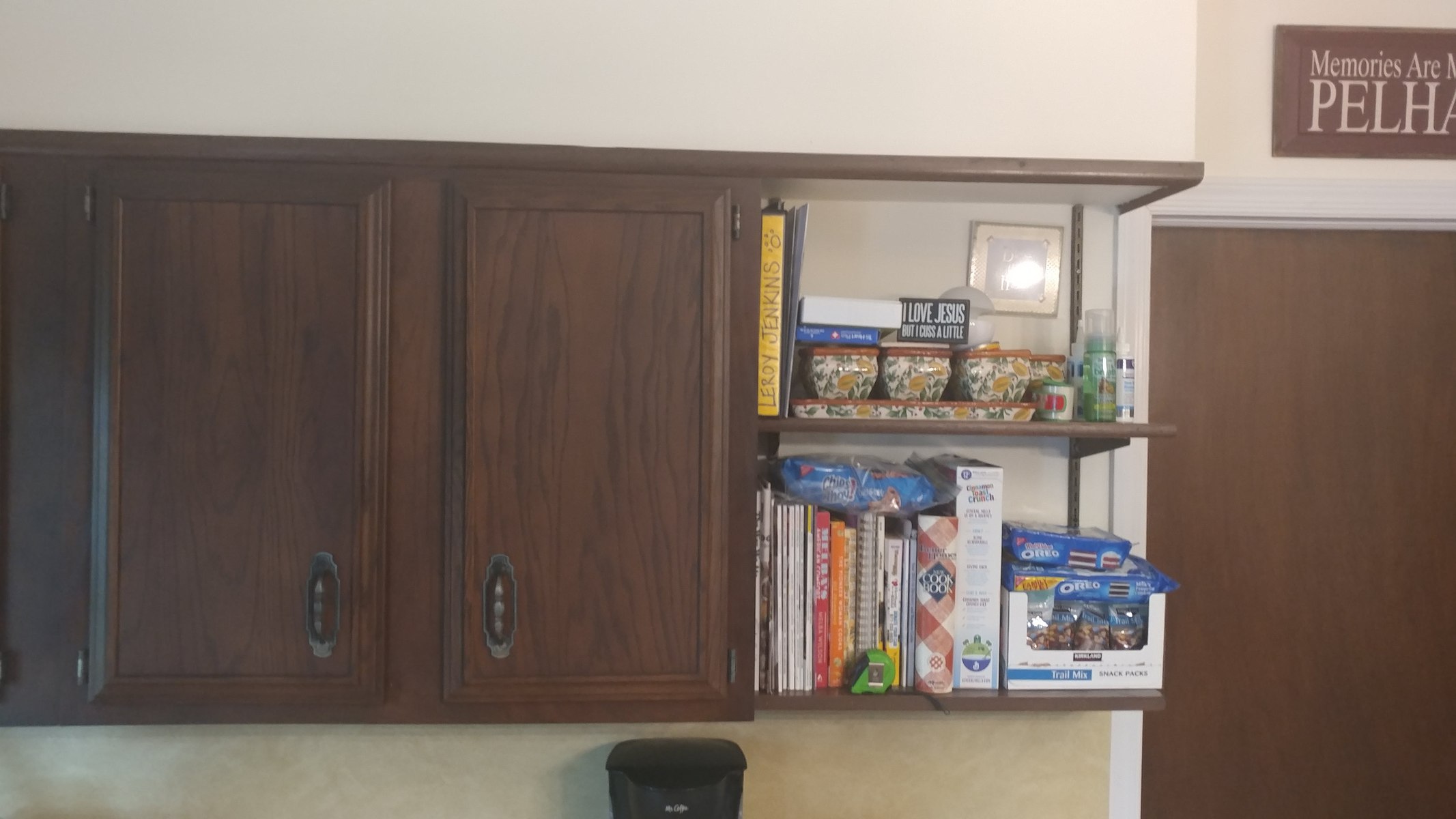
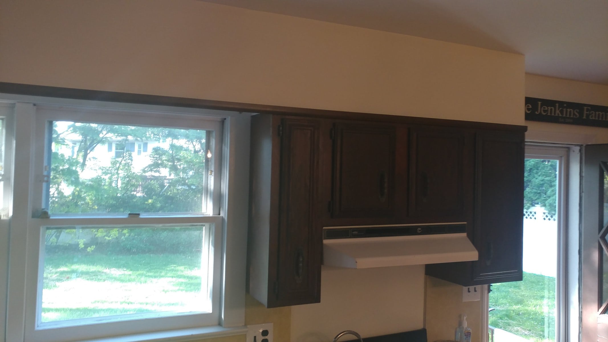
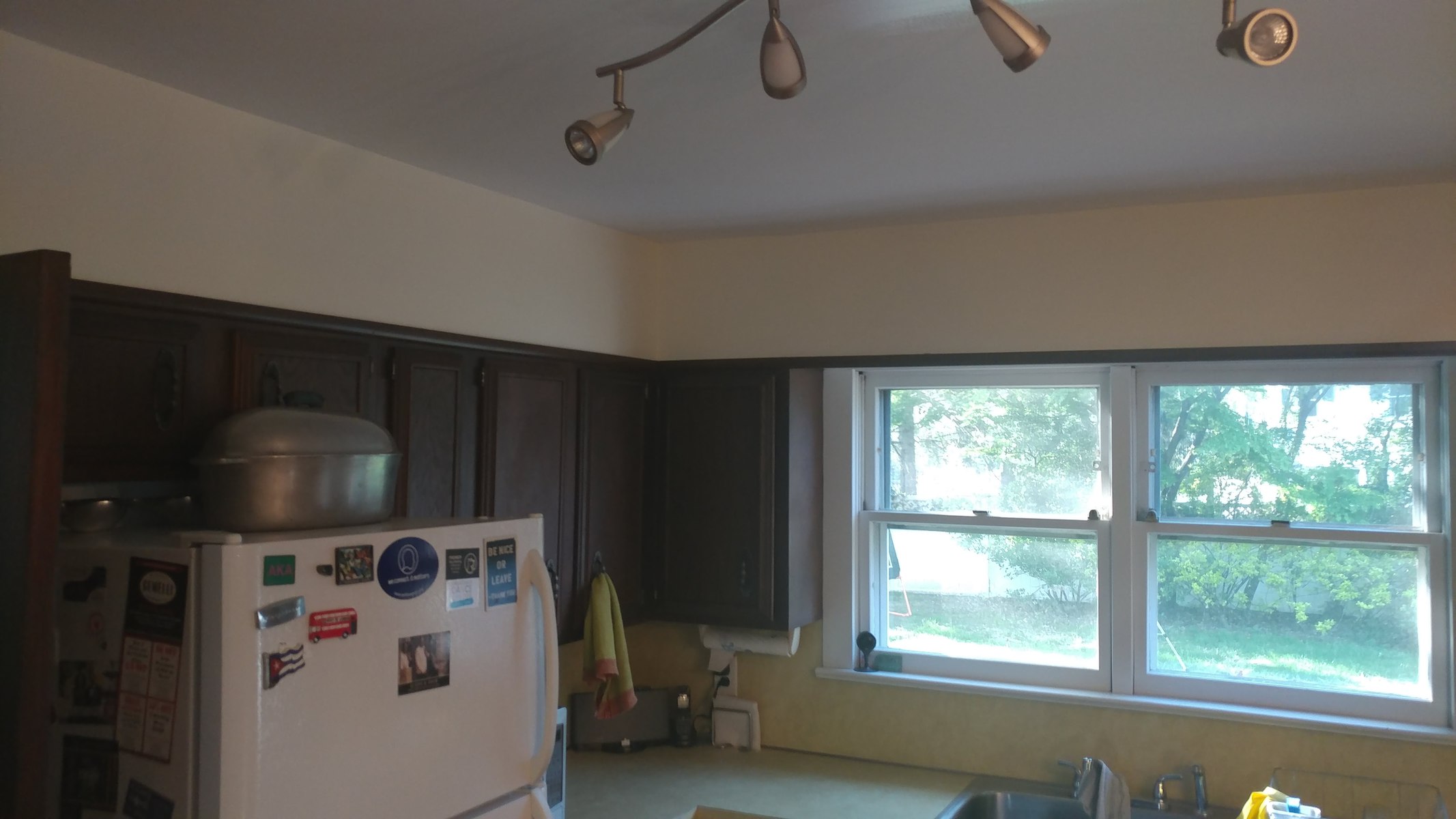
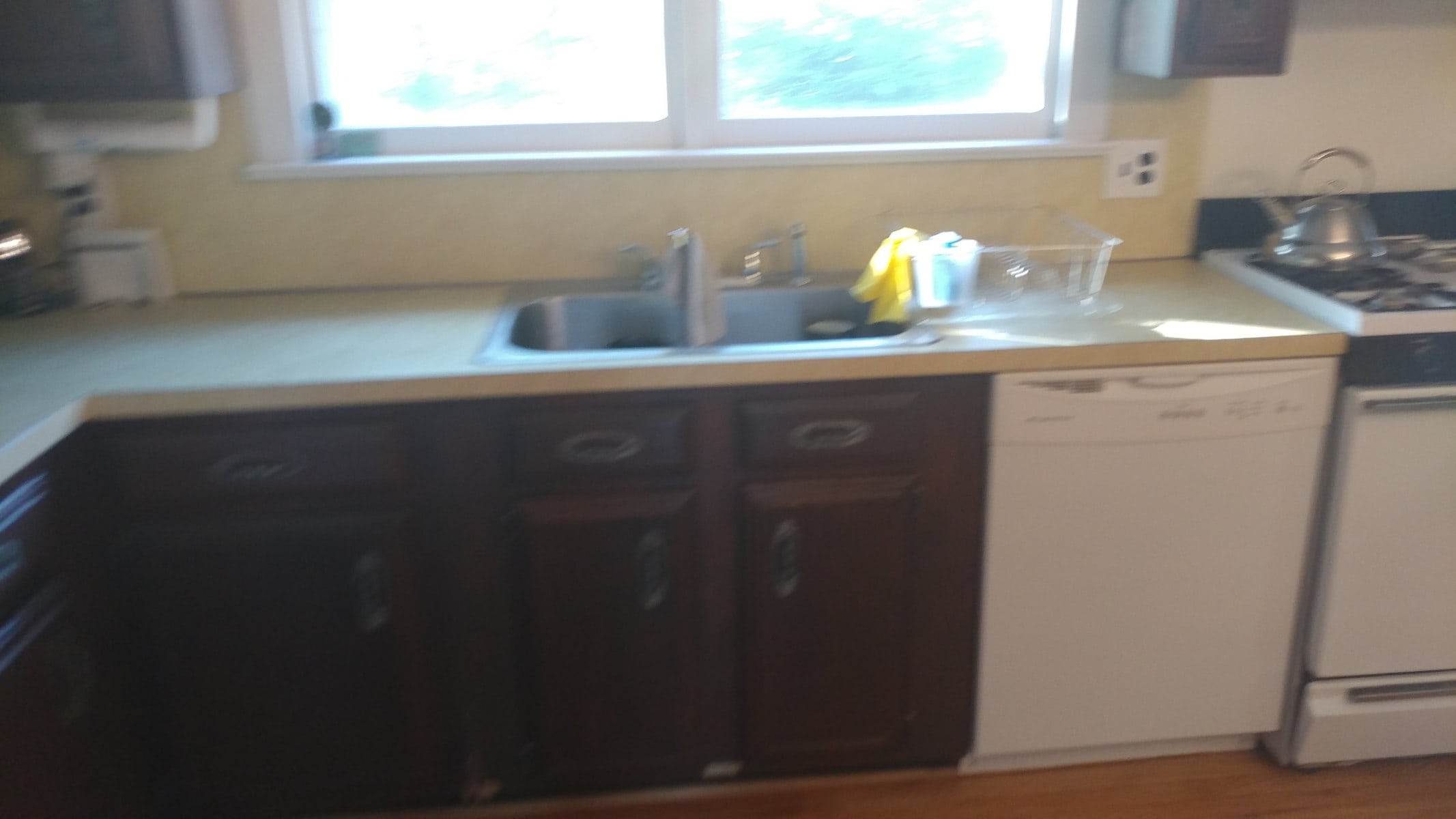
“BEFORE” PHOTOS:
“VIDEO TRANSFORMATION:
Dancing by the window.
A few months ago, we received a call to come in for a consult of the Kitchen space. This Family was planning on a kitchen remodel for a while. They did some research and the initial numbers that were coming in for the suggested scope of work was out of their budget. They kept putting it off year after year until they decided to finally pull the plug and go for it.
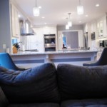
The kitchen was closed off from the rest of the space. It was in the middle of the dining and the family room, surrounded by two walls on both sides. At first sight, we knew right then that we could not just address the kitchen by itself. We had to look at this from a holistic approach where we would have to re-design the layout of the kitchen and also both adjoining rooms to bring them up to date. Those two other rooms are now going to be the new backdrop of the kitchen area so this was more than just a kitchen remodel at this stage.
We could see where cost would have been an issue with the space. Removing walls can sometimes open up to a lot of unknowns, and even when you assume the unknowns, you don’t know what you’ll see until it’s done. It can quickly become a very expensive proposal if those walls ended up being all load bearing, plus the additional problems of uncovering pipes and duct work which will have to be relocated. Added to those unknowns was the design. How can you add more of everything when you are tearing down the walls? Where can you add those things back? But if the walls are gone, where would they go?
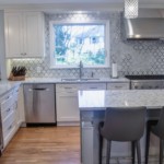
This family had quite an interesting request! They had a beautiful back yard view and mom and daughter would routinely dance in front of the kitchen window, while doing so they will take in the view of the back yard. There was a single French door that had the view of the back yard, and mom would usually sit at the end of the table and look out when she’s working from home. The thing was, no matter what we came up with, we had to maintain those two unique features of the space. This was one time where a feature of the kitchen was not an item but an experience. After consult, we left full of inspiration and challenges all at the same time, and we went to work on a new design concept the day after.
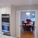
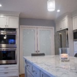
Our Client wanted to do some work just like they see on HGTV, so they opted for the demolition of the space. Another first time for us, but seeing the excitement on their faces to tear out those walls… we couldn’t stand in their way. The design had called for a contingency plan by leaving a header if it was load bearing, but on demolition day, they discovered that it was not a load bearing beam so that wall came tumbling down like humpty dumpty. The other wall was a careful demolition since we planned to put in a double pocket door with frosted glass for privacy to the dining room because that room gets a lot usage and hence the option to close if off when needed.
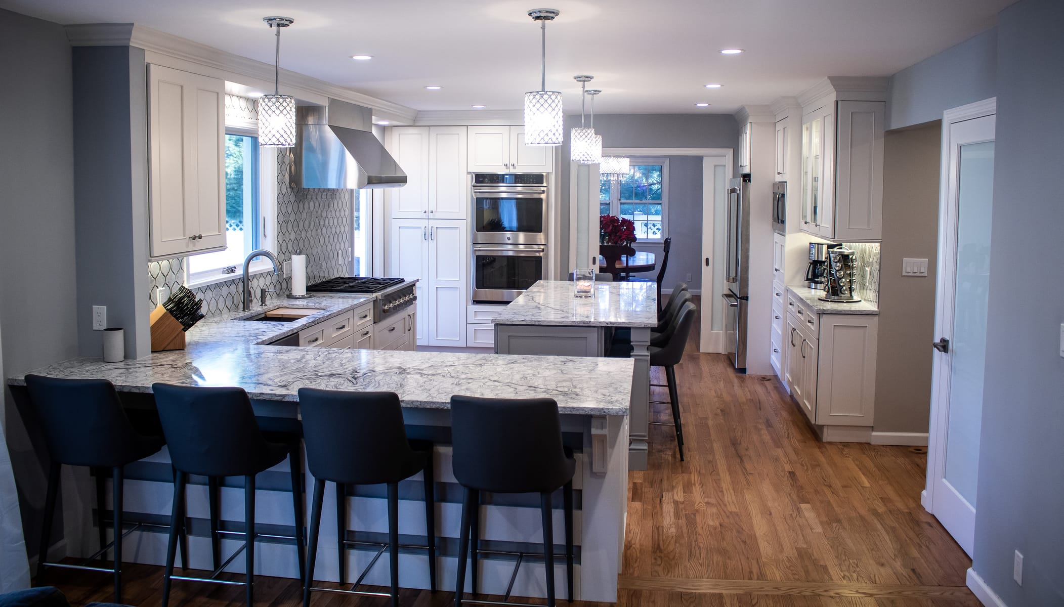
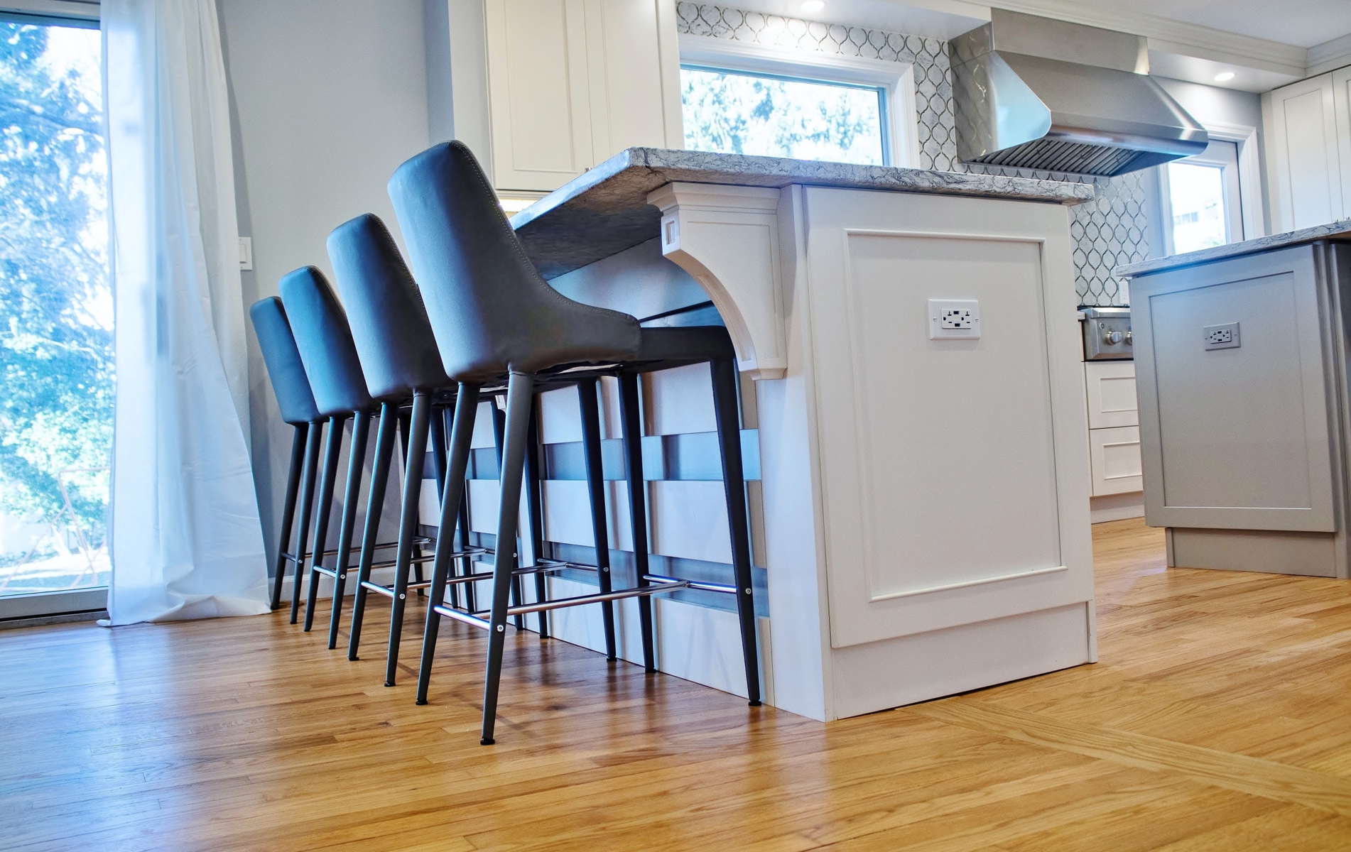
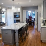
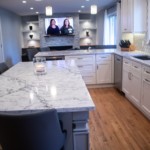
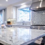
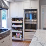
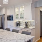
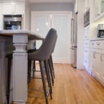
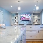
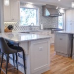
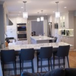
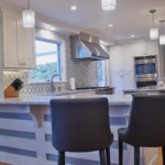
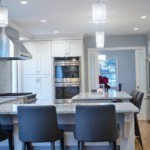
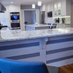
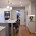
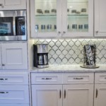
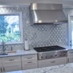
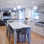
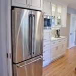
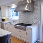
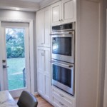
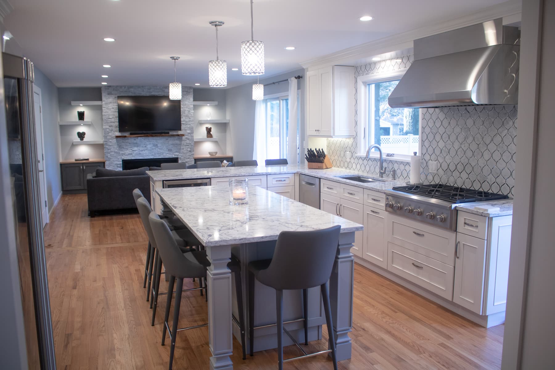
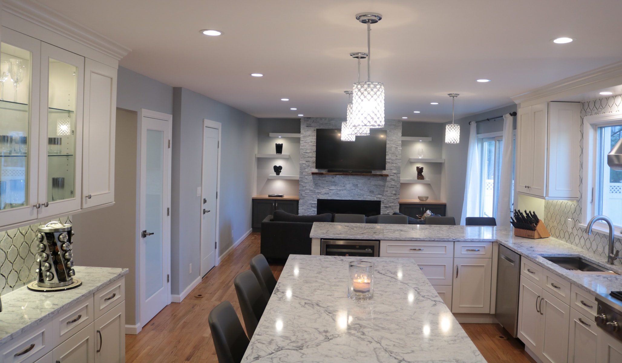
Once the demo was done, the professionals took over the work and began rebuilding the space. The kitchen plans called for re framing the walls for a single pane large window, a full clear glass exterior door, a double pocket door with frosted glass between Kitchen and dining, a large refrigerator, double oven, wine cooler, large range hood, large sink, dish washer, big pantry and a lot of counter space all of which are to be kept in the same kitchen space. This open space concept had to serve so many purposes- work, dancing routines and to seat at least 7 people on a good night especially when it comes to sports and entertaining. With all these heavy lifting, we want to ensure it has this glam look as if it belongs to a magazine shoot, so details were crucial.
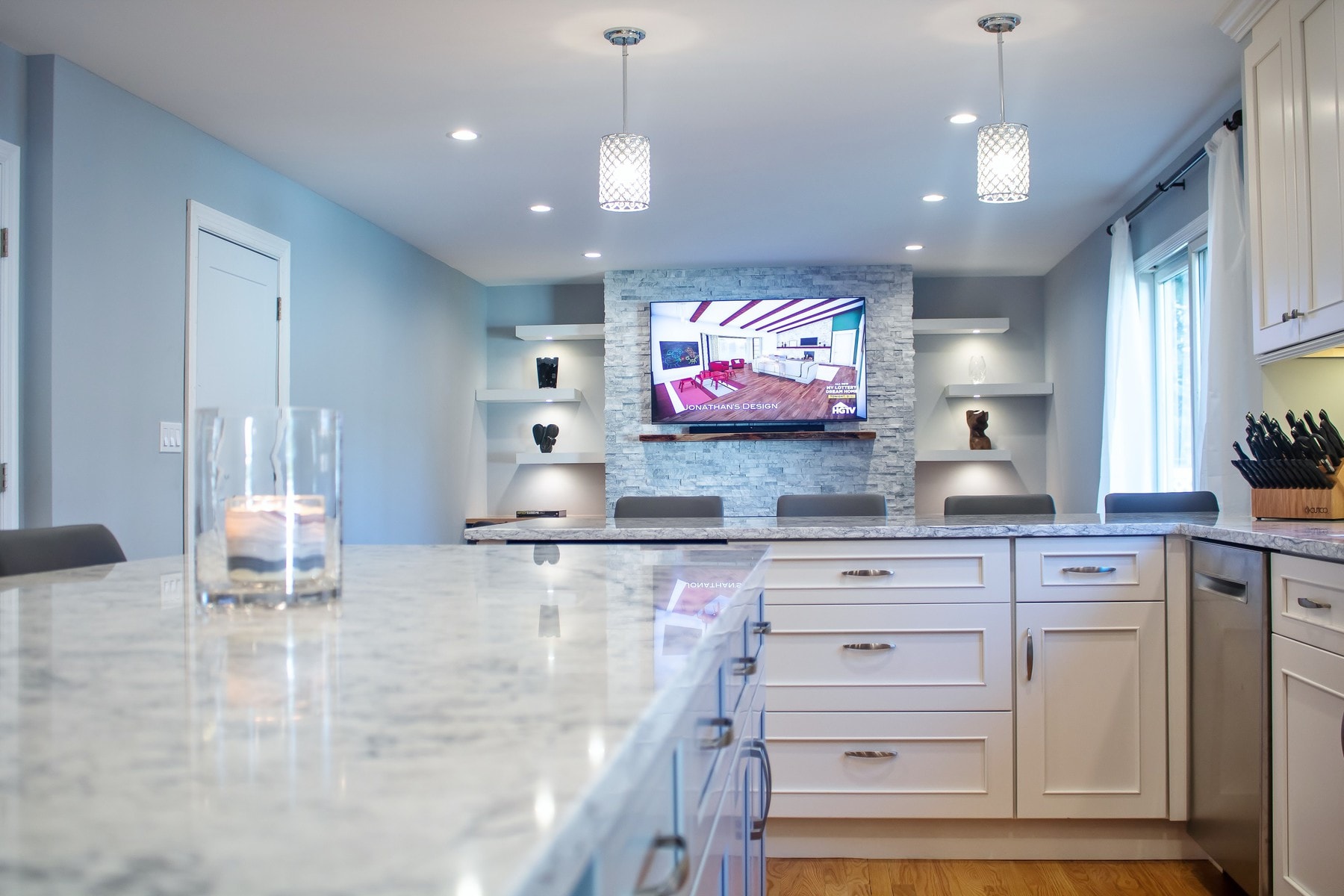
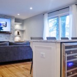
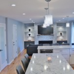
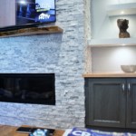
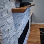
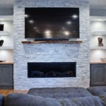
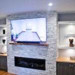
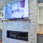
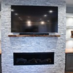
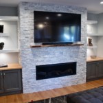
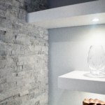
Earlier, we mentioned about the backdrop of the kitchen, the family room that was cut off and hidden all by itself, suddenly finds itself the center of attention in all of this. On that back wall, we built out a focal wall to hold a Massive TV, a linear gas fireplace below flanked by some open shelving on both sides with storage below. All of this was built-in around the new contemporary staggered 3d white brick wall that leads all the way to the ceiling. At night, it lights up to reflect all of the details that accentuate the live edge mantle that our clients hand-picked.
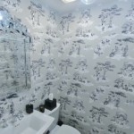
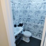
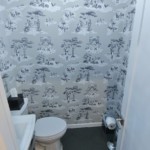
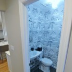
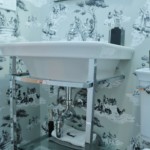
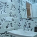
You cannot do all of this beautiful work and not touch the powder room, which was just off the hallway leading down the kitchen. It was updated to reflect some old history which was so refreshing to see. The big take away here was how a lot of creativity, along with the right team of people can pull off something so amazing that everyone else say it could not be done with our Mid-Size kitchen remodel range. Not only did we do it by skillfully redesigning the space, carefully selecting the right materials to have maximum impact, but also all details had to executed to precision!
Thanks to our clients for trusting us with their beautiful home so that we can create another unique and successful project and most of all, to see and know we left another happy family to enjoy their new space. Credit to all who worked on this project to make it a huge success- Samuka Construction team and to all of the sub-contractors
Now Onto the NEXT!
“AFTER” PHOTOS:
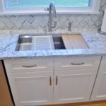
- quartz countertop
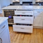
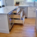
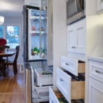
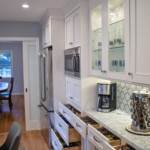
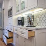
- pull out drawers
- pull out drawers
- closed pocket door
- Pocket door closed
- Pocket door partly open
- Practical stoage
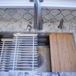
- sink organizer
- coffee station
Family Room
Powder room


