Project Description
…Kitchen Remodel: A Masterclass in Design and Functionality”…
The transformation of this kitchen was a true design journey, blending innovative ideas with meticulous attention to detail. From the outset, our goal was simple: create a space that was functional, stylish, and aligned with our client’s vision. However, like any great design project, the deeper we dove into the space, the more opportunities we discovered to enhance its functionality and aesthetic, without sacrificing valuable square footage.
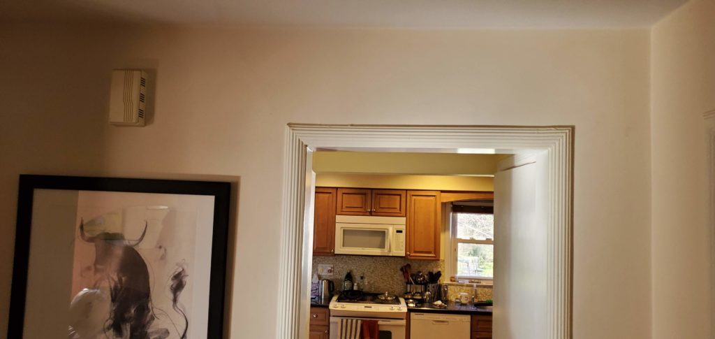
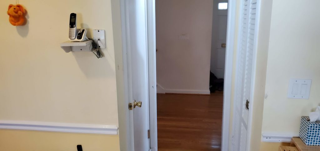
Initially, the kitchen was outdated, disconnected from both the client’s personal style and the overall flow of the home. It was a space trapped in the past, featuring cherry wood cabinetry that hadn’t stood the test of time. The layout, though standard, was inefficient. The kitchen felt cramped, especially when more than one person occupied the space. It was clear that a complete overhaul was necessary—not just to bring it up to date but to truly elevate the way the space functioned.
Reimagining the Space: A Focus on Functionality and Flow
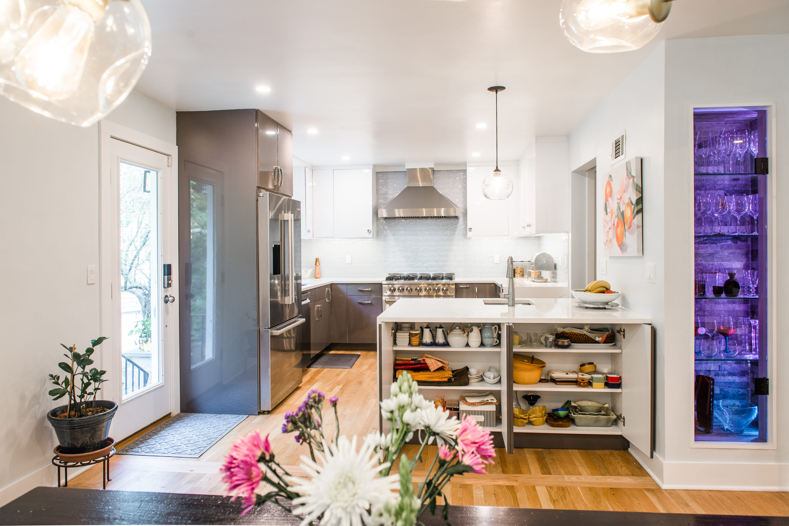
We began by stripping everything down to the bones, allowing us to rethink every aspect of the design. One of the few elements we decided to keep was the location of the sink, which remained central to the layout. However, the refrigerator was repositioned to maximize storage potential without interfering with the flow of the space.
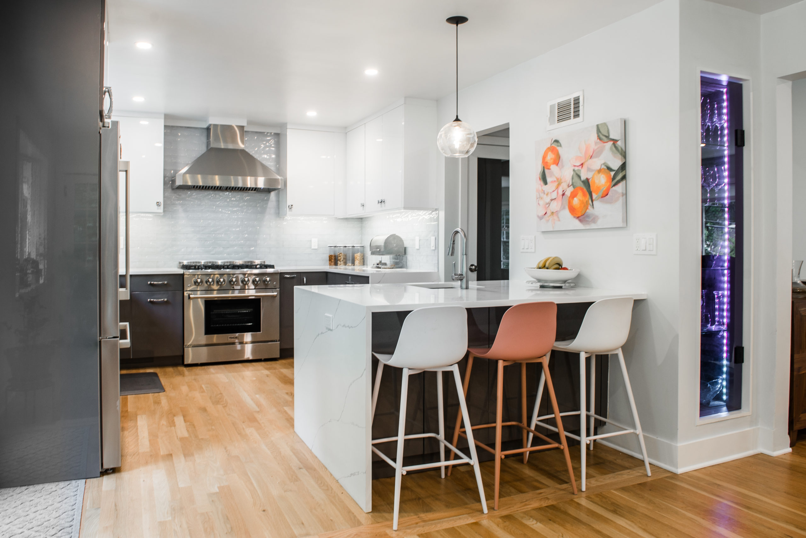
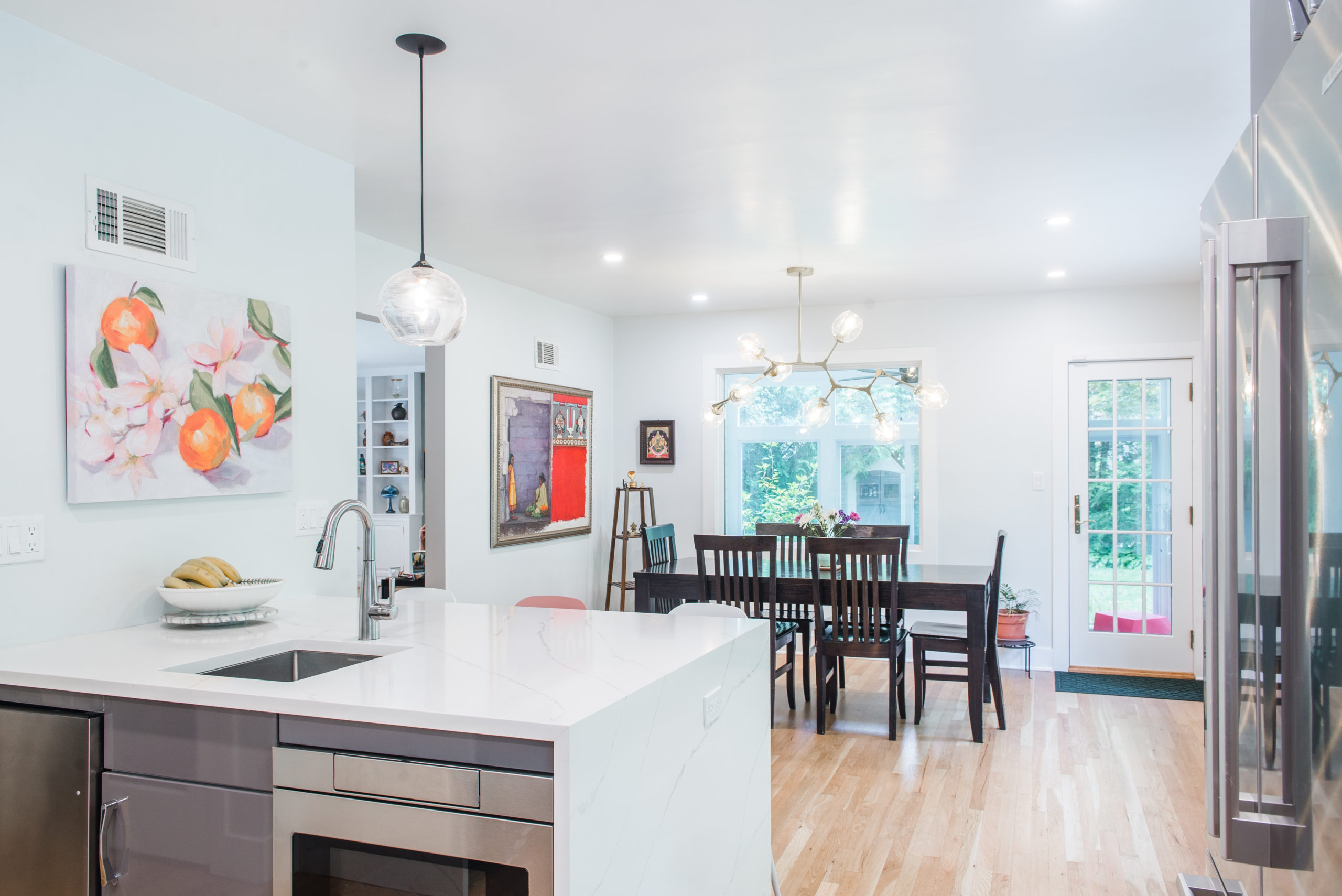
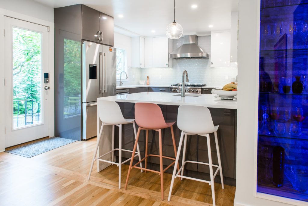
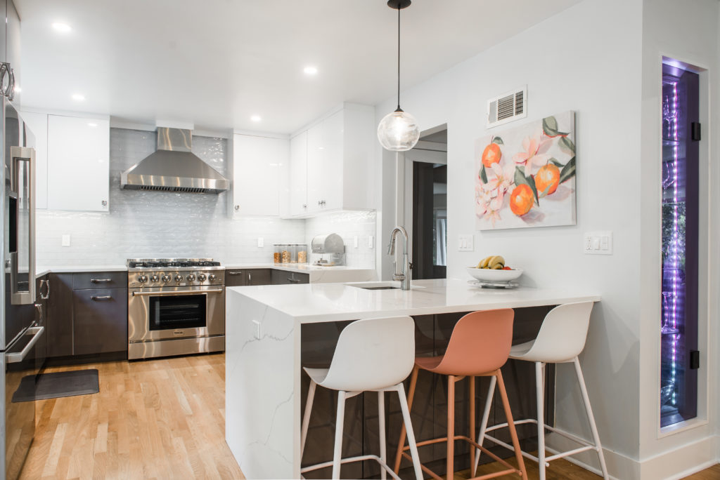
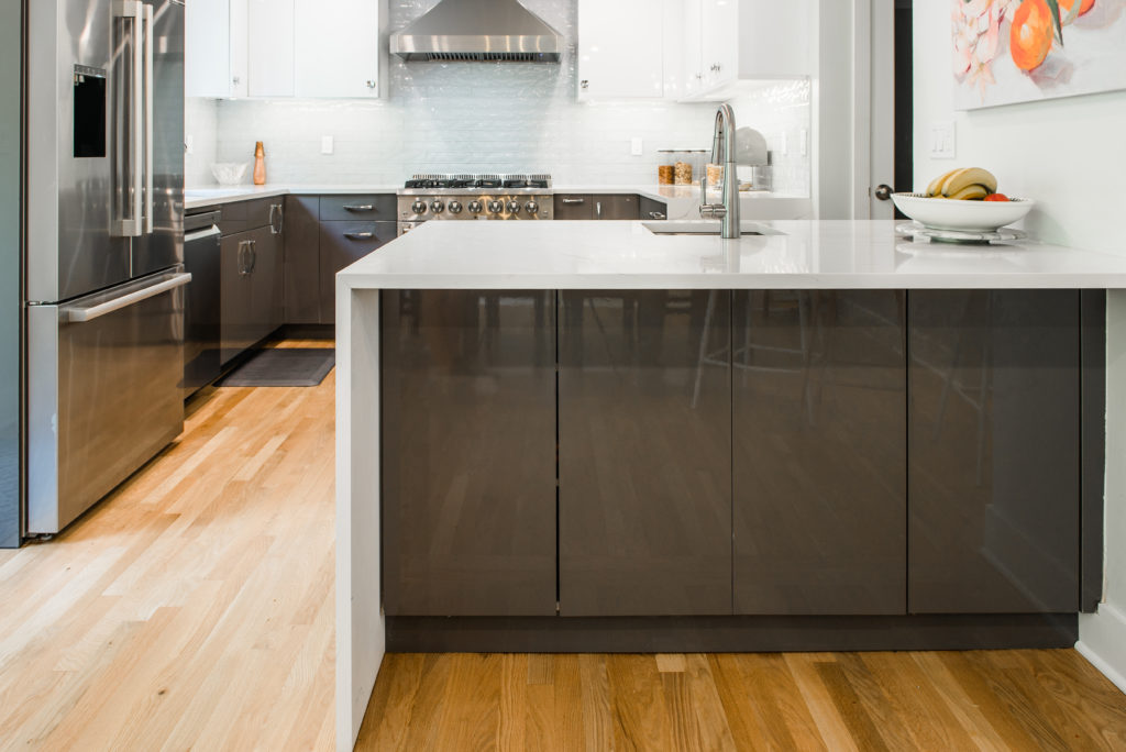
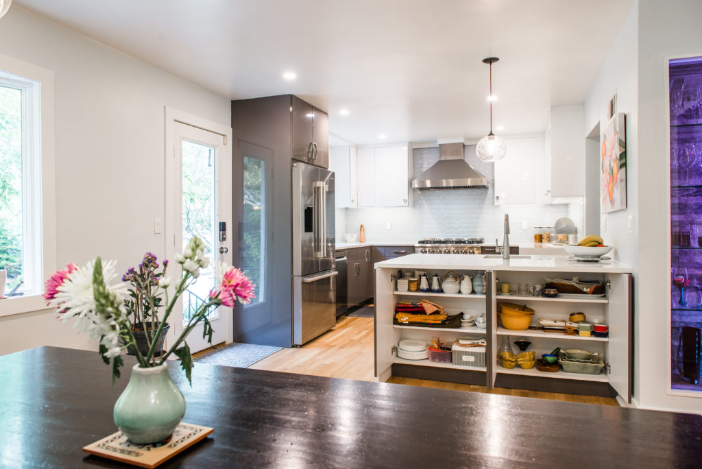
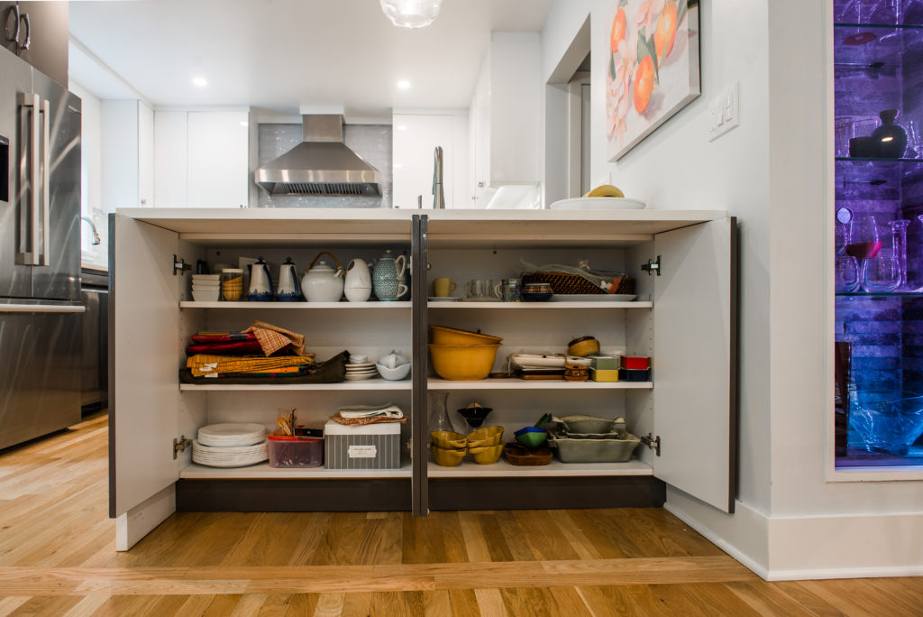
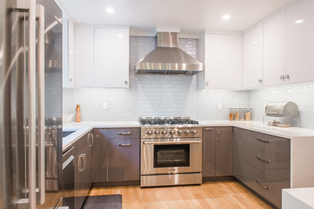
Rather than opting for a traditional island, we introduced a peninsula, a choice that preserved valuable floor space while still providing ample counter and seating area. This decision also allowed us to upgrade the range from a standard 30” to a 36” model, enhancing both the functionality and the visual impact of the space. To match this, we installed a larger, more powerful range hood, ensuring that the kitchen could handle the demands of cooking while maintaining a sleek, modern aesthetic.
Sustaining Integrity: Preserving What Works
While the kitchen was getting a complete facelift, we recognized the value in keeping elements that were in excellent condition. The existing hardwood floors were a standout feature, so instead of replacing them, we carefully routed plumbing and electrical lines beneath the second floor, preserving the integrity of the wood above. This thoughtful approach ensured that the flooring would remain undisturbed and added to the overall efficiency of the remodel.
Designing for Connection: A Seamless Integration with the Living Space
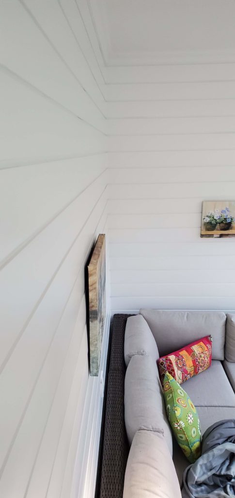
The client’s enclosed porch, a vibrant family hub, was a key part of the home’s atmosphere. However, the kitchen’s previous layout limited the connection between these two spaces. To address this, we cut a 5-foot-wide window into the wall, creating a visual and physical link between the kitchen and porch. This strategic opening immediately transformed the feel of both spaces, enhancing the flow and allowing natural light to flood the kitchen.
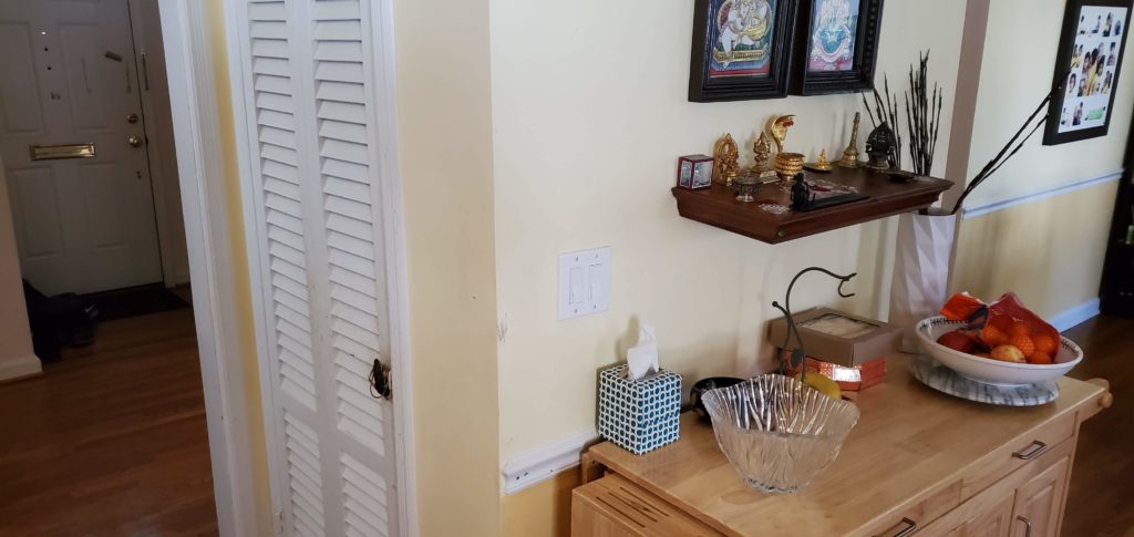
Additionally, we reimagined the pantry, turning underutilized space into a showpiece. By reversing the access point, we created a sleek glass-front cabinet that opens into the dining room. Tiled with a natural rock pattern and illuminated by custom LED lighting, this new storage area added a touch of luxury and functionality, all controllable via the client’s smartphone.
Modern Aesthetic: Light, Bright, and Inviting
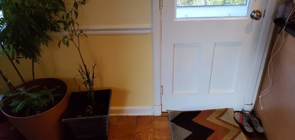
The design language was kept clean and contemporary, with a two-tone color palette featuring soft grey and white cabinetry. Light, bluish tiles complemented the neutral tones, creating a fresh, airy atmosphere. To further enhance the open, contemporary feel, we replaced the back door, pantry door, and basement door with full glass units, seamlessly integrating the interior with the exterior and allowing for unobstructed views of the surrounding space.
A Space for Every Occasion
What was once an outdated, poorly laid-out kitchen is now a versatile, inviting space that adapts to the needs of the entire family. From a family gathering spot to a quiet retreat for adults in the evening, the kitchen now functions as a true multi-purpose hub. It’s a space that elevates the daily experience of cooking, entertaining, and relaxing.
Conclusion: A Job Well Done, A Space Transformed
Our team poured dedication and expertise into this project, ensuring that every detail was executed to perfection. The end result is a kitchen that not only meets but exceeds the client’s expectations—a true reflection of their lifestyle.
If you’re ready to transform your kitchen into a space that combines style, functionality, and personalization, contact us today. Let’s make your dream kitchen a reality.


