Project Description
…she wears it well!”…
…she wears it well!”…
Caribbean Teal: “A Fresh, Bold Look”
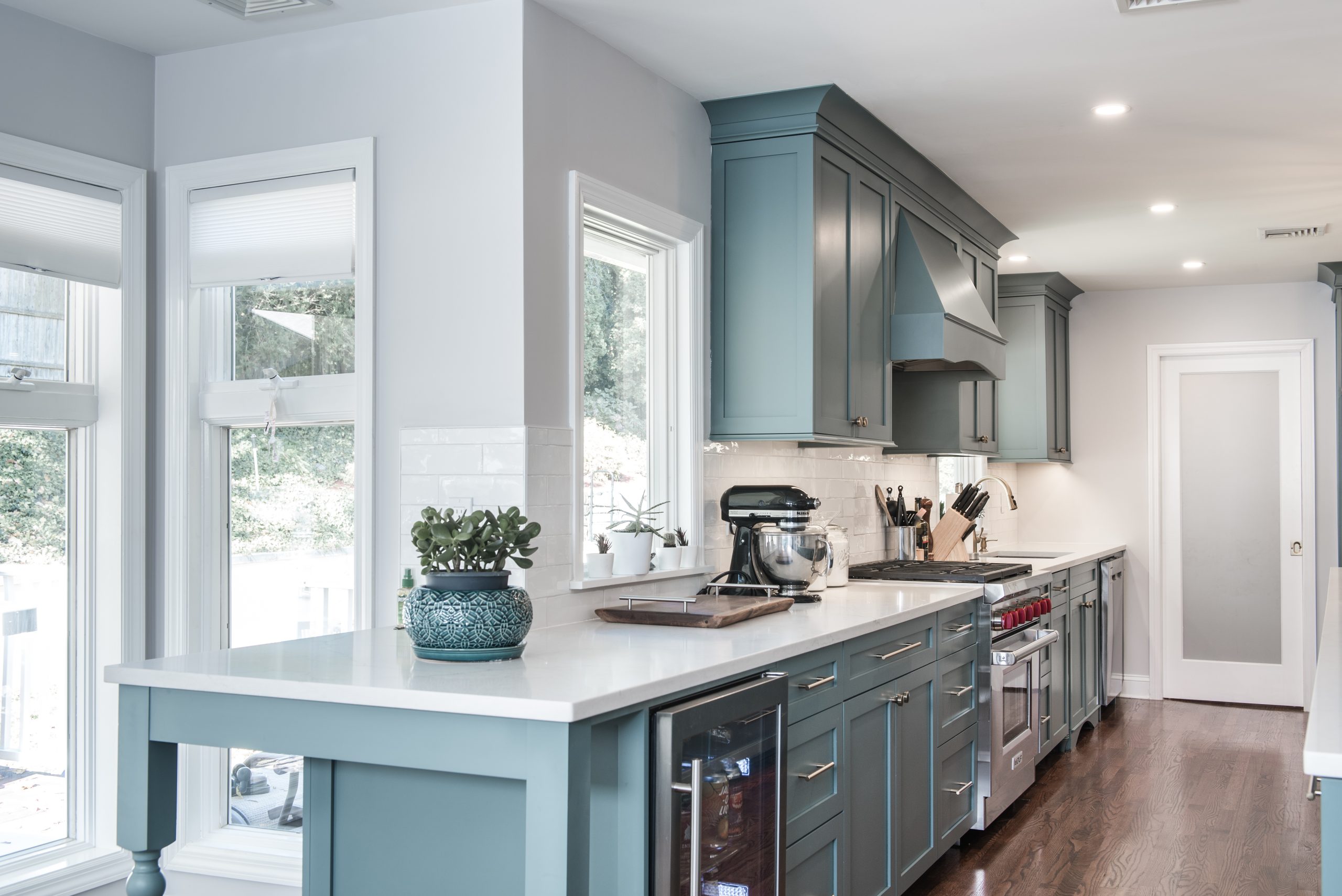
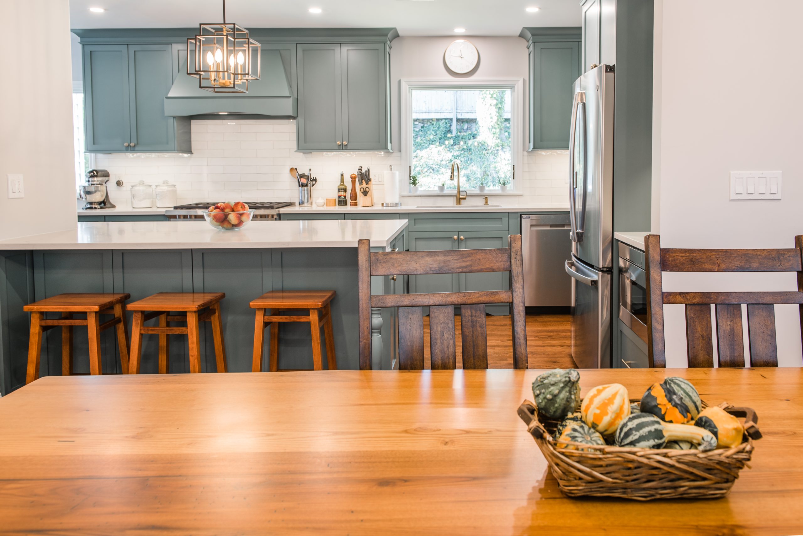
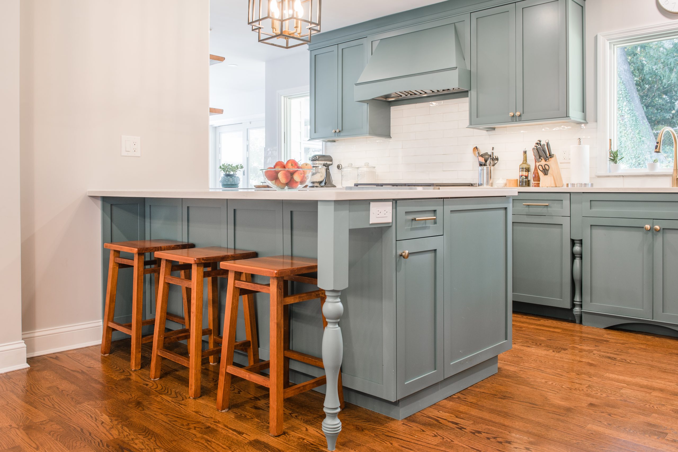
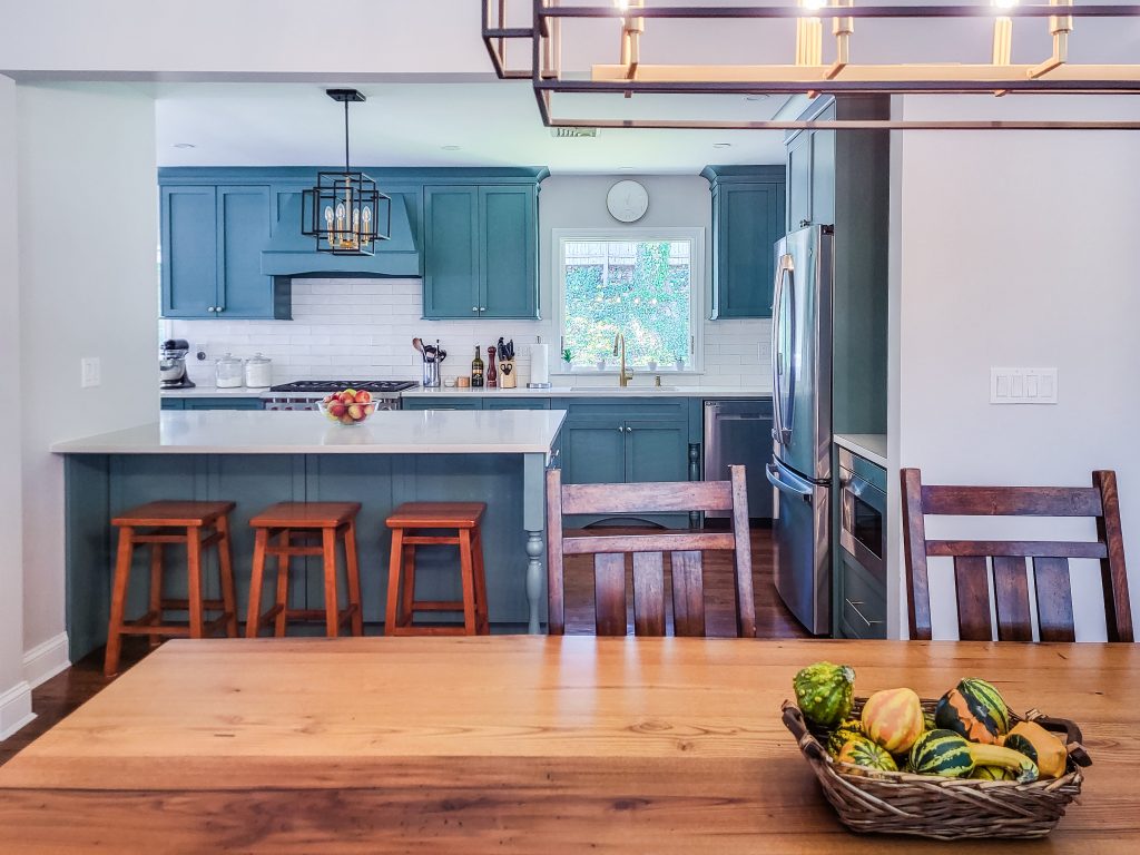
This striking color breathes new life into this kitchen. More than just a design choice, we believe it serves as an inspiration for those hesitant to experiment with bold colors in their space. For this home, it wasn’t just about a fresh look—it was about pushing boundaries and opening minds to new, daring design possibilities. While not every space can carry such a vibrant hue, our clients embraced this statement piece beautifully, proving that bold design choices, when executed thoughtfully, can truly transform a home.
Reimagining the Space
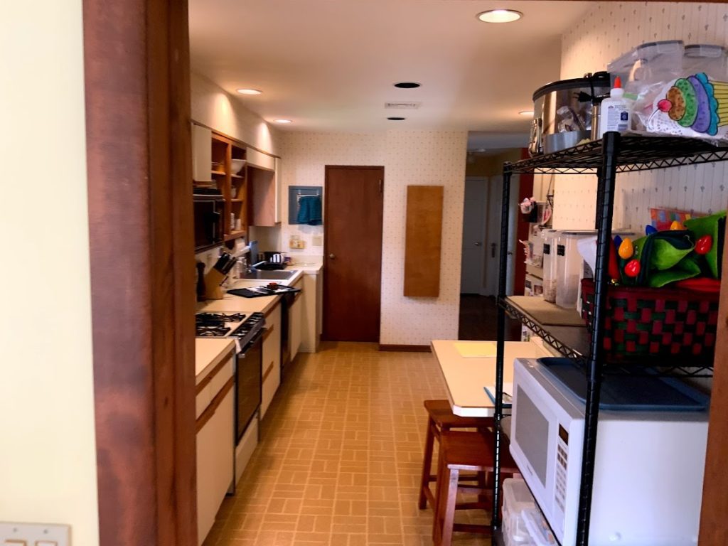
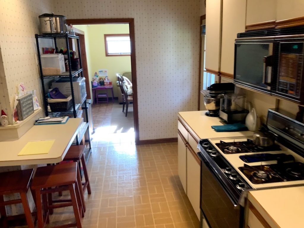
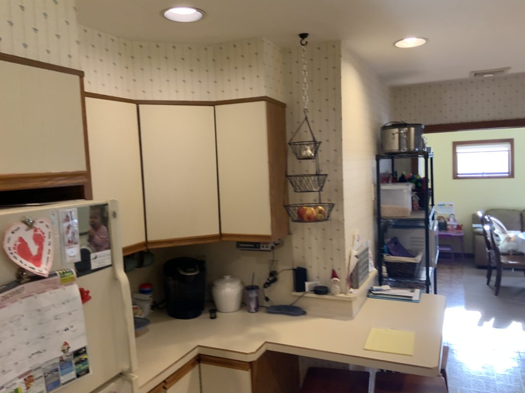
We didn’t initially set out with this bold color in mind, but as the design evolved, Caribbean Teal by Sherwin Williams became the defining element that tied everything together. Before the renovation, the kitchen felt trapped in time—functional but outdated, and positioned in a challenging part of the home. This wasn’t a project where removing walls to create an open-concept layout was feasible. Instead, every design decision had to be intentional, ensuring a seamless connection between key living spaces while maintaining the structural integrity of the home.
One major challenge was addressing the kitchen’s direct view of the hallway leading to the bedrooms. This sightline disrupted the home’s overall aesthetic, making the kitchen feel more like a transitional space rather than the heart of the home. To resolve this, we reworked the layout to create a more defined and inviting focal point, seamlessly integrating the kitchen into the overall flow of the house.
Design Meets Functionality
This transformation wasn’t just about aesthetics—function was a top priority. Our clients love spending time in the kitchen, and one of them is a serious cook who understands the importance of an efficient, well-organized space. Every detail was carefully considered to balance beauty and practicality.
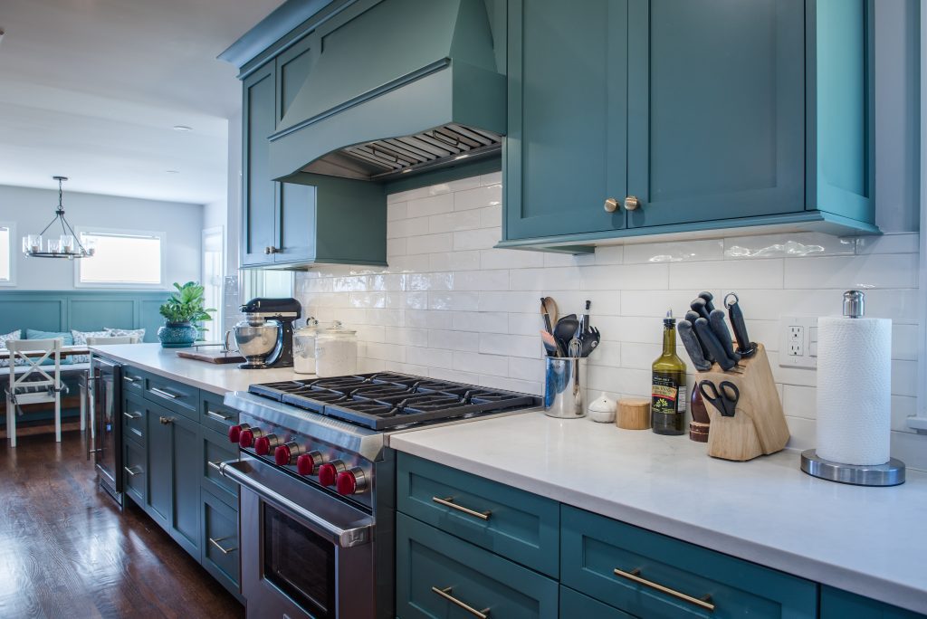
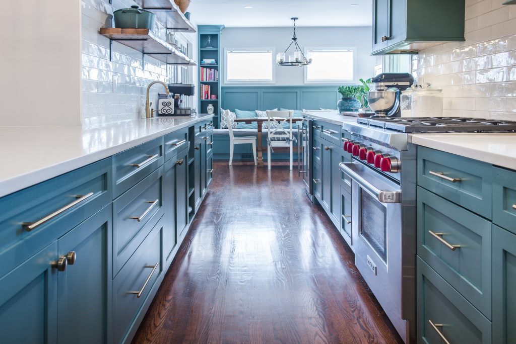
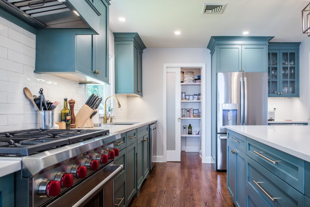
- Custom Cabinetry: Full-height cabinetry with integrated storage solutions was chosen to maximize functionality while maintaining a clean, modern aesthetic. A custom vent hood, finished in Caribbean Teal, became a seamless yet striking focal point.
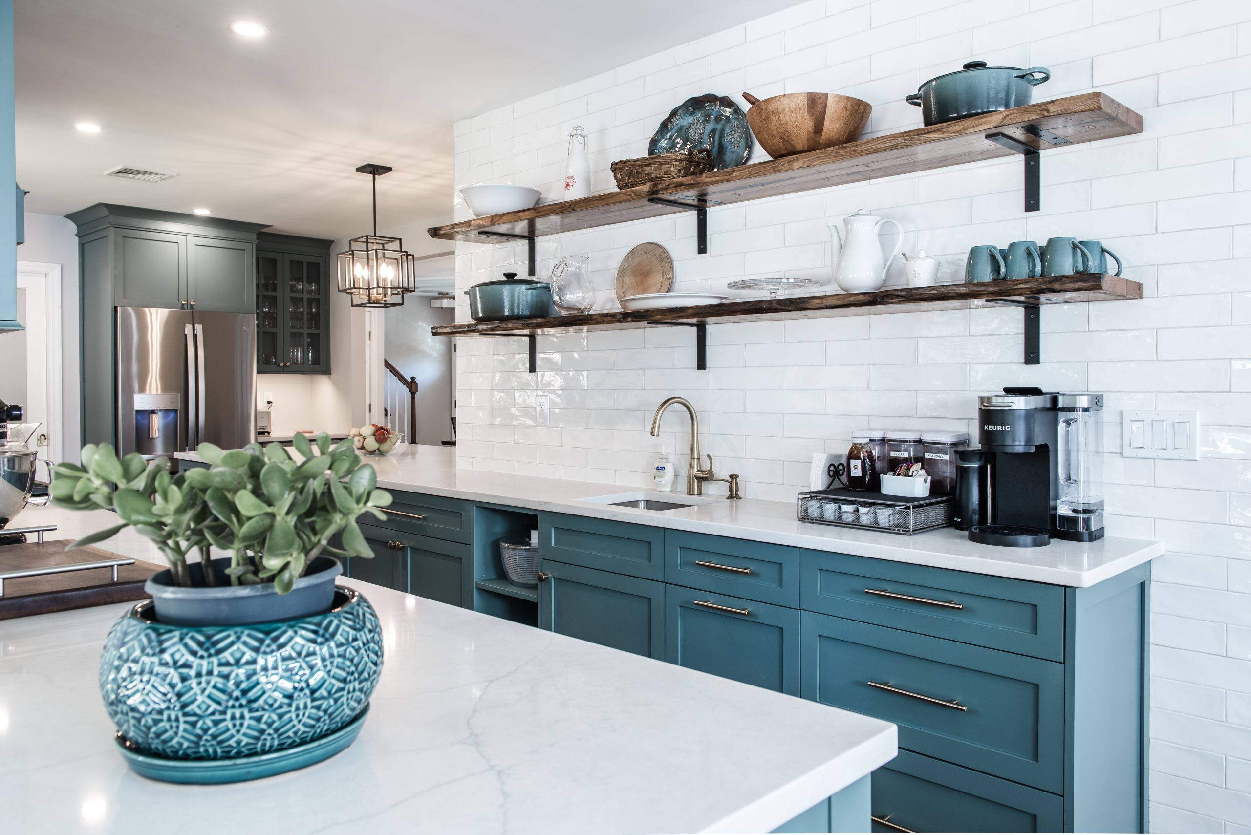
- Statement Countertops: A quartz countertop with subtle veining was selected to bring elegance and durability to the space, offering a refined contrast to the bold cabinetry.
- Lighting & Flow: To enhance natural light, we closed off a secondary door leading to the deck and replaced it with a large picture window, creating a brighter and more open feel. The existing kitchen window was also replaced with a larger, unobstructed version to improve sightlines.
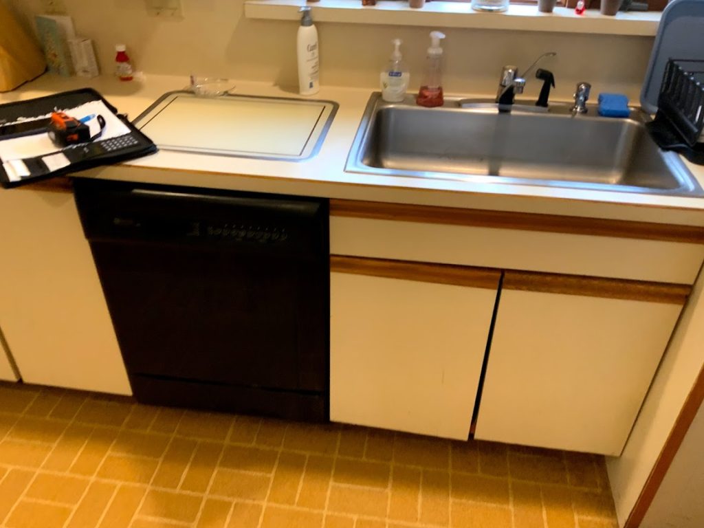
- Appliance Integration: A professional-grade range and paneled dishwasher were incorporated, ensuring high performance without disrupting the cohesive design.
Every design decision was intentional, creating a space that not only looks beautiful but functions effortlessly for the people who use it every day.
The Power of Bold Choices
Our clients’ appreciation for craftsmanship and natural materials played a significant role in shaping the final design. Their love for handcrafted, live-edge wood details is reflected in the custom floating shelves and a stunning solid wood dining table—elements that add warmth and character to the space. In fact, they personally selected the wood on a trip to Cape Cod, reinforcing the idea that when you invest in a home that truly reflects your personality, every detail matters.
With such a distinct vision, a traditional white kitchen simply wouldn’t have done it justice. That’s when we embraced Caribbean Teal—a choice that initially felt bold but ultimately became the defining feature of this stunning remodel. And the result speaks for itself.
If any kitchen could pull off Caribbean Teal with style and confidence, it was this one. And she wears it well.
Ready to Transform Your Space?
A kitchen remodel is more than just an upgrade—it’s an opportunity to design a space that reflects your lifestyle and enhances the way you live. Whether you gravitate toward classic elegance or bold, unexpected details, we’re here to bring your vision to life.
Let’s create a kitchen that’s not just beautiful but truly designed for you. Contact us today to start the conversation.


