Project Description
…Midcentury modern with a Scandinavian flair”…
…Midcentury modern with a Scandinavian flair”…
Mid-Century Modern Full Home Renovation in Pleasantville, NY — Scandinavian Upgrade
This home had a clear architectural identity from the start. Built in the 1980s and well maintained over the years, it featured many of the elements that define midcentury design—strong geometry, natural materials, and a layout that responded to its setting rather than current trends. From the floor-to-ceiling stone fireplace to the tongue-and-groove cedar ceiling that followed the sloped roofline, the character of the home was intact and worth preserving.
At the same time, the way the home functioned no longer matched how the homeowners lived. The multi-level layout, while unique, created separation between spaces. Key areas felt visually and physically disconnected, and certain rooms—most notably the kitchen and bathrooms—were no longer supporting everyday use as efficiently as they could.
The goal of this renovation was not to erase the home’s original design, but to refine it. The approach balanced respect for the existing architecture with targeted updates that improved flow, usability, and light. Drawing from Scandinavian principles—simplicity, restraint, and function—the design focused on clarifying spaces rather than overworking them.
What followed was a series of intentional changes across the home, each aimed at improving how the spaces connect and perform, while allowing the original character of the house to remain the dominant voice.


Architectural Overview
The renovation focused on targeted changes rather than a complete reworking of the home. The goal was to improve how the spaces function and connect while preserving the architectural elements that gave the house its identity.
The scope included selective structural modifications, layout reconfiguration, and material updates across the kitchen, bathrooms, and main living areas. Walls were adjusted where needed to improve sightlines and circulation, while maintaining the home’s original rhythm and proportions. Layouts were refined to better define functional zones, reduce visual separation, and support everyday use.
Material selections were approached with restraint, emphasizing continuity throughout the home. Lighter finishes and simplified detailing helped balance the existing wood ceilings and stone elements, allowing the original architecture to remain present without feeling heavy or dated.
Each intervention was considered in relation to the whole, ensuring that changes in one area strengthened the overall flow of the home rather than creating isolated improvements.
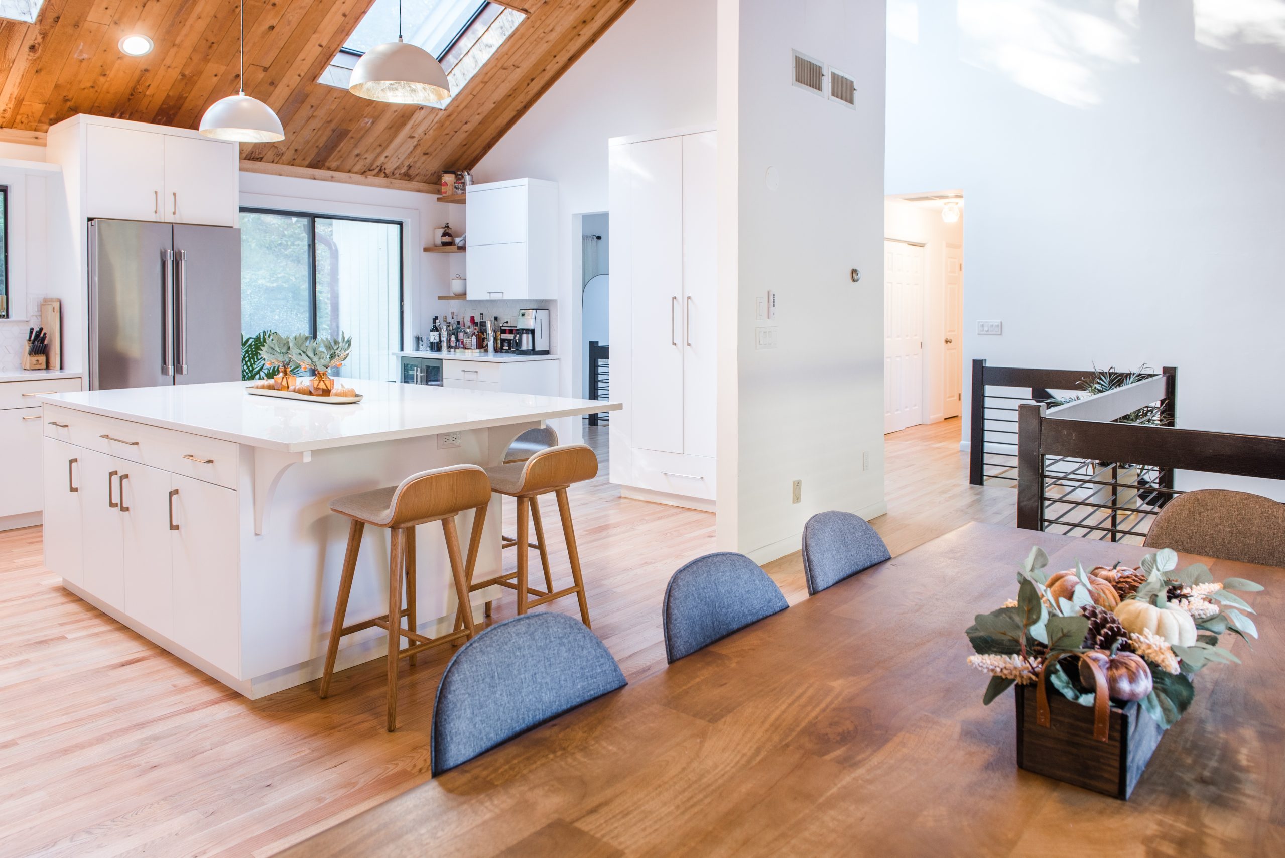
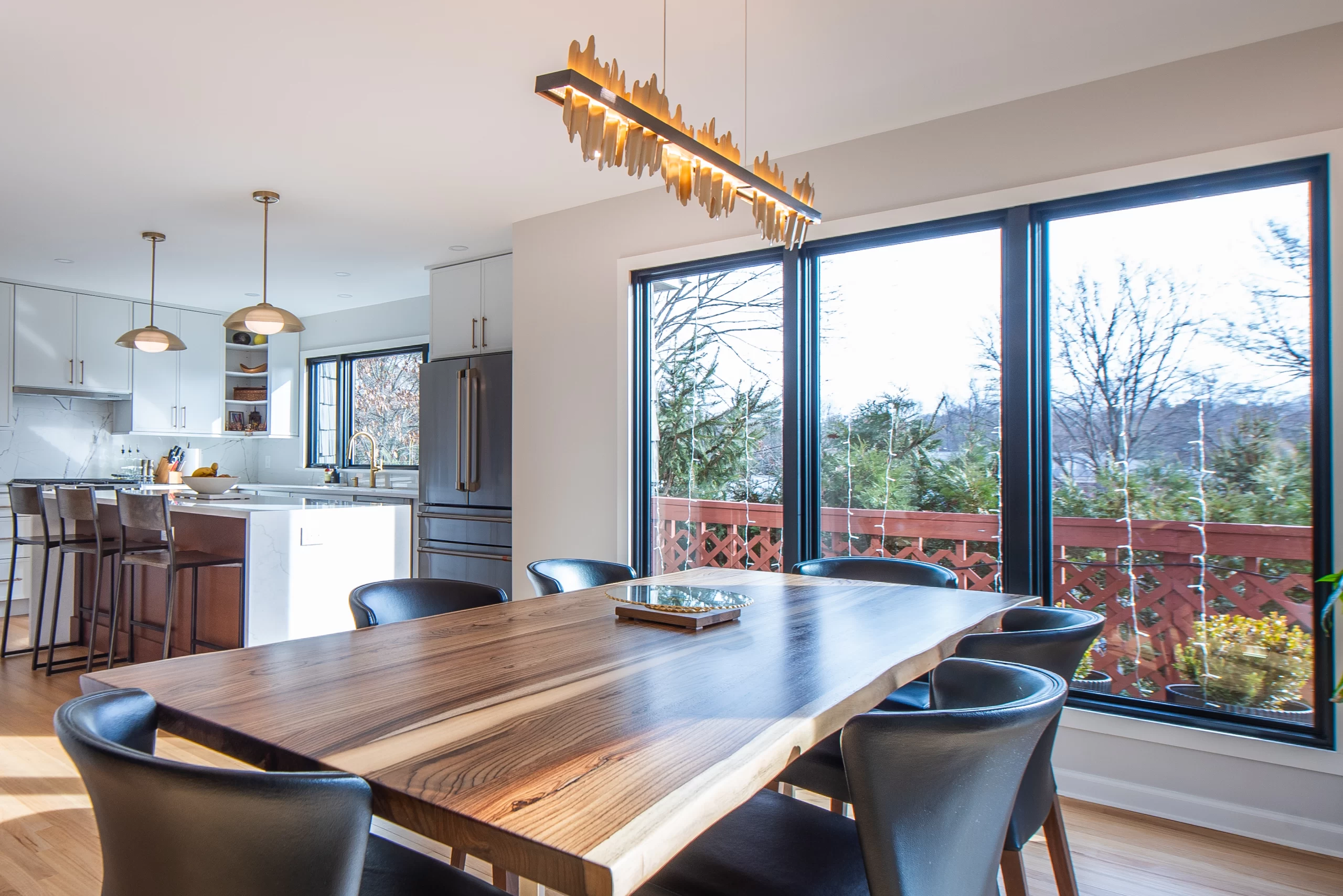
The Kitchen
The kitchen was one of the key spaces driving this renovation. While generous in size, it was visually and physically separated from the dining and living areas, making it feel disconnected from the rest of the home. The original layout reflected the era it was built in—closed off, inward-facing, and structured more around boundaries than use.
Rather than fully opening the space, the solution focused on selective modification. A large wall separating the kitchen from the dining area was partially opened, improving sightlines and allowing light to move more freely through the space while still preserving a sense of separation between zones. This approach maintained the home’s architectural rhythm while addressing the need for connection.
With the new opening established, the kitchen layout was reoriented to take advantage of the improved visibility and flow. A centrally positioned island now anchors the space, supporting both daily use and informal gathering.
VIDEO: WALK THROUGH
Storage and work zones were reorganized to feel more intuitive, reducing visual clutter and allowing the kitchen to function as a natural extension of the surrounding living areas rather than a standalone room. The result is a kitchen that feels open without being undefined, connected without losing structure. It supports how the home is used today while remaining consistent with the original architecture.


Explore how we approach kitchen remodeling in Pleasantville. View our Pleasantville kitchen remodeling services.
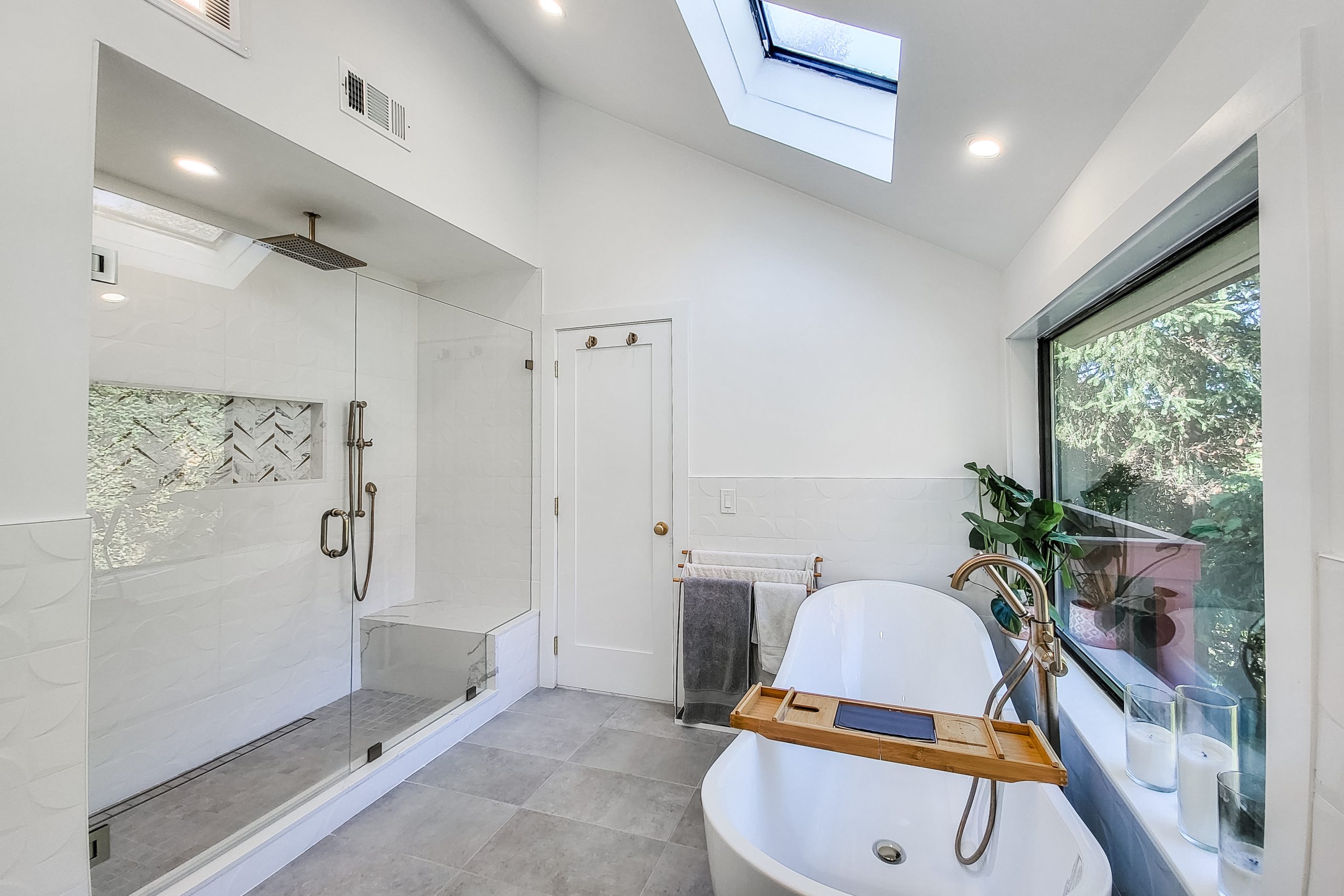
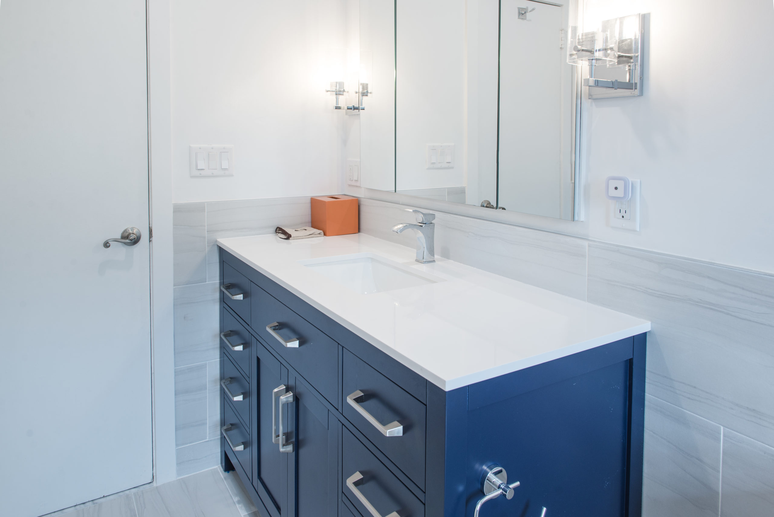
Primary Bathroom Renovation in Pleasantville, NY
The primary bathroom was redesigned with the same philosophy that guided the rest of the Pleasantville renovation — improve function without stripping away character. The original layout felt compartmentalized and dated, with fixtures positioned more out of habit than intention. Circulation was tight, storage was limited, and the room lacked the calm presence the homeowners wanted.


Rather than expand the footprint unnecessarily, we focused on refinement. The shower was reconfigured for better flow and proportion, allowing for a more generous enclosure without overwhelming the space. Plumbing lines were strategically adjusted to improve usability while keeping structural disruption minimal. Every move was deliberate.
VIDEO WALK THROUGH


Material selections followed the architectural tone of the home. Clean lines, restrained finishes, and balanced contrast helped modernize the space while maintaining continuity with the mid-century language throughout the house. The result is a primary bathroom that feels open, grounded, and connected — not like an addition, but a natural evolution of the home. If you’re considering a bathroom remodel in Pleasantville, NY, you can learn more about our bathroom remodeling services in Westchester County and how our design-build process works.
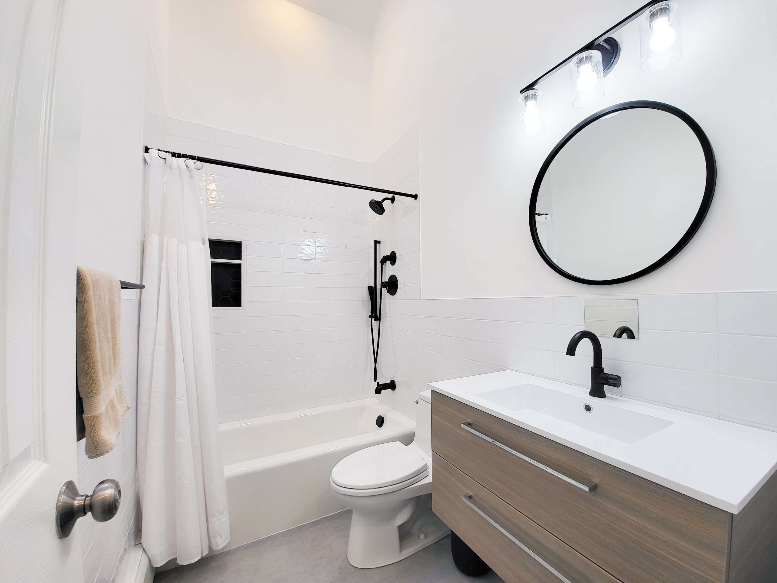
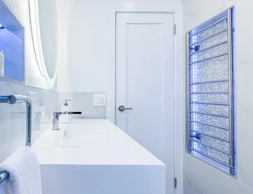
Guest Bathroom Remodel – Mid-Century Modern Update
The secondary bathroom required a different approach. While smaller in scale, it presented its own set of layout challenges. The original configuration lacked clarity — fixtures competed for space, and storage was an afterthought.
Here, the solution centered on efficiency. We reorganized the vanity and shower alignment to create a clearer circulation path and better visual balance upon entry. Storage was integrated thoughtfully rather than added superficially. Every inch was considered.
EXISTING HALLWAY BATH


Finishes were selected to echo the broader Pleasantville renovation while maintaining subtle distinction from the primary suite. The goal was cohesion without repetition. What emerged is a bathroom that feels intentional and proportioned — modern in function, respectful in tone. As part of this full home renovation in Pleasantville, NY, each bathroom was treated as an integral piece of the architectural whole rather than a standalone upgrade reflecting the same thoughtful approach we bring to every bathroom remodeling project in Westchester
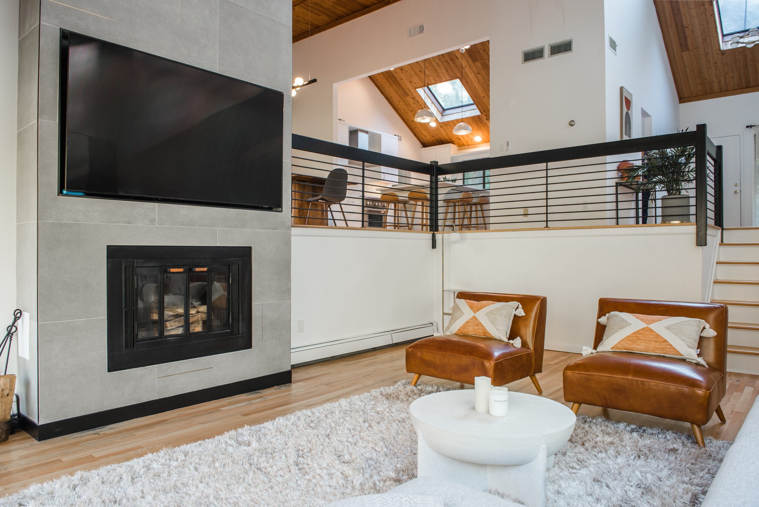
Living Room & Lower Levels
Beyond the kitchen and bathrooms, several supporting spaces throughout the home were refined to improve continuity and flow. These areas did not require major reconfiguration, but they did benefit from selective updates that aligned them with the rest of the renovation.
In the living room, the focus was on softening heavy elements while preserving the room’s original character. The existing stone fireplace, while a defining feature, visually dominated the space. By replacing the oversized stone with a cleaner tile finish, the room immediately felt more balanced and inviting, allowing the architecture and natural light to play a larger role.
Original railings were retained to maintain the home’s midcentury roots, but were updated with a fresh black finish and new balusters. This subtle change brought clarity and cohesion to the main level, tying the living spaces more closely to the updated kitchen and dining areas without erasing their identity.
On the lower levels, improvements focused on livability and flow. Hardwood floors were refinished, layouts were lightly adjusted where needed, and a more cohesive color palette was applied throughout. These updates helped the lower floors feel more connected to the rest of the home, reinforcing a sense of continuity across levels rather than treating them as separate zones.
Together, these supporting updates ensured that the renovation felt complete. While less dramatic than the changes made in the kitchen and bathrooms, they played a critical role in unifying the home and reinforcing the overall design direction.


Closing
This full home renovation in Pleasantville demonstrates how thoughtful structural refinement can elevate a home without compromising its identity.. By focusing on circulation, proportion, and architectural continuity rather than surface-level updates, each space — from kitchen to bathrooms to living areas — now works in harmony. The improvements are not defined by any single feature, but by how the home functions and feels as a complete, cohesive environment.
Behind the finished design is a cabinet system engineered for durability. Explore how professionals evaluate kitchen cabinets.


