Project Description
…”Clear as black and white”…
…”Clear as black and white”…
Kitchen Remodel in Rye NY


The Kitchen — Where the Project Began
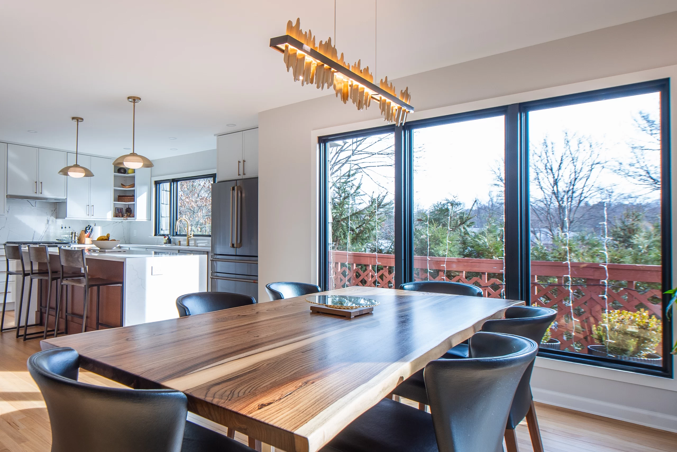
This kitchen remodel in Rye began with correcting a space that had scale but lacked structure. The room was large and well-lit, yet the layout worked against everyday use. Circulation paths were unclear, major elements competed with one another, and storage had been added without hierarchy.
The original planning relied heavily on size to solve problems. Instead, it created them.
Layout Correction & Zoning
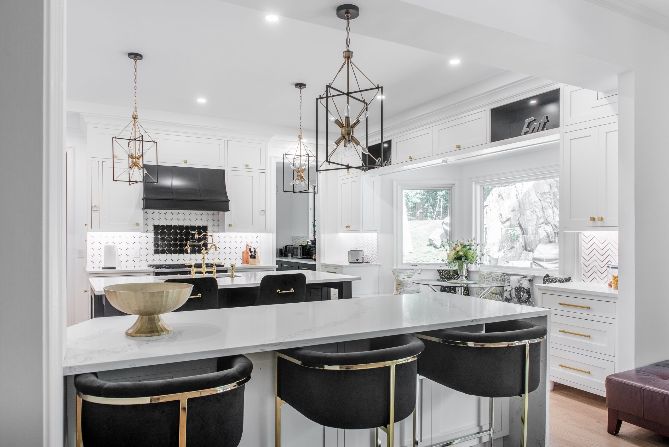
The redesigned kitchen is organized around clear functional zones—prep, cooking, storage, seating, and circulation—each defined without walls or visual clutter.
The island was repositioned and scaled to anchor the room, creating a true working surface rather than a pass-through. Its darker base visually grounds the space while clearly defining the kitchen’s center without interrupting sightlines.
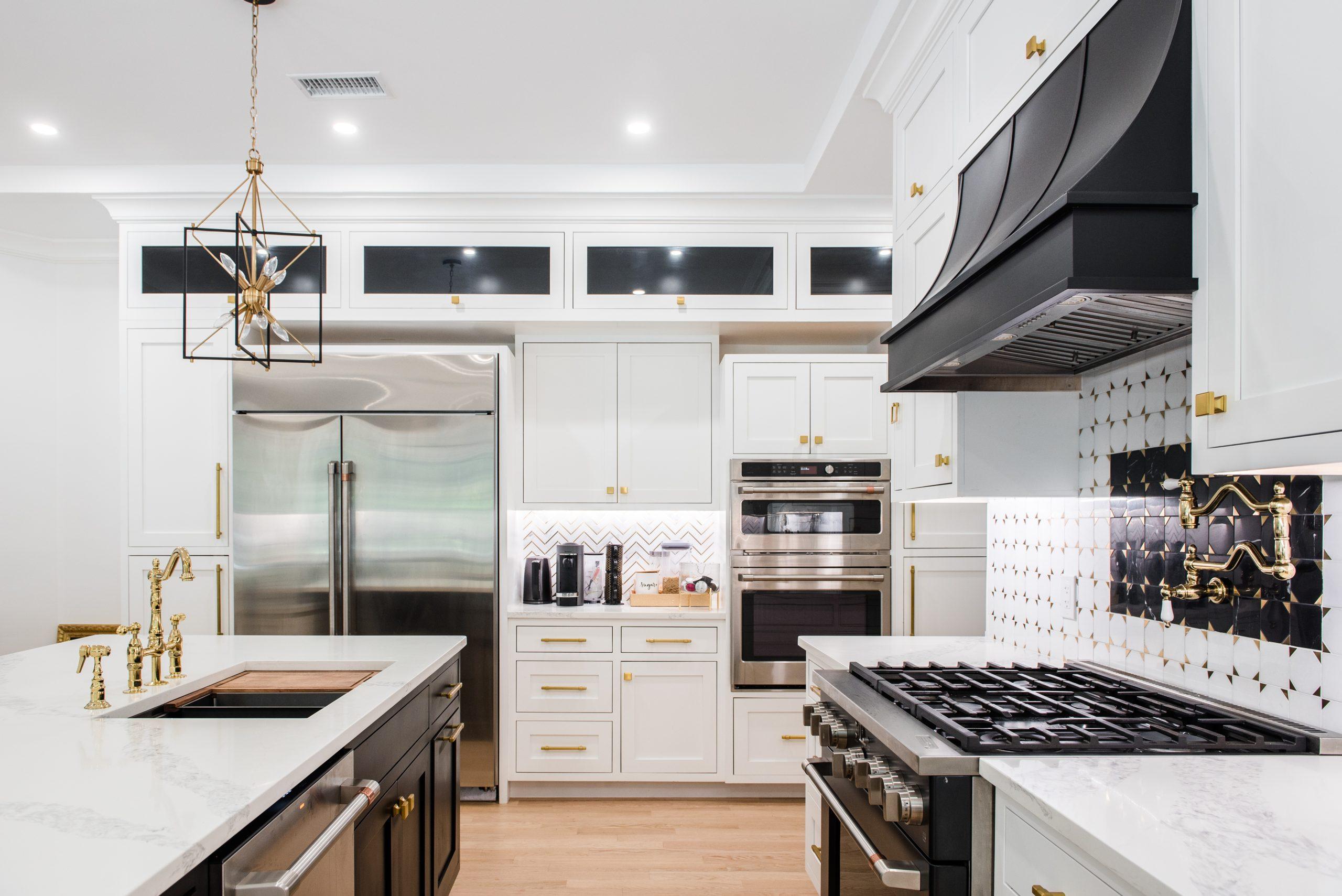
The cooking zone was consolidated and properly aligned, eliminating the former mid-room interruption. The black hood now anchors the wall composition instead of competing with it, restoring balance and improving both workflow and ventilation efficiency.
Storage Strategy (What the Photos Show Clearly)
Inset cabinetry was used to introduce order and consistency, but storage was intentionally redistributed:
Wall cabinetry is no longer overloaded
Tall storage is consolidated
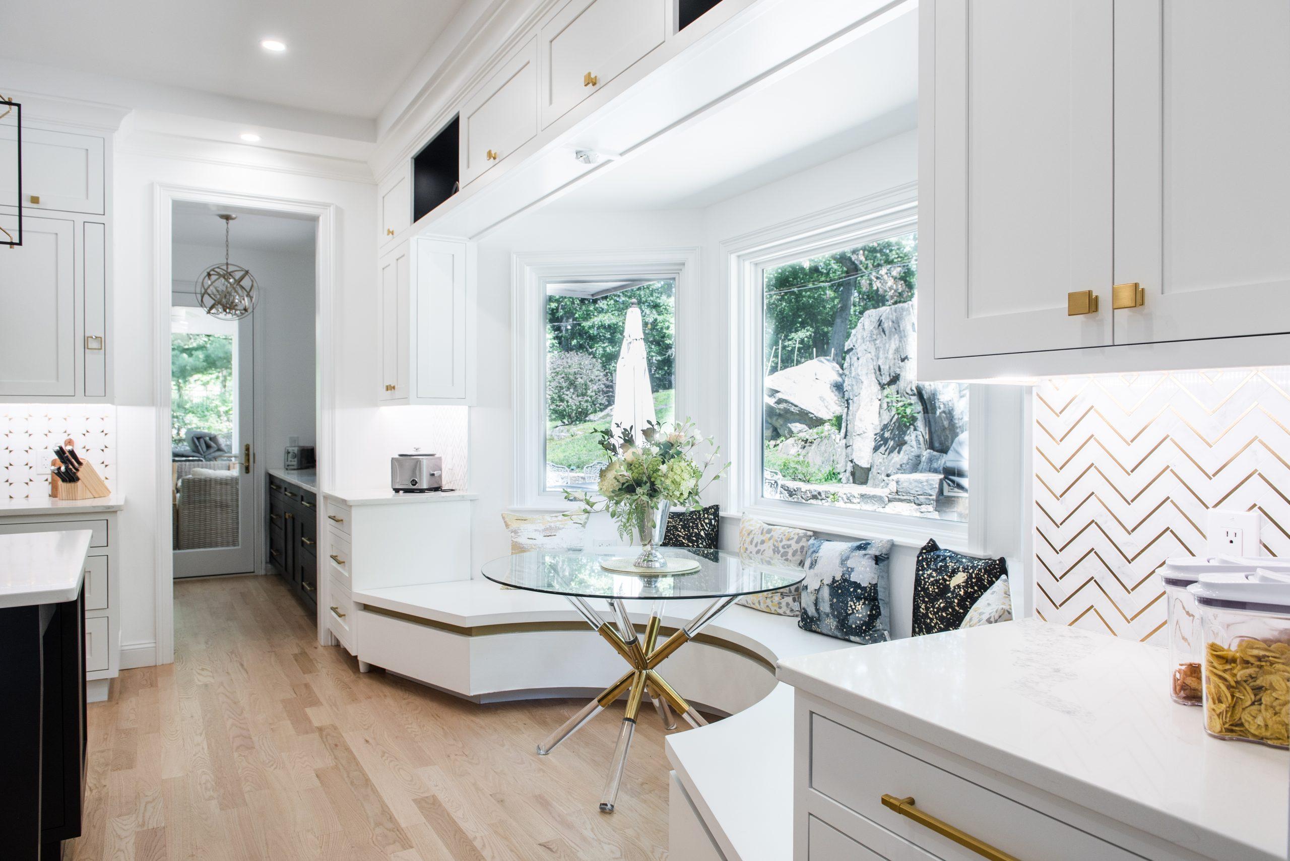
A walk-through pantry absorbs excess function
This allowed the main kitchen to breathe visually while remaining highly functional. The transom-style upper cabinets maintain storage capacity without lowering the ceiling line or overwhelming the room.
Seating & Daily Use
Rather than forcing furniture into leftover space, seating was intentionally built into the architecture. The curved banquette creates a defined, usable dining zone that aligns with the window placement and circulation paths. It supports everyday meals without interfering with kitchen function.
This decision alone corrected one of the biggest planning issues in the original layout: furniture filling gaps instead of spaces being designed for use.
Materials & Visual Discipline
The black-and-white palette was used for clarity, not contrast for contrast’s sake. White cabinetry keeps the perimeter light and consistent, while darker elements—the island base, hood, and select accents—establish visual hierarchy.
Natural wood flooring ties the kitchen back to the rest of the home, preventing it from feeling isolated or overbuilt. Lighting is layered and purposeful, reinforcing work zones without drawing attention to itself.


The Result
The finished kitchen no longer relies on size to function. It relies on planning.
Every visible element in these photos reflects a correction:
Clear circulation
Defined zones
Consolidated storage Seating that belongs
A kitchen that connects to the rest of the home
This is a kitchen designed to be used daily, not just viewed.
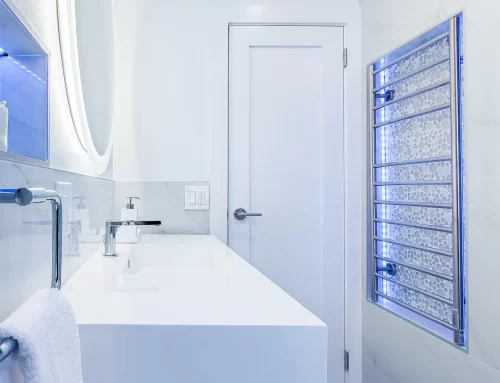
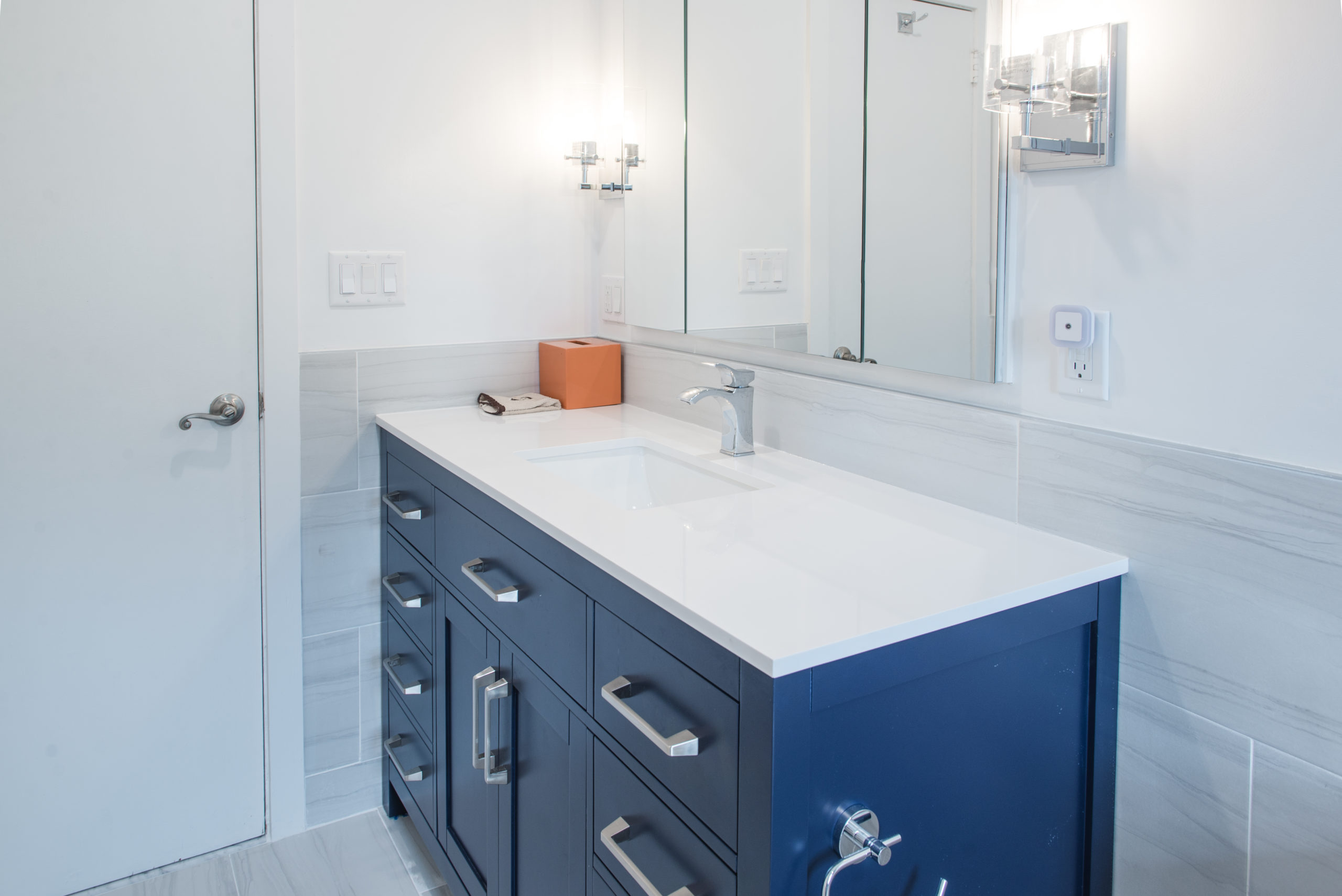
As part of this project, the same planning approach was applied to the primary bathroom, where layout inefficiencies were corrected and daily routines were simplified through better use of space.
View our
Behind the finished design is a cabinet system engineered for durability. Explore how professionals evaluate kitchen cabinets.
View our kitchen remodeling service in Rye NY or explore our full kitchen remodeling services in Westchester County.
Behind the finished design is a cabinet system engineered for durability. Explore how professionals evaluate kitchen cabinets.


