Project Description
…”Clear as black and white”…
…”Clear as black and white”…
BLACK AND WHITE
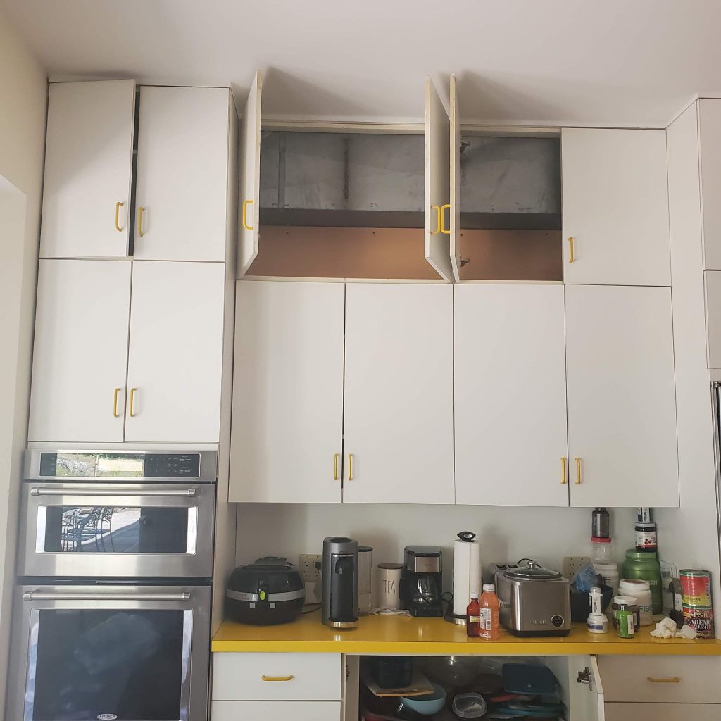
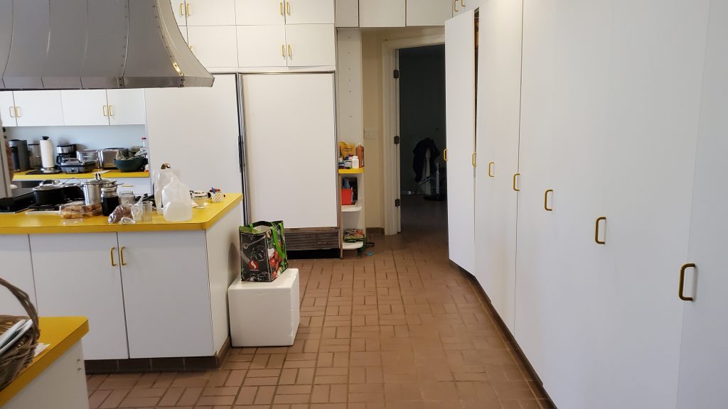
By the time we finally reached the kitchen while walking through the house, we immediately understood why they called us. The rest of the home looked fantastic, but the kitchen—despite being spacious, well-lit, and filled with cabinets—felt completely out of place. A table was awkwardly crammed into a small space under the window, an area clearly not designed for it. Two doors leading outside remained untouched, likely because the layout made them impractical to use.
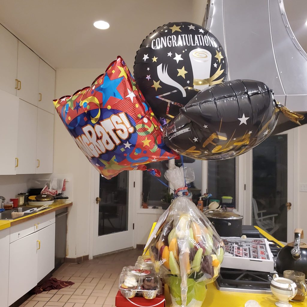
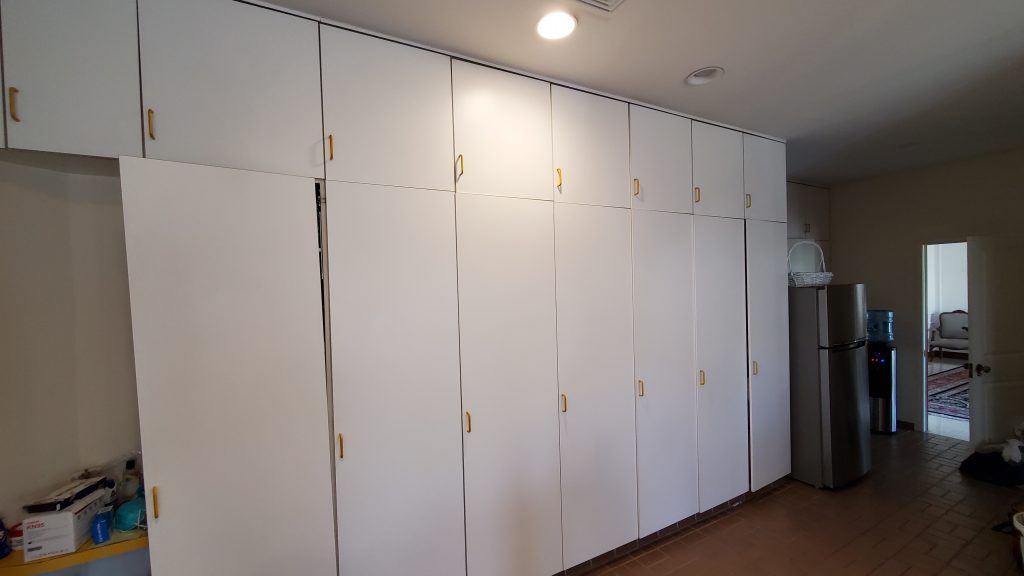
Then there was the oversized laundry room, which separated the kitchen from the dining area. The cooktop was planted right in the middle of the room, with a massive hood dominating the space. While it was certainly a focal point, it sent the wrong message. The builder may have intended to create an open feel and additional counter space, but instead, the cooktop overwhelmed the room, negating any intended benefits.
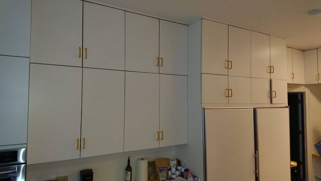
The cabinets stretched all the way to the ceiling, maximizing storage but creating a forest of cabinetry without any real design intent. The kitchen itself felt isolated, cut off from the rest of the home. To reach the dining or family room, you had to embark on what felt like a small journey—hardly ideal for a connected, functional living space.
On top of that, the cabinets were deteriorating, and some appliances were already on their last legs. The homeowners knew it was time for a change. More than just a renovation, they wanted a kitchen that truly reflected their style, complemented their home, and elevated its overall aesthetic.
The Transformation
During our consultation, it became clear that this remodel required a dramatic transformation. The homeowners had a wish list, and we were ready for the challenge. It was complex, but this is exactly what we live for.
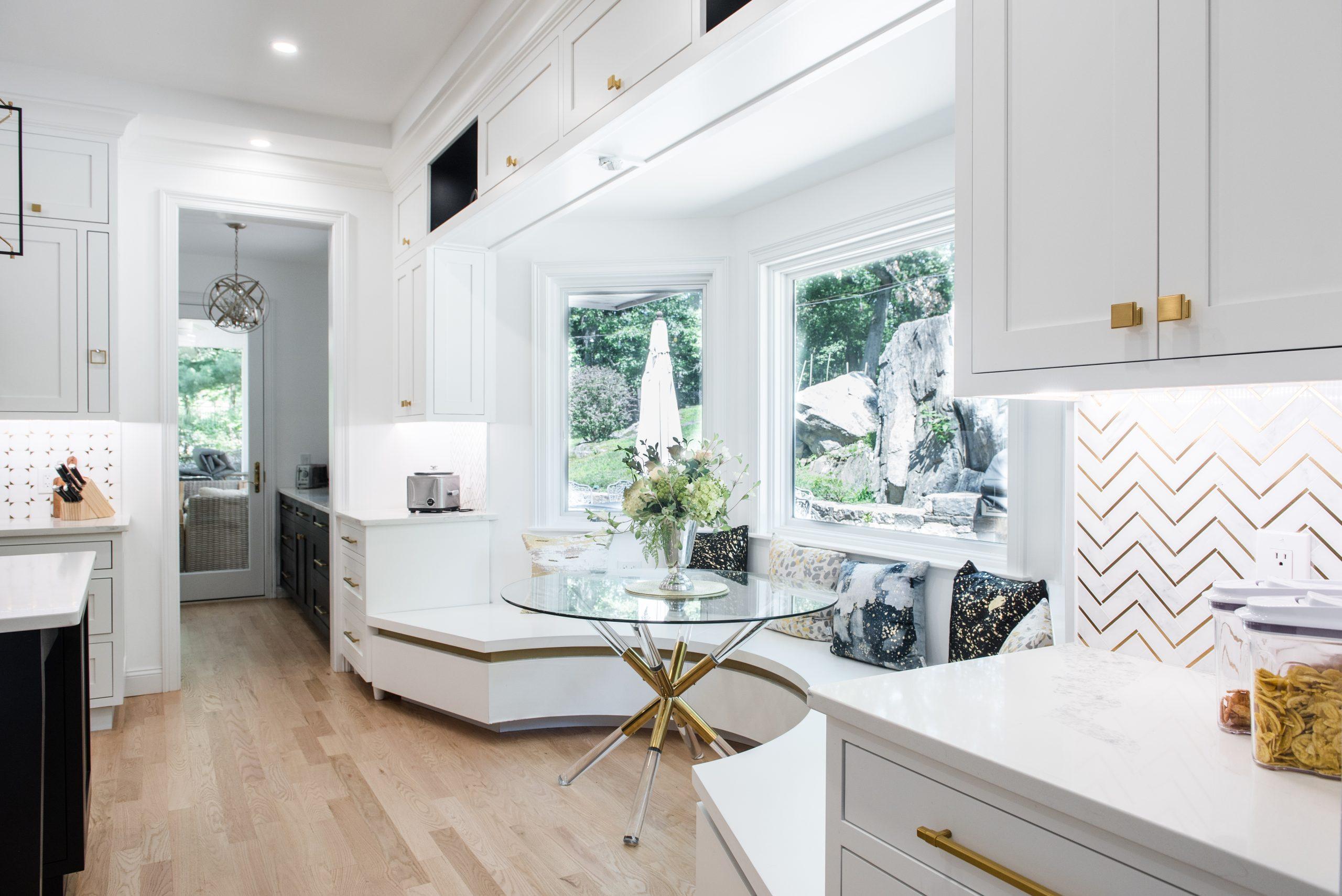
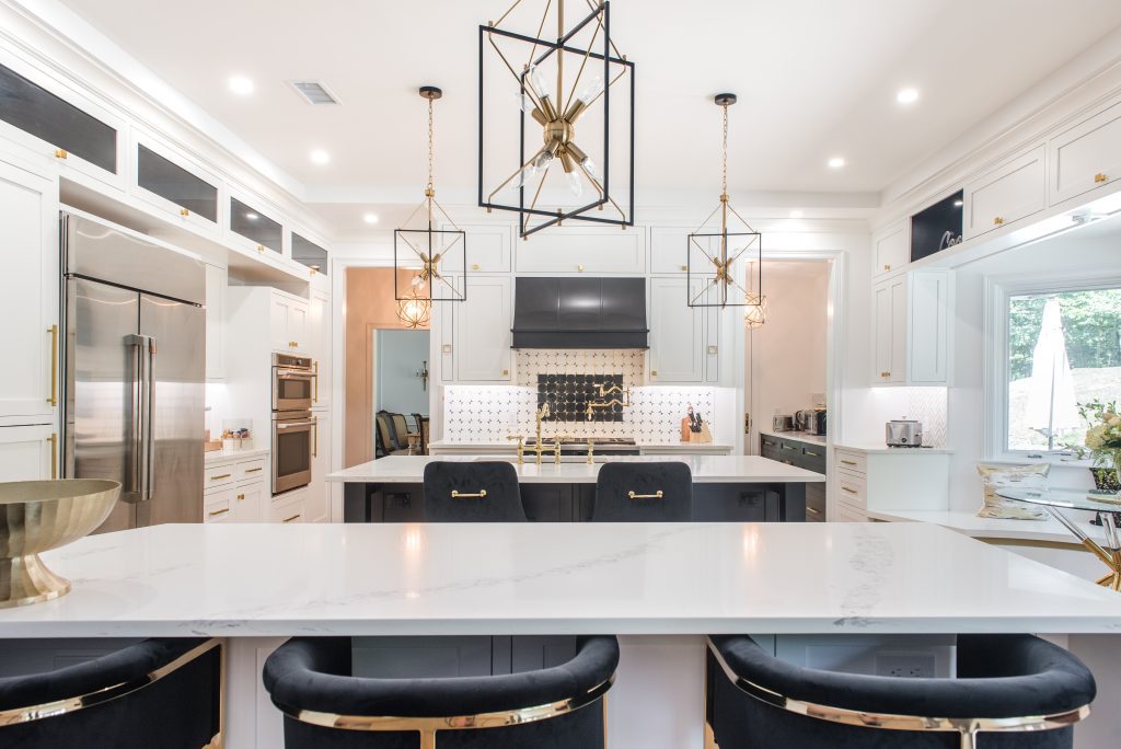
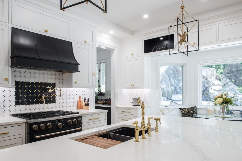
Our design plan called for removing the wall between the family room and kitchen, instantly opening up the space. We also closed off the two underutilized kitchen doors and reimagined the oversized laundry room. We divided it into three functional sections: a wet bar/pantry leading to the dining room, a hallway with a new door leading outside, and a compact but highly efficient laundry space. The awkward nook under the window was transformed into a stunning curved banquette in white with elegant brass inlay details.
By creating a walk-through pantry, we were able to reduce the overwhelming amount of cabinetry, allowing us to craft a serene, well-balanced kitchen. Now, cooking could be an interactive experience—whether engaging with family at the island, the peninsula, the banquette, or the adjacent family room. The new design fostered connection while maintaining distinct functional areas.
The Design Details
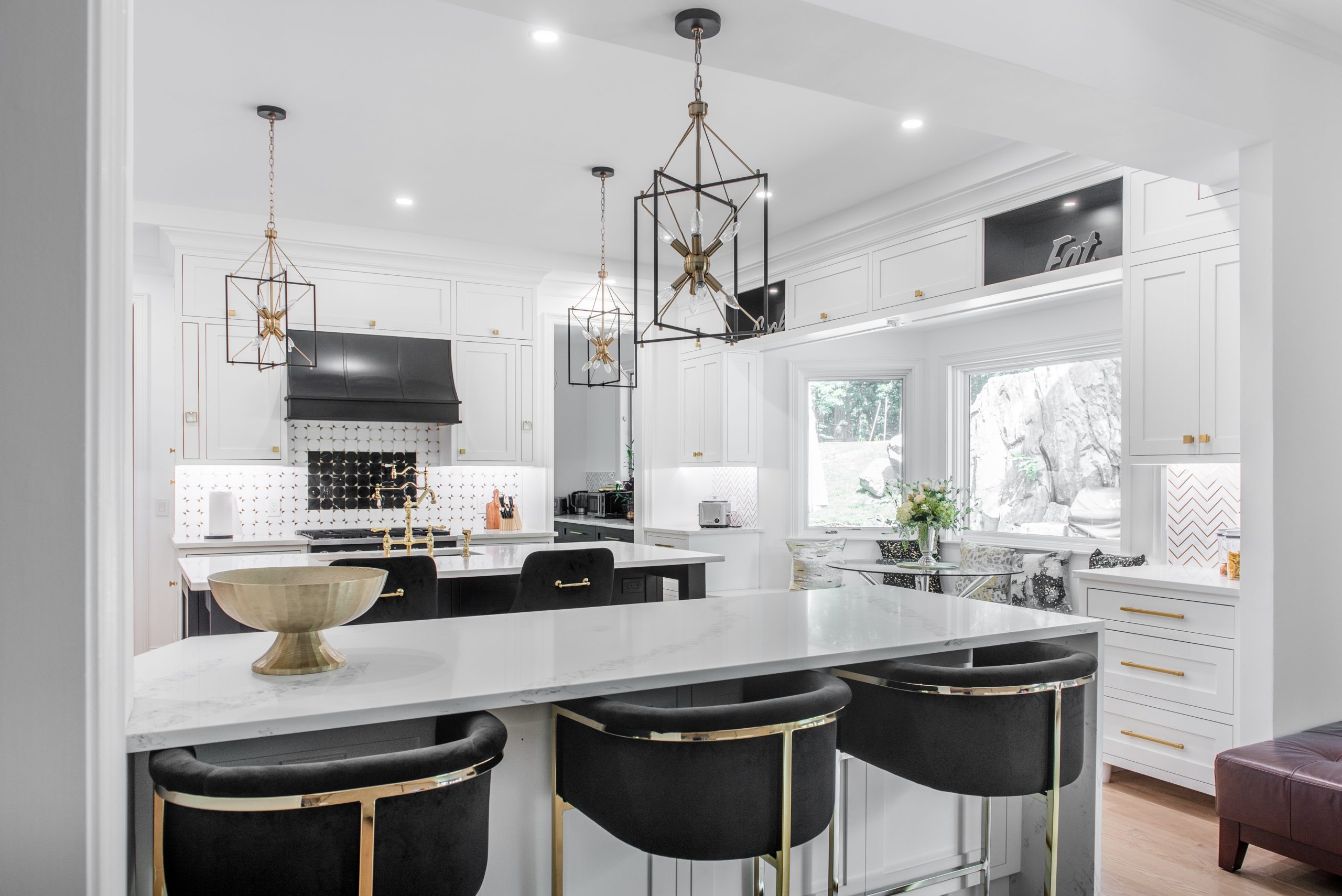
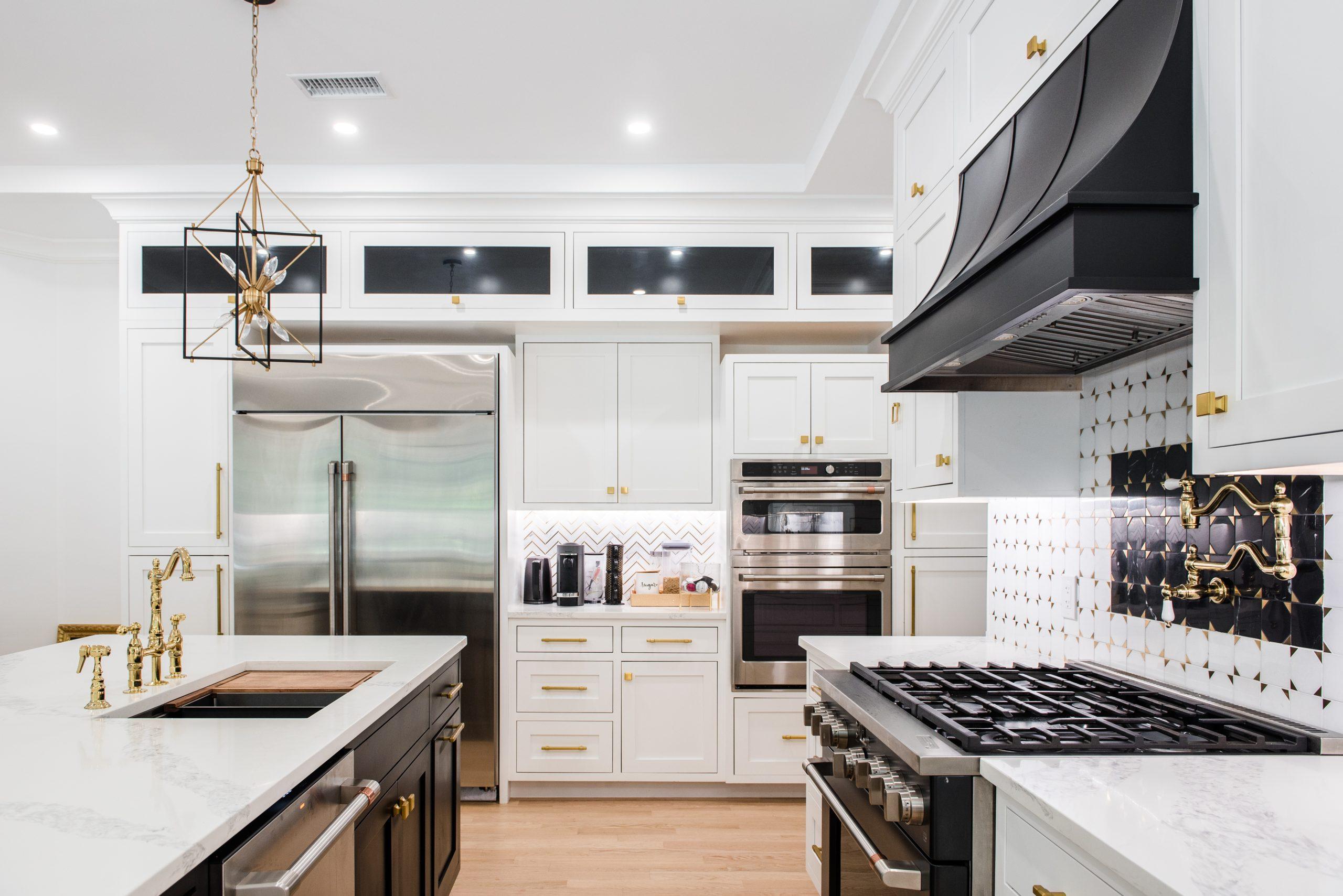
We embraced a classic black-and-white theme with inset cabinetry, pull-out accessories, a bold black hood, brass hardware, and brass pendants. The finishes were exquisite—every surface carefully selected to balance sophistication with warmth. The cabinetry, with its smooth, hand-finished detailing, gave a timeless elegance to the space, while the brass hardware added a touch of refined luxury.
One of the most striking elements of the renovation was the natural wood flooring. Lightly sanded to highlight its organic beauty, the floors introduced warmth and texture, grounding the kitchen and seamlessly tying it into the rest of the home. The natural grain of the wood brought an authenticity to the space, enhancing its charm and inviting nature.
Lighting played a crucial role in defining the atmosphere. The carefully chosen brass pendants above the island not only provided focused illumination but also served as elegant design statements. Under-cabinet lighting added a soft, ambient glow in the evenings, creating a cozy yet sophisticated mood. Large windows bathed the kitchen in natural light during the day, making the space feel airy and fresh, reinforcing the sense of openness we worked so hard to achieve.
A Masterful Upgrade
The laundry room, though smaller, was carefully planned to maximize functionality. It featured a sink, ample storage, and countertops for folding. Two pocket doors with beautiful milky-white glass added a sophisticated touch, ensuring the space remained stylish even when closed off. The new layout also created a seamless hallway leading to both the dining room and the outdoor area. And when entertaining? Simply slide the doors shut, keeping the laundry tucked away.
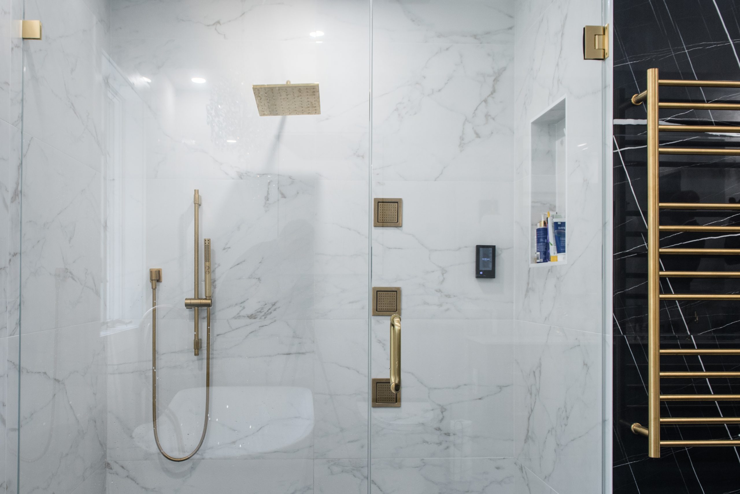
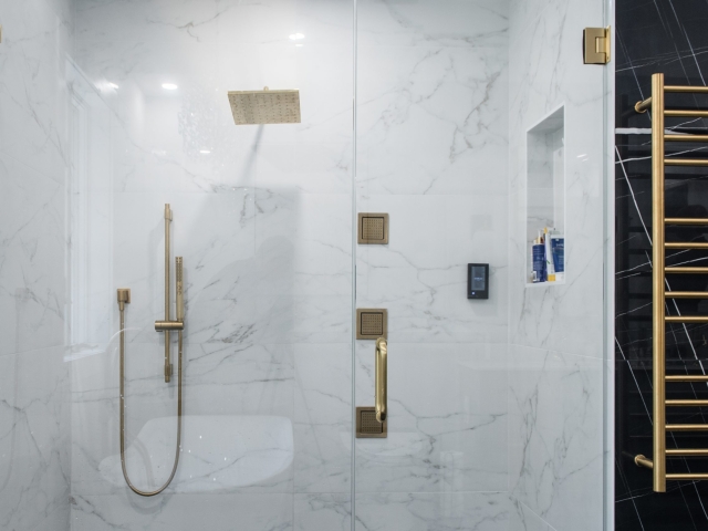
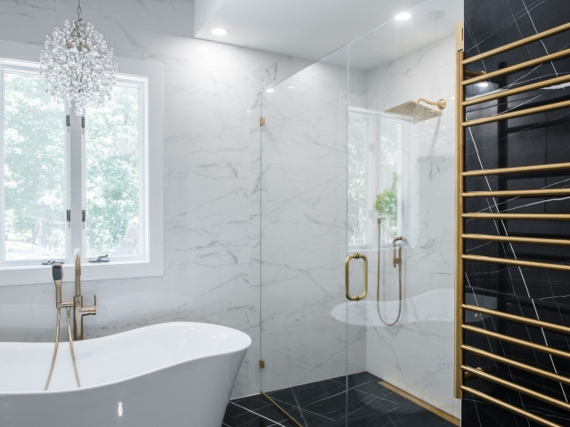
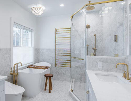
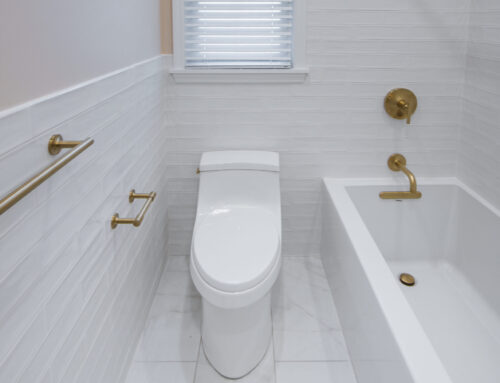
The master bathroom also received a luxurious update. Have you ever considered having your own private laundry inside your master suite? No need to leave the room—pure convenience at its finest. With the right design, anything is possible, especially when space is utilized wisely.
Now, the homeowners are thrilled, enjoying their beautifully transformed space. Their kitchen is no longer just a place to cook—it’s a place to gather, to entertain, to create memories.
If you’ve ever walked into your kitchen and felt like something wasn’t quite right, if you’ve dreamed of a space that truly reflects your style and enhances the way you live, we can help. This transformation is proof that a home should work for you, not against you. Your dream kitchen is possible—it starts with a vision, and we’d love to bring it to life. Let’s create something beautiful together.
Onto the next project—another happy client!


