Project Description
…Midcentury modern with a Scandinavian flair”…
…Midcentury modern with a Scandinavian flair”…
MIDCENTURY MODERN GETS A SCANDINAVIAN UPGRADE
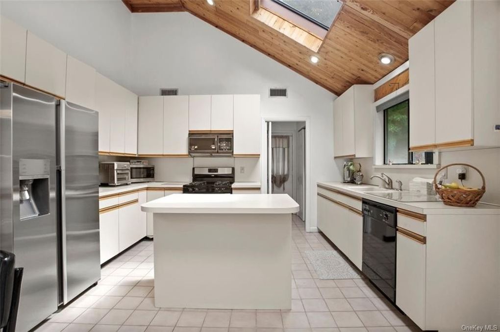
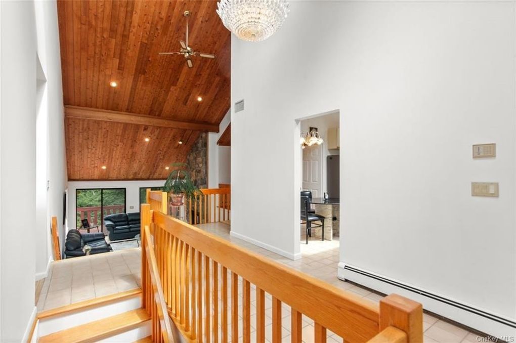
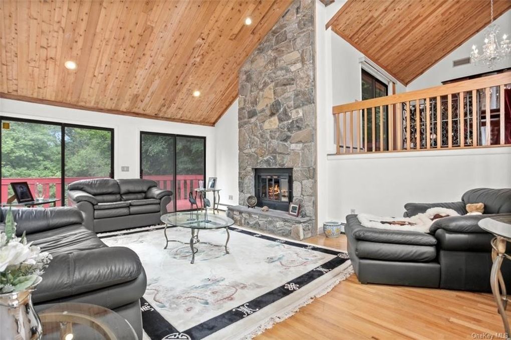
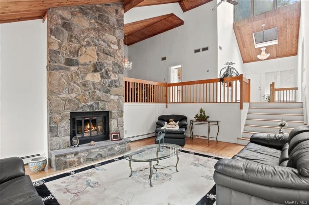
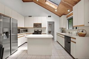
This mid-century home was not only well-maintained but also a testament to timeless design. Originally built in the 1980s, it featured a strong architectural foundation with details that defined its era. From the floor-to-ceiling stone fireplace to the tongue-and-groove cedar-paneled ceiling that followed the dramatic sloped roofline, every element contributed to its unique character. The kitchen boasted classic slab white cabinets with wood pull handles—an unmistakable hallmark of midcentury style. One of the most intriguing features was the loft in the main bedroom, accessed via a ladder, which served as a compact office space.
Despite its seemingly modest exterior, the home unfolded into a surprising multi-level layout with two lower floors, creating an expansive yet intimate living experience. This layout, though unconventional by today’s standards, provided an excellent opportunity to reimagine the space while staying true to its architectural integrity.
BEFORE PHOTOS
When we arrived for the initial consultation, we were immediately captivated by the home’s potential. Our approach to the renovation was twofold: honor the original architectural vision while modernizing the space to meet contemporary functionality and aesthetic expectations. The result? A sophisticated blend of midcentury character and Scandinavian-inspired refinement.
Opening Up the Kitchen: Merging Functionality with Architectural Integrity
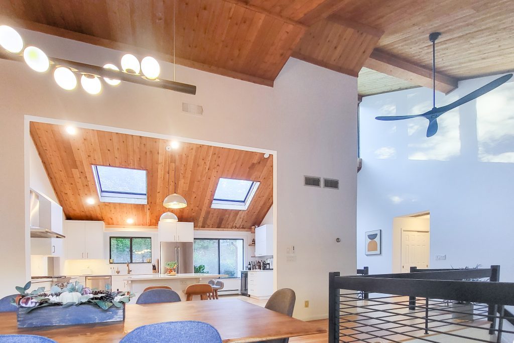
In the 1980s, kitchens were often closed off from the rest of the home—a stark contrast to the open-concept layouts we see today. For this family, visibility and connectivity were essential, but completely removing all barriers wasn’t the right solution. Instead, we took a surgical approach to restructuring the space.
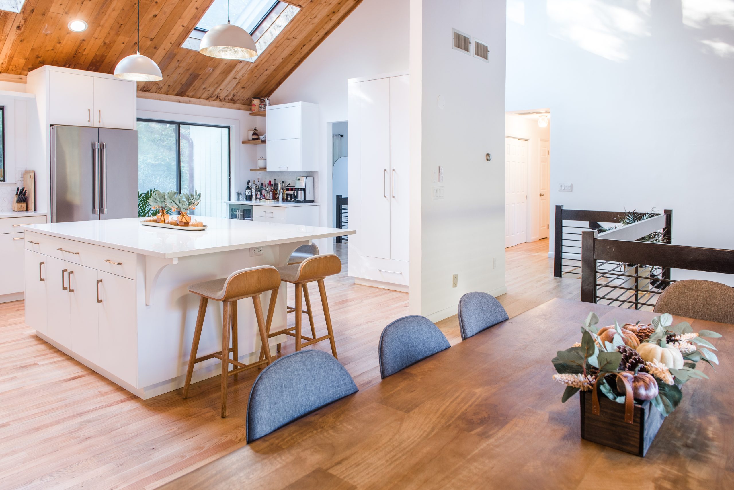
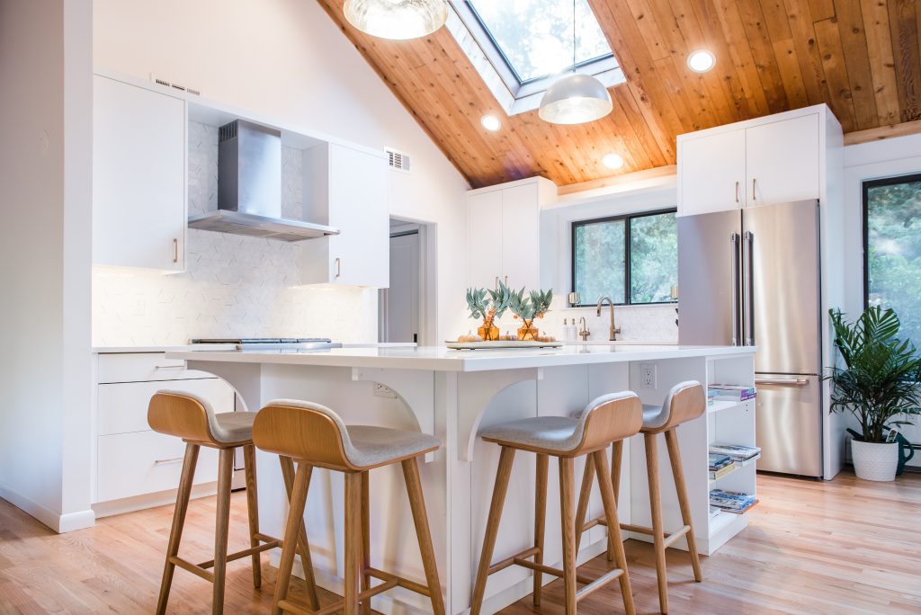
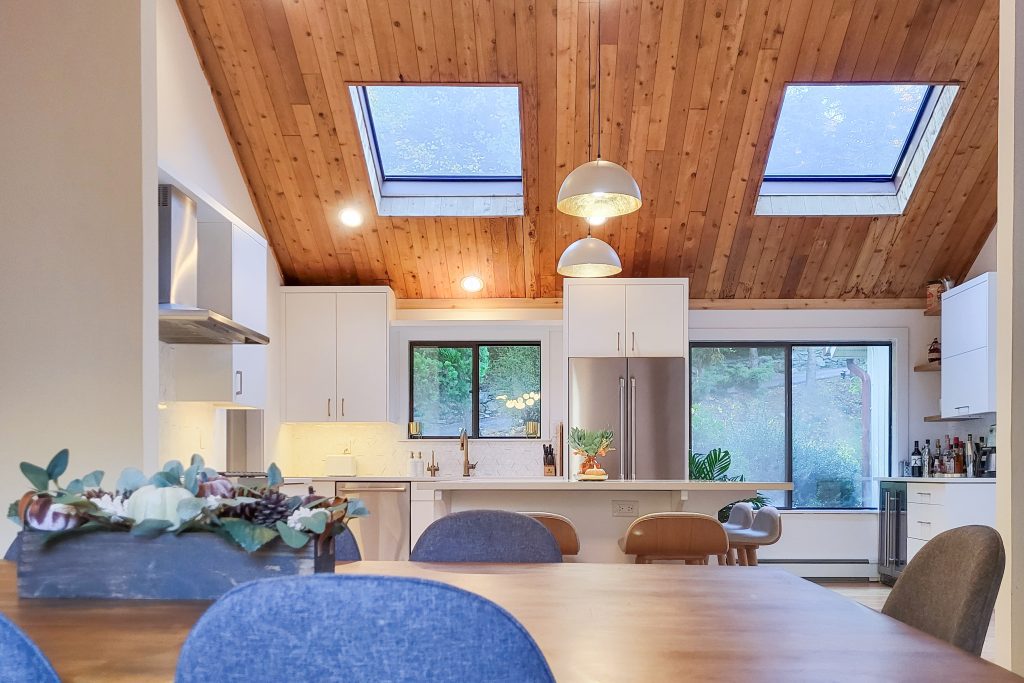
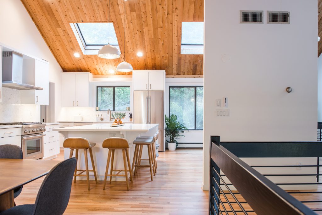
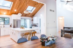
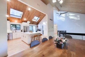
A massive 25-foot-tall wall that separated the kitchen from the dining area was strategically modified. We carved out a 10-foot-tall opening to enhance sightlines while maintaining enough structure to preserve the home’s distinct zones. This not only highlighted the stunning cedar ceiling but also revealed previously hidden backyard views, including two decks and a lush landscape. We then reoriented the kitchen layout to maximize this newfound visual connection, placing a statement island at its heart—perfect for both casual meals and entertaining.
BEFORE/AFTER SLIDE:

Elevating the Bathrooms: A Fusion of Comfort and Luxury
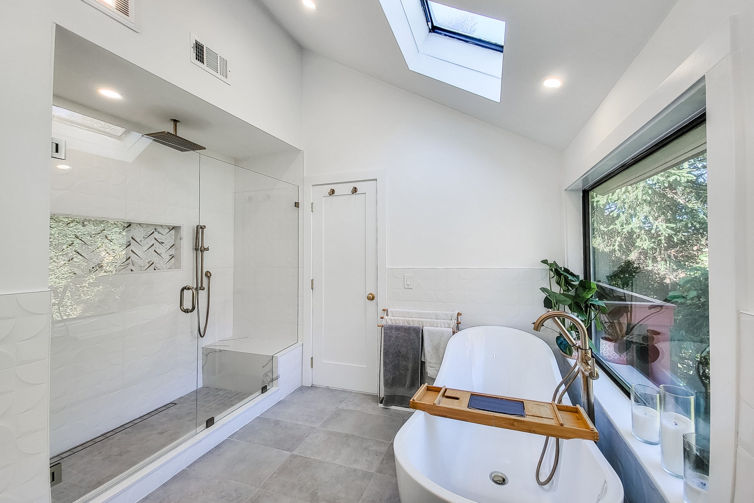
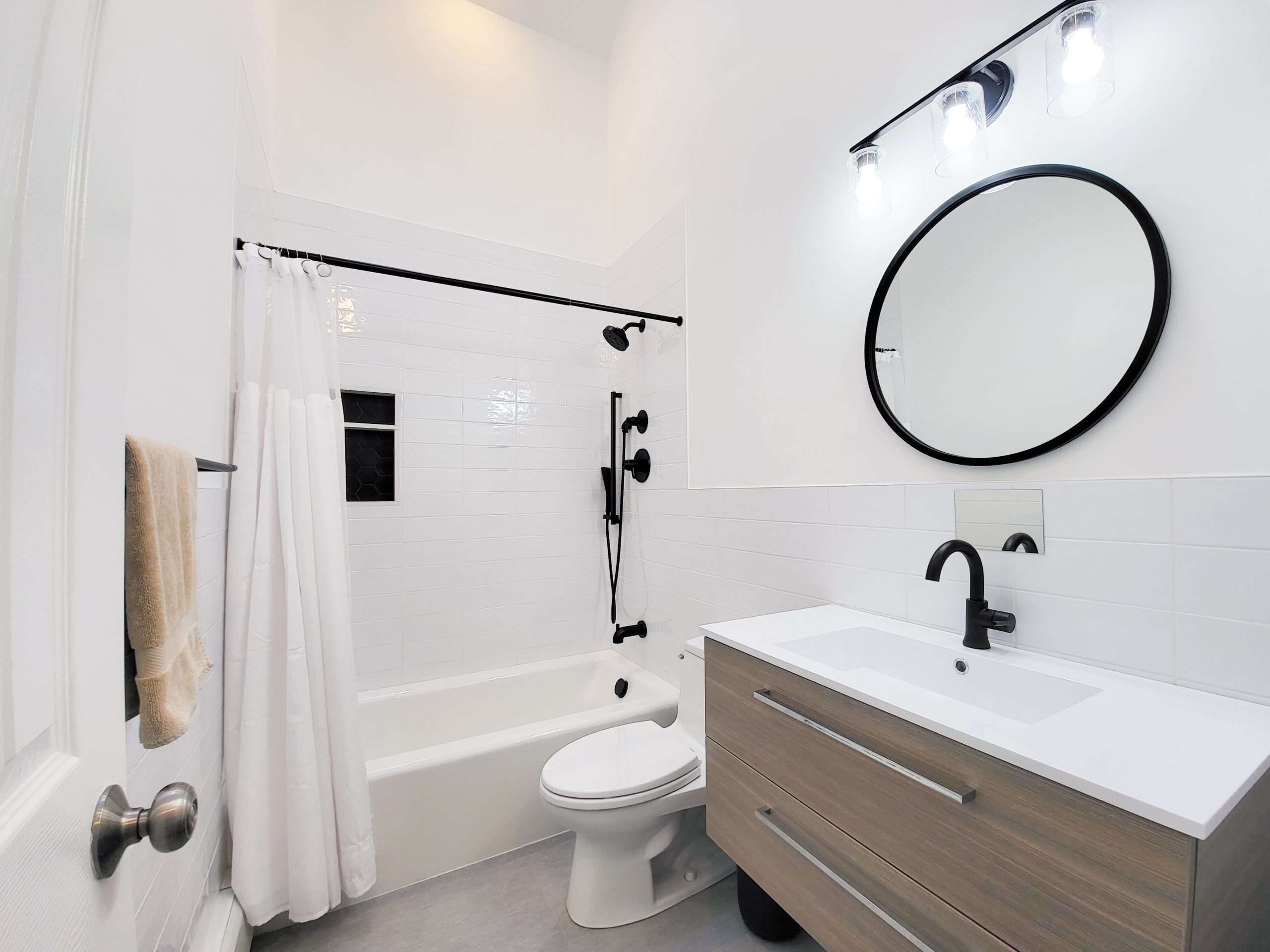
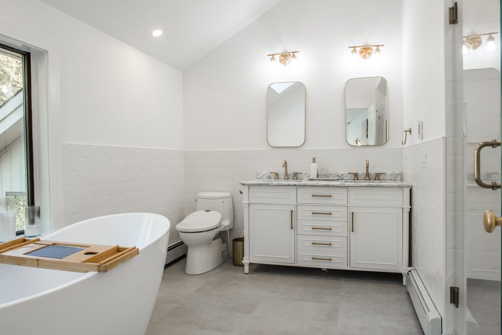
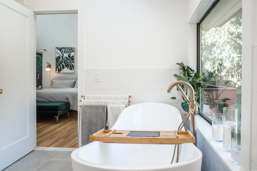
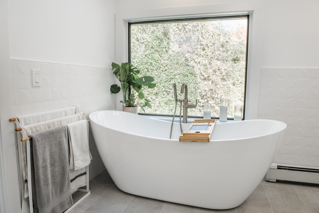
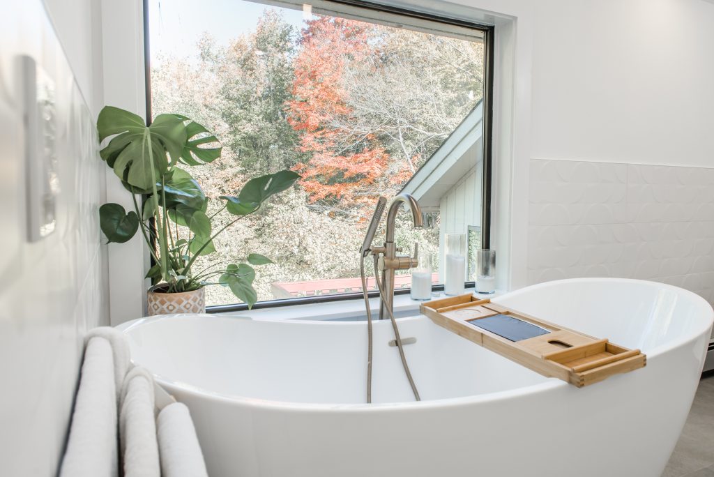
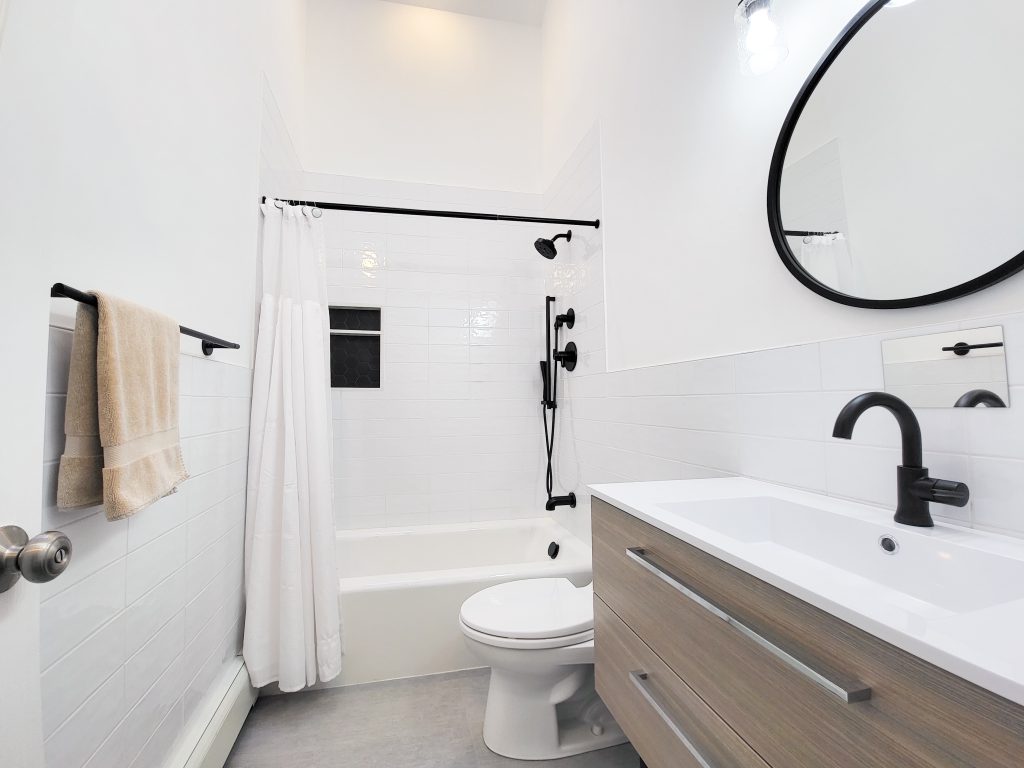
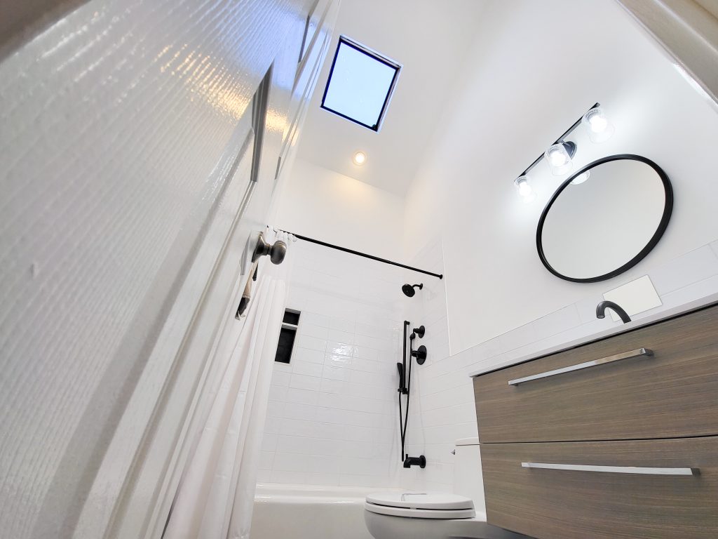
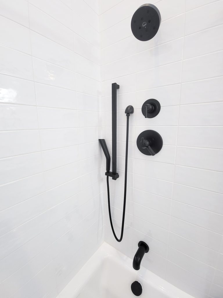
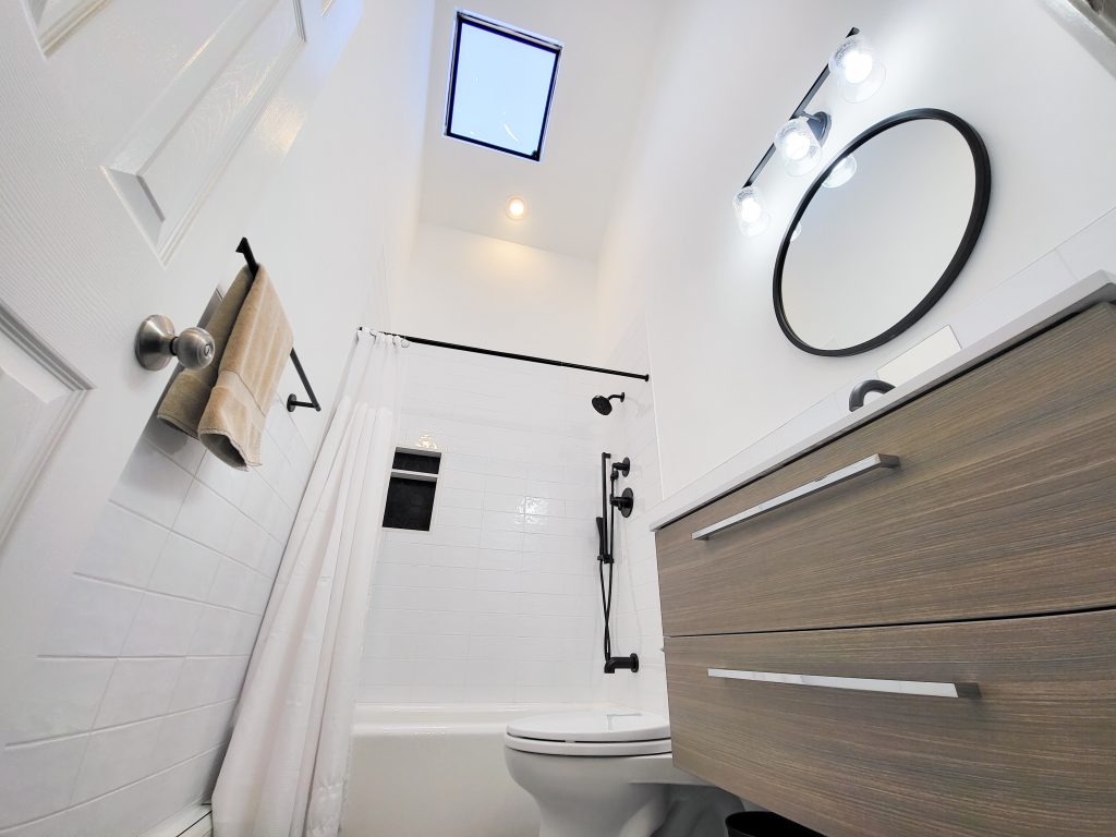
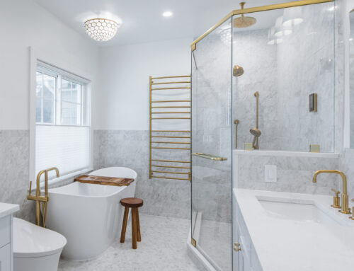
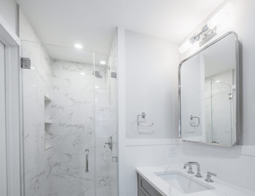
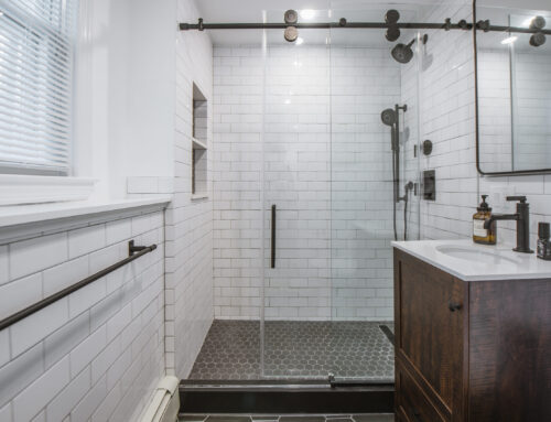
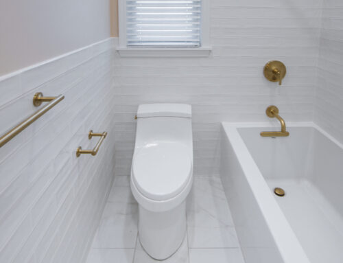
The bathrooms required more than just surface-level updates—they needed a complete transformation. We implemented high-end finishes, modern fixtures, and luxurious heated flooring to enhance both comfort and style. The master bath was designed to be a calming retreat, featuring natural materials and warm tones that complemented the home’s existing aesthetic. In contrast, the hallway bath took on a bold black-and-white theme, adding a striking visual impact while maintaining cohesion with the overall design.
Our client played a vital role in curating the finishes, ensuring that each space felt personalized and cohesive with the home’s refreshed aesthetic.
Revitalizing the Living Room: Subtle Changes, Dramatic Impact
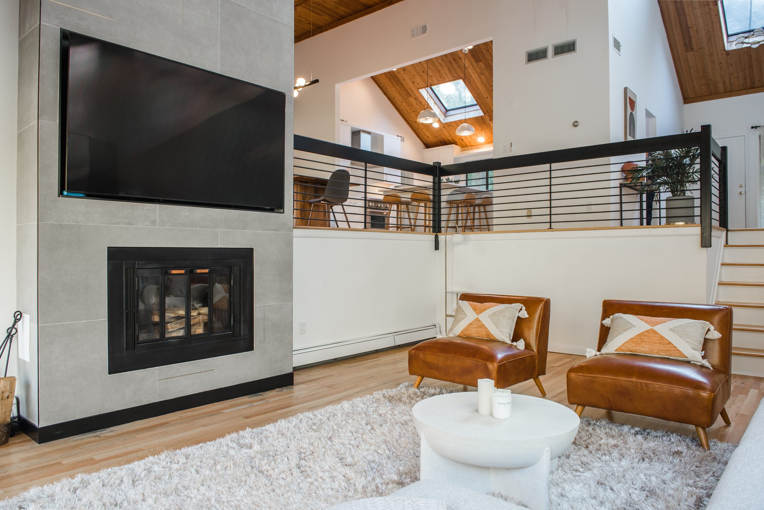
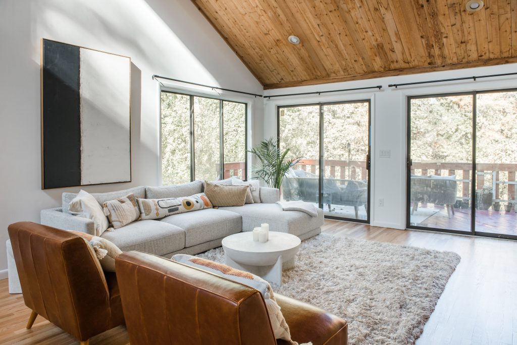
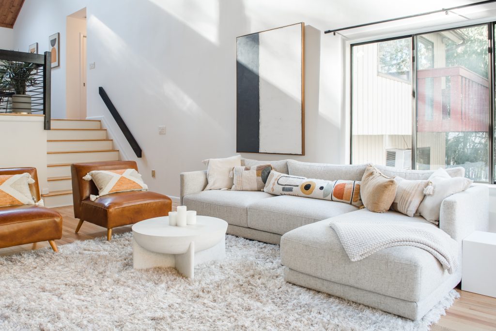
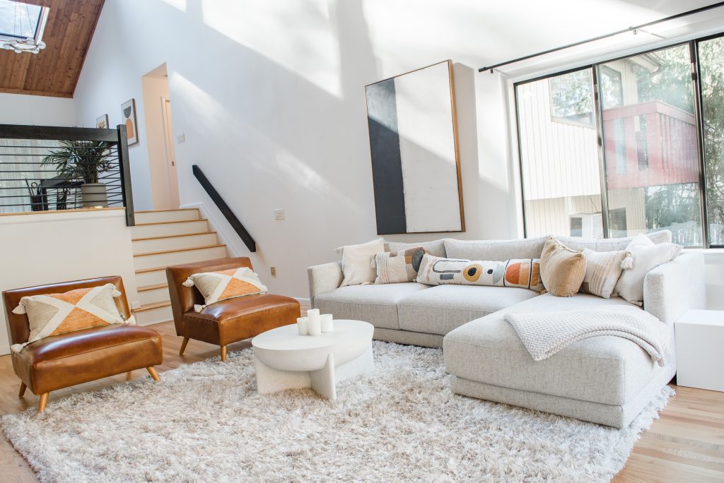
The living room’s grandeur was overshadowed by its heavy, outdated stone fireplace. By replacing the massive boulders with a sleek tile facade, we instantly softened the space, making it feel more inviting and sophisticated.
To maintain the midcentury essence, we retained the original railings but gave them a modern update with a fresh black finish and new balusters. This seemingly small change had an outsized impact, bringing a sense of refinement and cohesion to the entire first floor.
Transforming the Lower Levels: Maximizing Space and Flow
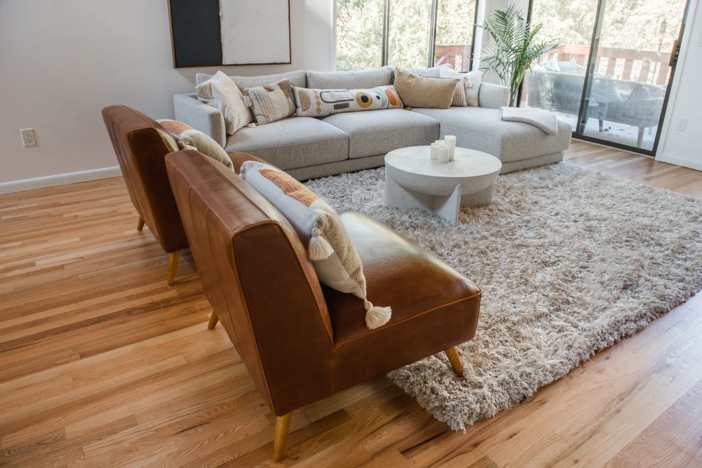
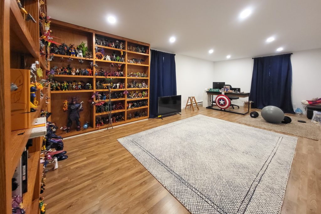
On the lower floors, we focused on optimizing space and enhancing livability. We refinished the hardwood floors, reconfigured certain areas for better functionality, and applied a fresh, modern color palette throughout. These updates not only improved the flow of the home but also made it feel more expansive and inviting.
Another Masterpiece Completed—Could Yours Be Next?
This renovation exemplifies how strategic design choices can breathe new life into a home, preserving its history while enhancing its functionality and aesthetic appeal. Whether you’re a homeowner looking to modernize your space or a design professional seeking inspiration, this project proves that a well-executed remodel can transform even the most challenging layouts into something extraordinary.
Looking to revitalize your home? Let’s make your vision a reality. Contact us today to start your transformation!


