Project Description
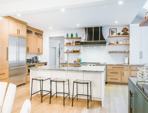
The new modern
ADDITIONAL VIEWS AND DETAILS:
SEE THE “BEFORE” PHOTOS:
TRANSFORMATION VIDEO:
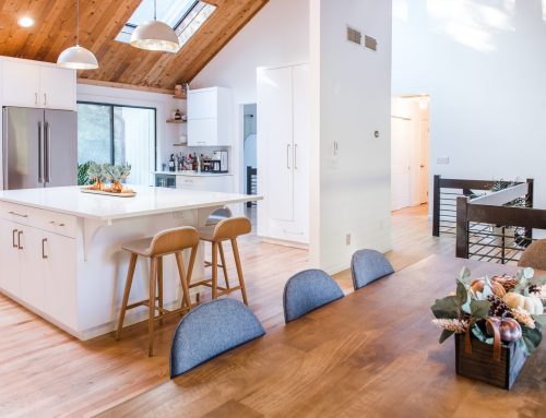
“RAISE THE ROOF!”
Well in this case, “raise the Angled ceiling”.
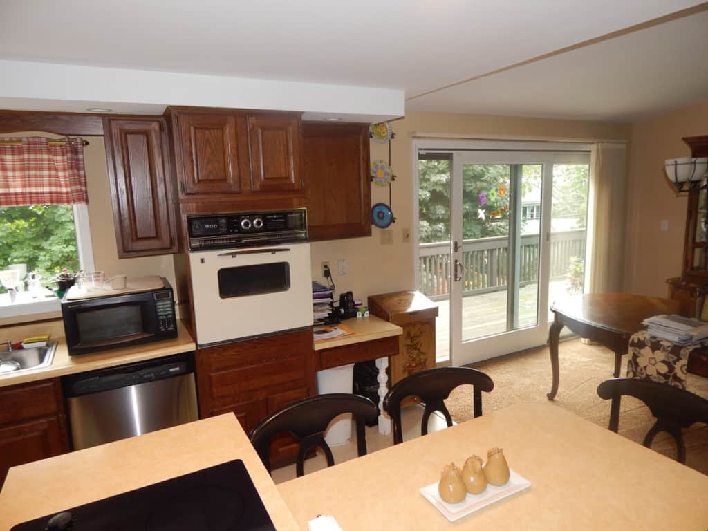
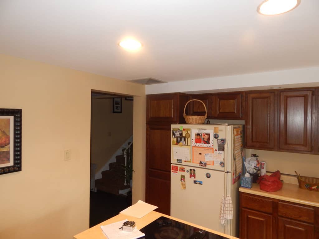
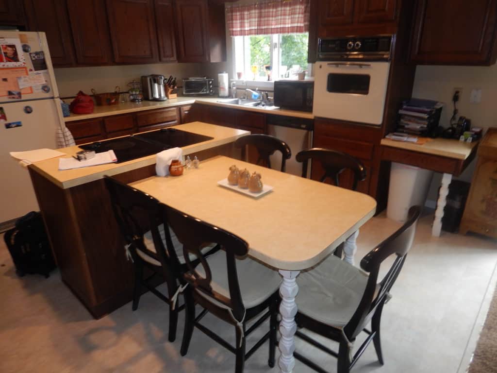
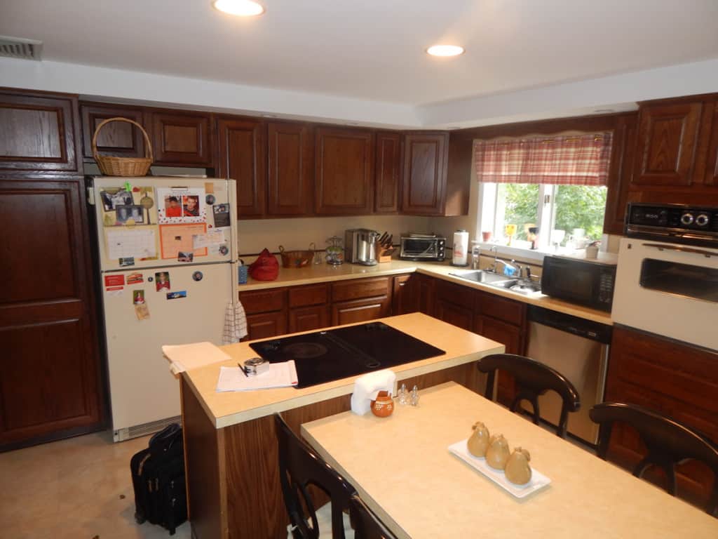
This kitchen was the original kitchen that came with the house. Yes, the house was assembled on site! Not to mistake this for anything but fascinating. Great footprints and good bones, pretty nice house if I might add, but the kitchen time was up! Her number was called and it was time for her to go!
I am still today very impress with this client. She was so organized. She had everything written down, her needs her wants and her wishes. Yes the excel spread sheets and the schedules as well.
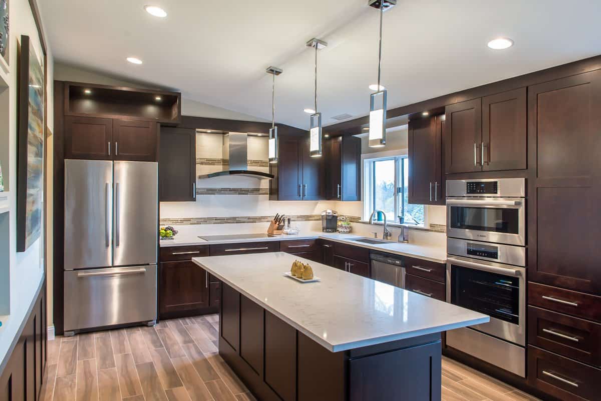
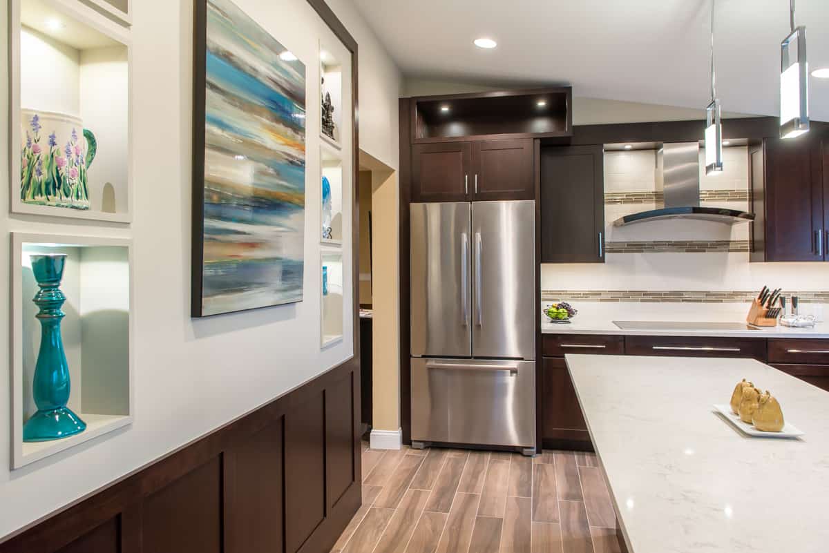
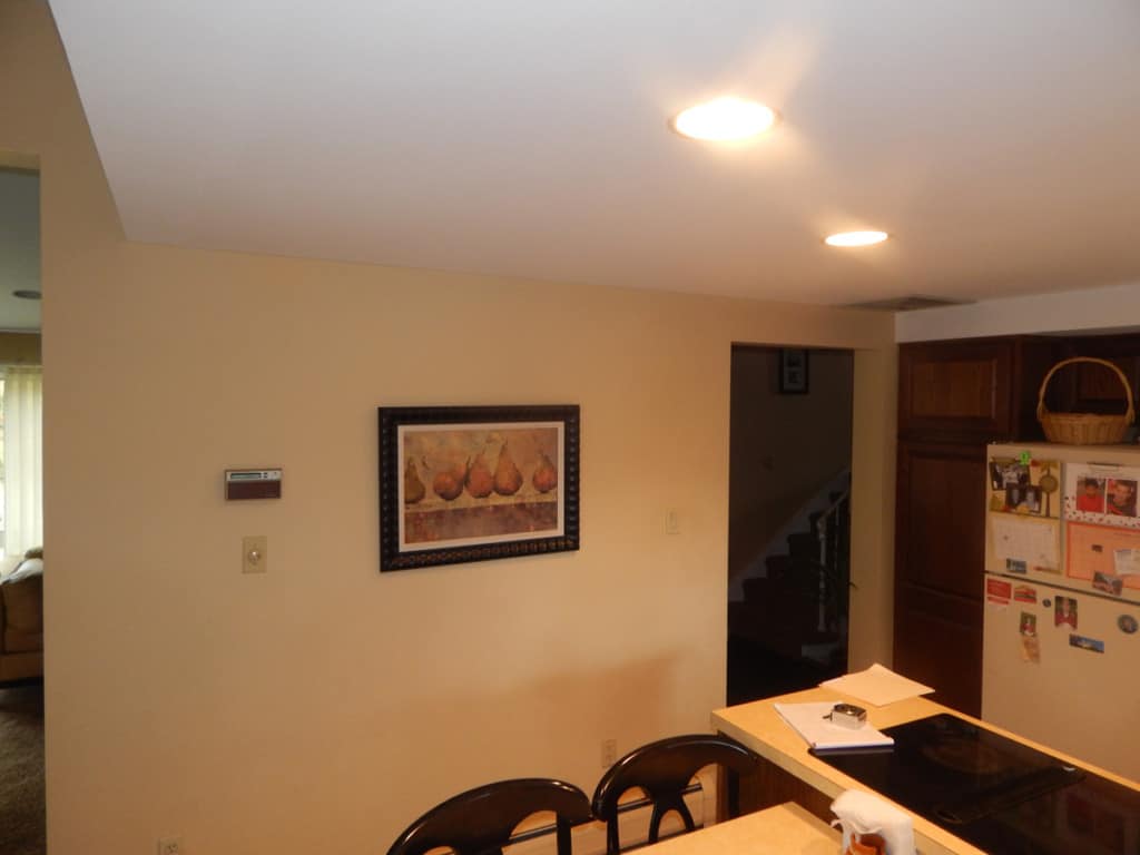
When I did the walk through with the trades, one of the things that I was really interesting in was to find out if I can take the ceiling back to the original height. It looks like there were HVAC and electrical pipes running in the ceiling and they were bumped low to accommodate these pipes, really low to an overall height of about 92”. I believe in those days the tallest cabinets were about 90” so their ideas of taking the cabinets to ceiling was to bring the ceiling to the cabinets and it bugged me, let’s just say, it bugged me a lot!
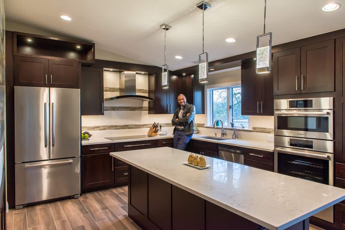
I remember the HVAC guy went up in the hole in the ceiling and shouted out to me. James! “Yeah you can raise the ceiling”! I said YES! From there, everything else was design around that ceiling gone. While 1 problem was solved, here comes another one. I want the cabinets to go to the ceiling but the new height will be way too high and cabinets are not built at an Angle. They are typically straight. And now that we picked this very unusually nice, welcoming height in the kitchen, we didn’t want to just put cabinets on the wall. It wasn’t going to do any justice to the space.
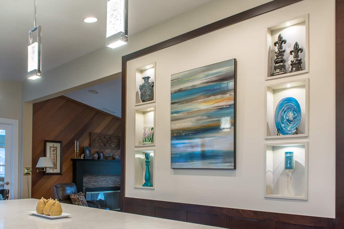
We came up with the idea, to create this sort of 3D Effect over the Refrigerator that uses the new found height as its anchor, which we then lighted up with LED for a very cool effect at night. We then turned our attention to the “wall to nowhere” which was located behind the Island. I remember sitting down in the office one day and virtually standing in the kitchen with my back towards the sink and I said, this wall will be one of the most looked at wall in this kitchen while you are using the island. And it’s blank! Not good, got to do something about it.
Fortunately for us, it was a load bearing wall and it was furred out deeper than 4” because post are typically installed 16” on Center. We did some probing and then I designed those beautiful cubbies inset into the sheetrock between the wall frames with LED lighting in each one and a photo frame in the middle. Seeing this lit up at nights transforms this kitchen into something else. That was the missing piece to complete this beautiful Kitchen.
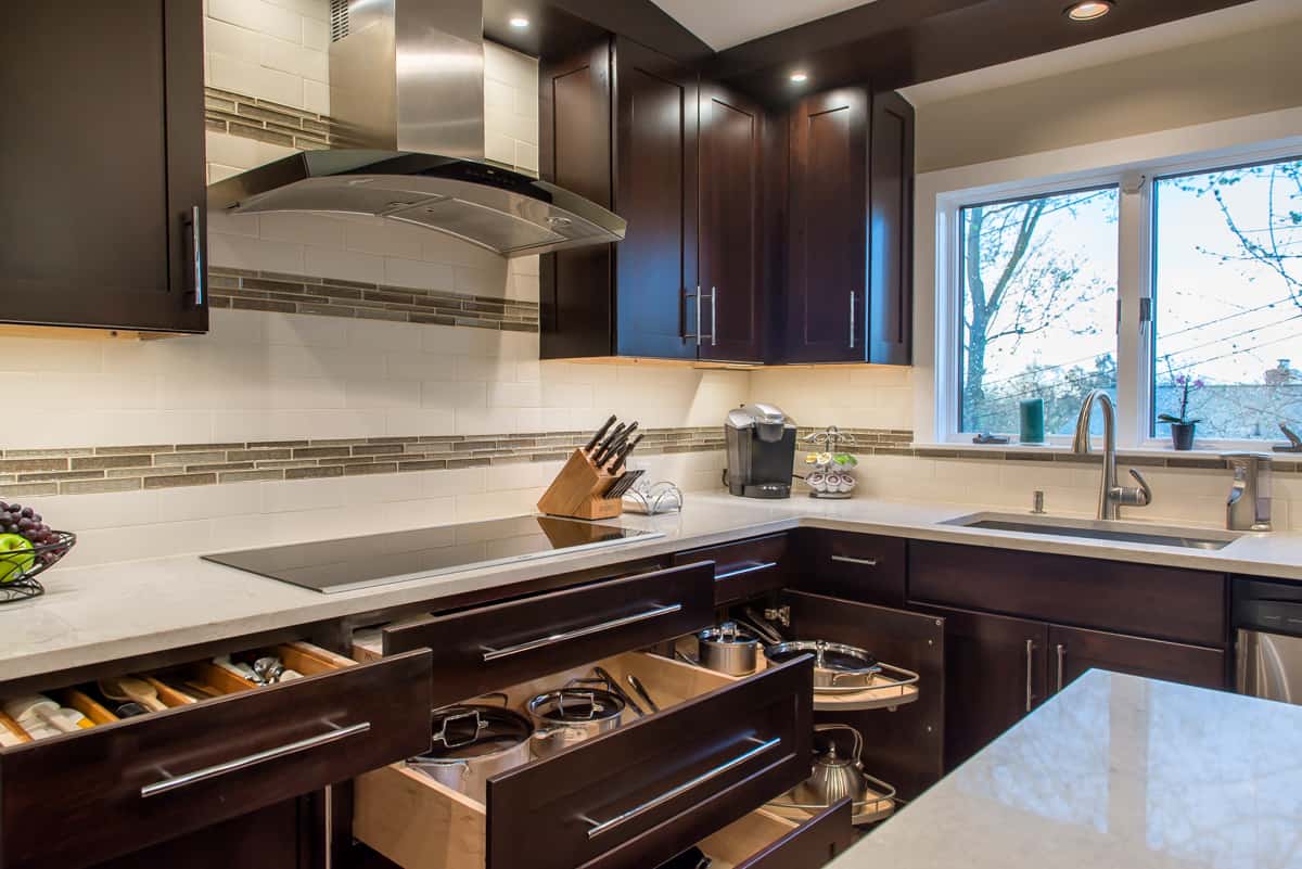
We had so much fun working on this project and to see the outcome of this is just wonderful. The back and forth, the color selection of the cabinets, dark vs light. I wanted a lighter color at first but so glad we went with the darker one. The lighting package on this was extensive, the improve function and storage. Well worth it!
Execution and collaboration between all the trades and client was Stella.
So Cheers! Here is to another happy client! – Now onto the next.
Services provided by RAJ Kitchen and bath, LLC:
Kitchen Renovation / Kitchen Cabinets /Countertop /Bathroom Renovation
Bathroom Vanities / Custom built-ins/ Closets/ Consultation
Project Management / Kitchen design /Interior design


