Project Description
…Making this house a home”…
…Making this house a home”…
…”Making Our House Into a Home: A Stunning Transformation of a 1958 Cape”…
What began as a simple kitchen remodel evolved into a breathtaking, full-home renovation of a 1958 Cape-style house in a charming neighborhood. This project is a testament to how thoughtful design and bold creativity can transform a dated space into a modern, functional, and warm family home.
The Vision: From Outdated to Outstanding
When we first met the homeowners, they had recently purchased the property and made minor updates like painting and refreshing the interiors to make it livable. However, they knew the home needed more work—especially the kitchen. As a family that loves to cook, entertain, and spend time together, they wanted a kitchen that wasn’t just functional but also a centerpiece of their home.
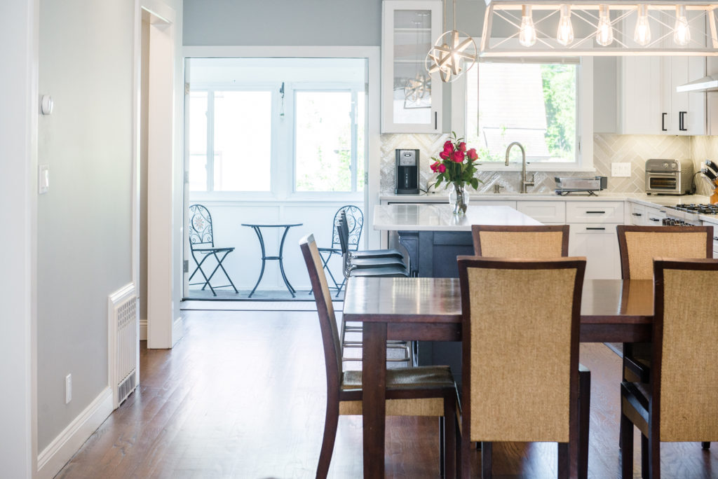
The existing layout was disjointed: to reach the kitchen, you had to pass through the dining room and a narrow doorway. The family dreamed of an open-concept space that would flow seamlessly while maintaining a cozy, homey feel. They had consulted other contractors, but their ideas didn’t quite align with the family’s vision. That’s when we stepped in with a fresh perspective.
The Challenge: Balancing Openness and Functionality
Our goal was to create a space that felt open yet distinct, practical yet stylish—all without compromising the home’s original footprint. The family entrusted us with their biggest investment, and we were determined to deliver on our promise.
Key Transformations:
- Opening Up the Space
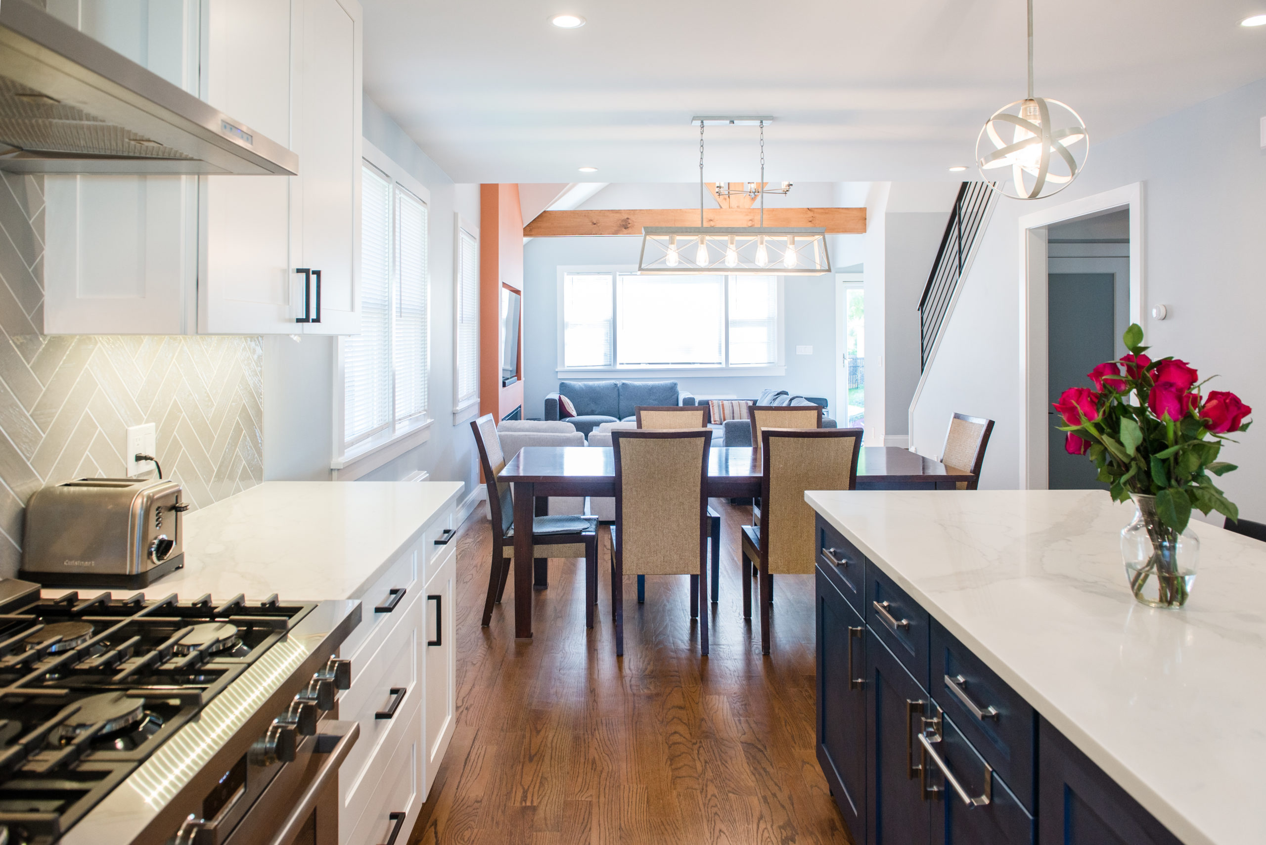
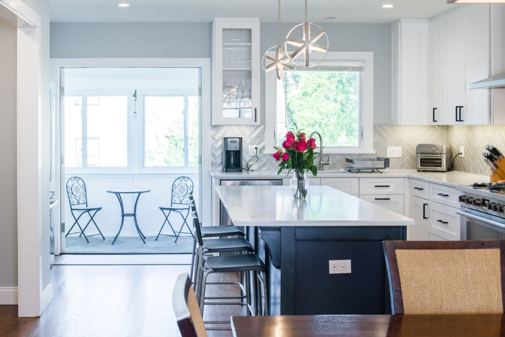
We removed the walls separating the kitchen and dining room, creating a seamless flow. However, we discovered a structural issue: the upstairs addition had left a load-bearing wall in the wrong spot, causing joists to hang unsupported. After consulting with our architect and engineer, we installed a new metal beam and extended the joists to ensure the home was safe and sound. We concealed the beam in the ceiling, maintaining the clean, open look the family desired. - Maximizing Natural Light
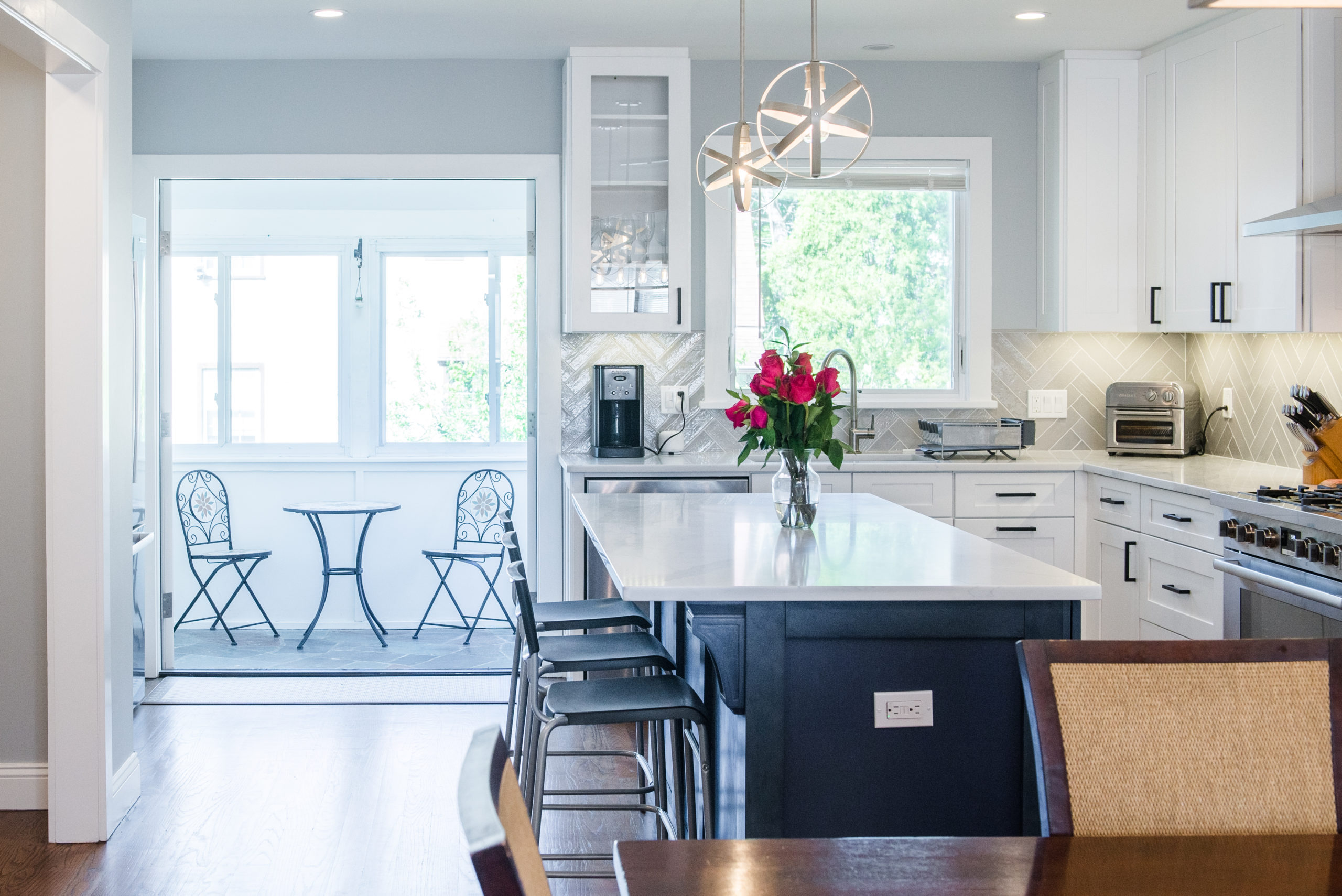
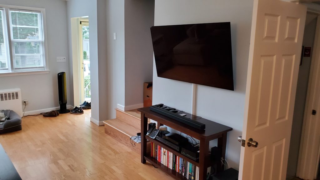
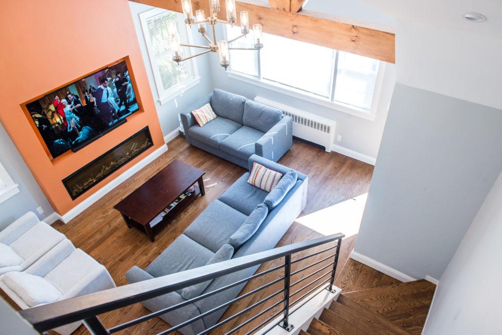
The home was dark, with insufficient windows. We added two new windows in the living room, flanking a unique, custom-designed fireplace. In the kitchen, we replaced an old window overlooking the neighbor’s yard with a beautiful picture casement window facing the backyard. We also converted an old door into a large French door leading to the porch, flooding the space with natural light. - Reimagining the Kitchen
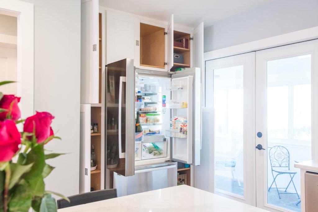
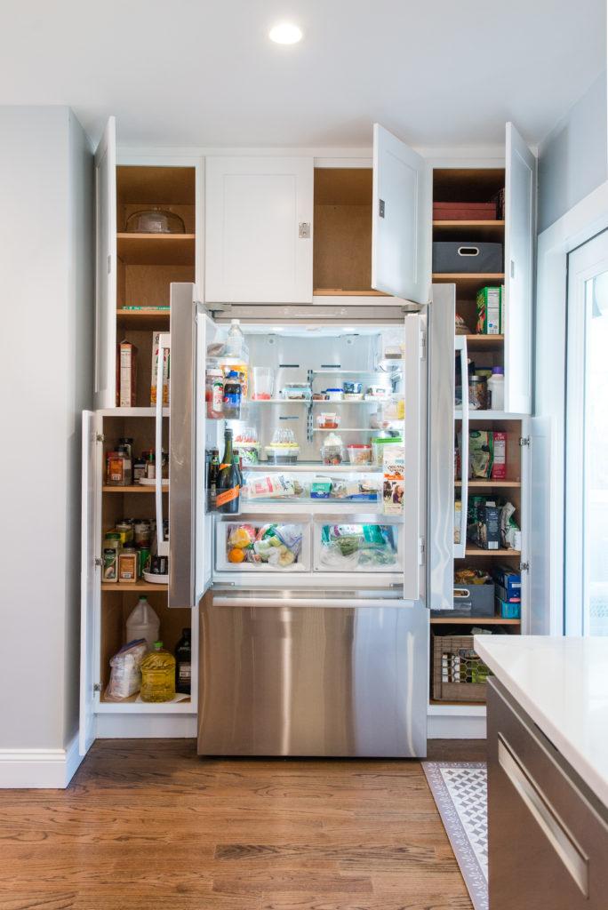
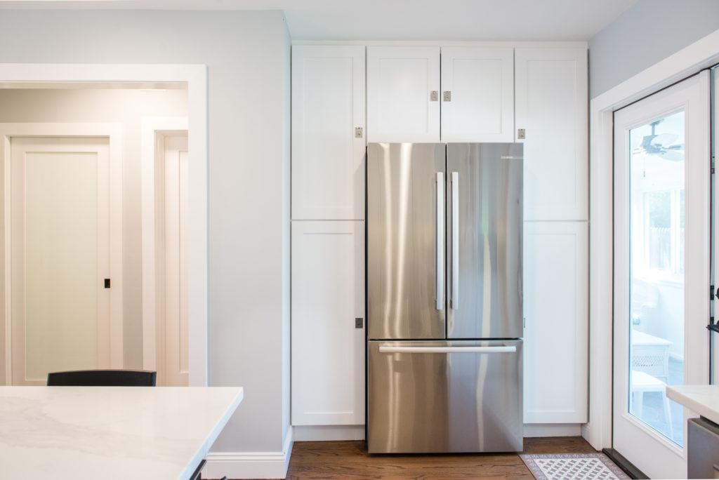
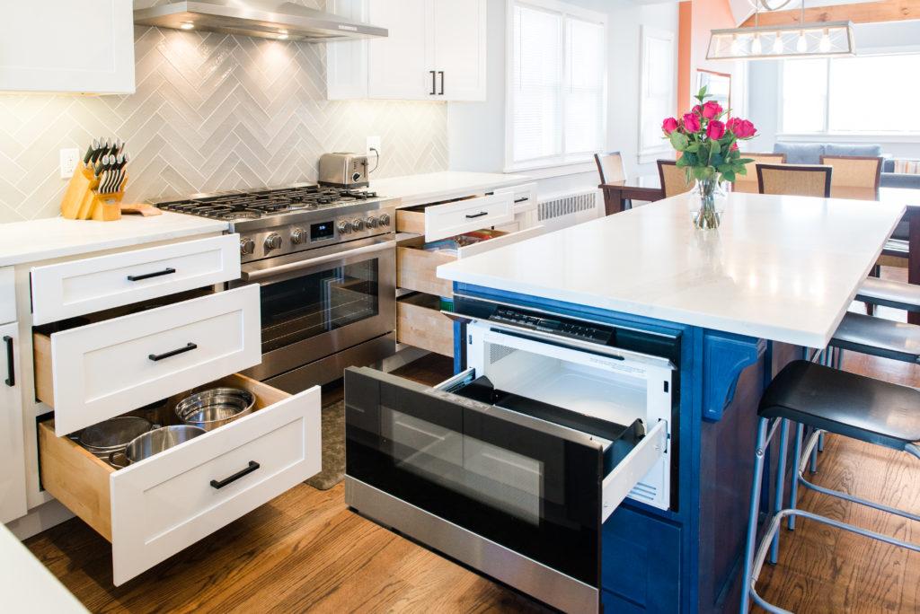
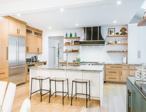
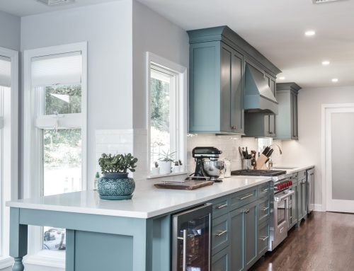
To avoid a top-heavy feel, we raised the upper cabinets to 42 inches and removed the crown molding. We also tucked the refrigerator between two pantries, creating a hidden alcove that added storage without sacrificing openness. The result was a kitchen that was both functional and visually stunning. - Elevating the Living Room
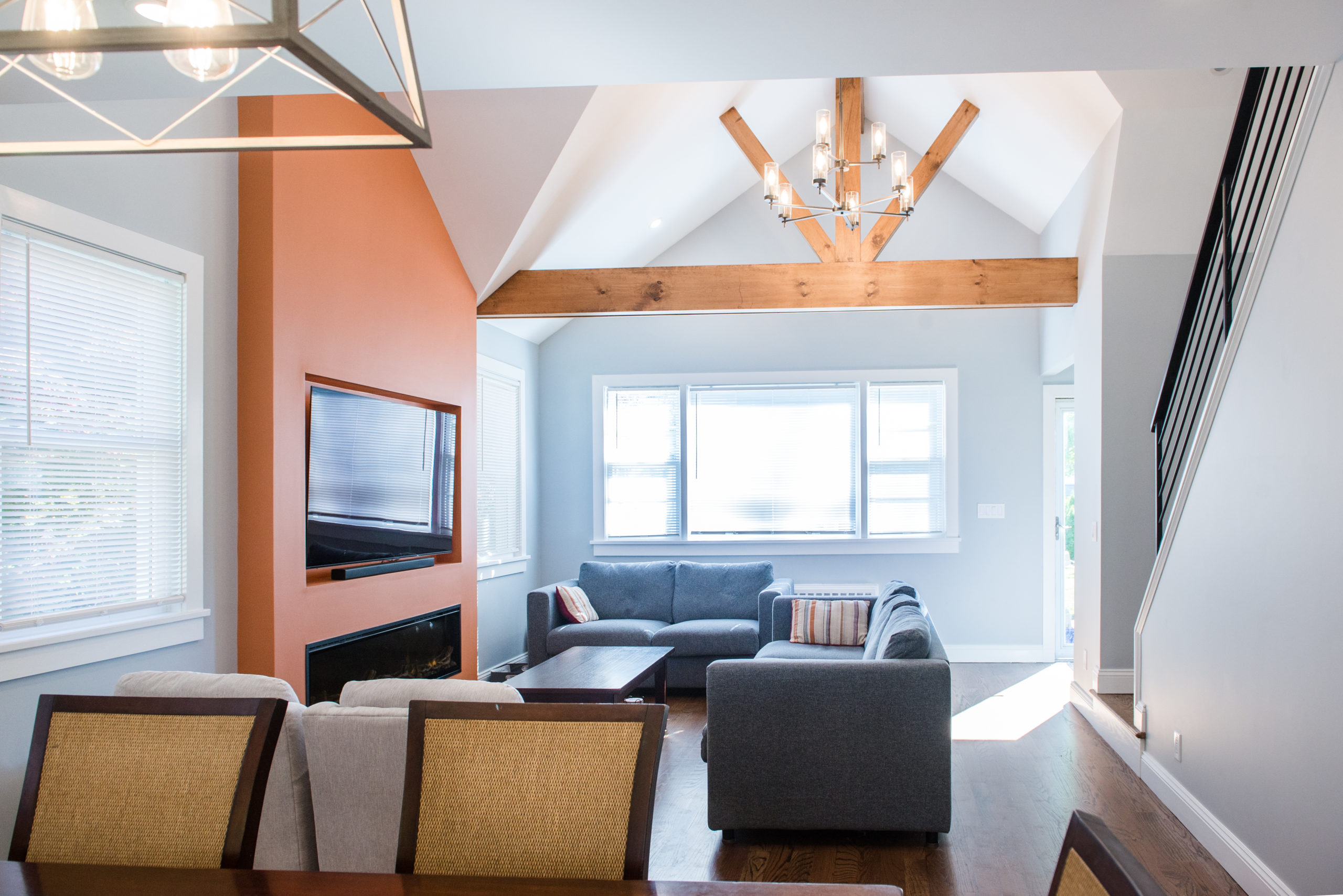
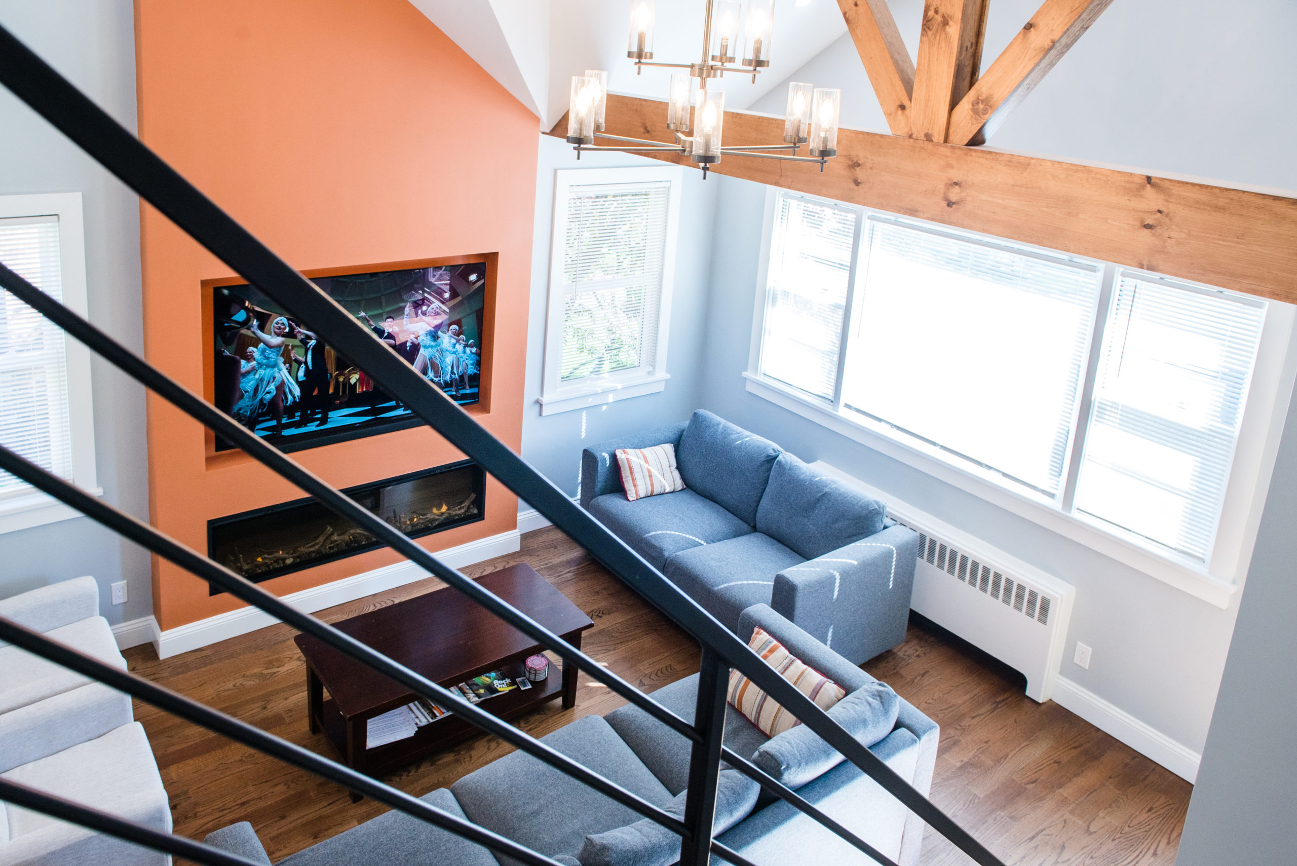
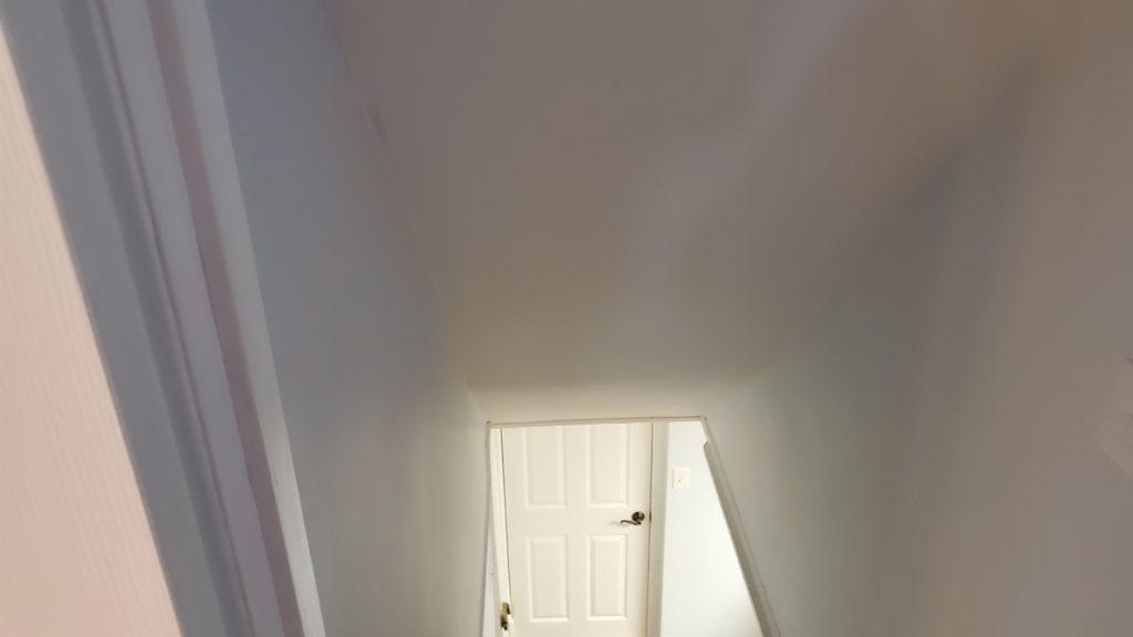
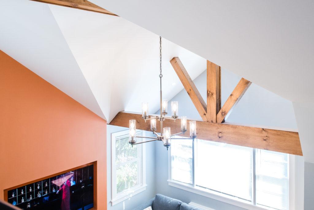
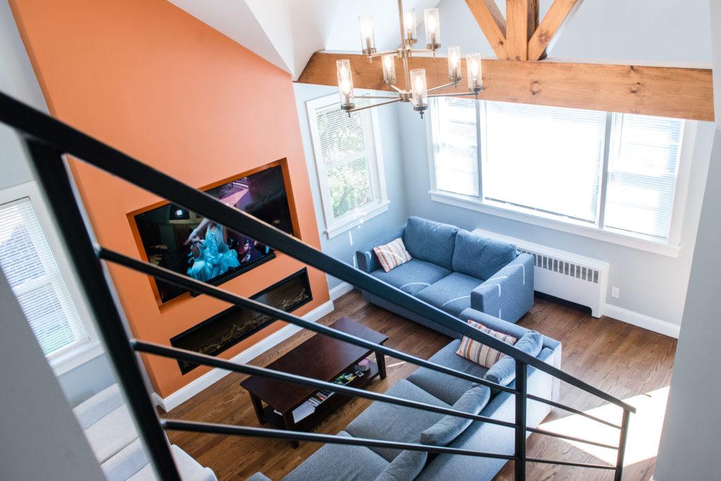
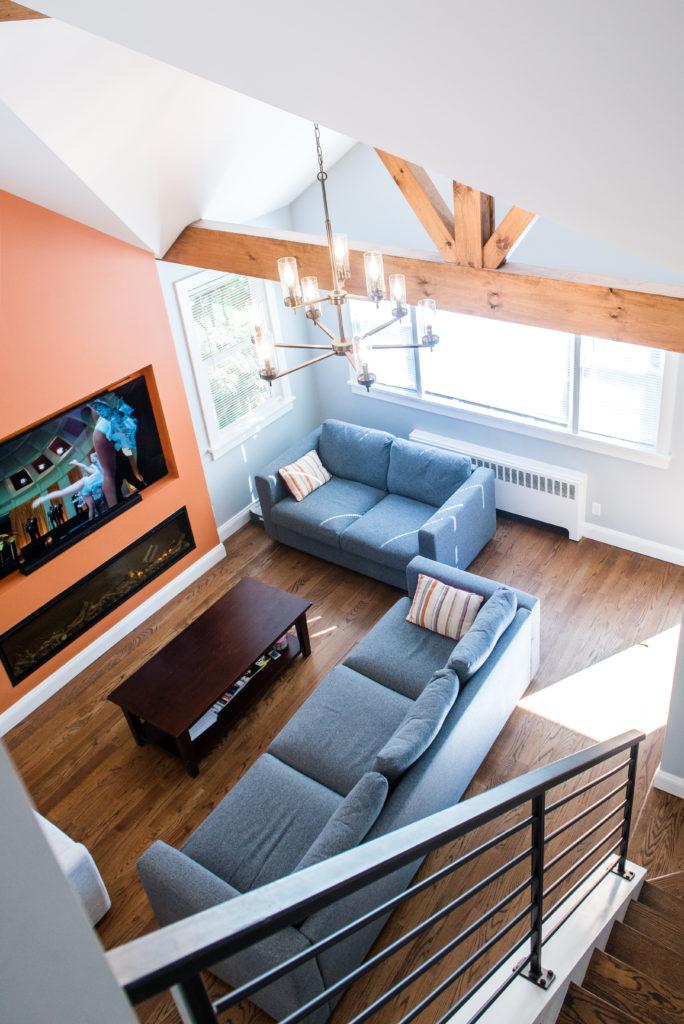
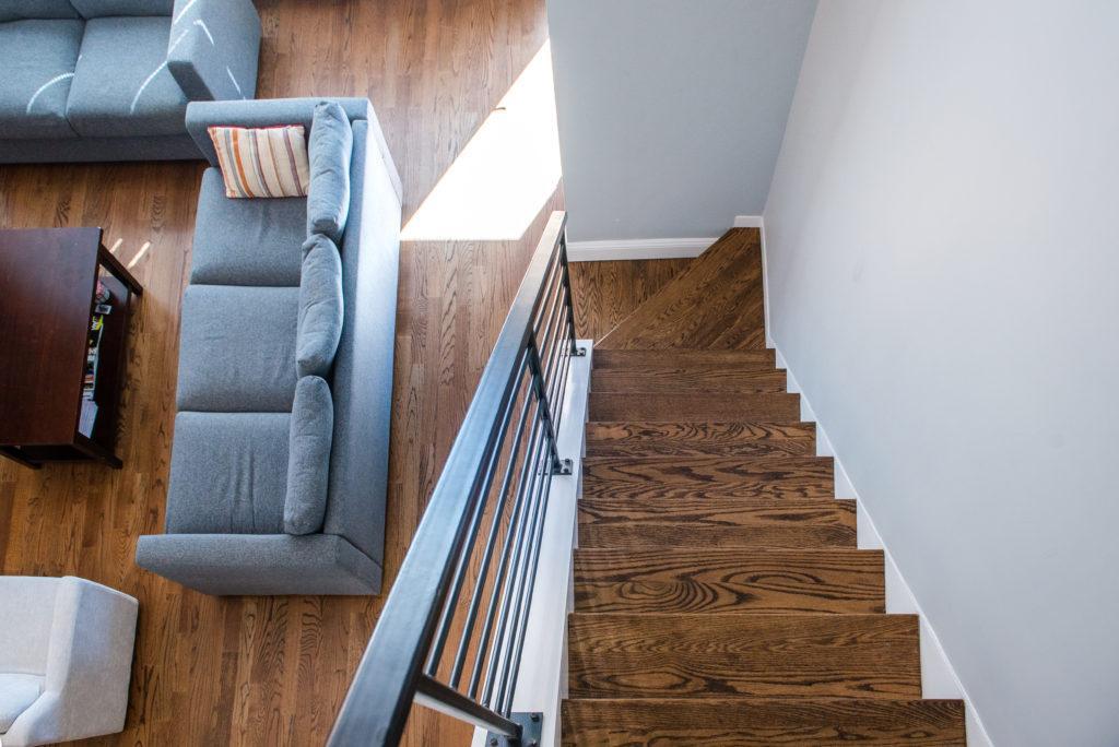
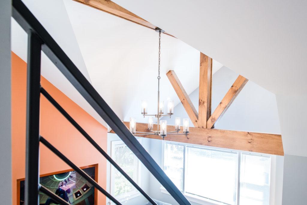
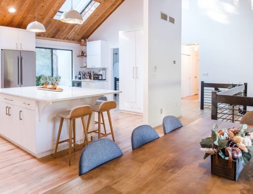
We removed the closed-off attic area above the living room, exposing the rafters and creating a dramatic vaulted ceiling. By demoing the wall near the staircase, we opened up the view into the living room, adding character and charm. Rustic pine beams, decorative trusses, and an extended fireplace wall painted in a contrasting color completed the transformation. - Creating a True Master Suite
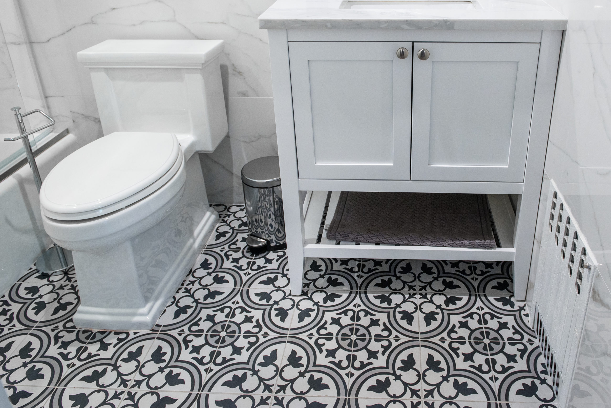
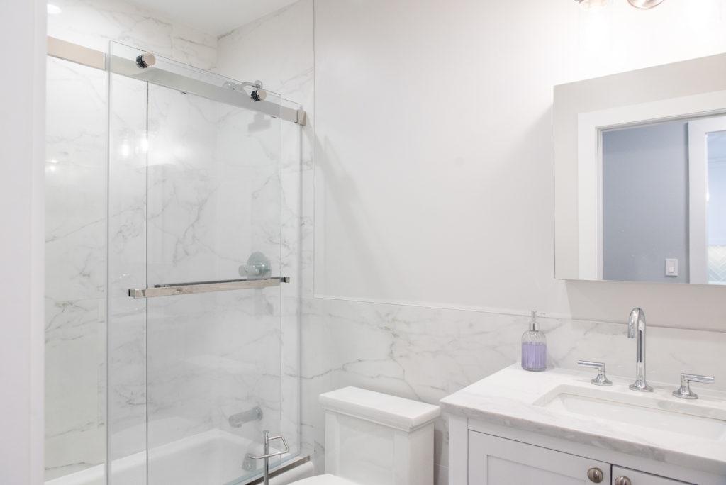
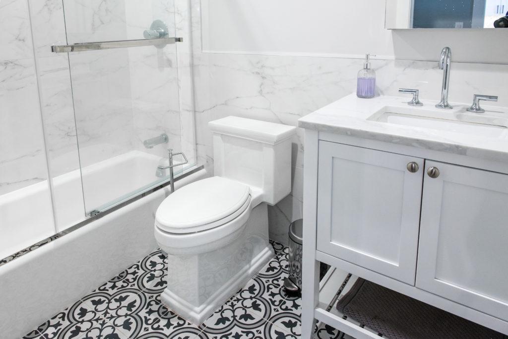
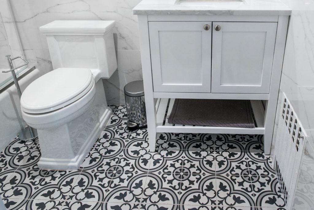
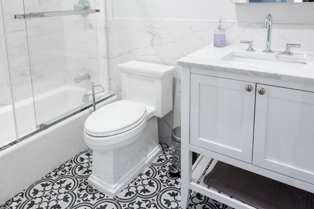
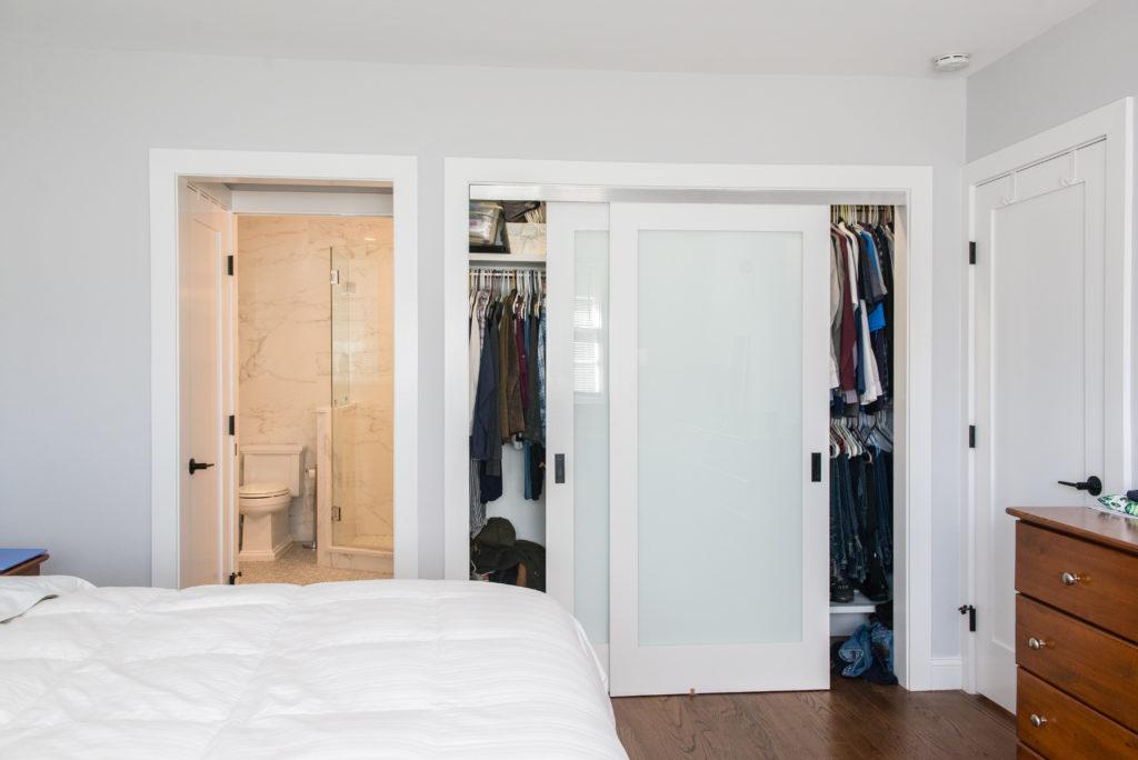
The home originally had only one bathroom, shared by everyone. We split the bathroom in half, creating a private master suite with its own access and additional closets. The other half became a full 3-piece bathroom accessible from the hallway, ensuring functionality for the entire family. - Smart Use of Space
In a 1,683 sqft home, every inch counts. We blocked off the existing hallway and added two large closets, effectively dividing the home into two wings. This not only provided much-needed storage but also enhanced privacy for the master suite.
The Finishing Touches
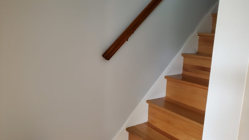
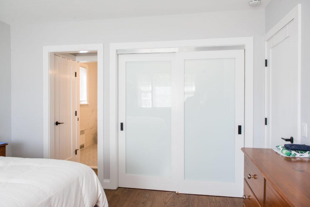
To complete the transformation, we installed new flooring throughout, added fresh paint, and incorporated modern lighting fixtures. Custom metal handrails and black hardware on frosted glass doors added the perfect finishing touches, giving the home a cohesive, contemporary look.
A Home Reborn
This 1958 Cape was stuck in the past, but with bold thinking and meticulous execution, we brought it into the 21st century. The result is a home that’s not only beautiful but also perfectly suited to the needs of a growing family.
Ready to Transform Your Home?
If you’re dreaming of a home that’s both functional and stunning, we’re here to help. Whether it’s a kitchen remodel, a full-home renovation, or something in between, our team is ready to bring your vision to life.
Let’s turn your house into the home you’ve always dreamed of. Contact us now to begin your transformation!


