Project Description
THE MARRIAGE OF CONTEMPORARY TO TRANSITIONAL
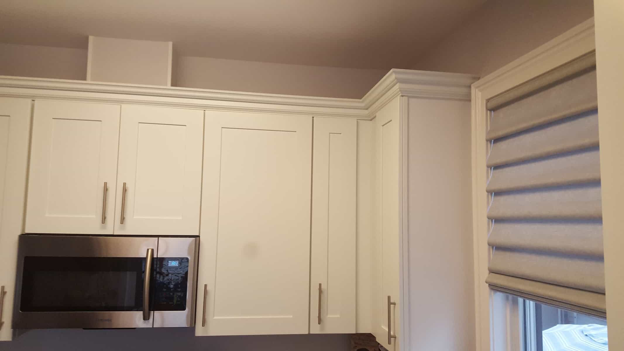
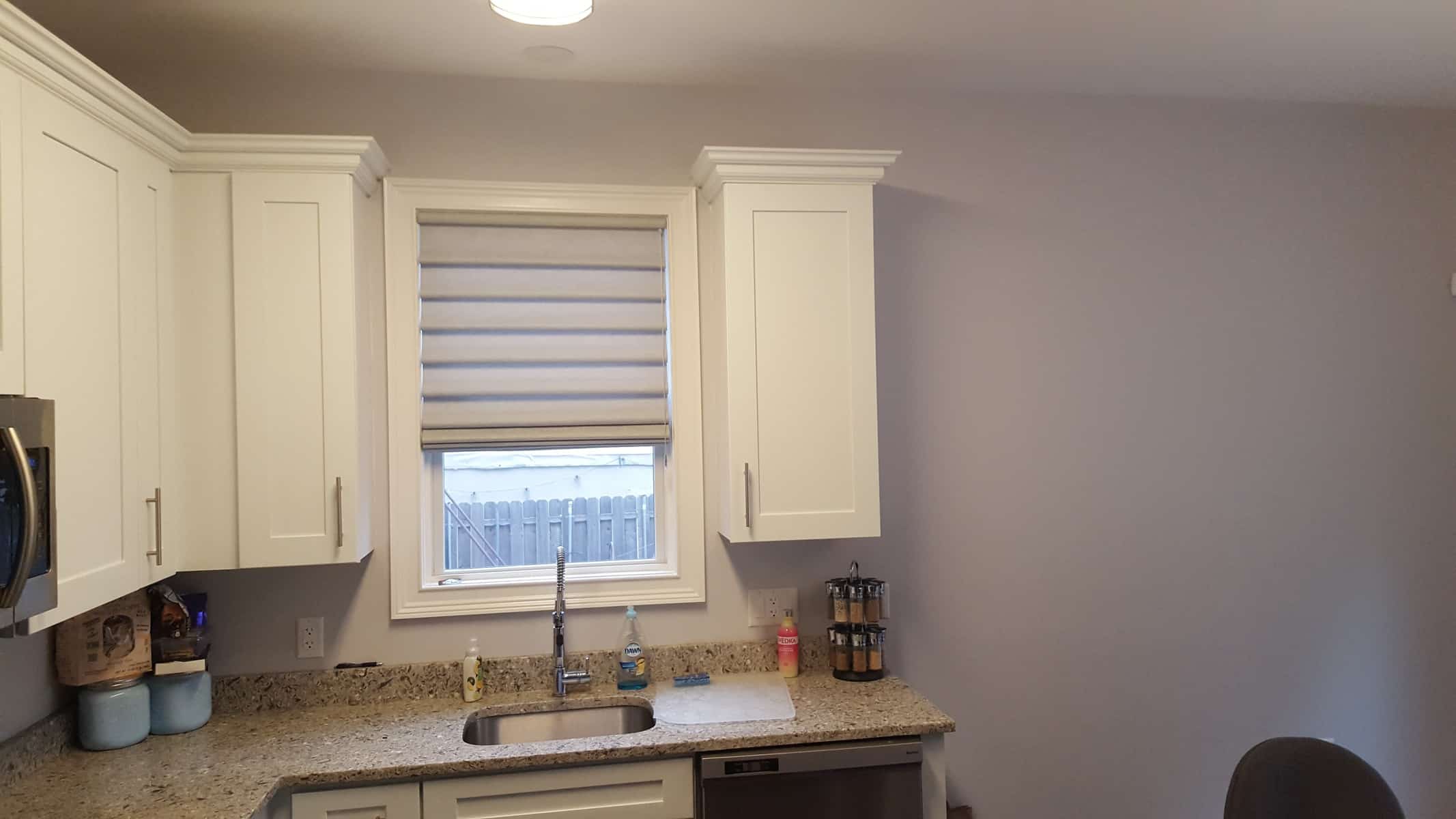
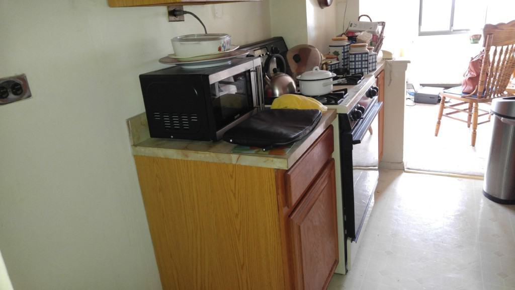
“BEFORE” PHOTOS:
The marriage of Contemporary to Traditional.
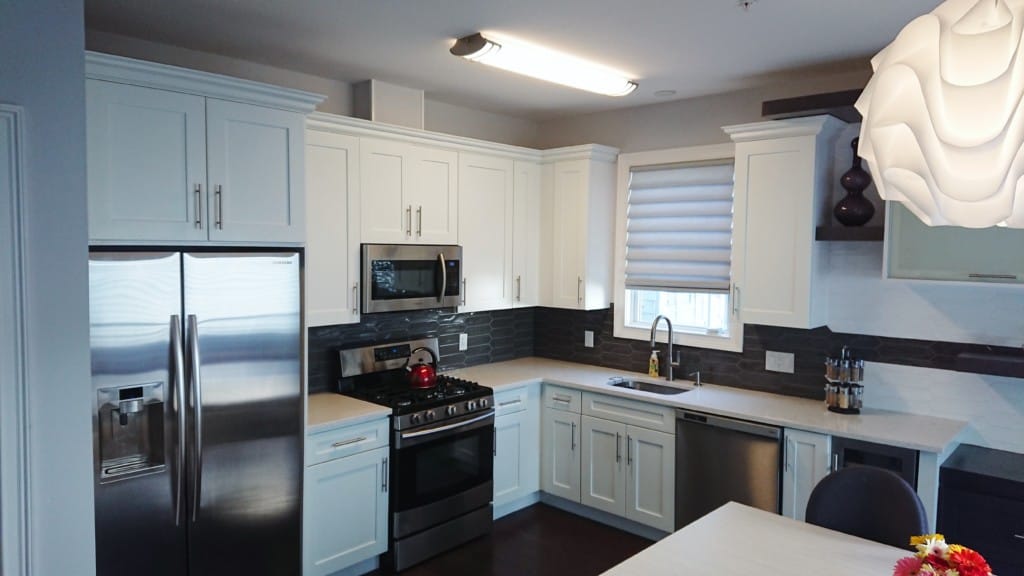
This was a unique project in every sense to us, because it wasn’t a typical full gut renovation. We usually design for a complete Kitchen Reno, which would typically involve tearing down walls, moving plumbing, gas lines, and electrical. This one was different. Much different! Our client bought this beautiful turnkey Condo in Union City, so the Kitchen Cabinet was a keeper but needed some additional “pizazz”.
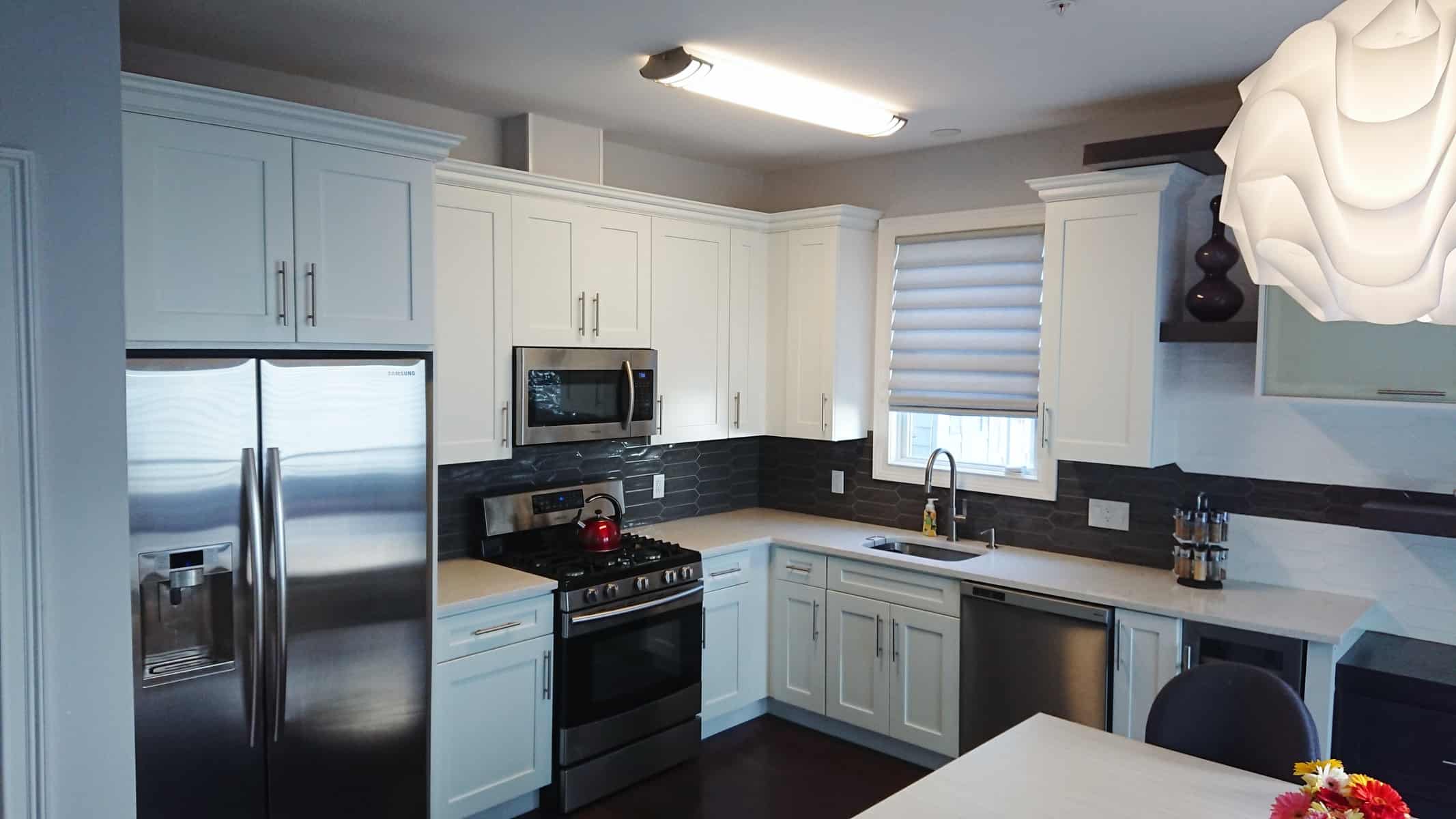
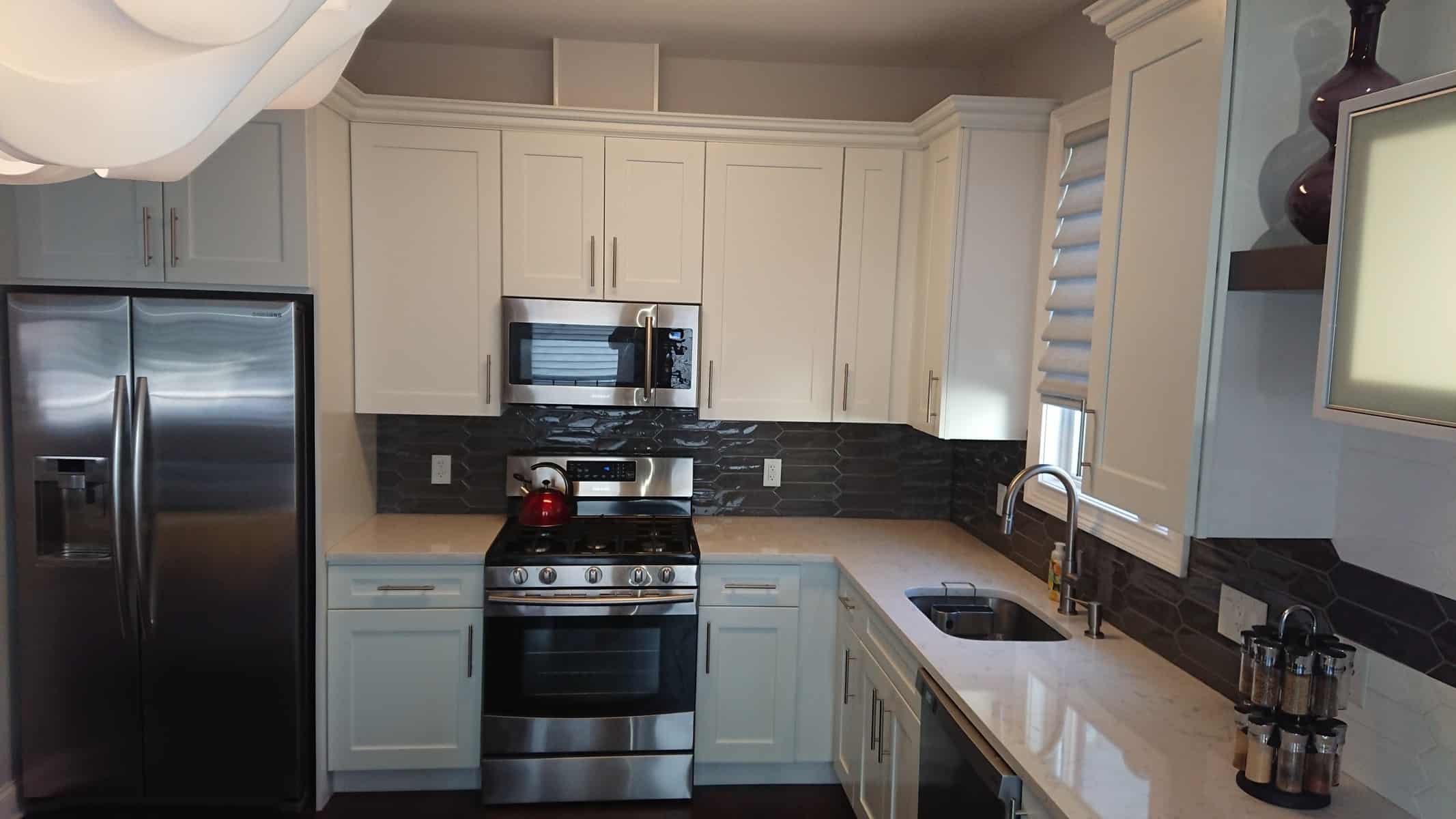
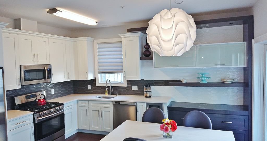
The kitchen was typical for a Condo; and that was the problem. Our client wanted to keep the existing transitional, white, open Kitchen concept, but jazz it up with an extension that would give her more countertop and storage space.
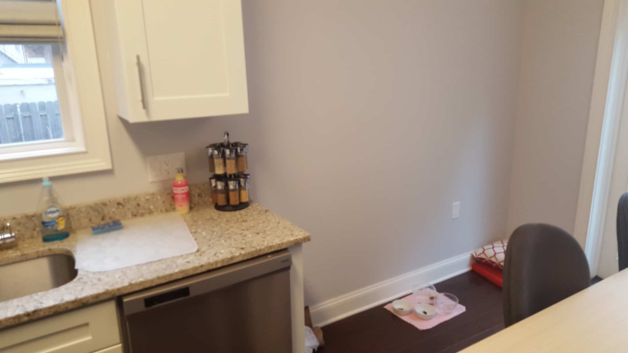
When we first showed up for the initial consult, she said to us we were like the 3rd or 4th Company she had come out to consult for a new extension to the existing Kitchen, but no one had yet quite come up with a solution to integrate her design style into the space. One look around the Condo and we sort of got right into her head a bit by looking at her furniture style, lighting fixtures, and artwork. Our challenge was to transform 80” of wall space into the most glamourous sort after square footage into that space, while at the same time, making it practical for storage and décor.
We went about by designing the extension to change the way you look at the whole space. We blurred the lines between transitional and cotemporary style by creating a new category of design, rather than continuing with the existing theme and feel of the space.
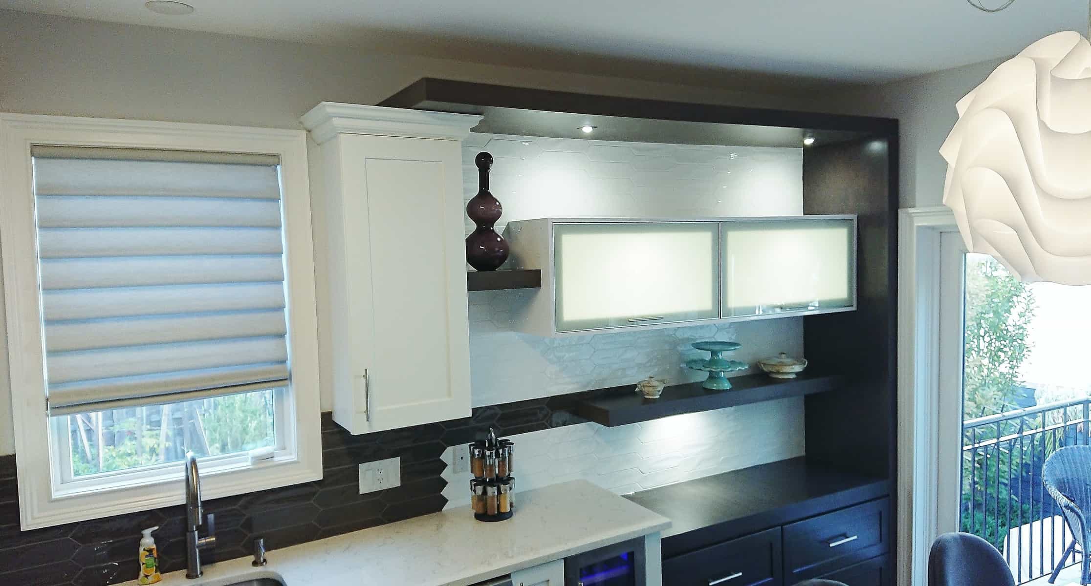
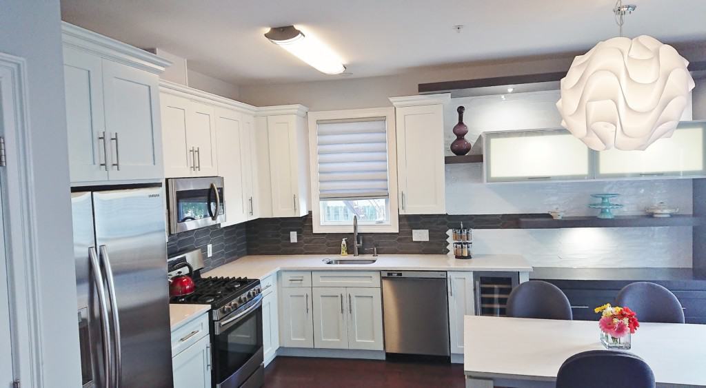
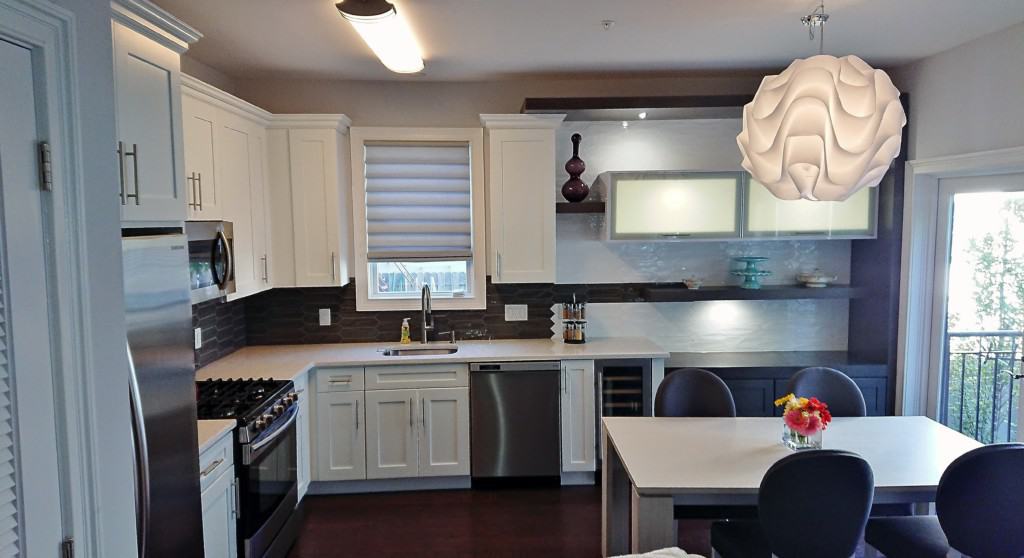
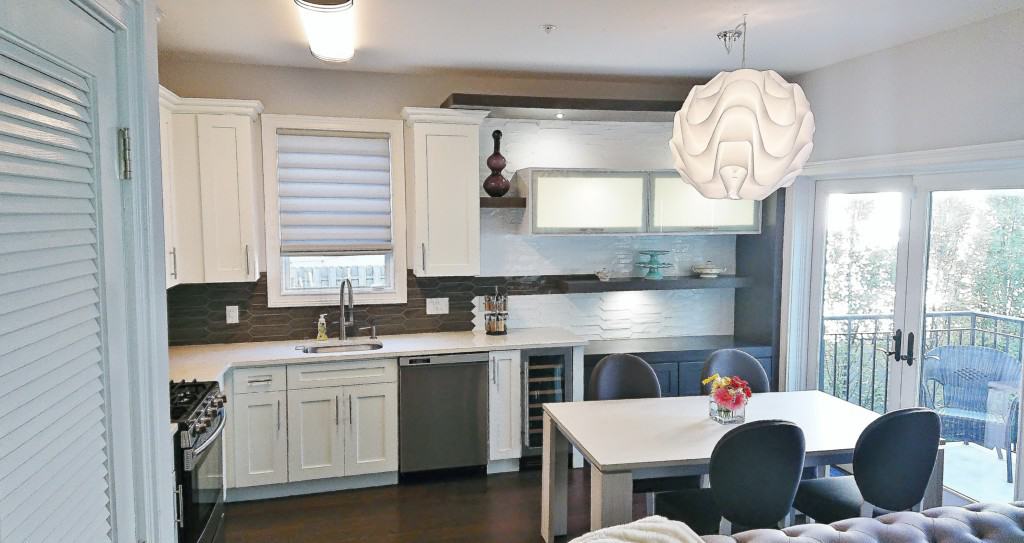
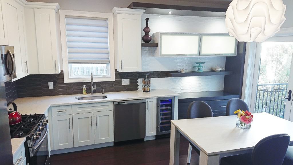
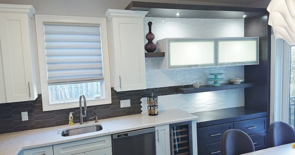
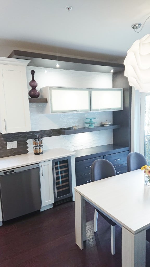
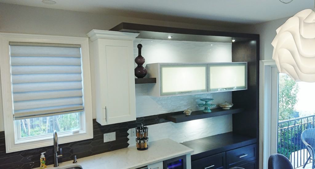
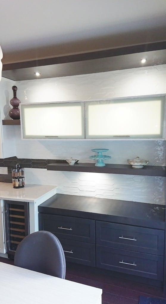
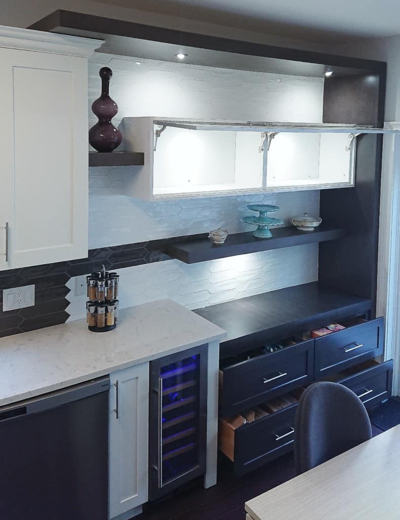
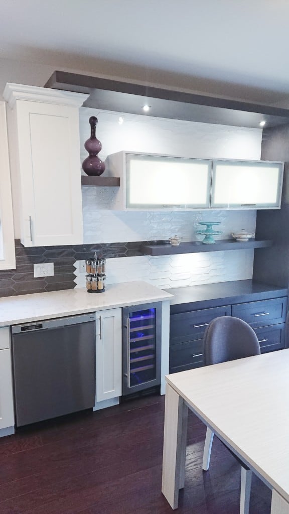
Our design team created a bold grey color wrap that extends the view to the height of the room, which highlights the tall ceiling feature. We also designed the grey backsplash tile to run from the existing kitchen Cabinets that bleeds through to the new extension and a wine cooler for our avid wine collector client.
The floating shelf helped to accentuate that design detail by sitting directly on the line coming in from the grey back splash. The design lowered the new section for added drama while two lift up aluminum Glass cabinets were tied in to anchor the middle of the wall while creating much needed storage space both inside and outside.
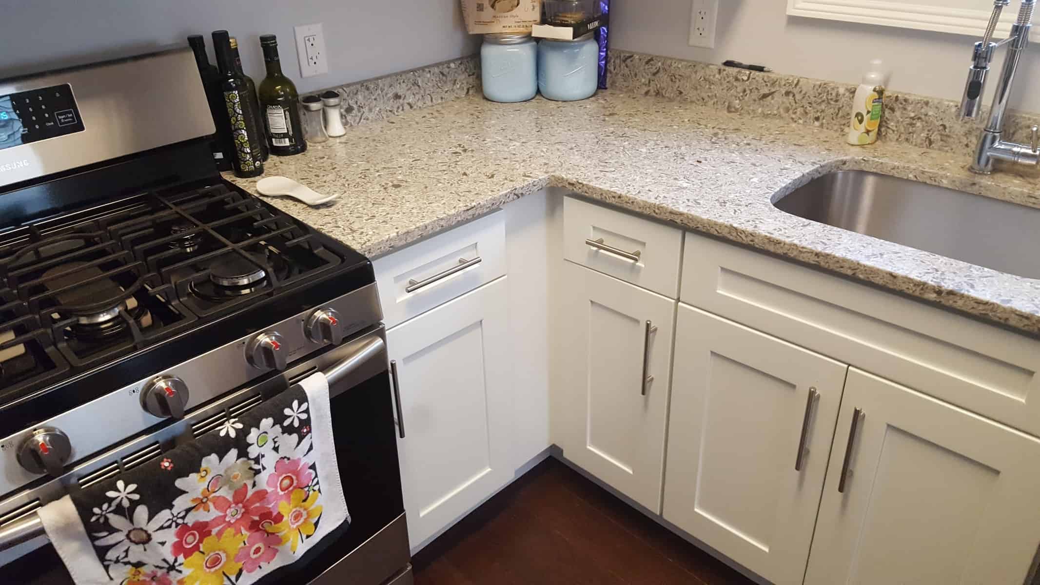
To “consummate this marriage”, a new Cambria quartz countertop was installed, white V shape edge subway tiles that went to the top of the ceiling for more drama, along with a “V” shape LED lighting design plan.
Pictures are worth a 1000 words, so have a look at the before and after photos of this space and see how we were able to tie a whole new style into an existing one.
Credits to: Carter Construction on the incredible details on the backsplash tiles installation
Trim projects on installation of the new addition (Cabinets, floating shelf and LED Lights)
Here’s to another happy client.. Now onto the next.


