Project Description
Kitchen in Greenwich Ct. gets a dramatic Upgrade
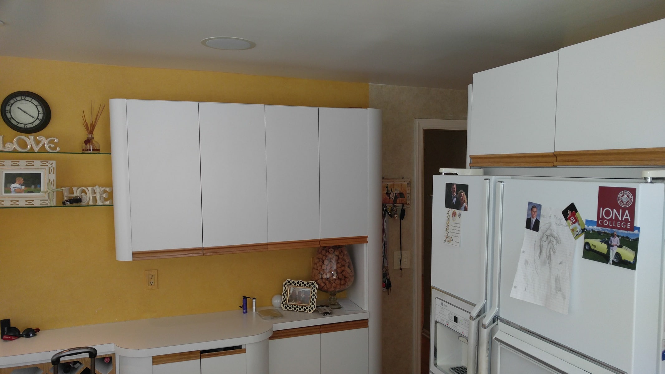
This was a beautiful home! A lot of work was already done to this house and it was in tip top shape… well except for the Kitchen. The owners knew that they had to do some work on the kitchen but they weren’t sure how to tackle it. They weren’t sure that when they do, they’ll get more value in terms of using the space in the most efficient way possibly. The new kitchen needed to fit in with the theme of the rest of the home.
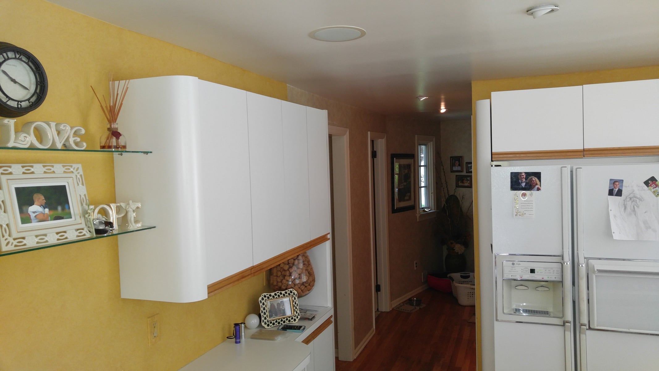
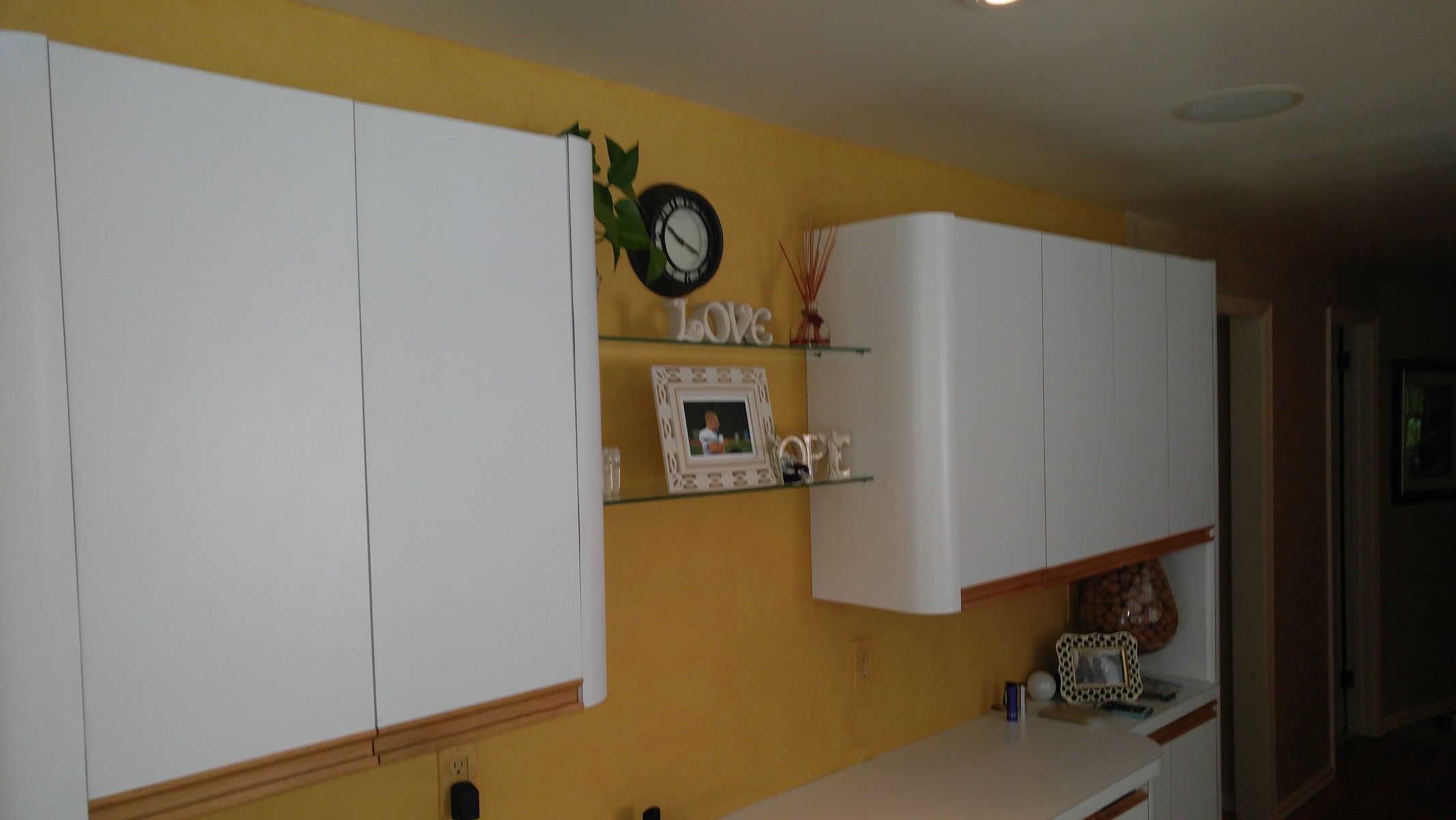
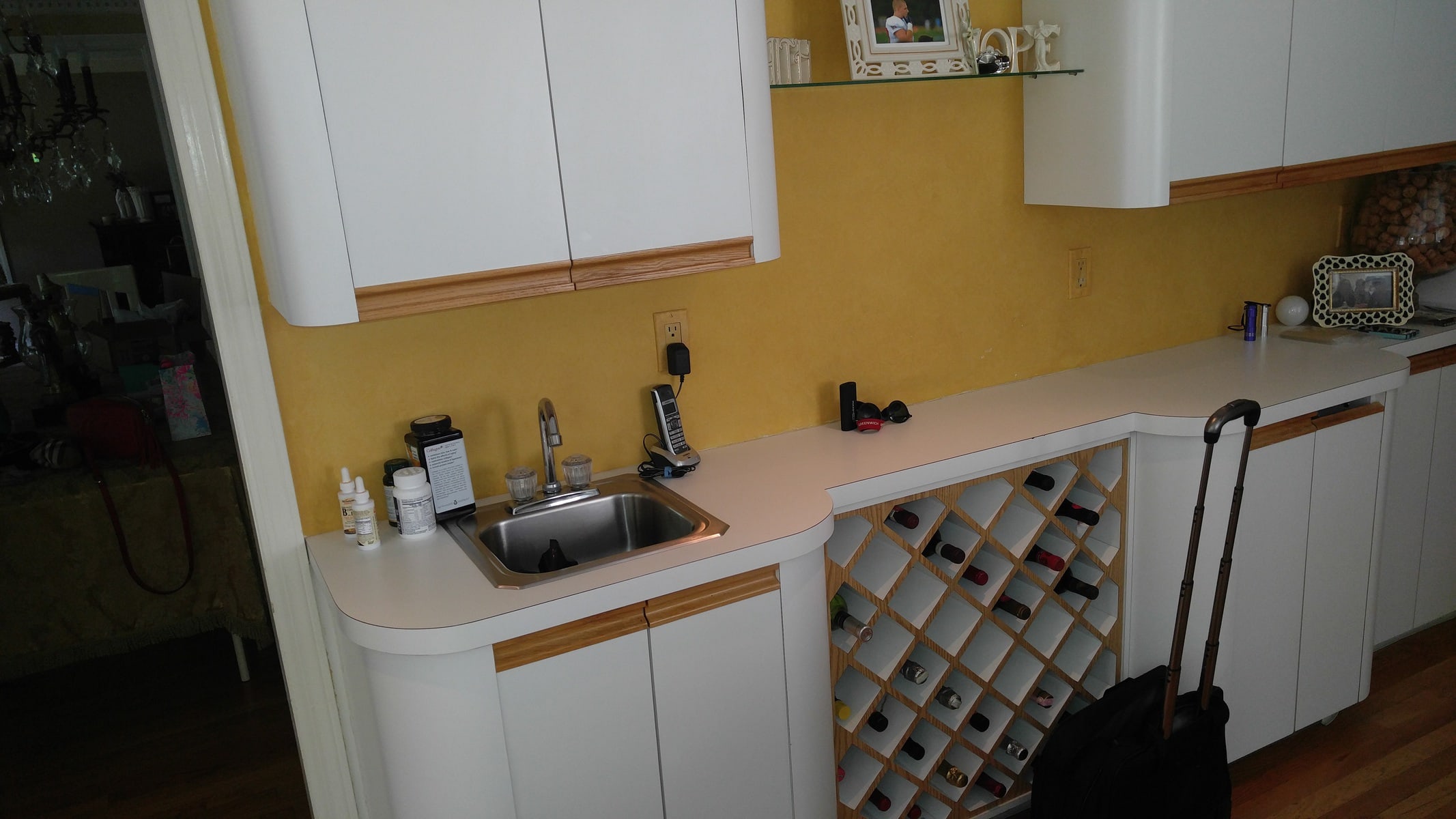
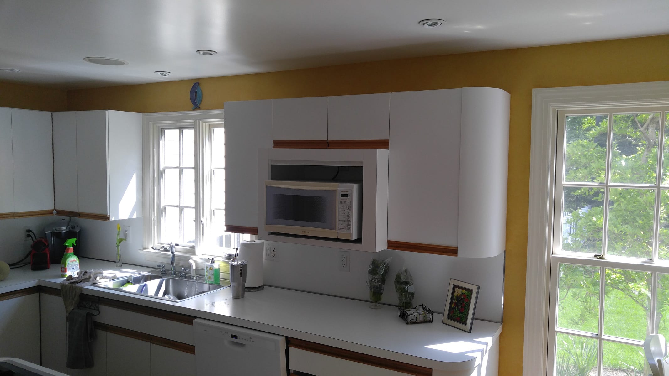
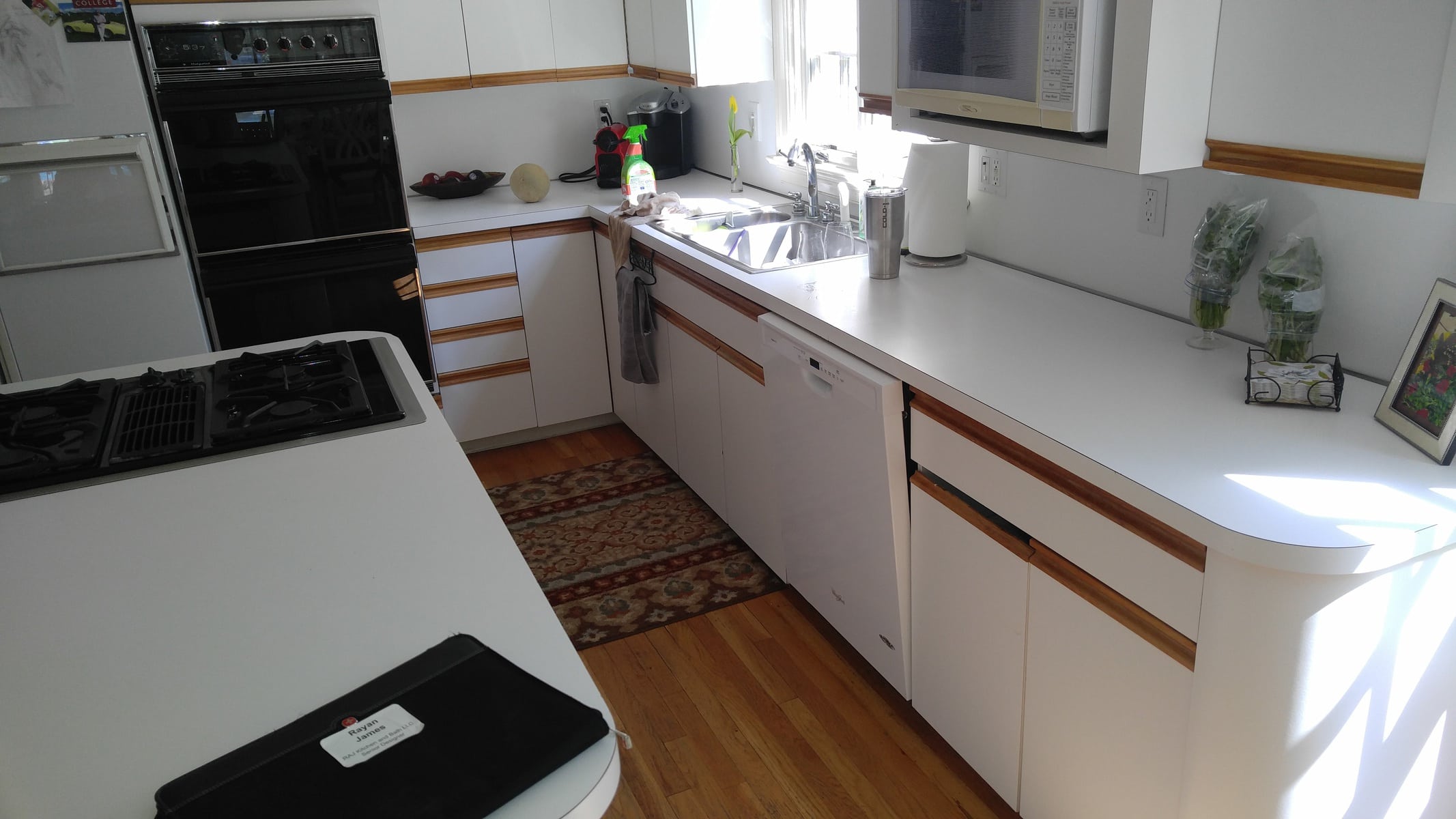
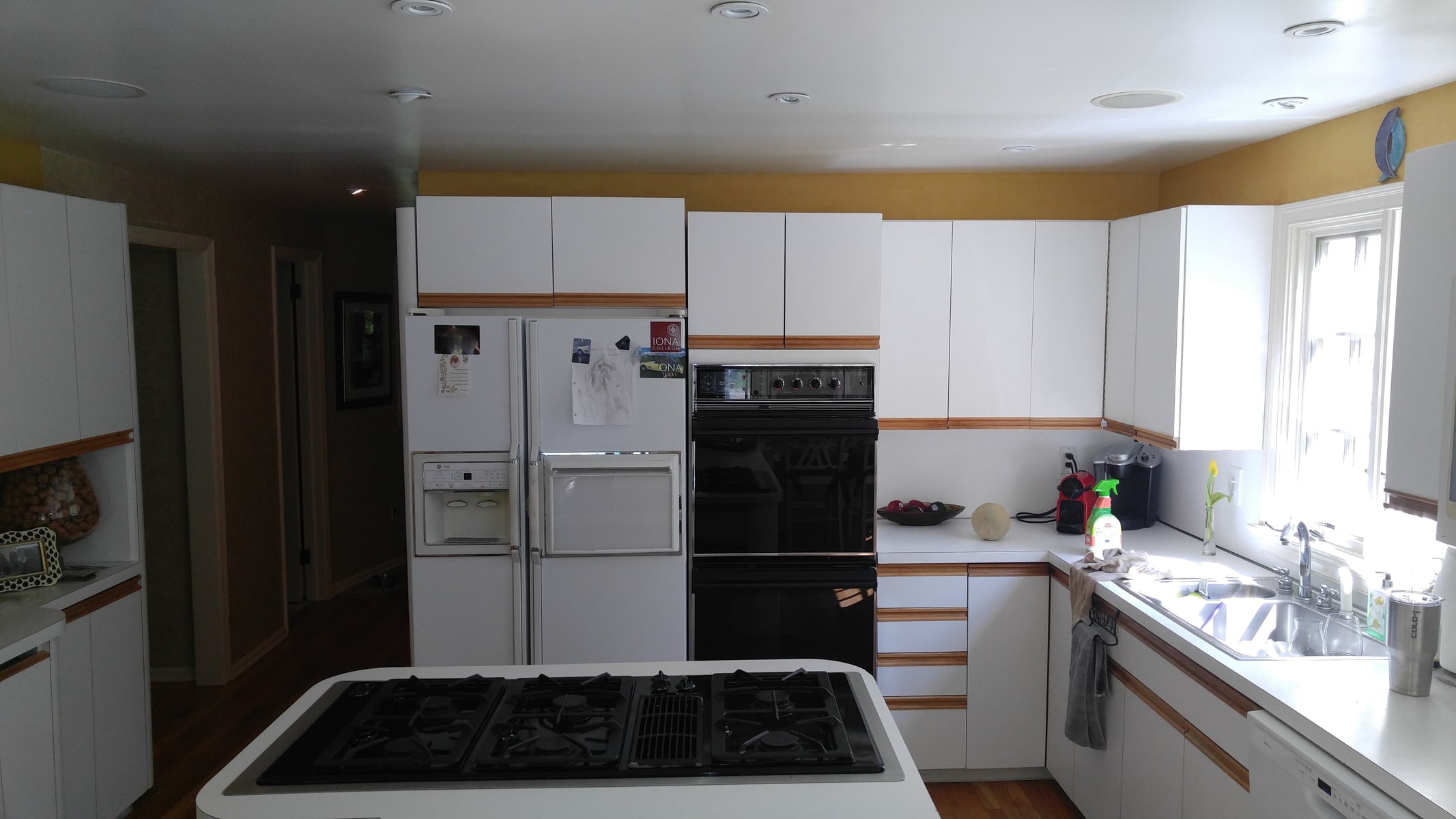
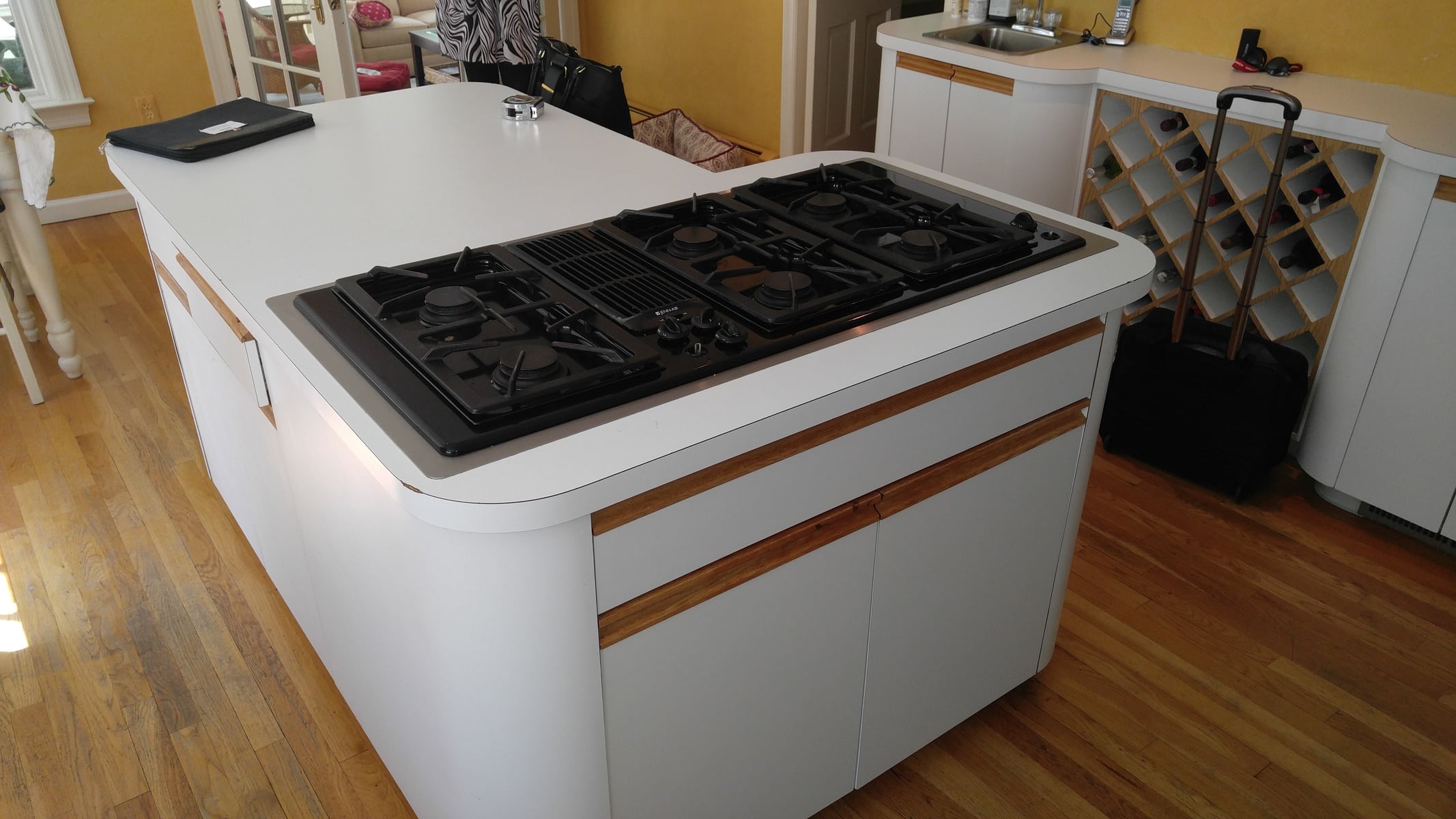
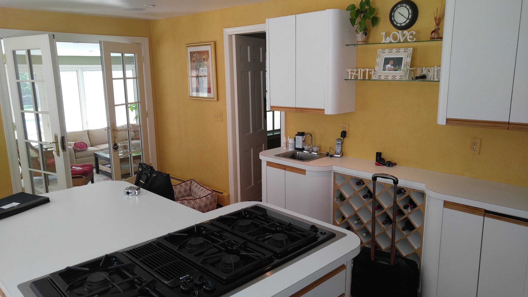
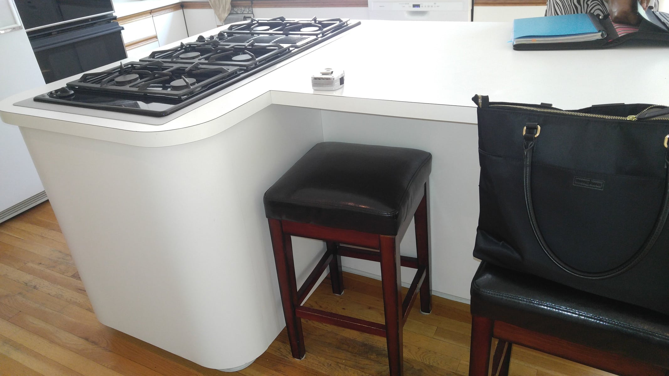
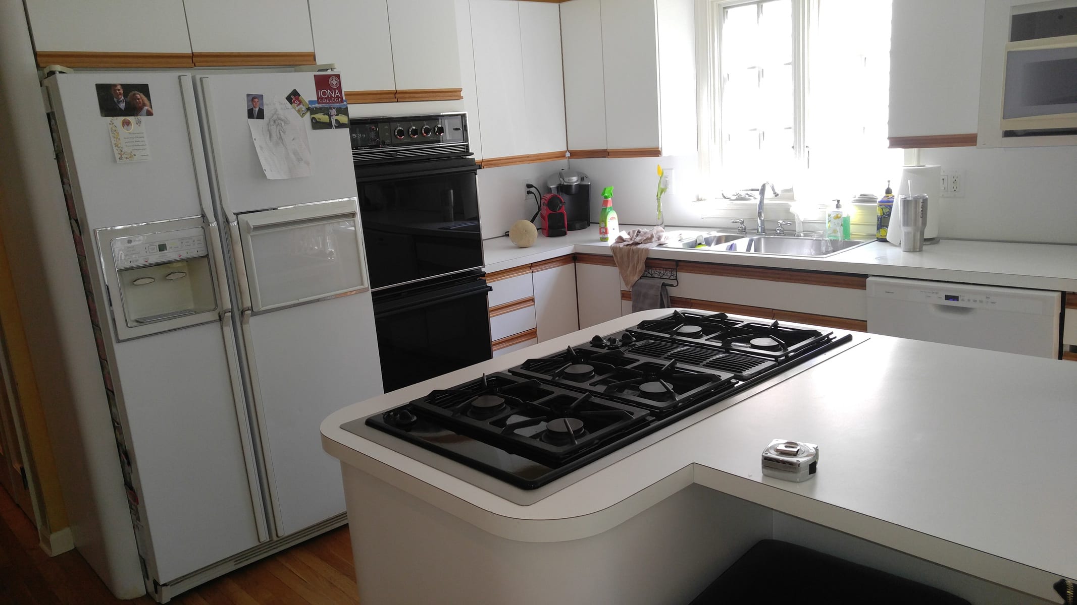
When we got there, it was clear that they needed some help with the space. The kitchen was a bit tiny, plus there were some large appliances that were grouped together in the wrong places, thus making the room look even smaller because the existing footprint of the room was big enough to hold a good size kitchen. This family entertains a lot so for them using the space like this over the years, they simply just made it do.
The owners wanted a lot of seating, a lot of storage, a lot of countertop space for prepping, baking and cooking, along with a place to relax and entertain. Although they needed all of that, their intent also was to ensure that it was warm and inviting, so design aesthetics and mood flexibility had to be considered throughout the process.
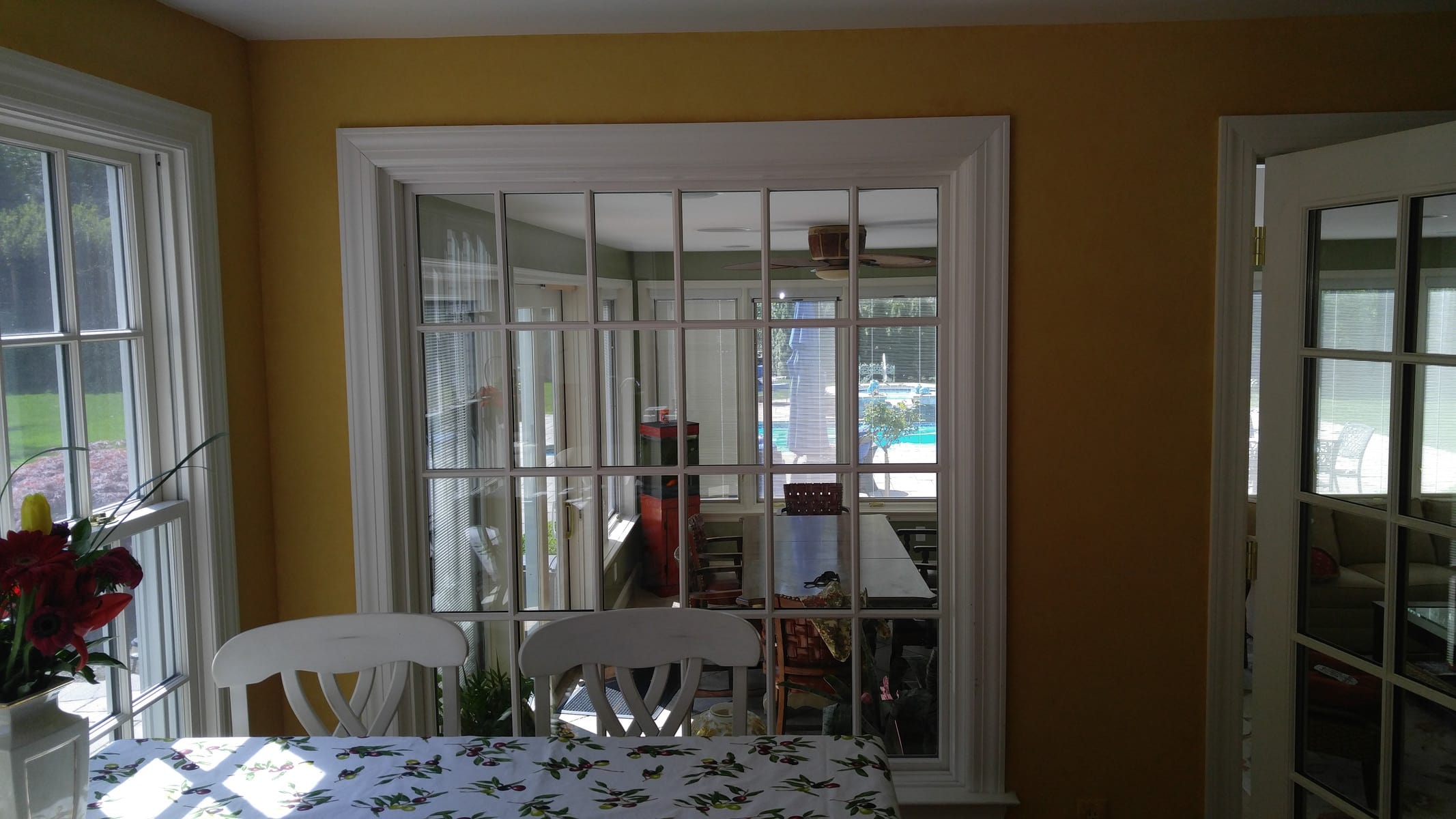
There were some good things that was already happening in the space. There were some large Windows looking out to the back yard, there was a four seasons room already opened up nicely into the kitchen, and then the dining room was somewhat separated via doorway to it. The challenge was how do we build upon that without starting over. We knew that tampering with any of the windows location or re-location was a none starter because there simply was no more value-added benefit to be achieved by doing that.
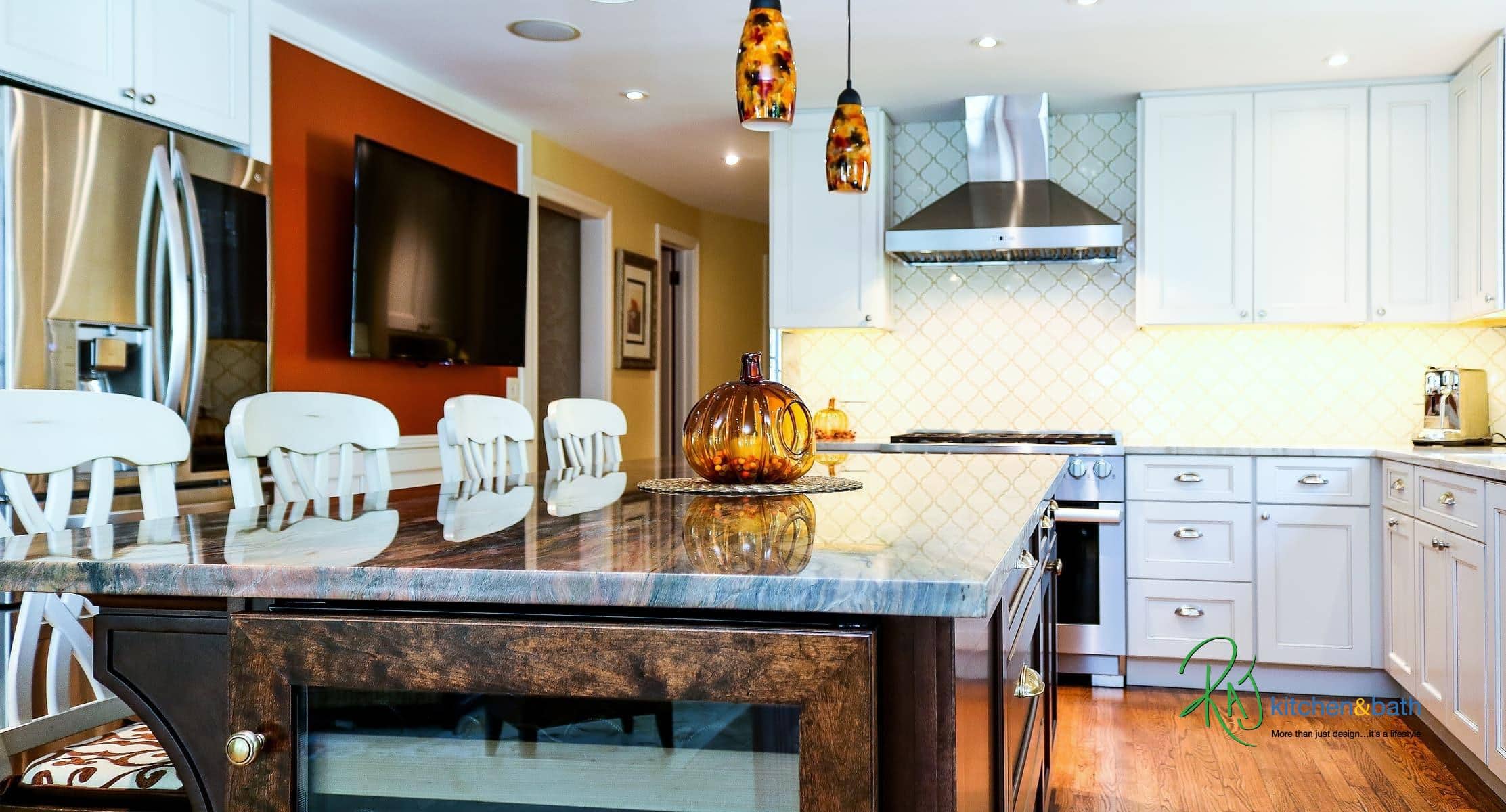
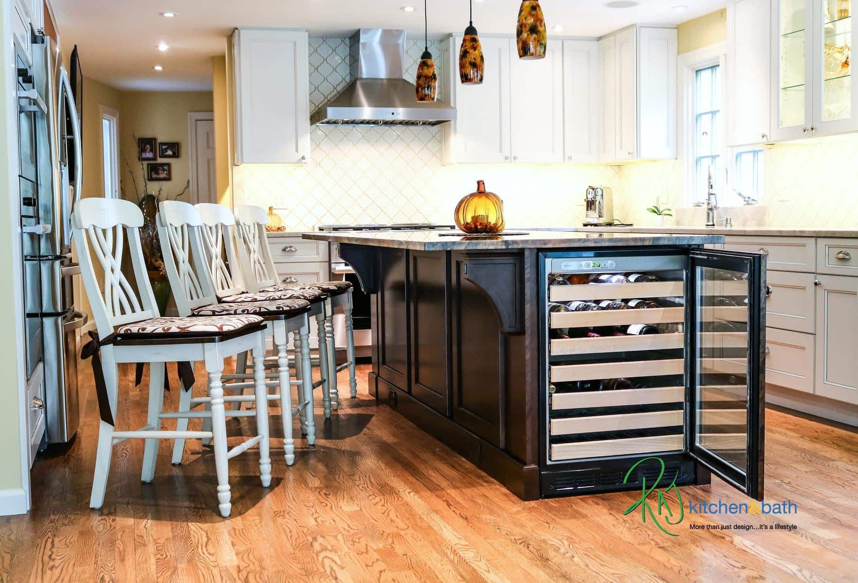
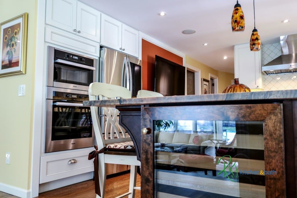
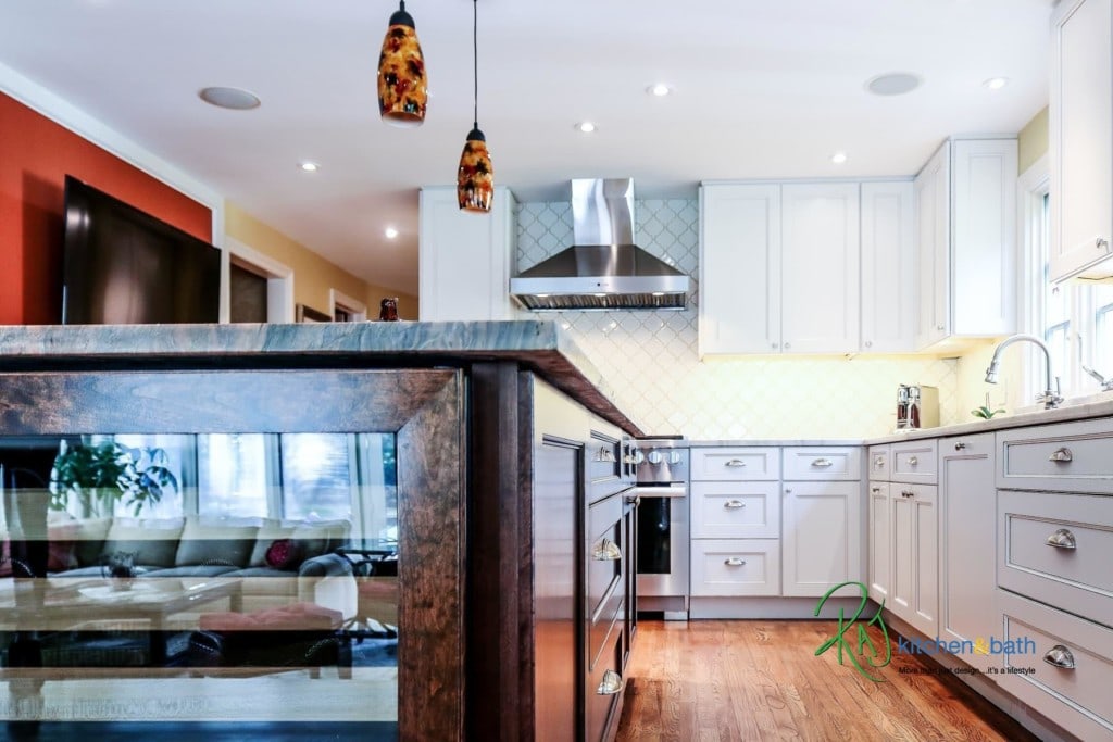
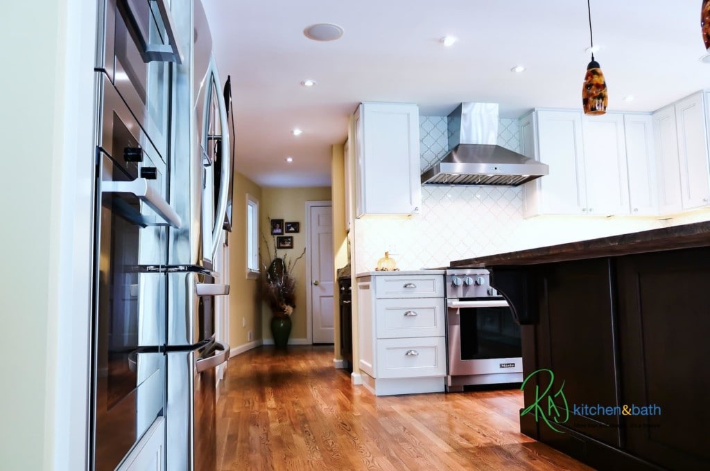
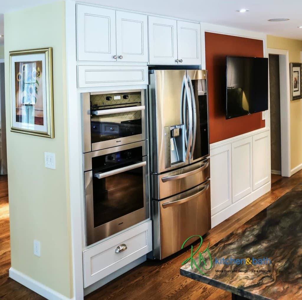
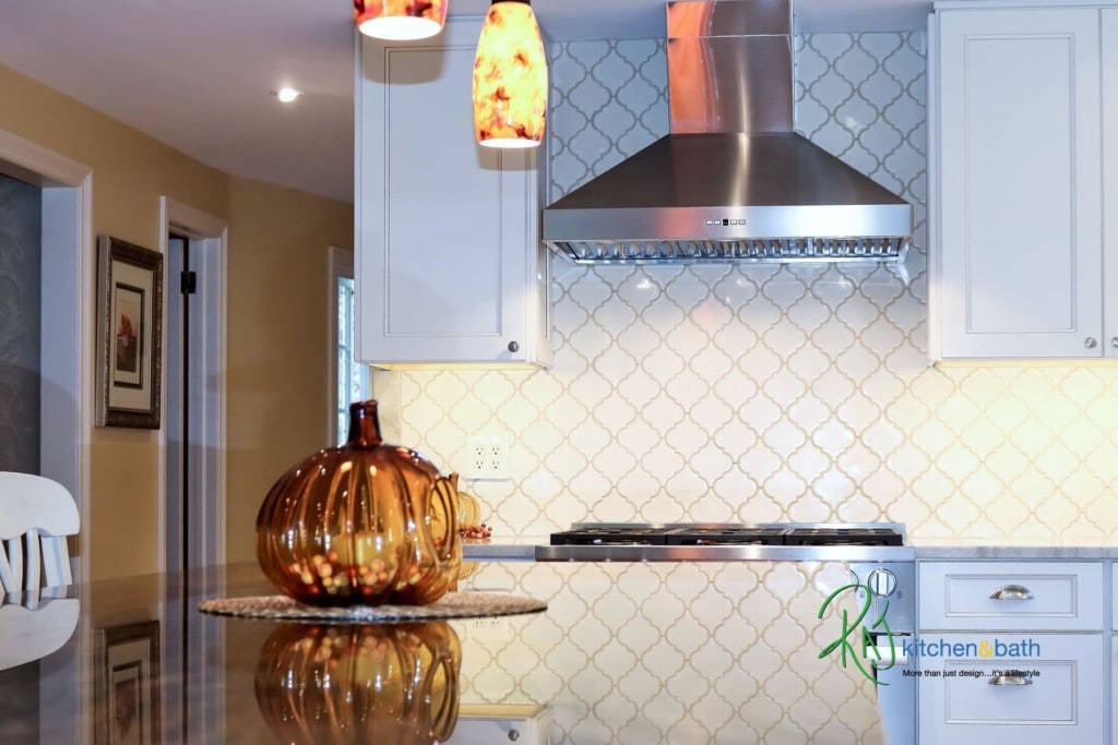
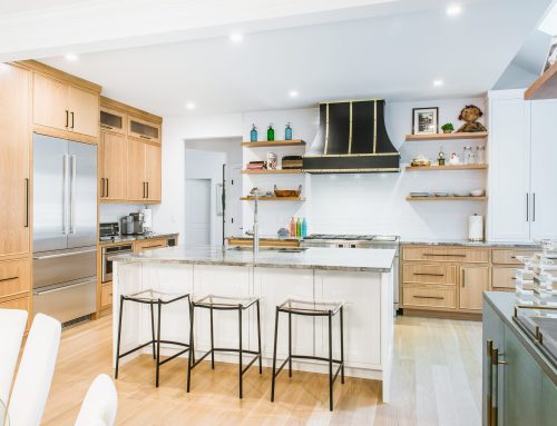
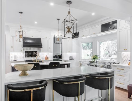
We began to surgically re-work the space with a level of precision that would open up the kitchen so much more. We found a way to move the cooktop from the Island and place a full-size Range in a much better position, because we needed that Island space for so much more. We then recessed the Refrigerator into the wall by bumping into the back side of the Dining room which gave us crucial space for us around the Range. After that, we added an Oven/Microwave combo to pick up the slack for baking, but most importantly to control the flow so no one enters the Kitchen when they are using those heavily used appliances because they were right along the traffic path.
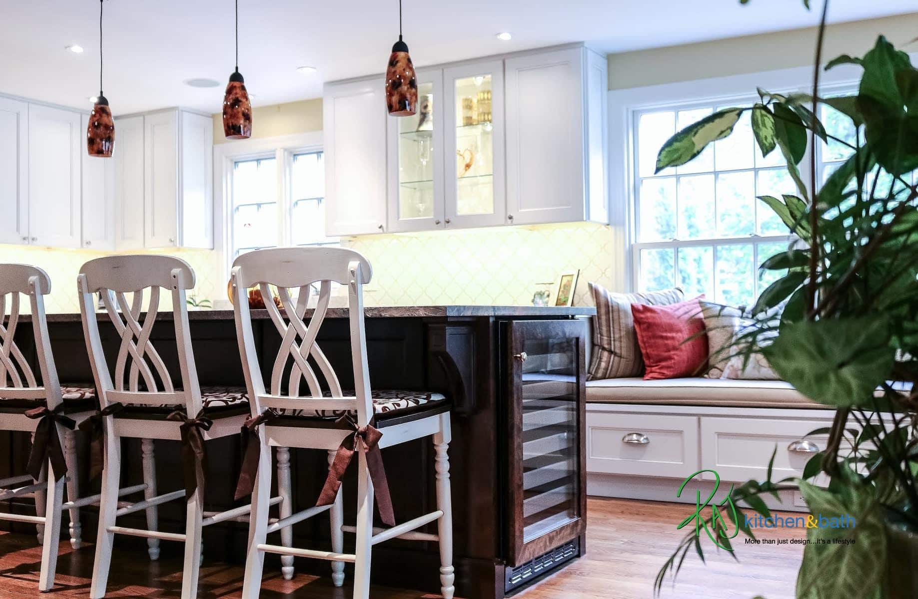
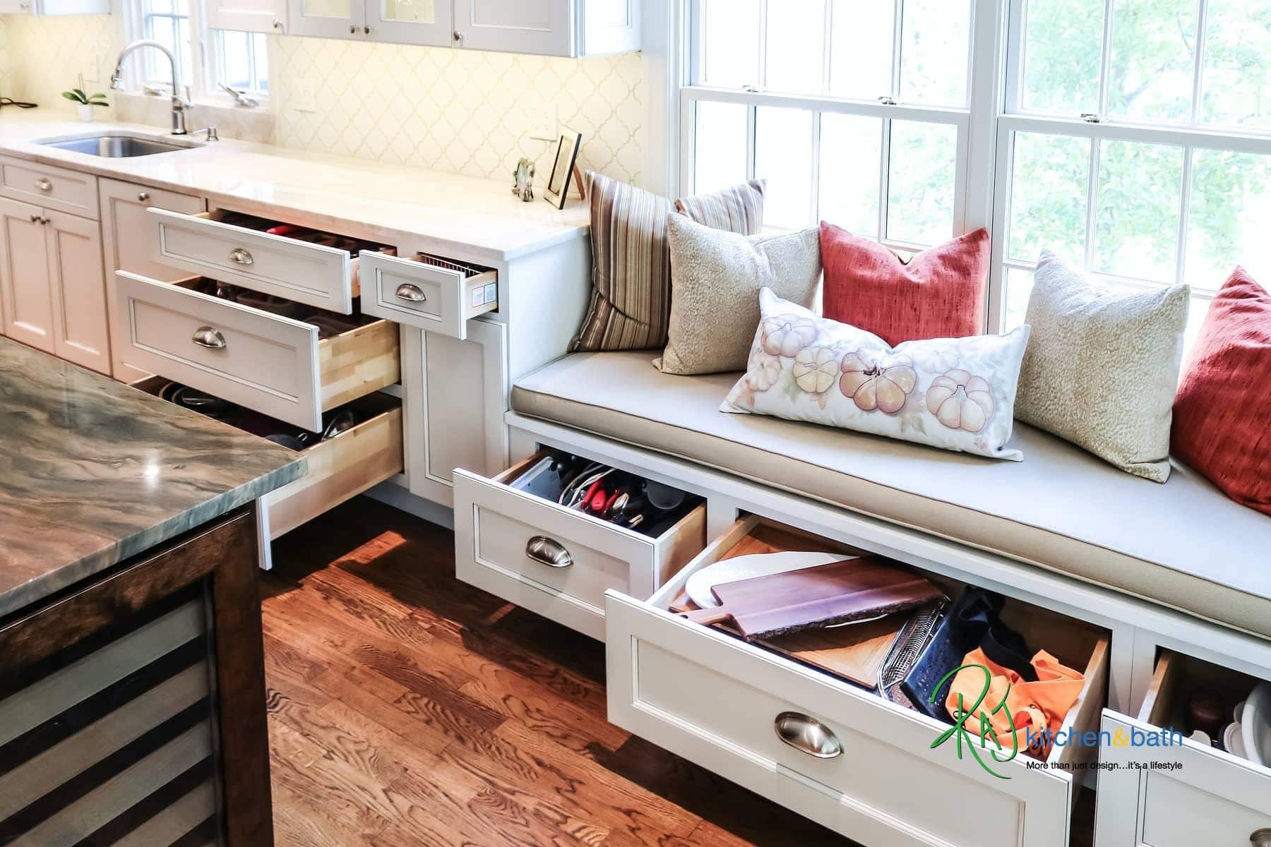
Once we figured out those big decisions, we added more seating under the Window so that we can make better use of the space by using it two-fold, storage and seating. This is a family that entertains a lot so having more people hanging out in the Kitchen is never a bad idea especially if we could figure out how to do so without making it too crowded. Naturally, we had to find a way for a large TV as well. This was the new family Hub.
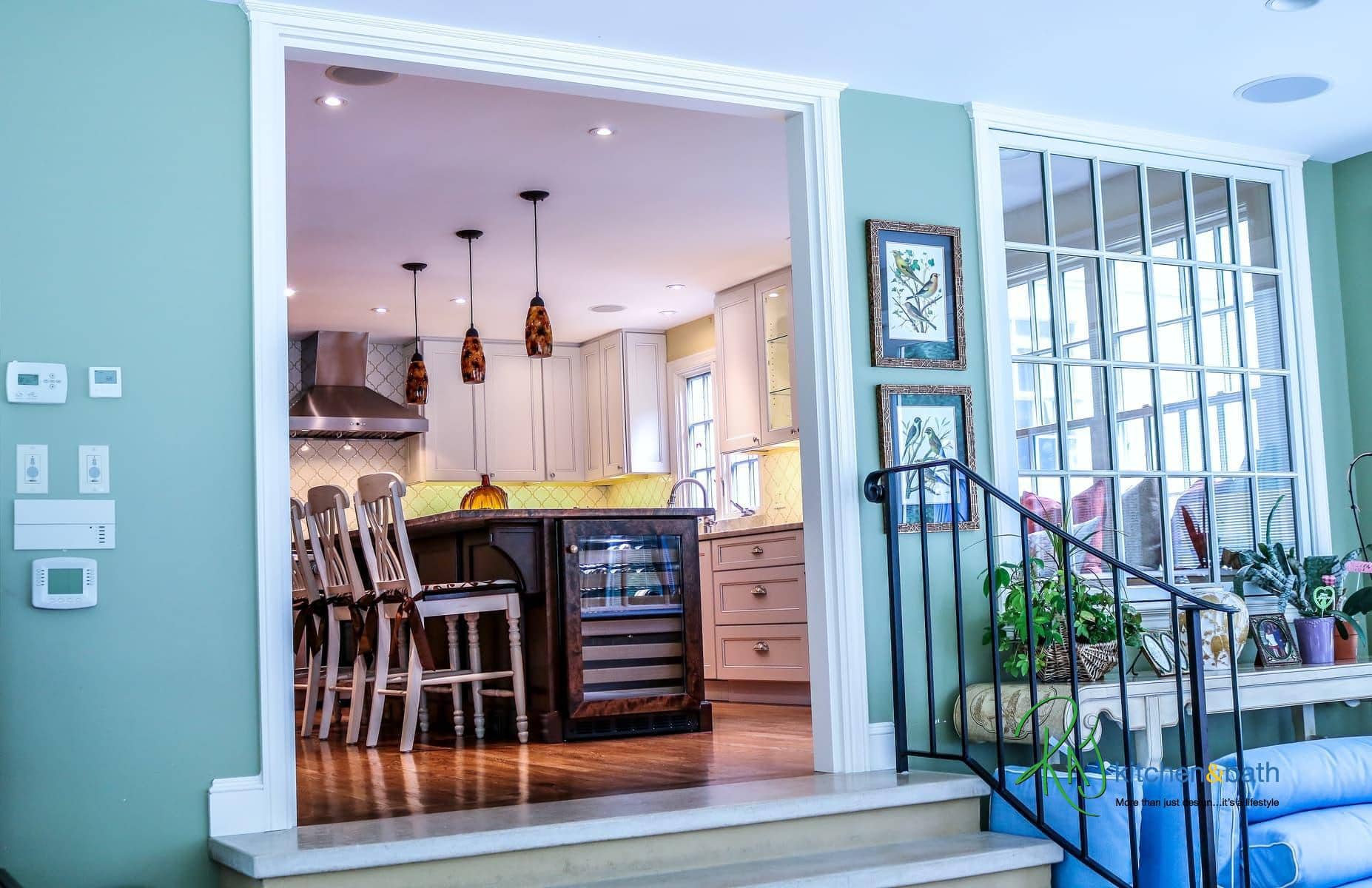
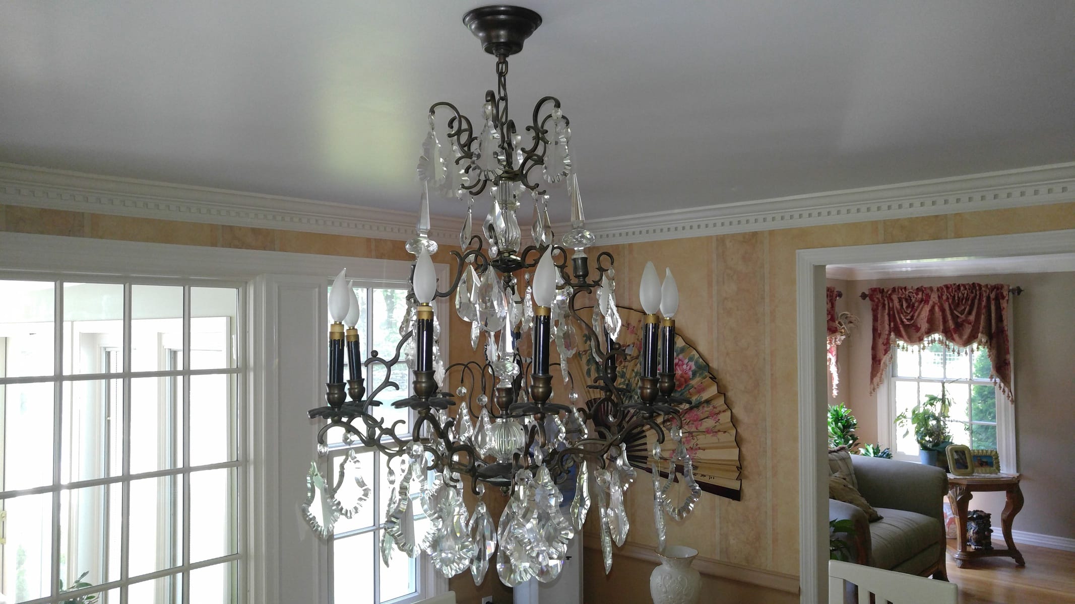
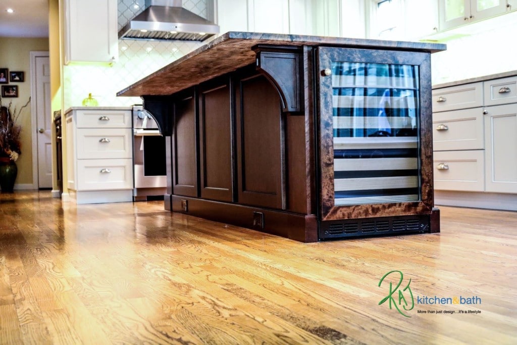
The Island was large! It had to be. We needed a place to act not only as a seating area but a food staging area as well. We needed a place to hold the Wine Cooler and some large Drawers for pots and pans which we stuck smack in the middle of the work triangle. We then opened up the area to the Dining room/New Bar section wider to bring in the natural light from the back of the room and to allow better connection to that area from the Kitchen.
We re-positioned the lighting in the ceiling, added some new lighting detail under the Cabinets and inside of the glass Cabinetry. The cabinet color and style was specifically chosen to fit into the rest of the style of the home.
Our client hand-picked that beautiful stone counter which turned out to be the final piece of detail that this kitchen really needed to give it that pop! This was a great collaborative effort among everyone to pull this all together. Have a look at some of the before and after photos of this project to see the transformation.
One more happy client! Now onto the next.


