Project Description
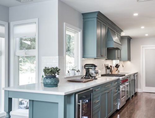
“Blue is the new white”
BLUE IS THE NEW WHITE.
When working on a project, there is always the usual bump in the road where you have to adapt and keep things moving to be on schedule. This one was no different. With all the usual uncertainties our clients were from out of state. They bought their house and were relocating 2 months from the date of closing so that they could have gotten here in time before the new school term opened. At the same time, dealing with a designer and contractors with whom they had no prior knowledge of or relationship with would be difficult since they planned to be out of state for the entire renovation. They trusted that everything that was decided upon was going to be done and they would not end up being another horror story statistic, after all their money was being spent.
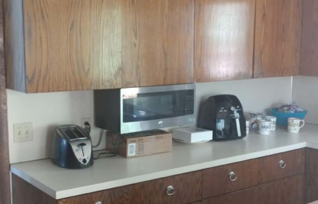
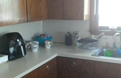
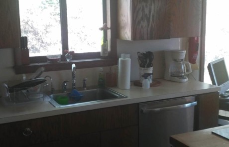
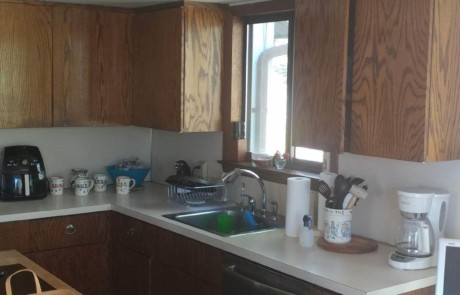
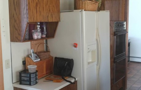
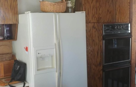
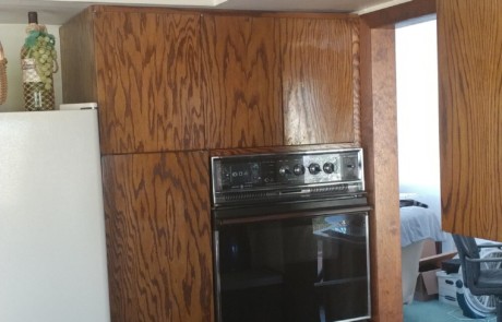
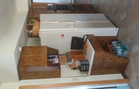
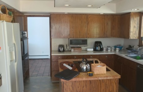
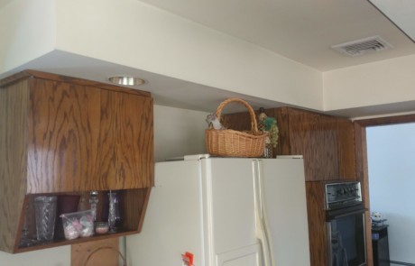
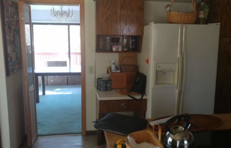
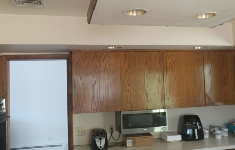
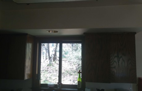
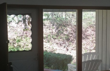
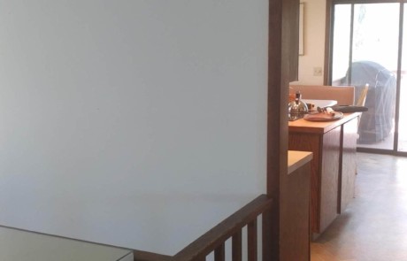
RAJ Kitchen & Bath had to design, build and execute on a remodel for this family within strict budgetary guidelines. The kitchen was very old and the previous owners did not make any upgrades for the years they owned the house, so it had outlived its time. There just wasn’t enough cabinets or counter space that could suffice for this new family, and the layout was just awful, even by the 1970’s living standards.
The rest of the house was not as bad, it just needed to be painted. Making this new kitchen layout work, involved RAJ coming up with a concept that would take one space and blend it into the other without making the home feel too mismatched. Our clients had a good sense of what they were looking for in terms of their living style, materials and finishes. So, with this as a starting point, we got to work on figuring out how to transform the old out dated kitchen into a masterful work of art.
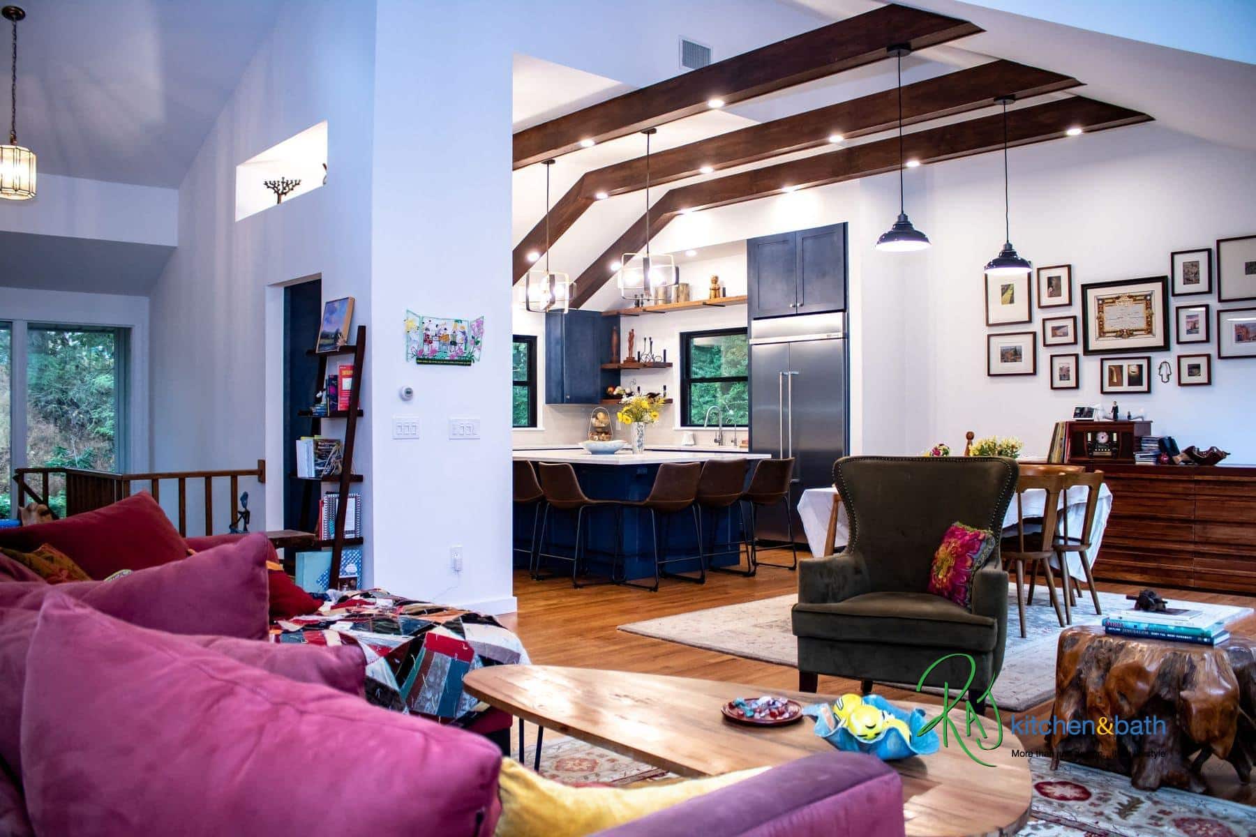
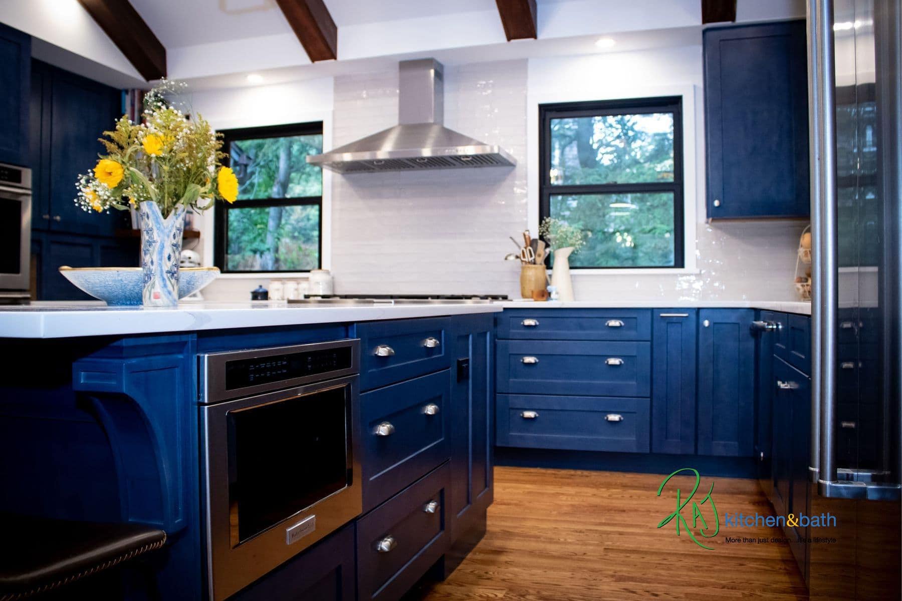
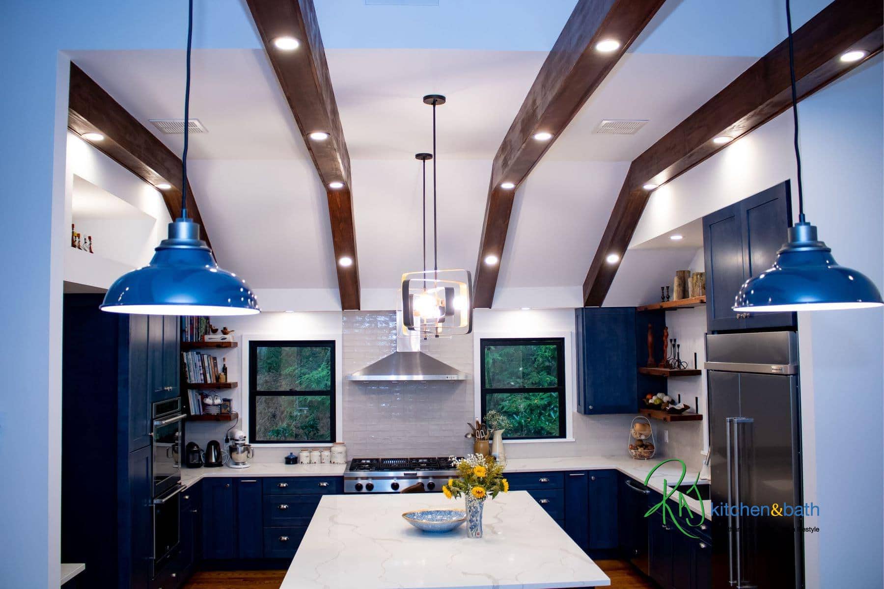
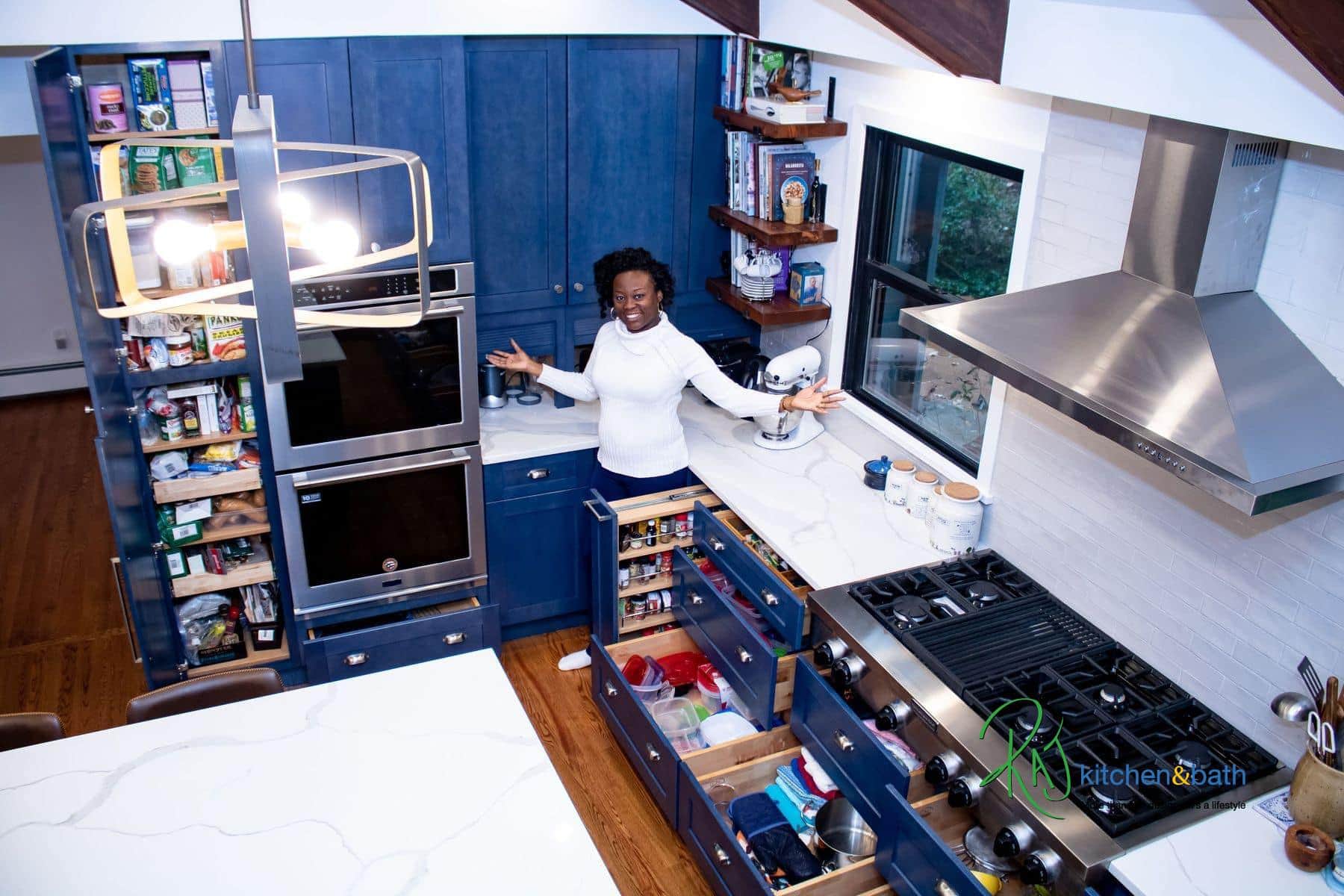
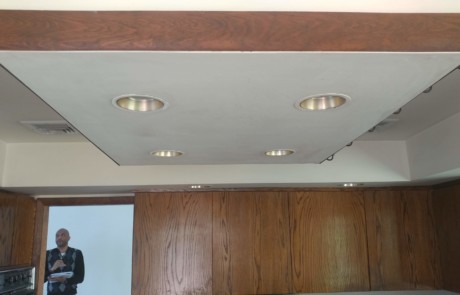
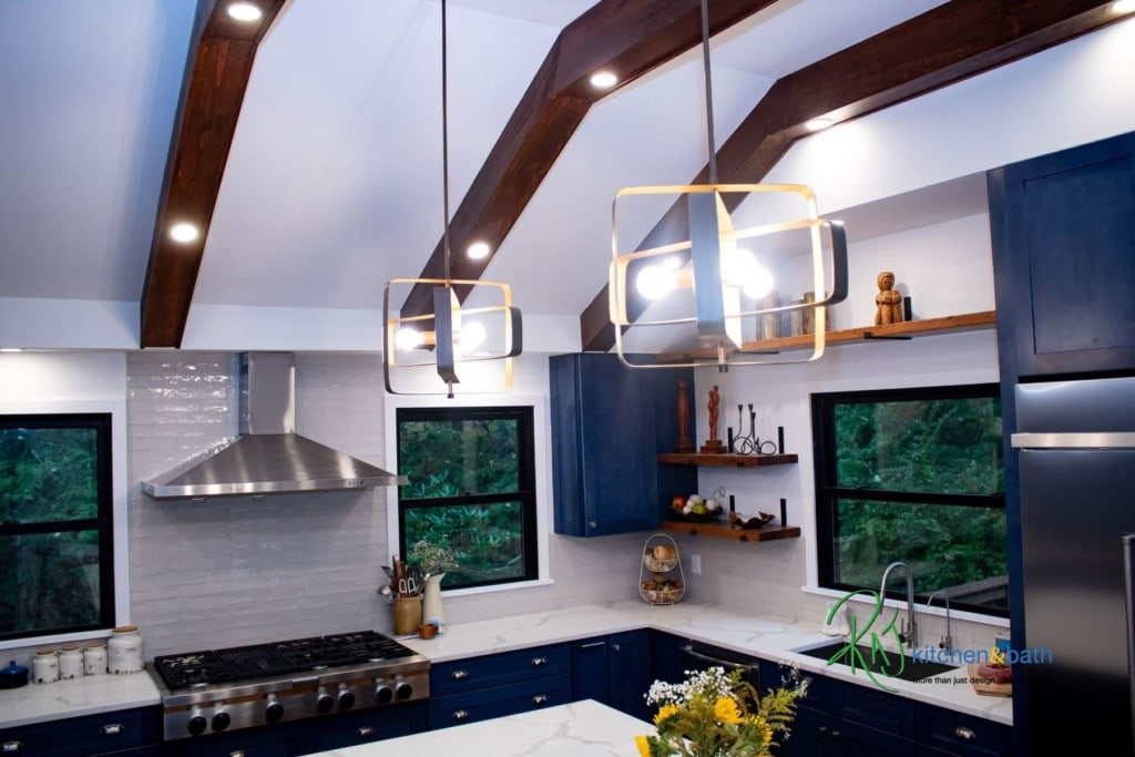
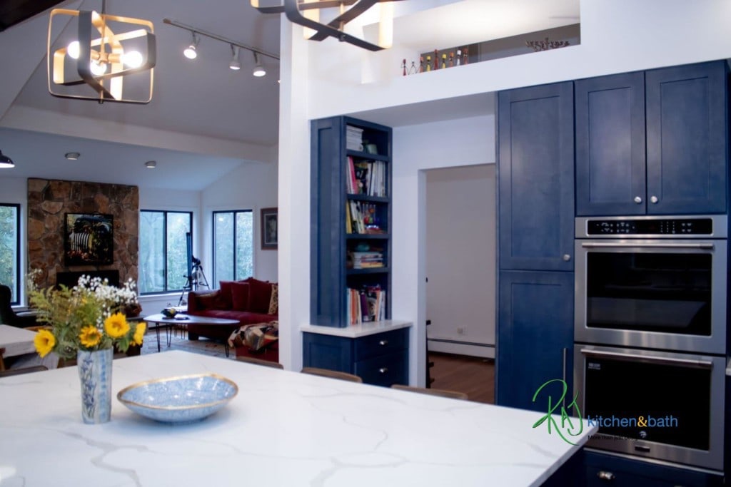
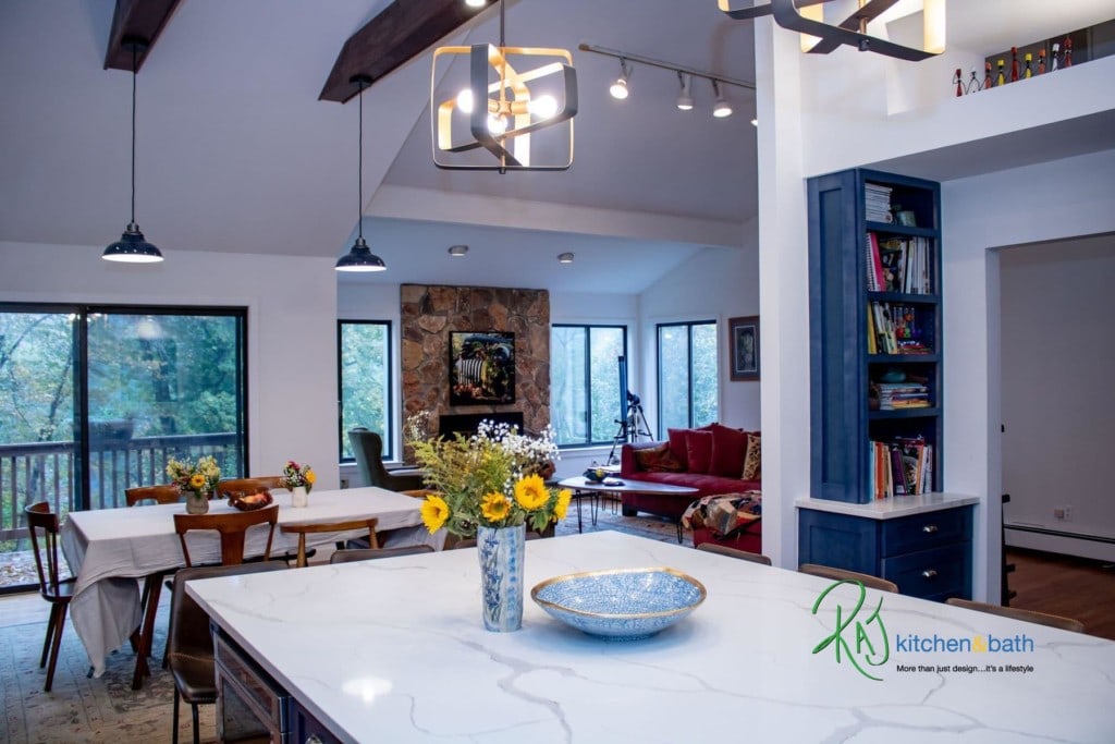
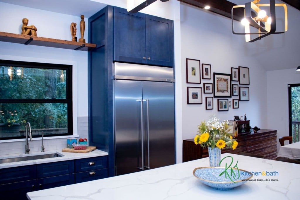
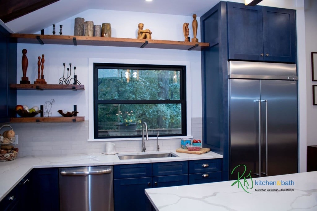
What RAJ did was just simply amazing. We did not take any space from any other part of the house. We stuck to our entire existing kitchen footprint and reconfigured the kitchen in that area. First, we raised the low old ceiling to fall in line with the mid-century modern look and feel of the house. We then opened up a wall to connect both the living and dining rooms together. Once this wall was opened, we had to find a way to tie in back both rooms together, so we approached this look from the ceiling. We installed massive non-structural beams that ran from the kitchen directly into the dining room. We then installed LED lighting into those beams from the kitchen all the way over to the dining room and used 2 to mount the dining room table lighting on. We strategically didn’t raise the ceiling all the way because we had HVAC ducts and pipes that had to stay in place. Parts of the original doorway was expanded to provide a better flow to the kitchen. An asymmetrical opening was cut in above to make the feel of the hallway and kitchen inter connected. The biggest debate and decision with our client was the blue cabinet color. This is a blue that we’ve grown to love since we started sampling it over the last year. We added hints of it in other kitchen designs we have worked on, but never in a complete design. We had some versions of the blue in our initial design concept for this space which was ok with our client, but then after back and forth discussions, our client wanted to just rip the safety goggles off and go ballistic with the BLUE. We welcomed that idea. What a great decision this was. The blue cabinets brought the space together and gave it the lift that it needed. It immediately set the kitchen apart from other typical kitchens that you would normally see. It ties right into our client’s taste and style of furniture and it made the home so much more unique.
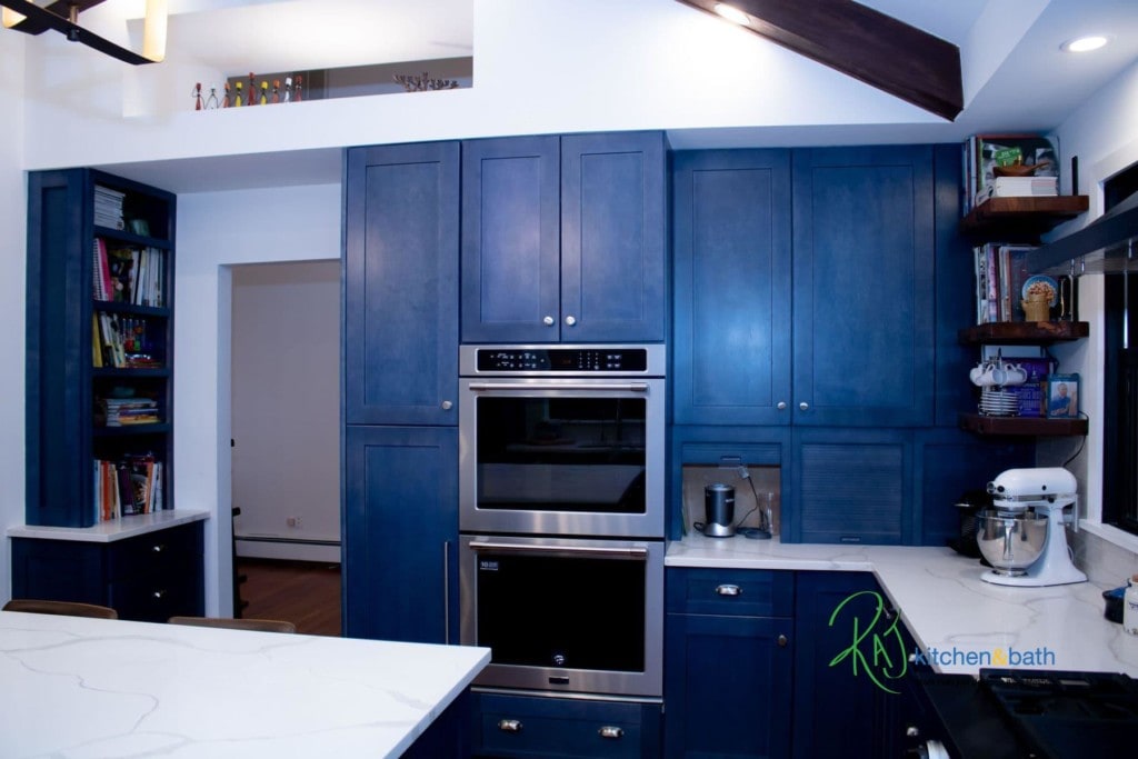
A lot of effort was put into the physical structure and the reconfiguration of the space. However, more was done in the kitchen design. There is a sense of awe you feel when you walk into this home today. You would almost forget how important the details of the kitchen cabinets and layout were. We added tons of storage and features in the cabinets, pull out shelving, appliance garage, under cabinet LED lighting and one of the largest islands that we have done to date. The island is so big that our client jokingly said that they would put a tennis net and play on it. I laughed, but I think I’ll like to grab a racket and play a game myself. This island is that big.
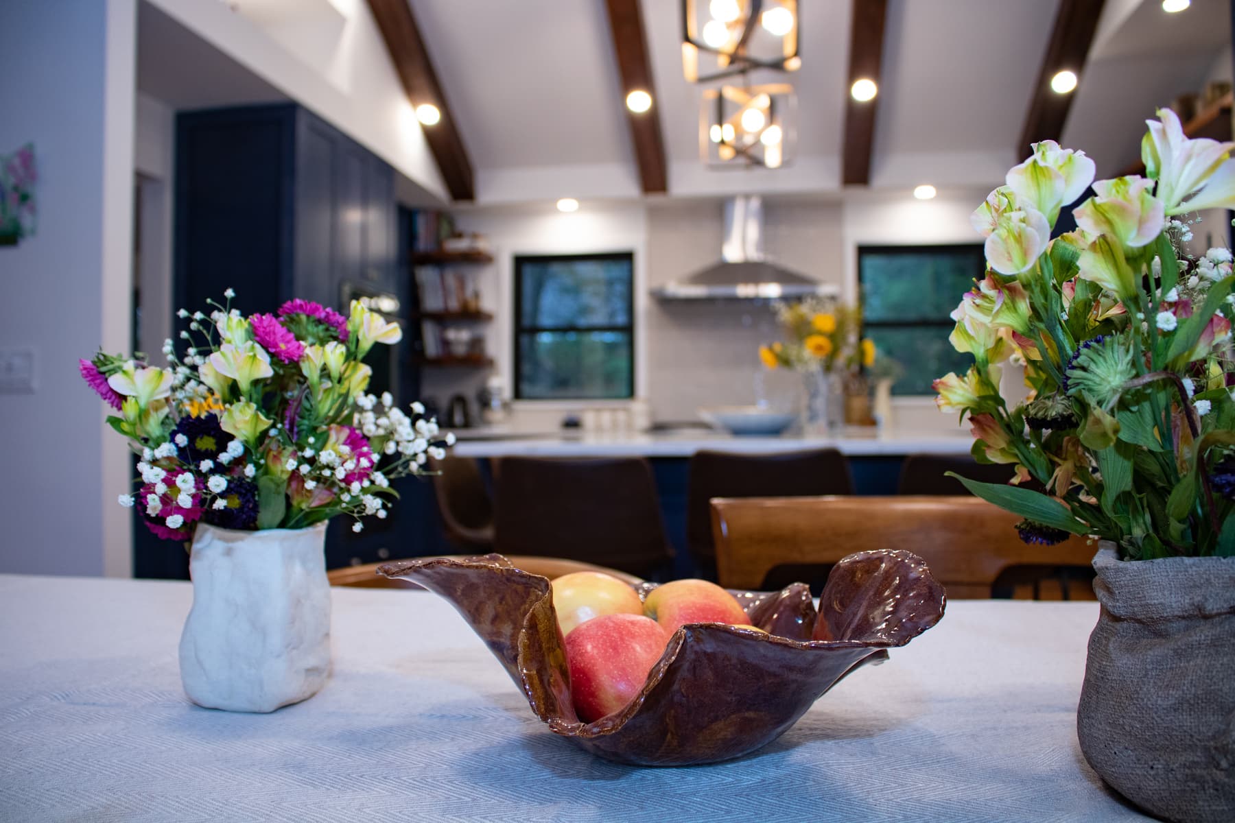
We made sure that every part of the kitchen was used for some storage. Our clients are avid book lovers. As you would see in the photos, the space was tastefully decorated with book cases, made with custom wood floating shelving from white pine which are over 100 years old now re- purposed into bookcases.
The entire team at RAJ Kitchen & Bath, all of our Vendors, the team from Samuka Home improvement who all worked diligently to get this project finished on time and within budgetary guidelines for this lovely family. They trusted us to do what we said we would do. The level of organization, management and critical communication between everyone made it easy and possible to get this project completed on time for their move in date.
We knew we were OK when we got the call that they landed safely, they were at the house and they said these words to us over the phone. We are SPEECHLESS!!!
Happy Clients, now onto the next!
