Project Description
…THE BIG CHILL”…
…”The Big Chill out”…
Transforming a Dated Kitchen into a Beautiful Showpiece: A White Plains Renovation
Located in one of the most sought-after buildings in White Plains, this apartment had amazing potential. The high ceilings welcomed you in, creating a sense of spaciousness. While the unit was one of the best in the building, there was one major issue: the kitchen.
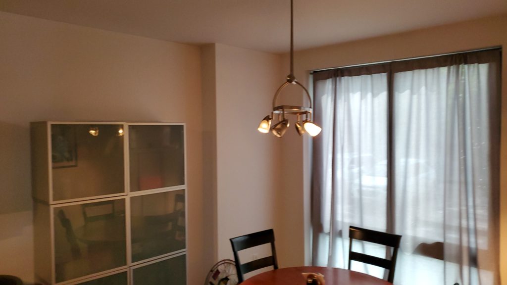
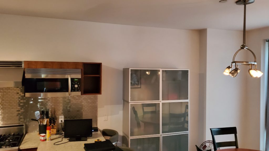
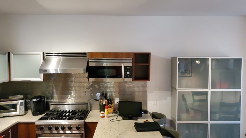
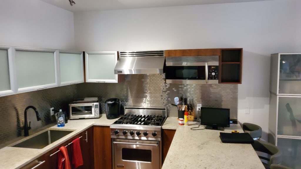
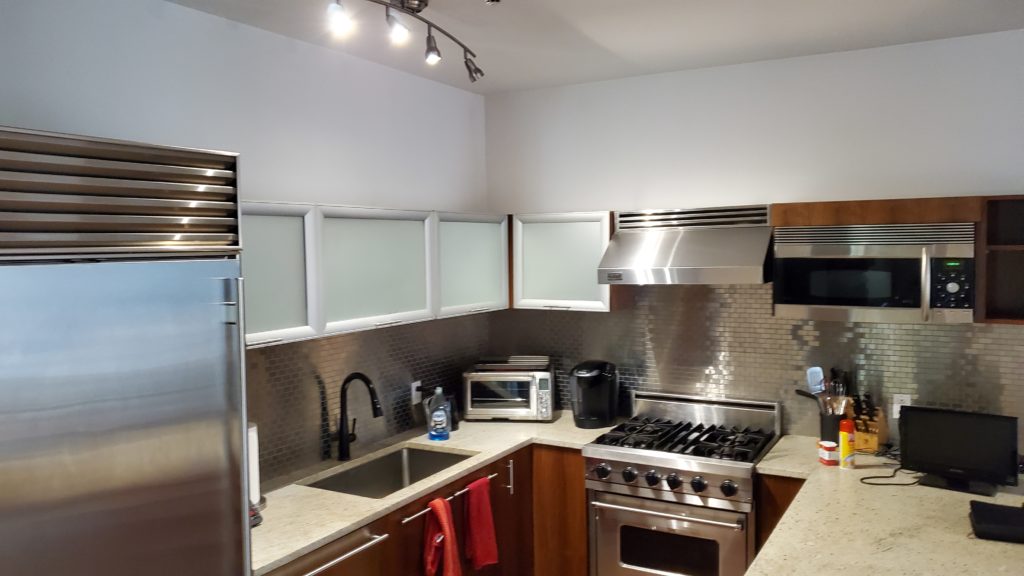
The kitchen didn’t fit the rest of the apartment’s design. It lacked the thoughtfulness and style the rest of the space had. Often, we see kitchens that try to combine too many functions into a small room, and this one was no exception. The materials used didn’t match the home’s design either, making the kitchen feel disconnected from the rest of the apartment.
Our client wanted to create a kitchen that flowed with the rest of the home—a space that would impress anyone who saw it and be the envy of their neighbors.
The Challenge
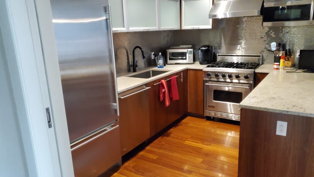
When we walked into the kitchen, it was clear that it needed help. The room felt closed off, with dark cabinets clashing against the floors, frosted glass cabinets that didn’t add any style, and a peninsula that made the space feel smaller. We knew this kitchen had great potential, it just needed a redesign that would open it up and make it blend seamlessly with the rest of the apartment.
The Solution
While we couldn’t move the appliances, we didn’t let that limit our vision. With the client’s full trust, we tore out the old cabinets and flooring but kept the layout. Our goal was to transform the kitchen into a space that flowed naturally from the rest of the apartment.
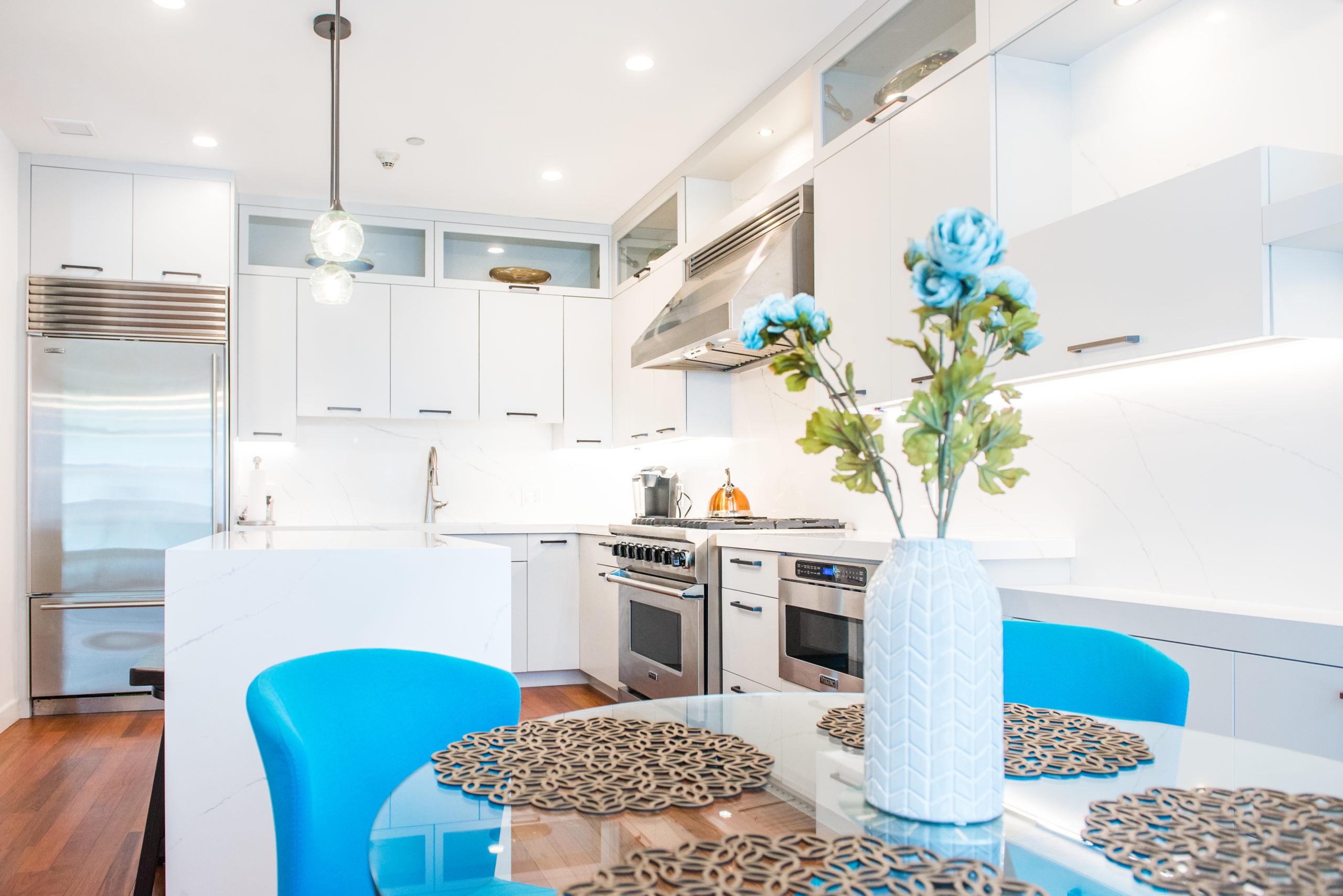
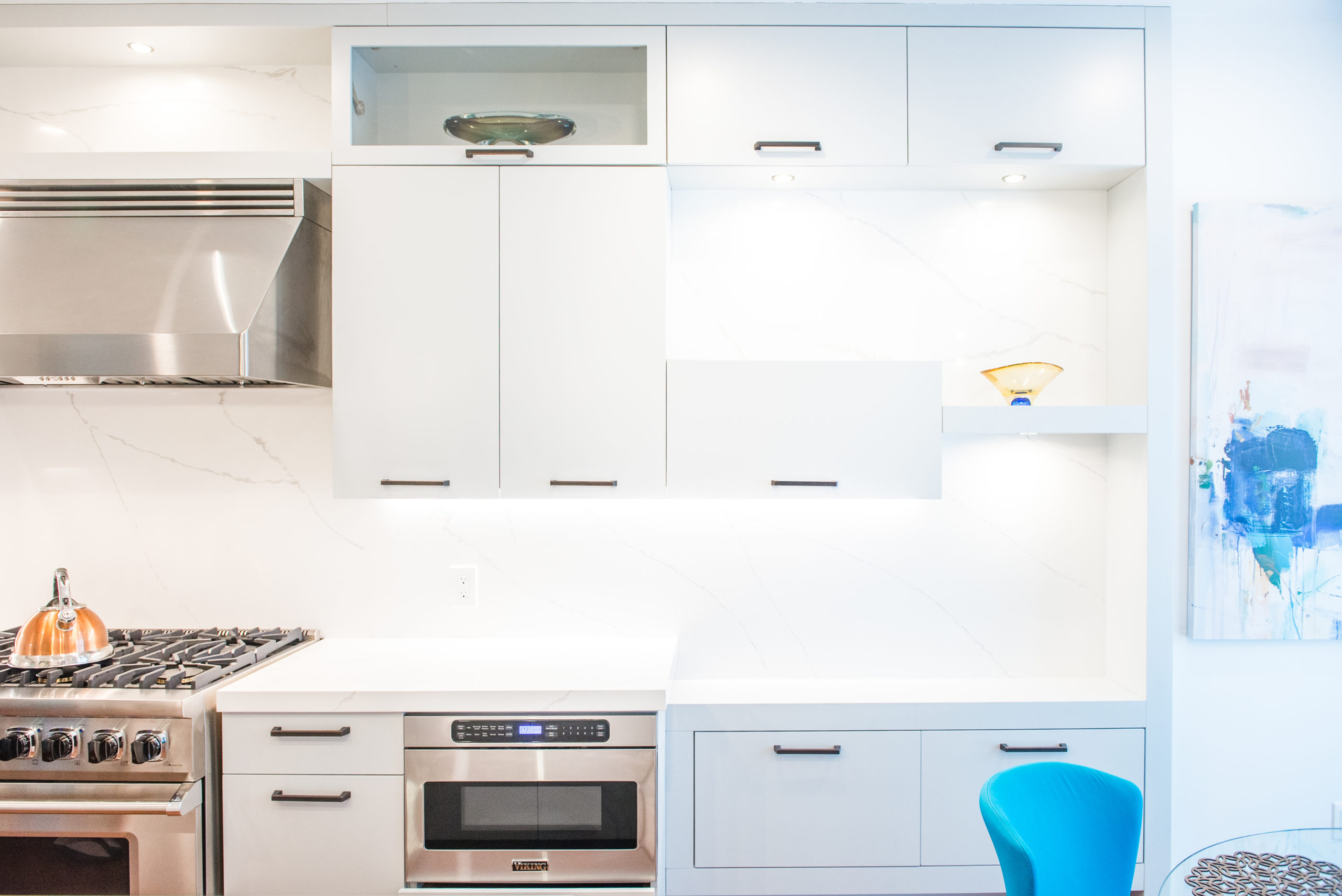
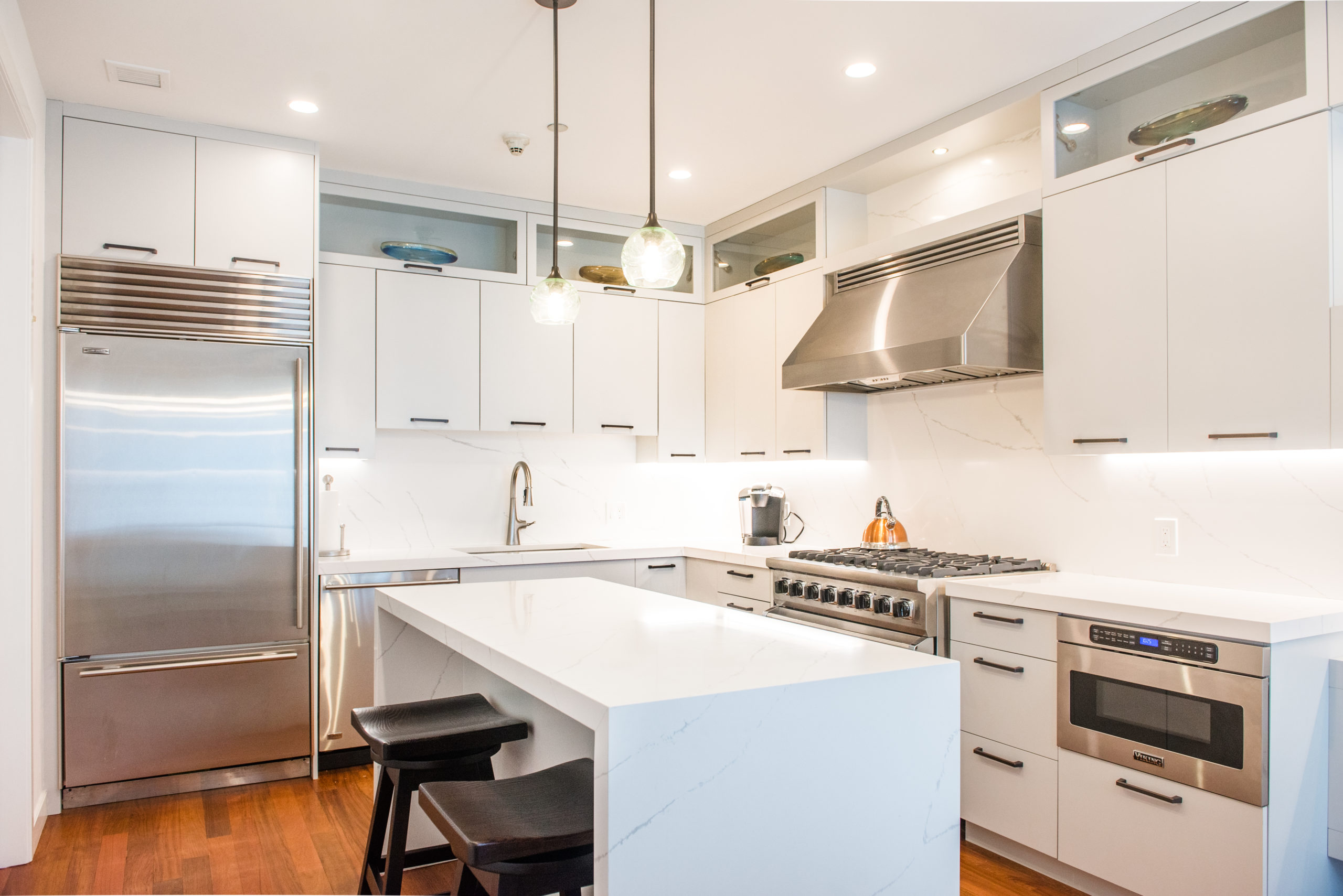
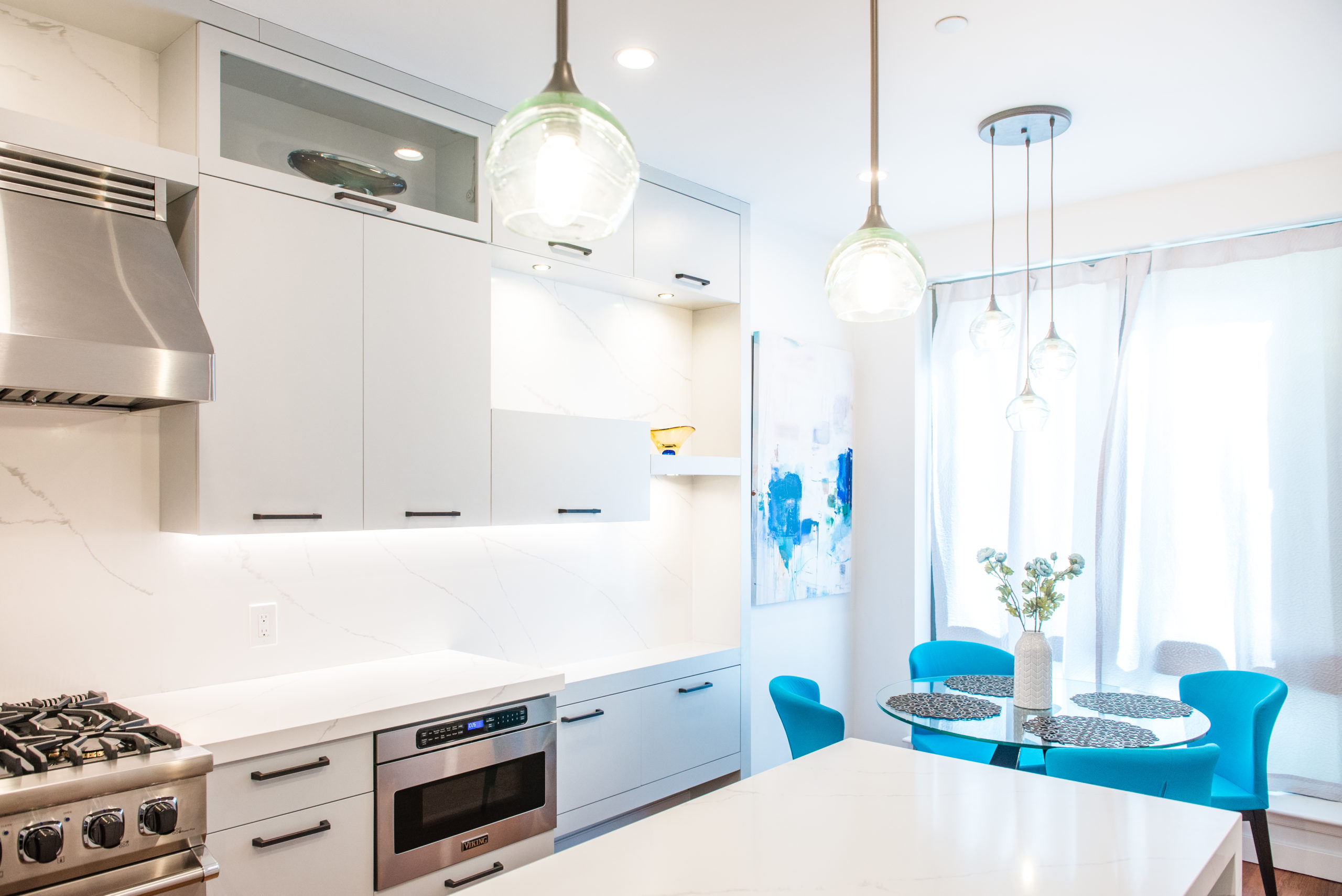
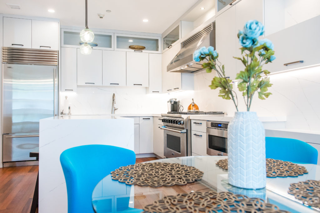
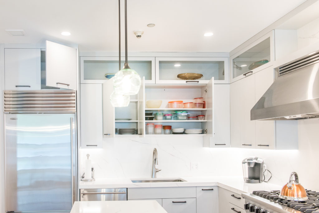
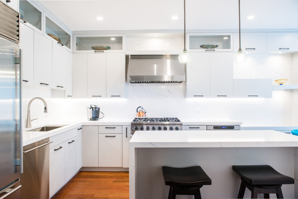
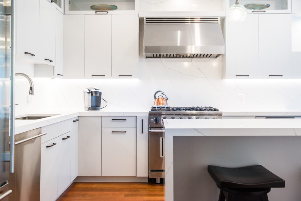
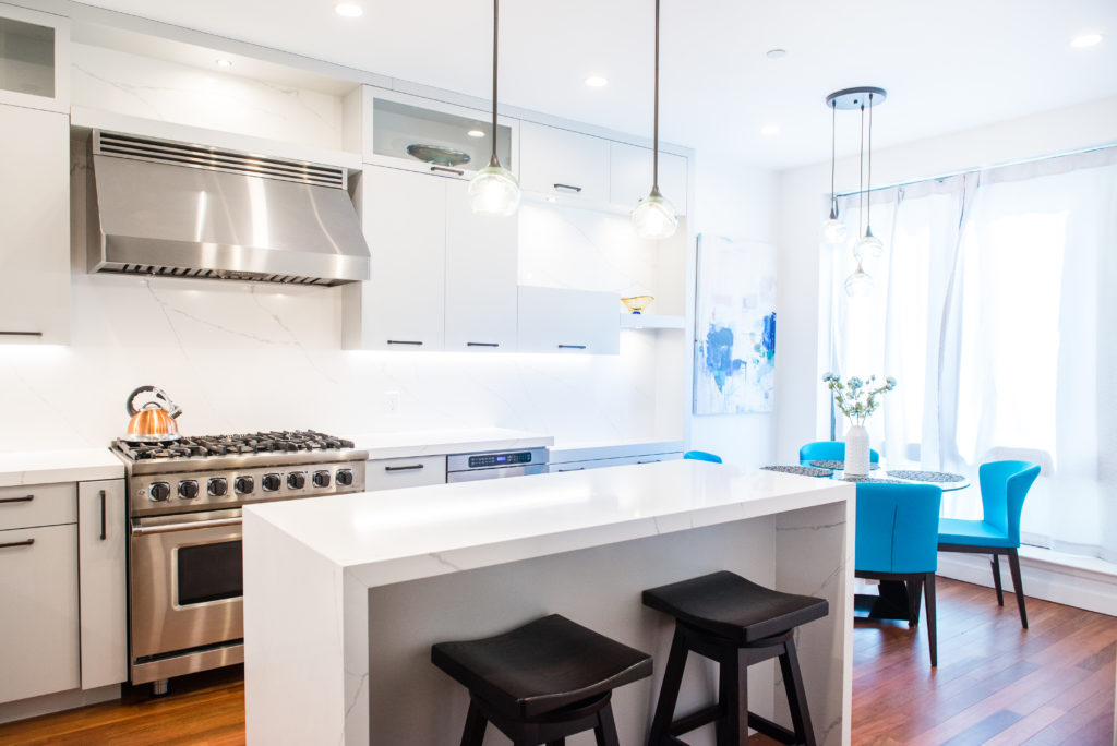
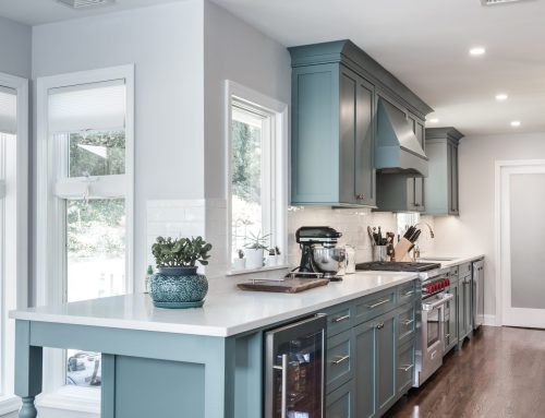
We used the tall ceilings to our advantage, extending the cabinets all the way to the ceiling—something that should’ve been done years ago. To keep the space from feeling too heavy, we incorporated glass into the upper cabinets, which lightened the look.
We replaced the existing 30” range with a larger 36” version to better balance the space. The refrigerator stayed in the same spot, but we wrapped it in custom panels to blend in with the design.
Opening Up the Space
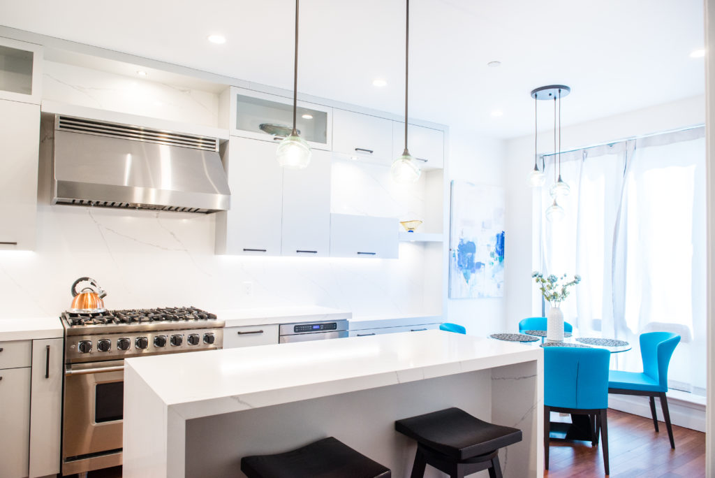
The peninsula was taking up valuable space and blocking the flow of the room, so we removed it and replaced it with a kitchen island. This simple change made the room feel bigger and created a smoother transition to the other areas of the apartment.
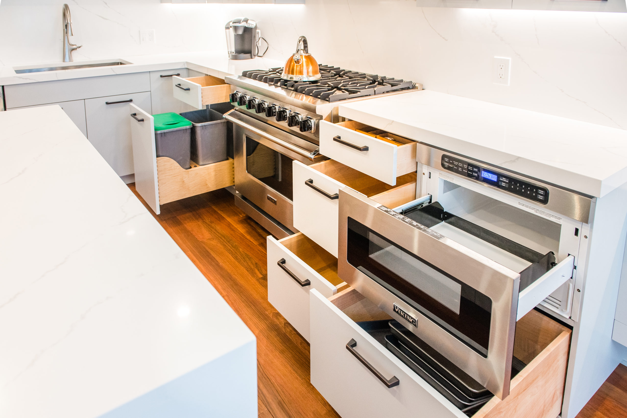
To avoid making the room feel too large, we used open shelving, glass elements, and floating cabinets that extended into the kitchen nook area, offering more storage and keeping the space feeling open.
The Final Touch: Color
After much consideration, the client chose a stunning color called “Big Chill” by Sherwin Williams. This cool, soft color brought everything together beautifully. The client was clear from the beginning: no white or grey kitchen! “Big Chill” was the perfect choice, offering elegance without being too bold.
The Result
The transformation was a complete success. The kitchen now flows beautifully with the rest of the home, and it’s a space that truly stands out. Our client couldn’t be happier with the result.
If you’re ready to transform your kitchen or any other space in your home, we’d love to help you bring your vision to life.
Contact us today to start your renovation journey.


