Project Description
“WINE AND DINE”
WINE AND DINE.
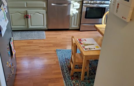
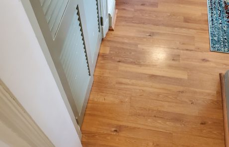
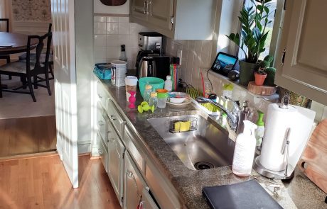
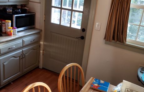
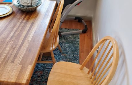
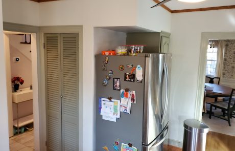
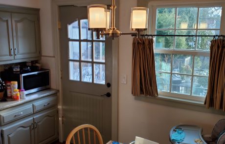
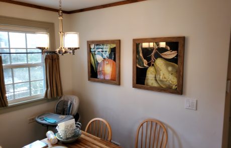
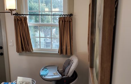
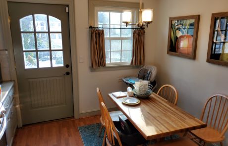
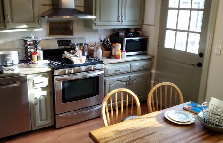
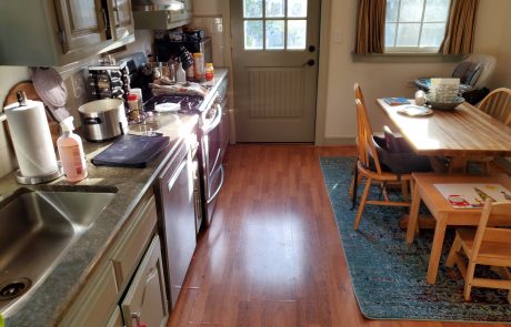
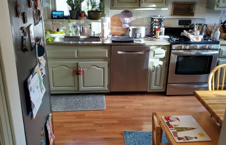
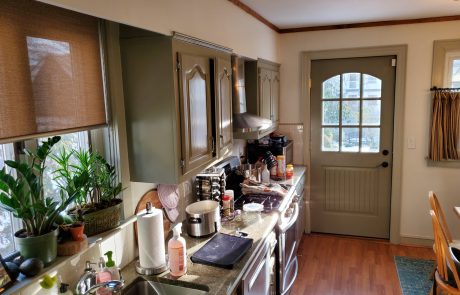
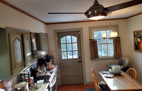
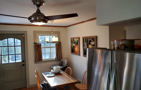
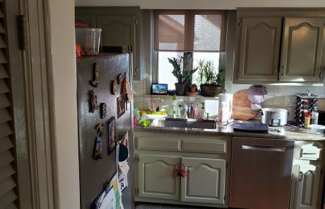
After a few years of searching around for a kitchen design and a plan that would fit their lives and compliment the décor, features and style of their existing home, our Client gave up. Resigned to the notion that somehow, if they ever wanted to get this kitchen remodel, they are going to have to accept that it would never be what they wanted. In the end, it might just be easier to update the cabinets and live with it.
A few months ago, we received a call from this lovely family. After talking on the phone for a while, it was clear that they’ve been at this for a while. We met sometime soon after, walked through the space, and immediately we saw what their issues were and we knew right away how we were going to address them. We were hired immediately to go back to the drawing table and come up with a plan that actually works.
Every kitchen, every house and every family are different. It’s just like your unique DNA, so one size, or style, or type does not fit all. What we deduced from our conversations and even from what we saw from the previous design that was presented to them, they all were trying to put that kitchen into the standard “typical mold”. That was never going to work and especially, it would have never worked in this house.
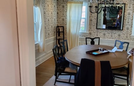
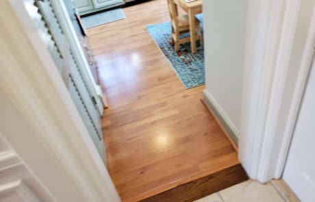
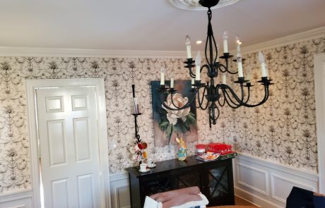
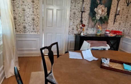
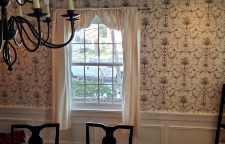
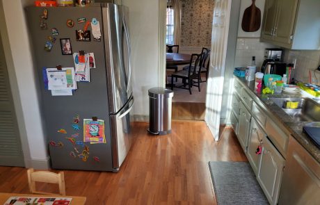
One thing that was clear and was the #1 on the must have list, was removing the wall that cuts off the Kitchen from the dining room. No doubt that would’ve open up the space and would be one of the biggest changes to the space but that was not enough. We had to now figure out where everything else would go, how to now blend the kitchen back into the room as if it was supposed to be there and not feel like it was a kitchen that was open just for the sake of being open.
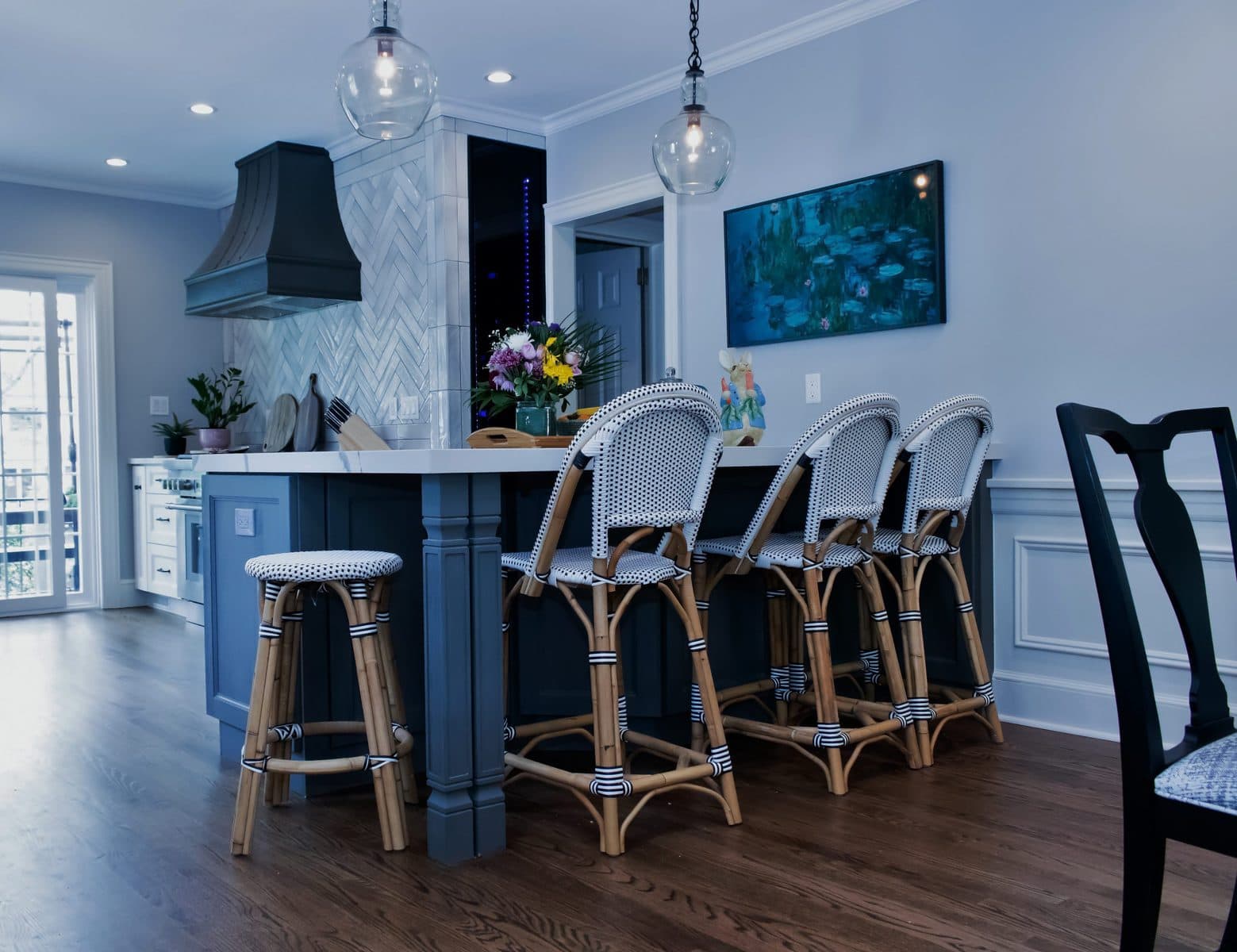
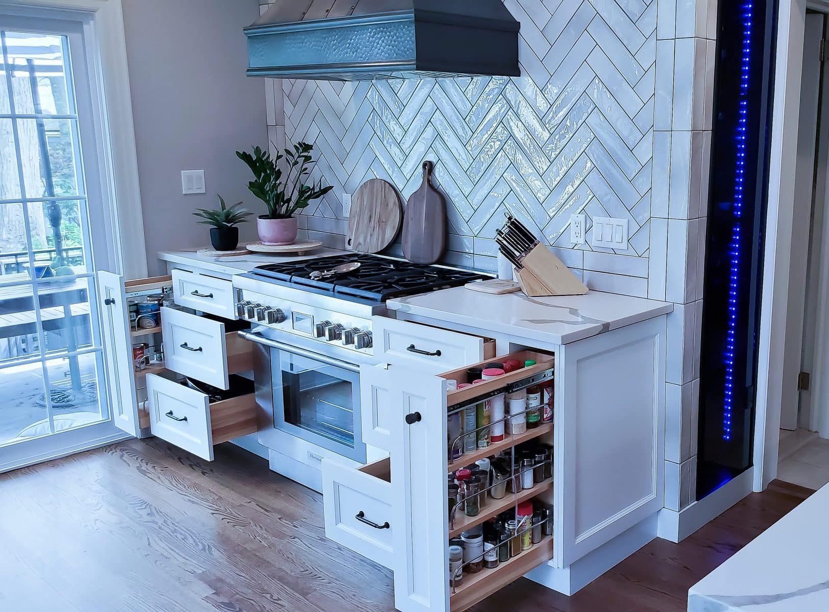
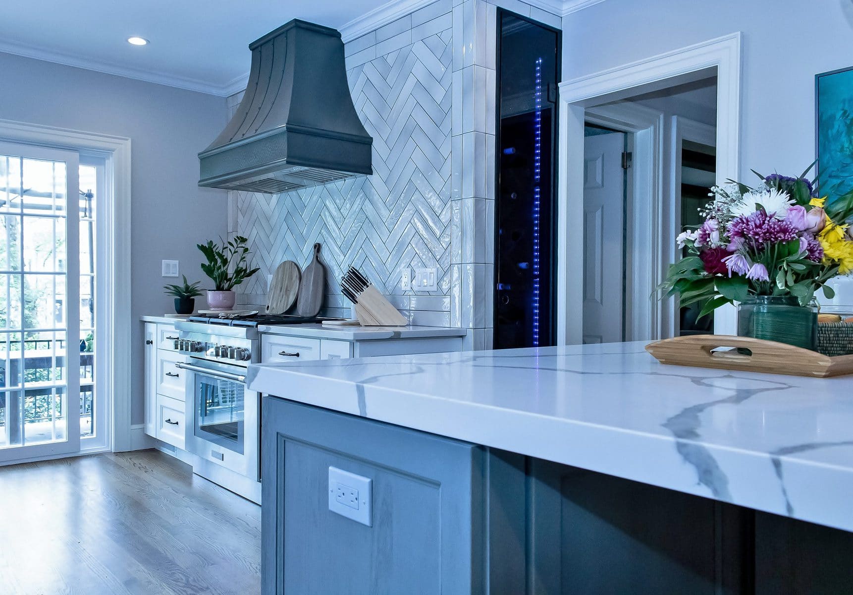
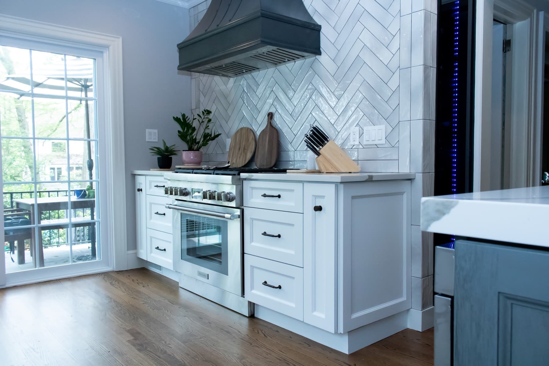
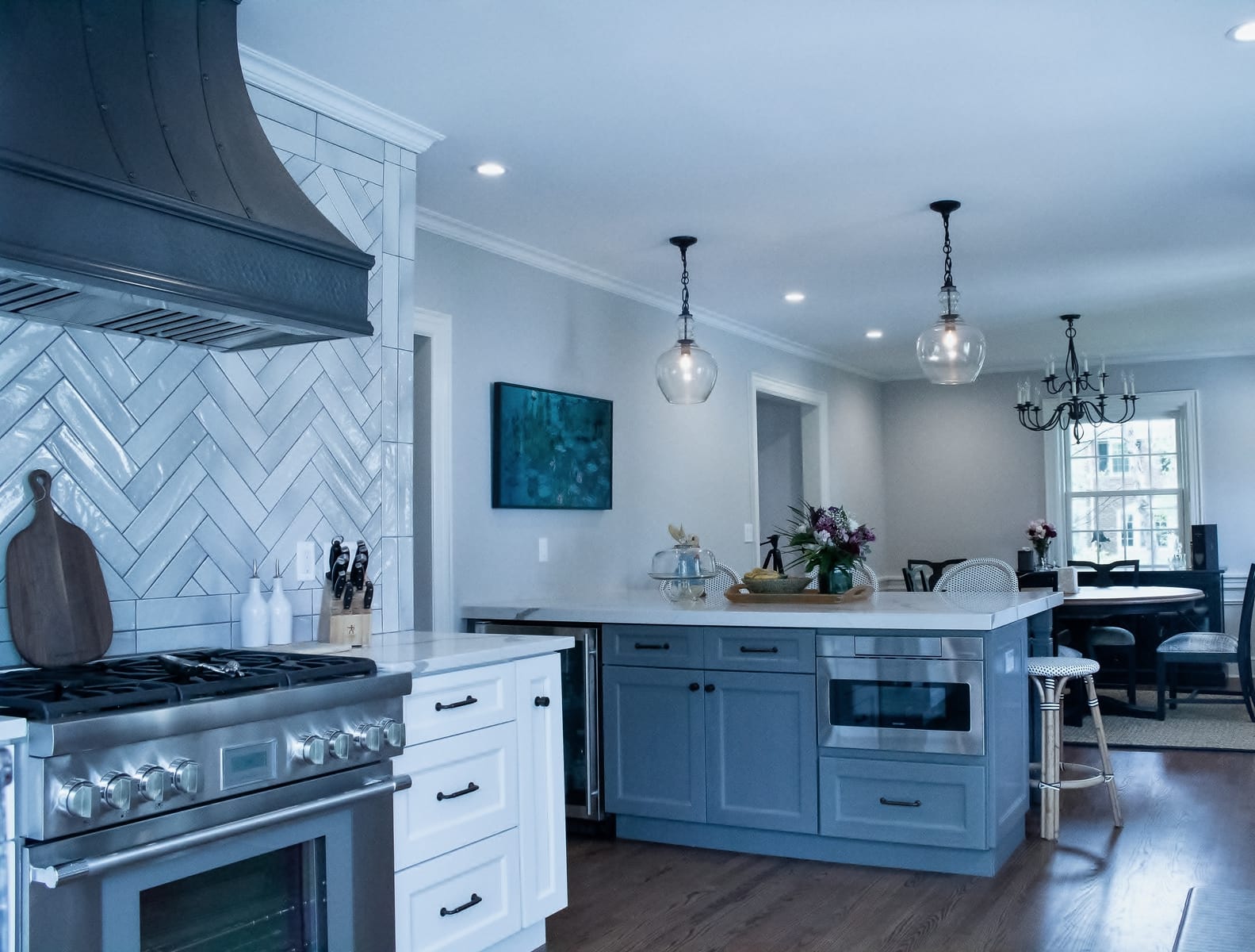
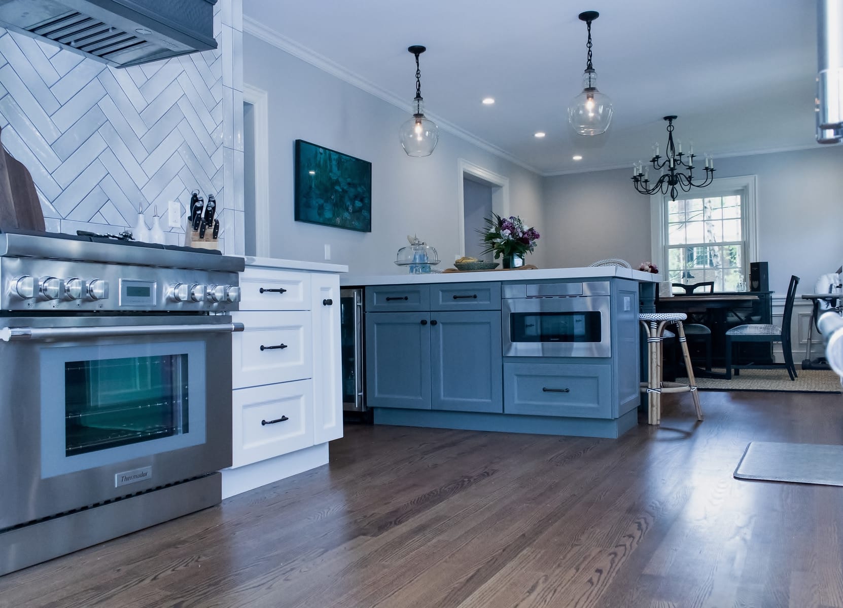
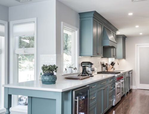
This is a family that cooks and entertain and that’s where the work began. We relocated the range to the other side of the room, but we purposefully planned for either open serving so that it would not block in the much-needed lighting that was coming in from the back. This particular wall was big, so the Range and the handmade copper Hood had to be really cool. The anchoring on that wall was the handmade copper hood that anchors the hood along with the herringbone tile inset pattern that brings them all together like a perfect marriage.
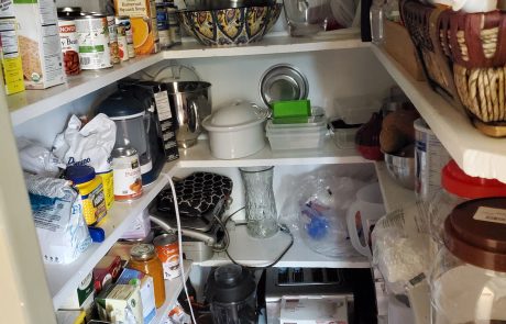
We then turned our attention to the next big item in the kitchen. The refrigerator. We had to get it to a spot where it would hide in plain sight. This was the only way we could do what we were about to do next.
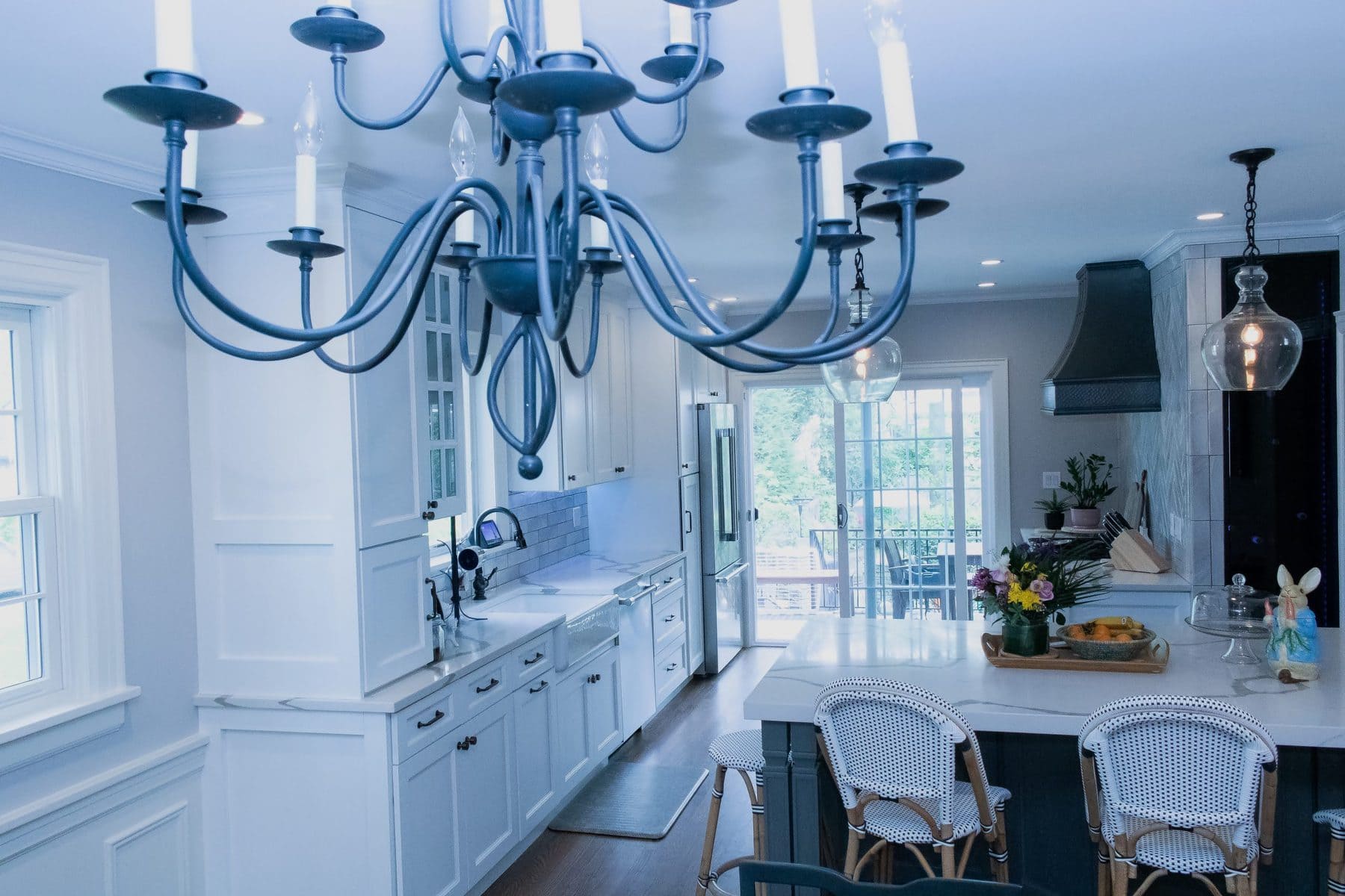
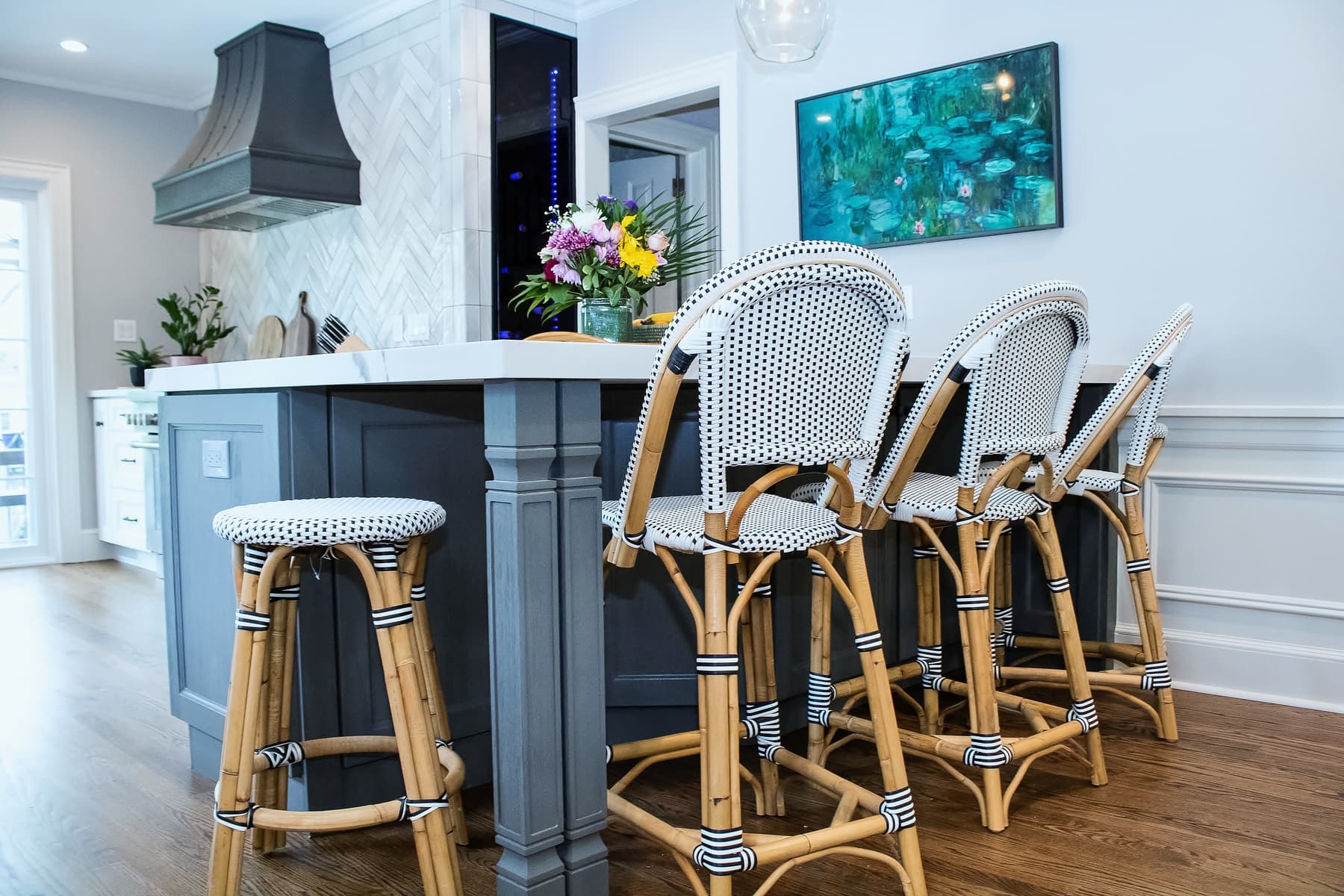
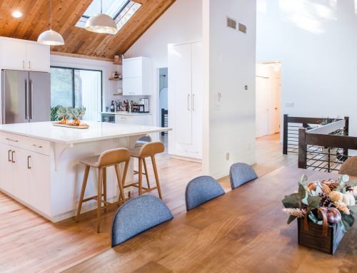
Our design catered for a huge peninsular in the same spot which once held a wall. Now, it holds a massive peninsula with a stone so big we could have given it its own name. We choose not to. This set up gave us enough room for 4 seating capacity and storage on both sides. We were also careful not to add any cabinets on that wall as well because we wanted the light to bleed through the room. We opted for a picture frame wall hung TV, which is a photo frame until you press the power button and it turns into a TV.
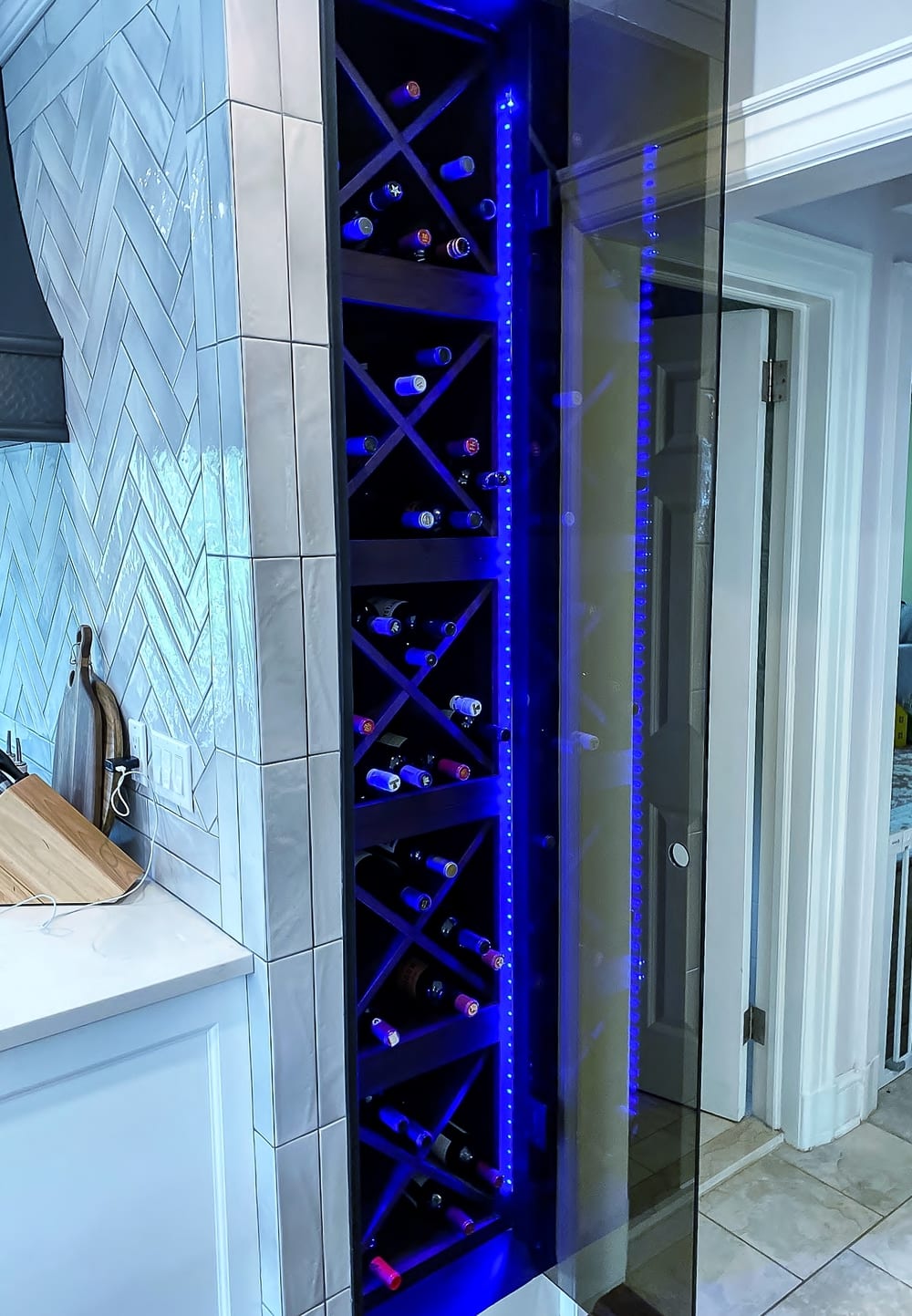
That solved a lot of the major, must haves on the list but we were missing the entertainment portion of this almost completed kitchen. We had to get really creative and dig a bit deeper to solve another crucial detail that would either make or break this kitchen design. We had to find a way to store the wine. Like some other wine collectors, this family does not collect wine and store them just for the sake of having them. They are more like us regular typical Americans that collect the wine, look at them, and then do to them what you should do to wine. Drink them! So, we got working on finding a home to store and display them at the same time.
There was a little space in the powder room in the side wall, just enough of it for us to take, and we cut into that room and took it. We built a wall into that room and recess the wine racks into it. We didn’t want to leave the bottles exposed, so we custom fabricate a bronze glass door which gave us enough privacy and yet provide that elegant look from the dining room that we were going for. We then lined the inside of the unit with an Alexa ready LED lighting that runs throughout the kitchen.
Finally, we cut in for a large slider door, upgraded the kitchen window, added a supporting wine/beverage cooler, recalibrated the kitchen to put in more lower storage vs uppers, thus giving them more volume with less intrusive top heave concept. We then added in some colors in the Cabinets, topped off by some handpicked pendant fixtures by our clients which brought this space together beautifully.
The space looked and feel larger than we could have ever imagine. All this was done without encroaching into the dining room, so both rooms were now rebalanced. Both rooms are now equally interdependent and interconnected to each other in a way that most other spaces would only dream of.
Another very happy client…now onto the next! you could be our next stop.


